How to Edit Photos like Steve McCurry: The Art of Removing Distractions
We’ve got a fun article today in which we post-process photojournalistic-style photos and polish them in an artistic way. Much like Steve McCurry did to his photos, but without the heaping pile of backlash.
Ethics in Photography Genres
Photojournalism is held in high regards and is supposed to represent real news stories in the form of photos which haven’t been manipulated. We can apply this style to our street or travel photos in a way that tells an equally compelling story. The only difference is that a photojournalist gets paid to present the truth within photos, while street or travel photographers (especially those that are not paid) are free to do what they wish with their photos.
Some street photographers follow the ethics of street photography and present things exactly as they were, while others choose to manipulate things. Most of us, myself included, are guilty of manipulating street photos when we were just starting out, but once understanding the ethical side of things, we learned how to embrace the imperfections we captured.
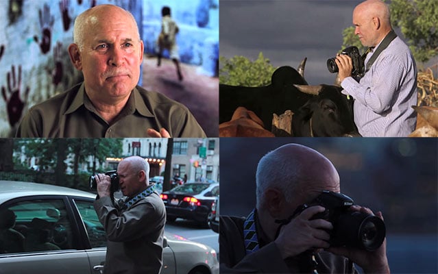
Steve McCurry now labels himself as a “visual storyteller” so he’s no longer held to the ethics of a photojournalist. If we are defining ourselves as street photographers or photojournalists, while presenting photos that were heavily manipulated, we should perhaps label ourselves as fine art photographers to avoid any confusion.
Elevating Photos to Fine Art Status
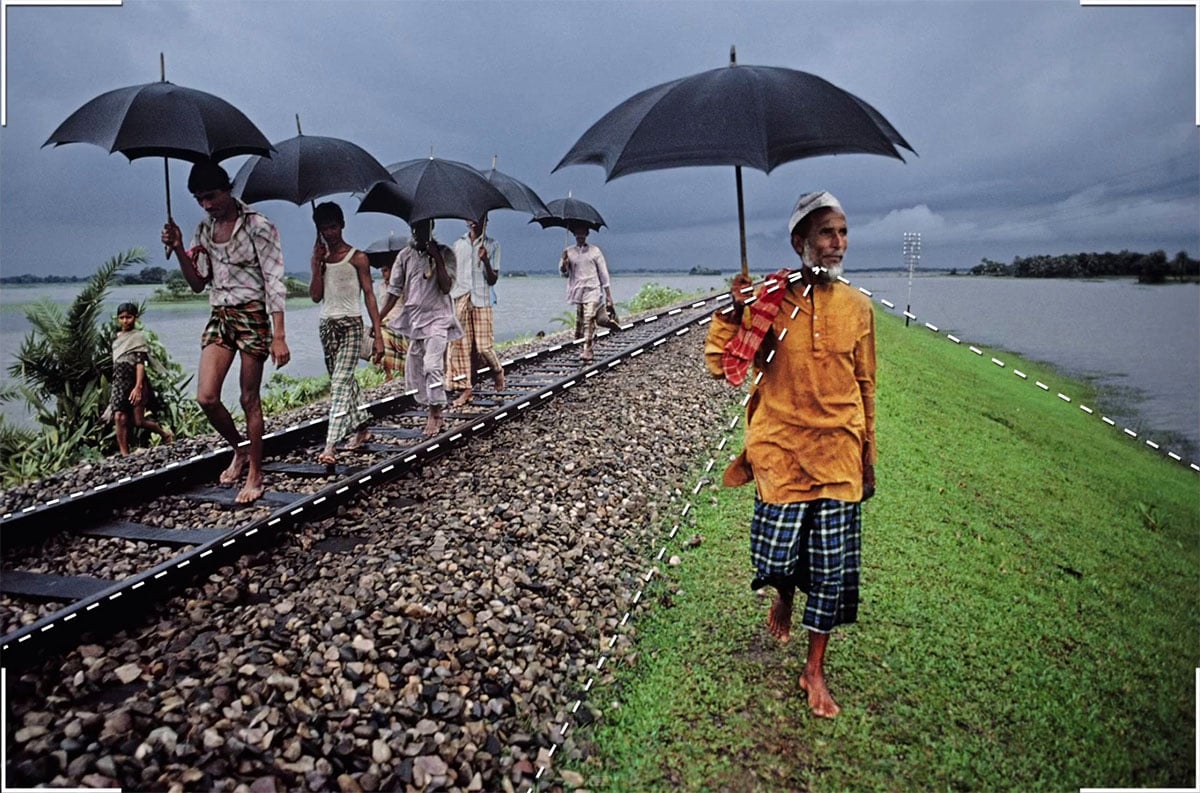
Most of Steve McCurry’s photos are portraits, but we’ll pull inspiration from his landscape photos. He usually includes a small human element and has a very polished end result. This means, the photo has nice exposure, some toning, is well composed, and is mostly free of distracting elements.
Most of us understand how to get a proper exposure, and Instagram is teaching us all about toning, but how do we eliminate distractions? To do this, we basically have to look for edge flicker, which is high contrast near the edge of the frame. This should be done in-camera, but in post we can use a subtle crop (snip) or reduce the contrast of the area. We also want to be on the lookout for elements that can be cloned out to simplify the image and story.
First, we have to start with a well-composed image, then we’ll polish things from there. No amount of post-processing or cropping will save an already shabby image. Admittedly, all of my photos below are shabby in comparison to the amazing imagery that Steve McCurry captures, but they will have to work for now.
Most of Steve’s landscape photos have a nice figure-ground relationship, the overall balance is nice, beautiful linear designs, and the edges are mostly free of high contrast. Some photos seem to have a muted tone within them, which could be a result of shooting with film. Results vary, depending on the type of light within his photos (cloudy vs sunny). Either way, we’ll add that muted tone, along with some color saturation to our Steve McCurry recipe.
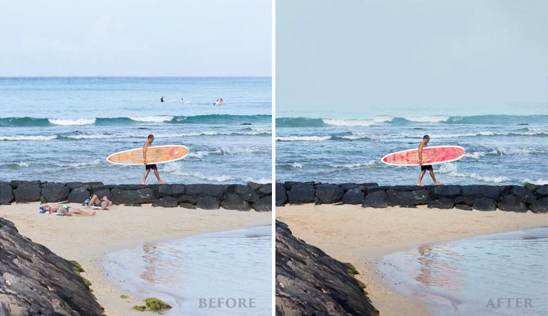
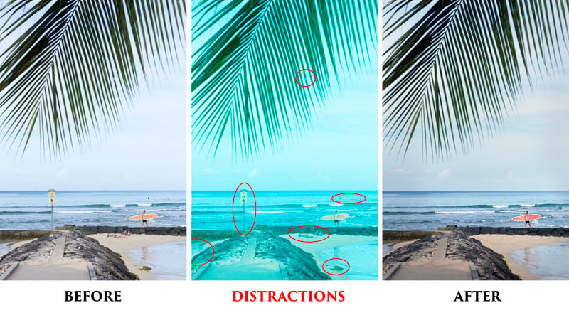
In this first example, taken in Waikiki, HI, we see a surfer getting ready for the morning waves (8:18 am, 5/10/18), but we also have many distractions for this to be considered a fine art photo. The sunbathers laying on the beach, the sign, the rock, someone in the ocean, and high contrast on the palm tree branch.
A Hue adjustment layer in Photoshop was used with selection masks to add more color to the sky and change the color of the surfboard. The color red is seen in many of Steve McCurry’s photos for a reason. It grabs the attention of the viewer and helps complete the color palette most of us seek to capture (a hierarchy of red, blue, yellow, green). We can see how it makes the image pop a little more.
Once the distractions are removed, the attention goes back to the landscape and the small human element. The viewer knows exactly what the story is.
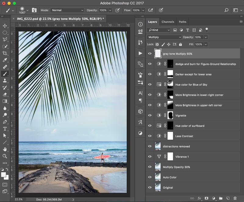
Here’s a look at the adjustment and editing layers in Photoshop. A gray layer was added to the top of all layers to mute the photo, similar to what we see in McCurry’s photography. The hex code for the gray used is #eff0f1 and the layer mode was set to multiply with an opacity of 50%.
The other images are edited in a similar fashion, with an emphasis on eliminating distractions. To help with eliminating distractions for the purpose of fine art, it’s a good idea to use a zoom lens when photographing. This way you can cut things out of the frame with the twist of your wrist.
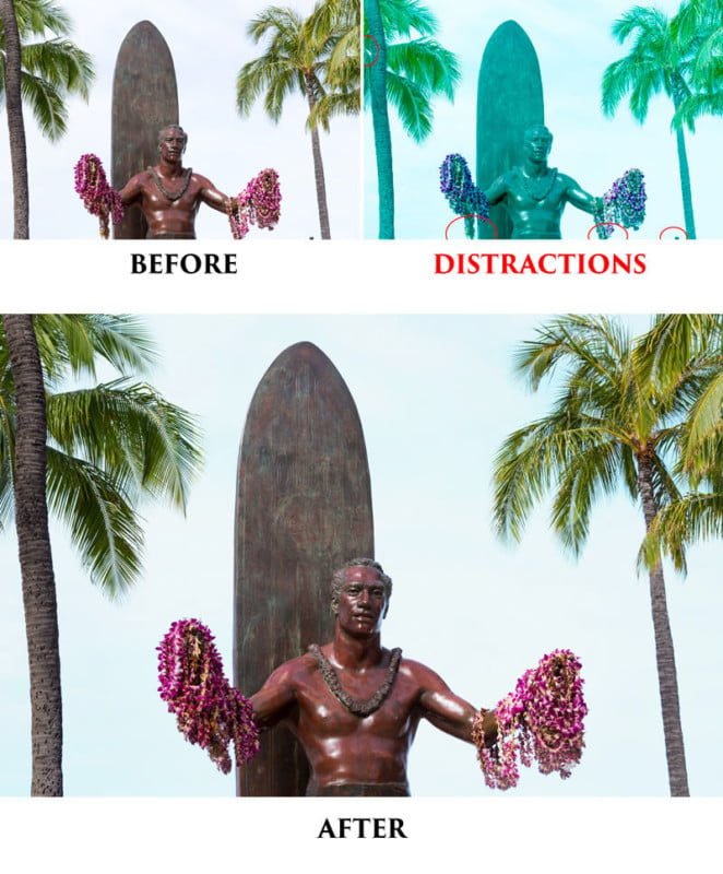
For instance, this next image had tourists in front of the statue, and other distracting elements, so I zoomed in and ensured the statue had a nice figure-ground relationship. One small step to the right or left and the statue’s arm would be overlapping onto the palm tree.
Now that I mentioned “zoom lens,” I guess it’s appropriate to talk about gear real quick.
For all of these photos, I used the Canon EOS 6D, with my favorite travel lens, the Canon 28-135mm f/3.5-5.6 IS USM. It doesn’t have a red ring around it, but that doesn’t mean it’s not capable of capturing some keepers. It’s really inexpensive, has a great range, image stabilization, and is lightweight. Perfect for traveling with one lens. The Canon 24-105mm f/4L IS II USM is similar, but much heavier and way more expensive. But, enough about gear. As long as it serves it’s purpose and doesn’t impair your creativity, break the bank or your back, it’s perfect for your needs.
This image of the Duke Kahanamoku Statue was cropped in a little on the right to even out the palm trees, and the distractions were eliminated. The lei meeting the bottom of the photo was cloned out and reshaped.
Now that we’ve got the gist of how things were edited, we can run through these a little quicker. Just keep in mind the distractions that were eliminated in order to present a polished image.
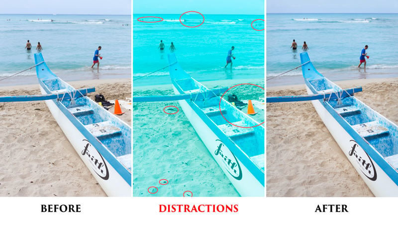
The cone was way too distracting in this next one, especially since it was near the edge. The background surfers in the distance were manipulated to reflect two on the left, one on the right, just as the foreground subjects.
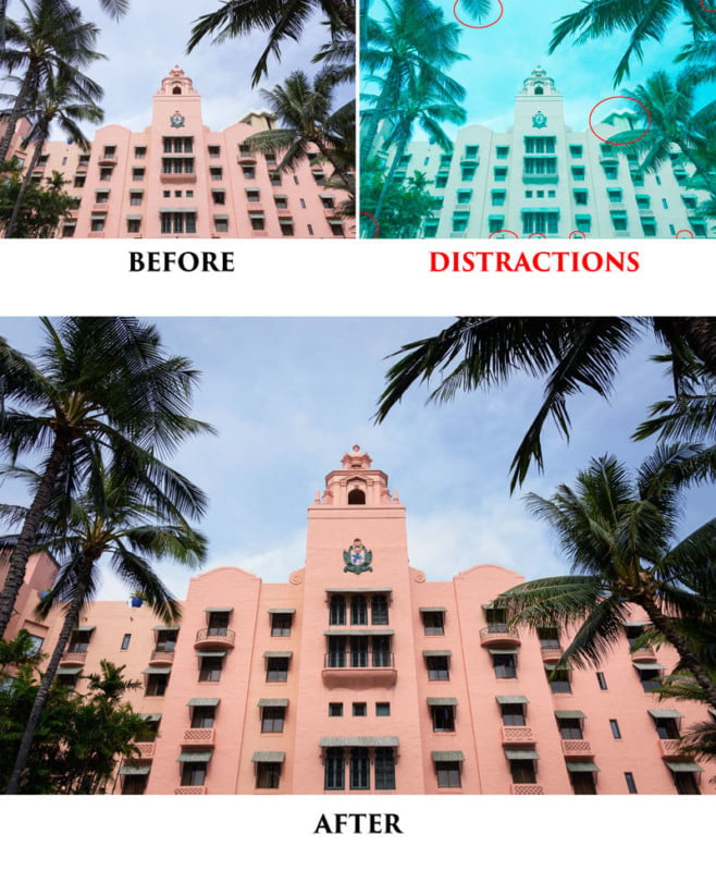
This one was a bit more difficult because the beige building on the right side needed to be cloned out. Even the smallest areas of contrast near the edge must be removed. If your eye keeps being pulled to the same spot, which is away from the subject, then it should be removed or subdued (contrast lowered in the area).
This photo captured several people in the water, who were distracting from the two ladies on the beach. Once they are cloned out, the image looks cleaner.
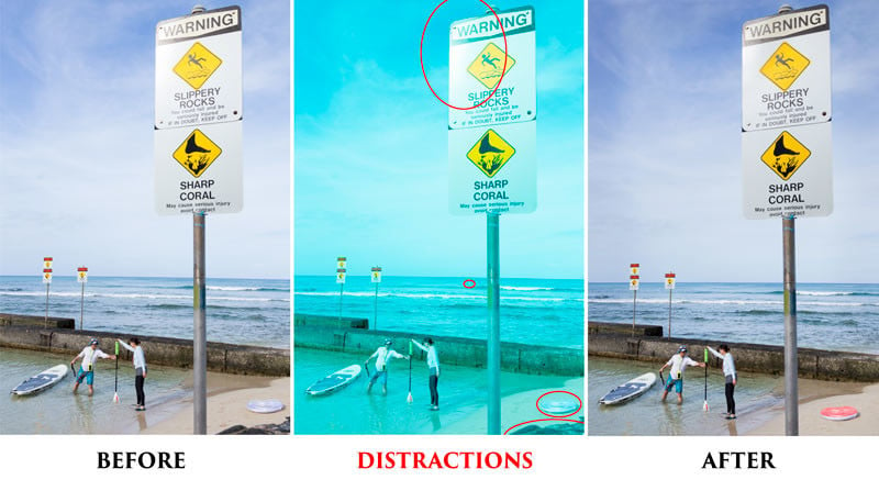
In this one, the horizon line needed to be straightened a little, but doing so clipped off the top of the sign, and also made the flotation device (bottom right) too close to the edge. To remedy this in a fine art kinda way, I fixed the horizon line, and just cloned in more sky where it was transparent at the top. I also moved the flotation device in from the edge.
The color palette needed a little splash of red, so I changed the hue of the flotation device; completing the color harmony. The glare on the sign was reduced as well.
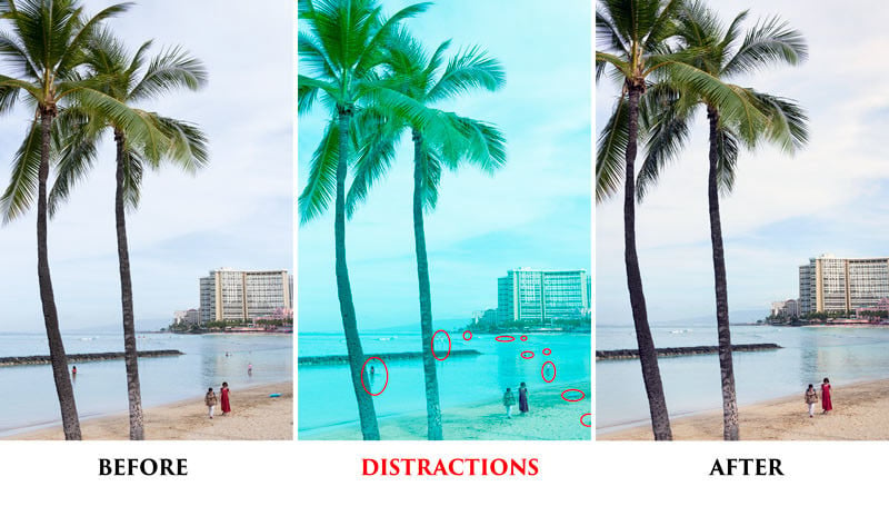
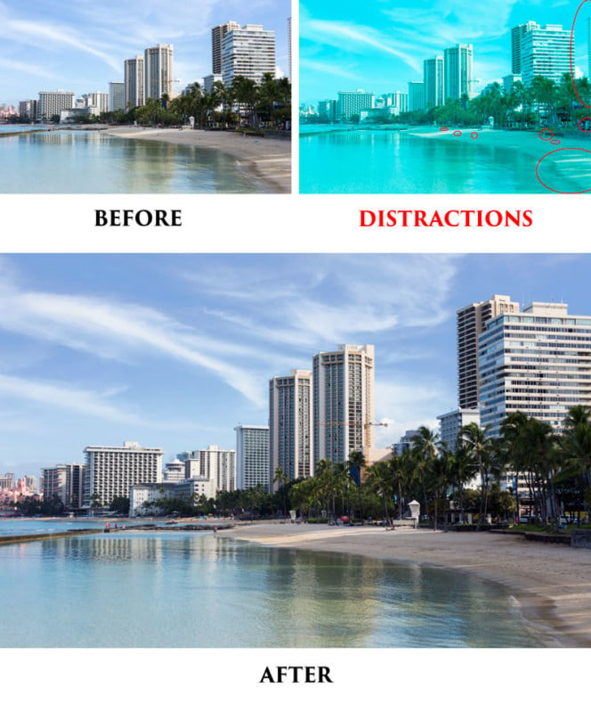
This is a simple shot with a nice design in the clouds, and reflections. The image was composed with a slight gap on the right, so this area needed to be snipped off. The other distractions (people laying on the beach) were removed or subdued to keep the attention on the skyline.
Conclusion
Removing distractions is one of the best ways to keep the attention on your subject, and polish an image to fine art status. Have you ever polished a street or travel image in this way? Do you consider yourself a visual storyteller like Steve McCurry, with the flexibility to edit what you choose, or do you present things as pure as possible?