How to Match Saturation in Composite Photos Using Photoshop
Once you’ve matched the color tones in a composite photo, you can then move on to matching the saturation for proper realism. Here is a 5-minute tutorial from Antti Karppinen that shows how you can do so using Photoshop.
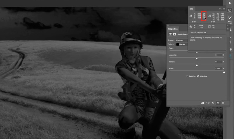
For the whites, blacks, and neutrals, move the slider to +100.
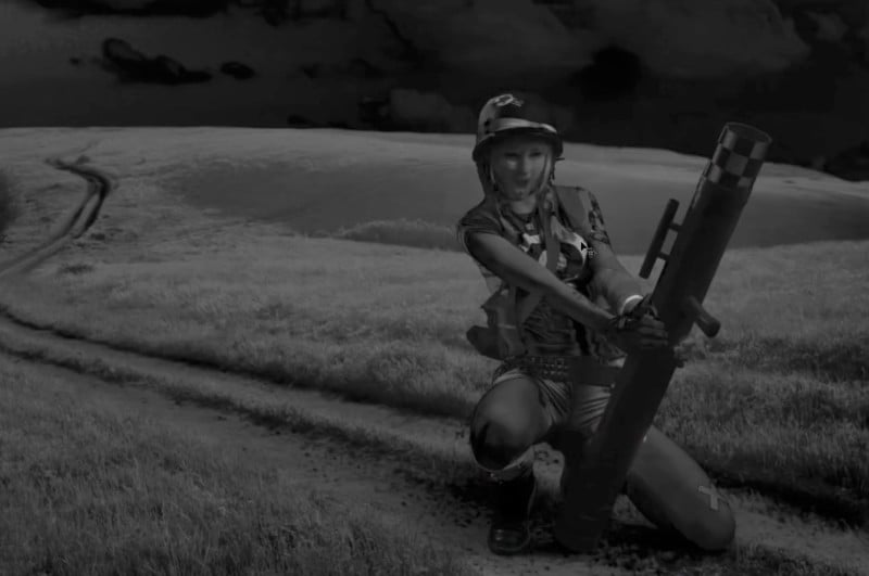
The result is a color map that shows you saturation levels across the scene. Darker shades of gray are less saturated, and lighter shades are more saturated.
Now, apply a Hue/Saturation layer to only the added element’s layer. Pull the saturation slider to the left and match the scene as best you can by eye.
If you want to be more fine-tuned, navigate to “Window > Info.” Next, using the eye-dropper tool, you can look at the RGB values for different areas across the image and match them as best as possible.
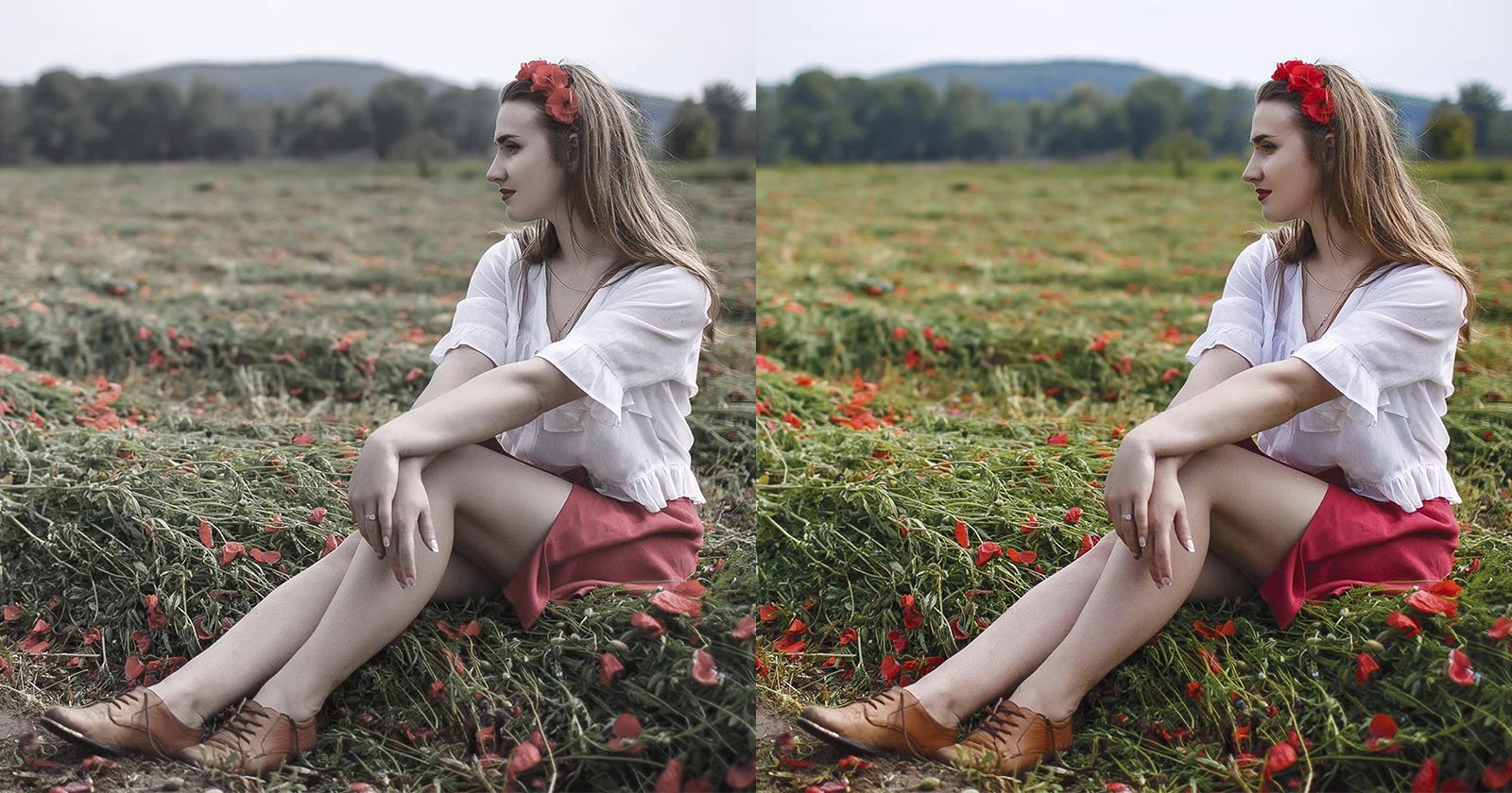
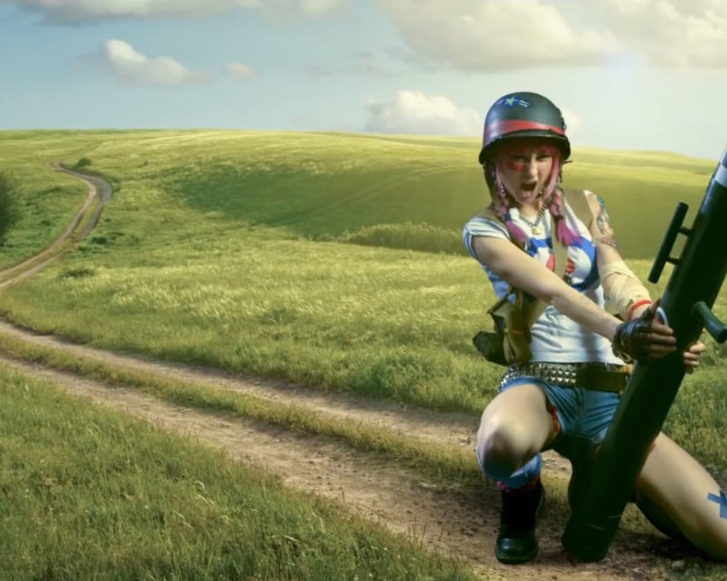
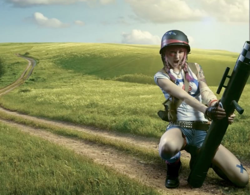
Here’s the before and after comparison from this technique:
Check out the full video above to follow the full step-by-step tutorial. You can also find more of Karppinen’s videos on his YouTube channel.