10 of the Most Beautiful Photography Templates: What Sets Them Apart?
The visual nature of the Internet makes it the ideal format for getting a photography portfolio in front of a wide audience. The problem that many photographers face, though, is finding a template that is eye-catching and easy to work with.
Full disclosureThis post was sponsored by Squarespace.
Fortunately, there are numerous examples of photography templates that offer the perfect blend of aesthetics and user friendliness. By taking a closer look at some of the most beautiful Squarespace photography templates available, you can learn what sets these options apart from a crowded sea of websites filled with images.
1. Forte
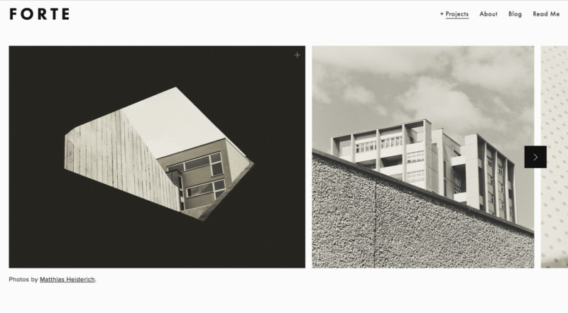
Going bold can be truly attention-grabbing, as the Forte template highlights. This is an ideal choice for photographers who have large scale imagery that contains visual contrast and compelling lines. Providing such a big example of the photographer’s work makes it easier for visitors to fully appreciate it. Having a subtle menu at the top right helps keeps people around without being so distracting that it detracts from the initial image.
2. Wexley
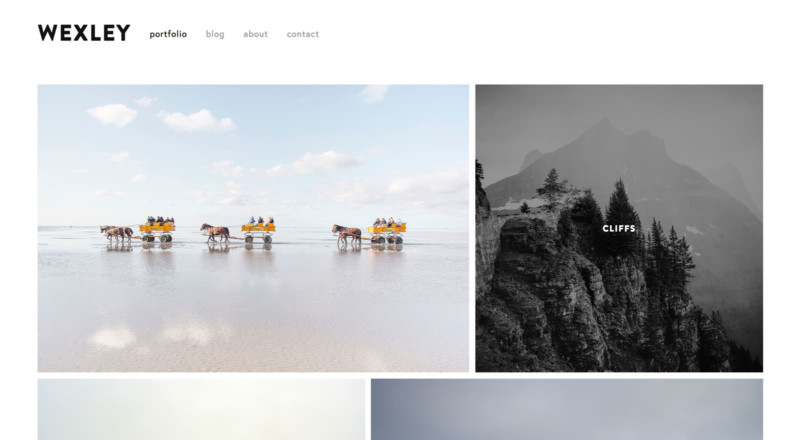
The ultimate goal of any photography website is to get people to look through the photographer’s portfolio. With Wexley’s clean, fluid design, this is exactly what’s going to happen. As each visitor scrolls down the page, they are greeted by two new images at a time. If they hover their cursor over any picture, an overlay appears that includes the name of the photo. After clicking on their photograph of choice, visitors will be taken to a larger version so that they can see the finer details.
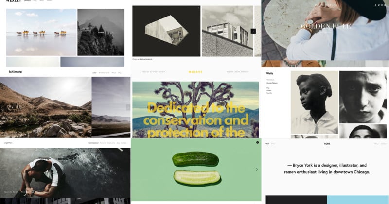
3. Ishimoto
![]()
Large scale photos are quite simply the most appealing because they quickly draw people in. Ishimoto provides more of a traditional top menu than the Forte photography template, but it still provides a huge viewing area that helps landscape photos pop! The inclusion of the scrolling arrow to the right of the screen keeps people looking through a slideshow instead of scrolling to the bottom of the page. Internet users have gotten used to looking at images in a slideshow format, so this can work to the photographer’s advantage.
4. Wells
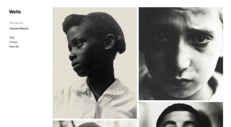
Something as simple as moving the website’s menu can offer a completely new look. In the Wells photography template, the menu stays fixed on the left side as visitors scroll through the photos. There are two nice things about this approach. First, the images stand out because of their placement. Additionally, the fixed menu offers quick access to everything else the website has to offer. Most photography templates don’t have a fixed menu, which means people have to scroll back to the top to navigate to another page. Removing this step is virtually certain to reduce bounce rates.
5. Tudor
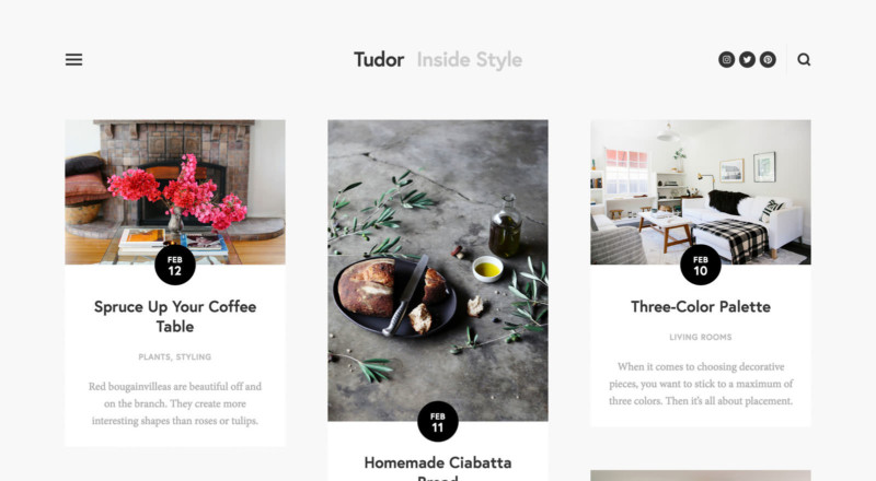
Although this isn’t exclusively a photography template, Tudor works very nicely as a showcase for a photographer’s blog. The layout is very scrollable, and it includes a fixed top menu that follows people down the page. There’s plenty of room to include a photograph with each blog post, and photographers can say as much, or as little, as they’d like in the rest of each entry. This is a good way to put recent work on display while simultaneously offering tips or adding keywords for SEO purposes. An online portfolio is necessary, but keep in mind that people want to see current work. A blog helps photographers accomplish this with ease.
6. Momentum
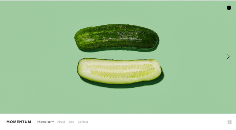
Momentum is another side-scrolling slideshow, but it has a few nice perks that make it stand apart from the crowd. For example, the cucumber shown in the screenshot usually takes up the entire screen above the menu. Clicking on the “I” button on the righthand side opens up an information box and resizes the image appropriately. This is a great way to share important details about each featured image, and it also gets people to take more of an active role by clicking on multiple things instead of merely making their way through the slideshow. The addition of the bottom menu makes this necessary piece unobtrusive to the imagery, which is very helpful considering the main goal is to put the photography on display.
7. Haute
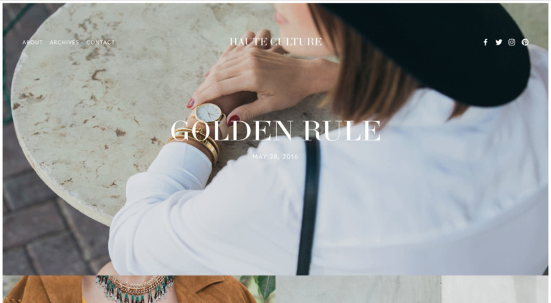
The Haute template features large clickable imagery that can go to blog posts or a sales page for each photograph. The template alternates between a large horizontal space followed by two smaller spaces, and this format continues all the way down the page. This offers photographers the ability to properly show off their best portrait and landscape imagery in one convenient location. Varying between the two styles also provides visitors with some much-needed visual contrast, and it makes it easier to display the versatility within a photographer’s portfolio.
8. York
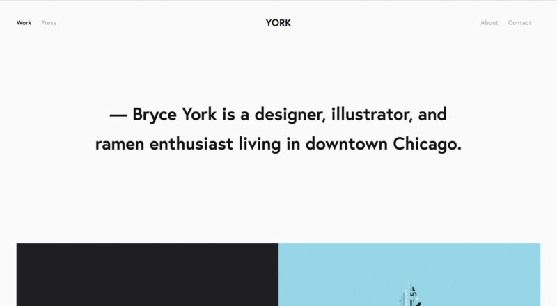
When people think of a photography website, the first thing that comes to mind is, naturally, photographs. But the truth is that’s only half of the package. As anyone who has ever hired a wedding photographer without ensuring their personality meshed well with the couple can tell you, it’s imperative to hire someone who the subjects will get along with.
The York template enables the photographer to include an introductory tagline, which is followed by space for several images in different sizes. Each photo can also feature a title that appears when a visitor hovers their cursor over it. A large tagline may not seem like a beautiful design element, but the impact it has on potential clients is definitely a thing of beauty.
9. Lange
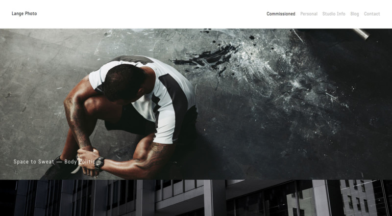
The Lange template is a wise selection for landscape and documentarian style photographers. Each image box has the same dimensions, but clicking on one opens up a new page that has plenty of room for additional photos of all shapes and sizes. There’s also room to describe what visitors are seeing, and the slick design makes images appear to come from out of nowhere as people scroll through these interior pages. That’s a handy photographic template technique because it will encourage visitors to keep looking.
10. Mojave
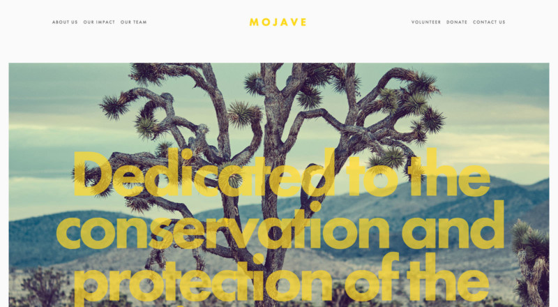
Bold and modern design choices can keep people scrolling through the homepage when they would have normally bounced almost instantly. Mojave has a very responsive design that makes large format images and words appear to go on top of each other as visitors work their way down the homepage. This provides the perfect blend between images, necessary information and personality.
Making the Right Choice
Ultimately, each photographer needs to ensure that the template they choose works well as a showcase for their portfolio. Using modern elements, large scale imagery, a blog, fluid movement and the addition of hidden but easily accessible information will help photographers connect with a diverse audience.
Remember, the most important thing to consider is whether or not the template is flattering to the images in question. With Squarespace’s award-winning, all-in-one designs and long list of options, though, it’s easier than ever to achieve stunning, professional looking results. The addition of helpful tools such as 24/7 customer service, SEO help, social media integration and Squarespace’s guide to building a photographer site make the process easy for everyone.
Create a beautiful portfolio for your photography with Squarespace! Start your free trial now, with no credit card required. Take 10 percent off your first website or domain purchase with coupon code: PETAPIXEL