I Gave Up on Squarespace and Built My Own Photo Website from Scratch
For the past several years my photography website called Squarespace home. Among online, fully-contained, content management systems, it is hard to go wrong with Squarespace. Offering domain registration and hosting, plus well-crafted templates, Squarespace makes it easy to create a professional looking website.
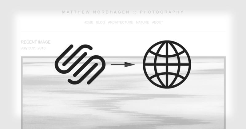
Squarespace has made available to individuals what would otherwise cost many hundreds, if not thousands, of dollars to accomplish through a component web developer, all for a somewhat reasonable monthly cost. While my website doesn’t see much traffic (no fault of Squarespace’s), I decided to transfer my domain from Squarespace to a dedicated hosting service. Which meant I had to start over and build my website from scratch.
Why would I opt to leave the carefully crafted, polished environment of Squarespace? Largely because of content management.
Before I go any further, I should make a couple things clear. First, this is not a criticism of Squarespace per se. Squarespace exists for a very specific purpose. Like I mentioned, Squarespace has made available tools for anyone to develop a professional looking website; whether that is to support a business, portfolio, or project without the need for costly web development. If you are willing to put in the time to get familiar with the Squarespace environment, it will likely suit your needs well.
Secondly, users of Squarespace will already know this. If they needed the extra flexibility of a self-managed website, they most likely would have gone that route in the first place. In my case, I started with Squarespace under the same circumstances. I wanted a well-tailored look with modern functionality, all for very little effort. It was after several years of use, however, when the needs for a self-managed website became more apparent.
Now in terms of content management, you may own your content but you really don’t own your website. Yes, you have a domain name, which you technically own and can take elsewhere, but your content is supported by a template that is managed and owned by Squarespace. Squarespace is a business and like any business, it could shut its doors tomorrow. Leaving you with very few options to recover your efforts in the event of a worst case scenario. To be fair, Squarespace does allow you to download your “site”, but not in any way that would make it easy to seamlessly transfer that content to another provider.
For a portfolio, this is likely not that big of a deal, but can be especially so if you use your website for any means of income. After several years of use, it was this overall lack of ownership that made me decide to leave Squarespace and host my website elsewhere. There is something to be said for having complete control over all areas of your website, from the media you upload on down to the HTML and CSS files that make up the core of a website.
Under this scenario, if worst came to worst, I know that I can easily take my website to any hosting service with little downtime in between. This should be an important consideration for all photographers or creators of any kind.
The following is a narrative about the decisions I made in building and designing this website and that it might be a helpful resource for others looking to do something similar. I tried to approach building this site as logically as I could, so each ‘Part’ is, more or less, in order of consideration. As such, I will begin by discussing my first decision in choosing a hosting platform.
Part 1
Choosing a Hosting Platform
Choosing a hosting platform was a bit of struggle. With numerous options available you think it would it would be anything but, however, quantity does not always equal quality. Simply Googling “best website hosting 2018” is not a bad place to start to get a handle on the current environment of website hosting. You can then use that information to further filter your choices.
Another option, and the one I eventually chose, was to search Stack Exchange and web developer subreddits on Reddit. Both have a massive user base and what better way to find this kind of information than from the people who are likely to have experience using hosting services? There was plenty of good advice to be had, but many stressed the importance of quality customer service over technical differences.
Speaking of technical differences, one technical decision you will likely have to make is choosing between shared hosting or dedicated hosting. With shared hosting, as the name implies, you are sharing server resources along with other websites. Dedicated hosting, on the other hand, provides dedicated resources for a single website. Both have their benefits. Shared hosting is significantly cheaper, while dedicated hosting favors stability. I would venture to say that for the vast majority of people, shared hosting is more than enough.
After comparing most of the major players in web hosting, I eventually chose a shared hosting plane from Siteground. They received great feedback from users (especially customer service), had reasonable yearly rates for shared hosting, and a solid introductory feature set for users just starting out with their own self-managed website.

Domain Transfers
When you sign up for a Squarespace account, you will also likely register for your own domain (website) name. It is actually a nice feature that Squarespace offers in that, as a service, everything is self-contained. You can have your domain name and website up and going in the 10 minutes that it takes to create an account; no need to buy a domain from another provider. This was the route I took when I used Squarespace and registered my name as the domain name.
Squarespace, fortunately, makes this a relatively painless experience by offering the tools needed to prepare your domain to be transferred to another provider. I followed the exact steps found here and encountered no issues. The transfer from Squarespace to Siteground took all of 10 minutes (although they do estimate that it can sometimes take as long as 48 hours). With the domain transfer complete, it was time to begin putting the pieces together for this site.
Part 2
WordPress (CMS) or Static HTML?
The next decision was to decide whether I should use WordPress or static HTML/CSS. Saying that WordPress is the most used CMS in the world is no exaggeration. According to WordPress, 30% of websites are built using WordPress, which include a number of big names such as The New York Times, Forbes, BBC America, TechCrunch.
If WordPress is good enough to manage these websites, it is good enough to manage your own personal website. The ubiquity of WordPress also means that hosting services generally offer easy WordPress installations. So, if you are coming from Squarespace and still like the idea of a CMS, WordPress (or one of the many variants) is a good way to go.
But, there is another consideration, and that is a static HTML website. Static meaning no CMS or dynamically rendered web pages say, via PHP. There are advantages to static HTML websites. First is simplicity. You have an HTML file for every page and a series of CSS files that style them. Once finished, you upload to your preferred hosting service and you are good to go. Also, static HTML websites tend to have faster load times. Another advantage is that static HTML pages can offer more SEO (search engine optimization) flexibility.
There is a significant downside, however, and that is, interestingly enough, content management. A CMS, like WordPress, is built to do just that, manage content. You can write and upload to a page through an easy-to-use text editor as well as upload photos using any number of photo gallery plugins available. Static HTML requires you to directly edit the HTML of the page and then upload that page via FTP to replace the old with the new. It is pretty archaic when compared to WordPress or other CMS systems. If you’re constantly adding new content, this is not exactly ideal.
Weighing the advantages and disadvantages of both WordPress and static HTML, I went with static HTML. In an environment where modern websites have a tendency to be feature heavy, I was looking for speed and simplicity. Static HTML/CSS offers both.
HTML/CSS Boilerplates
I don’t have much experience with web development. I have managed websites using a CMS, but not coding a website from scratch. My familiarity with HTML/CSS is basic; enough to know some of the terminologies and not a whole lot else. The one piece of information that I was aware of is HTML/CSS boilerplates.
Boilerplates, or skeletons as they are sometimes called, provide the basic foundation for developing and designing a website. Since all HTML pages have a required page structure, boilerplates include this structure as well as other common features that help speed along the website development process. These boilerplates usually include a CSS file (cascading style sheet) that normalizes your webpage to help keep it consistent between web browsers (typically called normalize.css).
Each web browser has the potential to style web pages differently. Including a normalized CSS file will help keep your website looking the same across all browsers. Speaking of web browsers, boilerplates will also include functionality that will make your website mobile-ready. The key is to be able to have your webpage viewed easily across any device; whether it is a cell phone, tablet, or full desktop computer.
Like everything up to this point, choosing a boilerplate required some decisions. For myself, there were two important factors. First, the boilerplate could not be large in size. Boilerplates have a tendency to be quite large depending on the features that are packaged in them. Secondly, the boilerplate had to be user-friendly. At the end of the day, all I needed was the bare minimum. Enter Skeleton.

Skeleton is billed as ‘a dead simple, responsive boilerplate’, which is no joke. The entire download is no more than 26KB. Skeleton also includes some nice, simple stylized features like buttons and forms if you choose to use them. A criticism that I have seen online is that it is not as consistently updated as other boilerplates and not as feature rich, but neither of that mattered for me. As my website is largely driven by photos and text, there isn’t much need for any additional overhead by way of user-experience functionality. Simple is all I needed and Skeleton more than fits that bill. Highly recommended.
Photo Gallery
I knew that putting together a photo gallery wouldn’t be as straightforward if I had opted to use a CMS like WordPress. Since this website is more hands-on, I knew that a photo gallery would require a little more work. I wanted to minimize not only the amount of potential work/coding but also keep with my theme of simple and lightweight. It took a solid evening but I came across the photo gallery utility called Fresco. It is fast, easy to implement, and provides plenty of customizability to suit most photo gallery needs.

Part 3 Design Philosophy
Although design should probably be the first thing that you consider and sketch out rather than the last, it is Part 3 in this series for reason. From using Squarespace for a number of years, I kept mental notes about things that I wish I could have changed but could not because of the limitations of the templates.
The Squarespace templates are nicely designed that generally follow many of today’s most popular web design trends: screen spanning images, large, blocky text and fading transitions between elements. While pleasing, they were personally irritating. I had a long-standing mental vision of how I would arrange my own website, so I did not have to spend much time sketching out the details. My ultimate design philosophy for this website was pretty simple; lightweight and fast, clean and neat.
Layout
I chose to go with a pretty standard layout. The container (the part of the website that you are reading now) is 960 pixels wide and centered. Using Skeleton as my boilerplate made this simple as this is the default layout. This 960-pixel working space can be further divided into columns to help support arranging elements on the page. For example, my Home, Blog, and About pages use 100% width of the container (all 960 pixels), or one column.
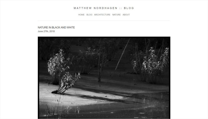
My photo galleries, on the other hand, are split into thirds so that I can have my photos arranged in a three-column grid.

A single page can have columns of various widths to help accommodate multiple layouts depending on content. Best of all everything is kept responsive so content will scale proportionally.
Fonts
Choosing the right font is a big deal. I would say it is up there as one of the most important decisions you will have to make design-wise. It does not help that there are thousands of fonts available. A few key considerations will help considerably narrow the field of choices. Regardless of whether a font will be used for a heading or body text, you want a font that will be easily readable and stay consistent between browsers. Thankfully, repositories like Google Fonts offer dynamically hosted fonts that will display regardless of platform and browser.
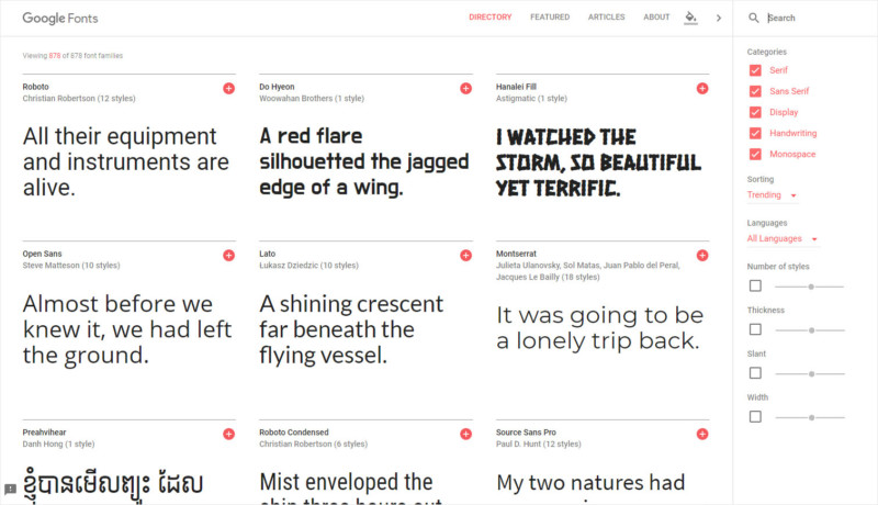
Another plus one for Google Fonts is that they are free. Not all fonts are free and often require a license to be purchased. As convenient as Google Fonts is, my thoughts are is that you are better off choosing a web safe font.
A web safe font will typically display regardless of what browser you are using. I wanted to use a sans-serif font and Arial is a web-safe font available for display on all browsers. Since Arial is considered a system font I did not have to rely on Google Fonts to serve the styling. Arial is used for both the body text and the headings of this website. While Arial may not have a lot of design wow-factor, it is one of those fonts that goes with almost anything; kind of like the neutral color equivalent of fonts.
Photos
I realize that high-resolution, screen-filling photos are hugely popular on websites, but this can also equal slower rendering and possibly expensive downloads. Google has several excellent resources that cover image optimization that are well worth the read. They can be found here and here. The images on this website average a size of 200KB, which strikes a nice balance between size, quality, and speed.
There are a number of programs that can help compress JPEGS without sacrificing too much in terms of quality. Some of them include online utilities such as TinyJPG and Compressor as well as desktop programs such as imageOptim (Mac only. I’m not too familiar with what options are available for Window users). While I have used these, Adobe Photoshop covers all of my image compression needs. If you already have a Creative Cloud account then there is little need to add anything else to your workflow. If not, the utilities mentioned above will work well.
Part 4
Workflow
I will use this last part to cover the workflow and applications that I use to maintain and update this website. There are numerous alternatives to what I will cover below but, for now, this is my current setup (may change depending on circumstances. If so, updates will be posted here).
HTML/CSS Editor
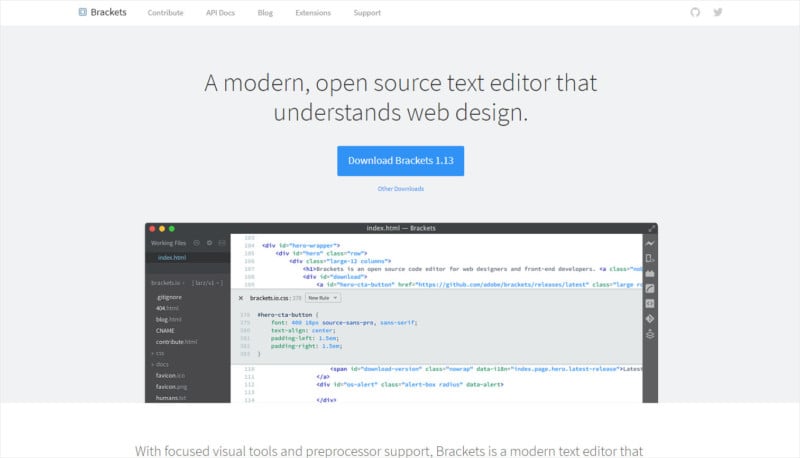
There are numerous HTML/CSS editors available and I don’t really have any specific advice to give for one over another. Unless you are a hardcore developer with very specific needs, there is little reason to purchase HTML/CSS editing software. The only advice I do have is to find one that has robust HTML/CSS autocomplete and Live Preview.
Autocomplete HTML/CSS is extremely useful and helps take the guesswork out of coding while Live Preview lets you view your webpage as if it were live and up on the web. This is useful when reviewing the content of a page before you upload it to your website. I chose to go with Brackets. Mostly because of its simplicity and uncomplicated feature set, as well as the inclusion of autocomplete HTML/CSS and Live Preview. It also allows for extensions of which there are many. I use Beautify which helps organize the HTML/CSS code in a more readable manner.
FTP Client
Since this is a static website, that means that I replace the old HTML files with the new HTML files along with uploading other website content. While hosting services offer online portals to access your FTP site, the easiest route is via an FTP client. FTP clients allow you to store your log-in credentials for later use so once logged in, you can simply reconnect. Like HTML/CSS editors there are many FTP clients to choose from, but I use Filezilla, which is available for both Mac and Windows. It is free and gets the job done.

Word Processing
For word processing, I will use both TextEdit and Brackets. TextEdit (the Mac equivalent of Notepad) is mainly to write the rough draft. Once I have the rough draft complete, I will copy that into Brackets to arrange into sections on the HTML page and then complete the final review. Live Preview is especially useful here as I’m able to get a better sense of the page layout before that page is made live.
Conclusion
In light of the many options available to individuals who want to create and maintain a website, this whole effort seems a little archaic. I am not leveraging any of the automated features of a more robust framework through a CMS or any server-side distribution of pages. On the other hand, though, I have found that I highly enjoy this hands-on management of my content. It is certainly not for everyone, but I would not rule all of this out completely.
About the author: Matthew Nordhagen is a hobbyist photographer based in Alexandria, Virginia. The opinions expressed in this article are solely those of the author. You can find more of his work on his website. This article was also published here and here.