How to Color Your Photos Using the HSL Tool in Lightroom
Today, it’s becoming increasingly harder for your style as a photographer to become recognized. Of course, there are prolific photographers such as William Eggleston and Stephen Shore whose use of color is almost instantly recognizable.
Let’s get into this!
#1. Learn Basic Color Theory
I’m completely a visual learner. So the easiest way to talk about color is to look at it.
Here is a typical color wheel:
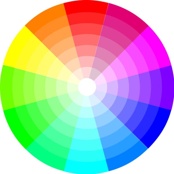
This is the easiest way to show the relationship between colors. Most photo editing is done in Red, Green and Blue (RGB), this is called an additive color model. There is an interactive color wheel from Adobe Color CC. I highly recommend playing around with their color wheel tool here.
There are 3 main color rules I want to discuss: Analogous, Monochromatic and Complementary. Below, I have included the prominent colors underneath the photos so you can start to develop an eye for color.
Analogous Color Scheme
An example of an Analogous color scheme is William Eggleston’s photo below.
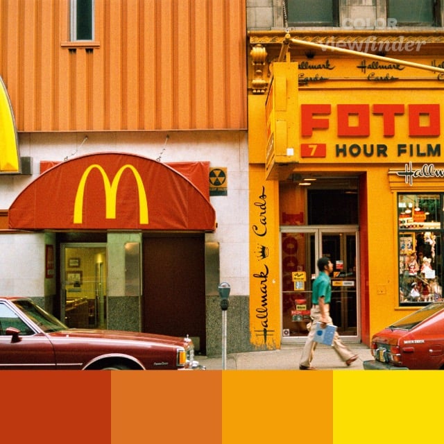
As you can see all the prominent colors are all different shades of red, orange and yellows making it very appealing to look at. All these colors that touch each other on the color wheel.
Monochromatic Color Scheme
This is an example of a monochromatic color scheme from Wes Anderson’s film The Darjeeling Limited.
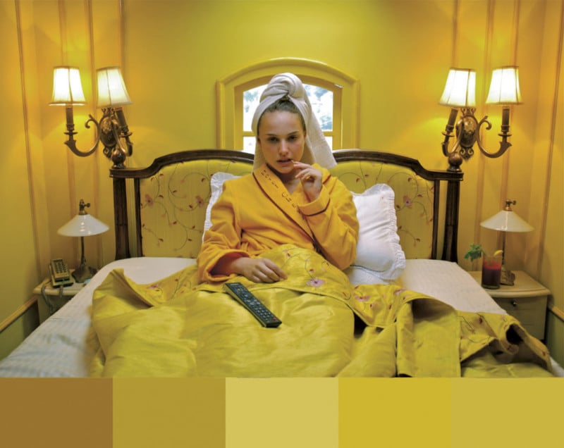
All the colors are different shades the of same color. Each color is from the same slice of the color wheel as you can see.
Complementary Color Scheme
This is an example of a Complementary color scheme from Tron: Legacy.
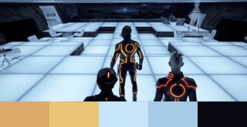
Complementary colors are colors that are on opposite sides of the color wheel. This is a very popular color scheme in most movies today. You will find that a lot of movies use orange and blue as complementary colors.
You can now use this basic knowledge of color theory to help edit your photos. I highly recommend checking out this video if you’re interested in learning more about color (it is more of an approach to film but the basic principles are the same):
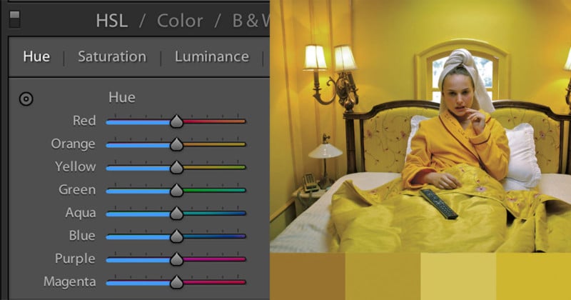
#2. The HSL Tool
The Hue, Saturation and Luminance (HSL) Tool is located under the tone curve tool. This allows you to edit the individual color ranges in your photos.
Before we get into how the tool works. Let’s talk about how you manipulate the color of the photograph (aka what does HSL mean?)
Hue: The general shade of the color
Saturation: The intensity of a color
Luminance: The brightness of a color
Now, that you know what HSL means. Let’s talk about the tool itself and the impact it can have on your images.
Please see the before-and-after example below to see that you can make:
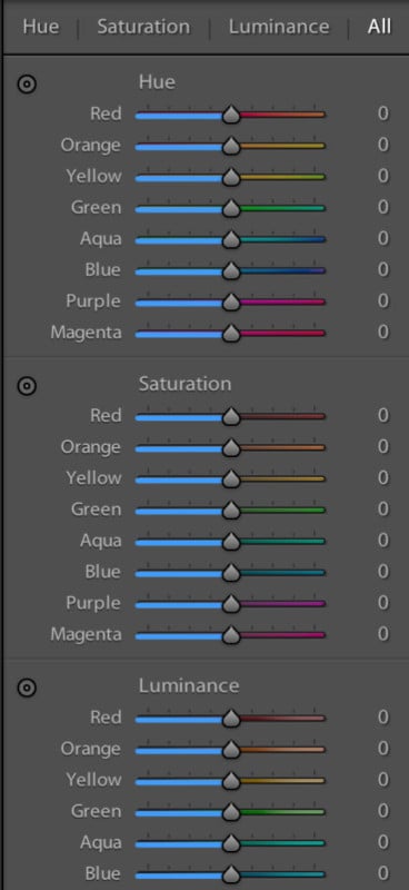
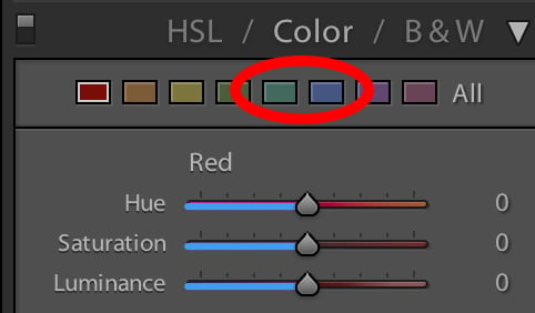
Depending on your workflow, the tool can be set up a couple of ways. If you click on HSL, Lightroom will organize all the colors in order from Red to Magenta.
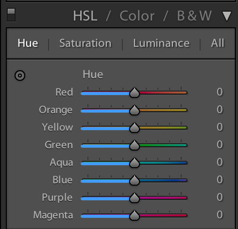
You will also notice that they break the colors into the subcategories of Hue, Saturation and Luminance and All. I recommend using this setup if you have never used this tool before.
You will notice that in the sliders there are different intensity or shades of that color. This is a little preview of the manipulation you will be doing.
With the hue slider, I like to think of this as bending the color on the color wheel.
This button indicated below serves the same purpose as it does in the tone curve tool. Check out our blog post on Tone Curves here. (It’s super helpful!)
But, the really cool thing about the button is that it can adjust multiple values at the same time.
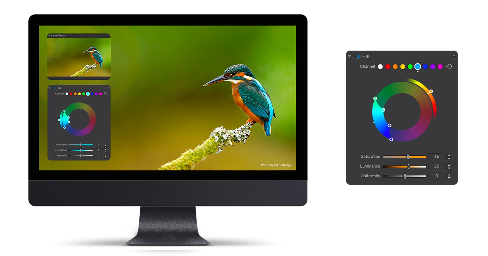
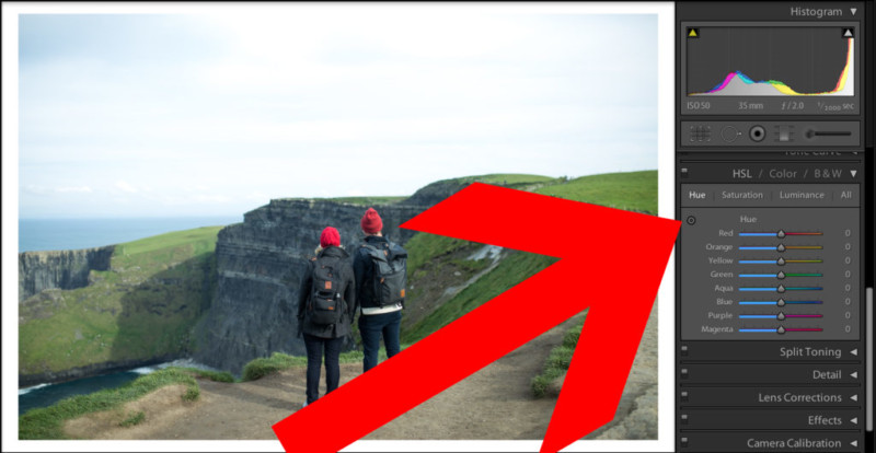
By hovering over different parts of the image you can see which color the impacted by which slider.
As you can see, that as I drag up and down over the green grass, the green and aqua sliders are impacted.
If you click “All” on the top right, It will open Hue, Saturation and Luminance for each color.
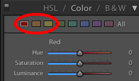
The other way to organize your HSL tool is by clicking on “Color”. I prefer this way because I can just go color by color and manipulate how I see fit.
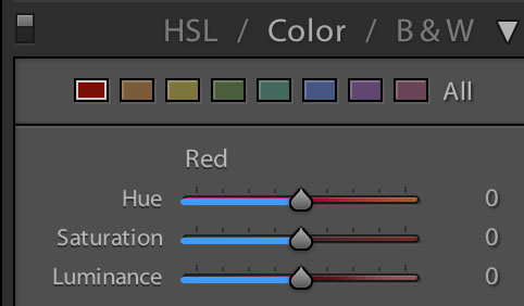
This is how I typically think of the color tool when I go to edit.
Pro tip: Yellow and green are way more linked than you would think.
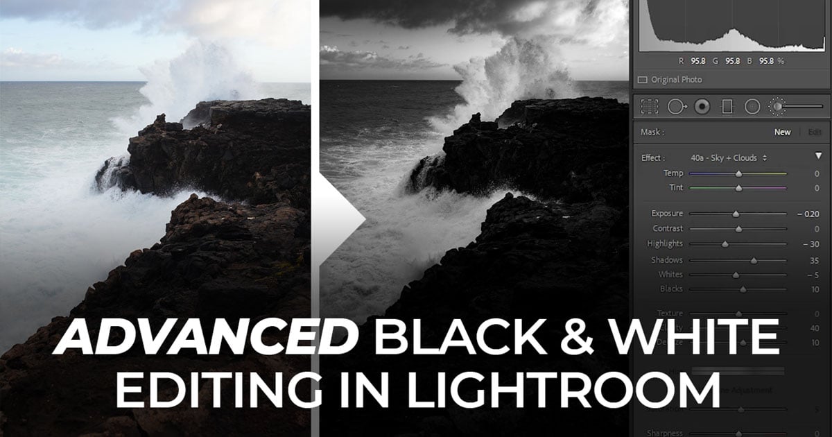
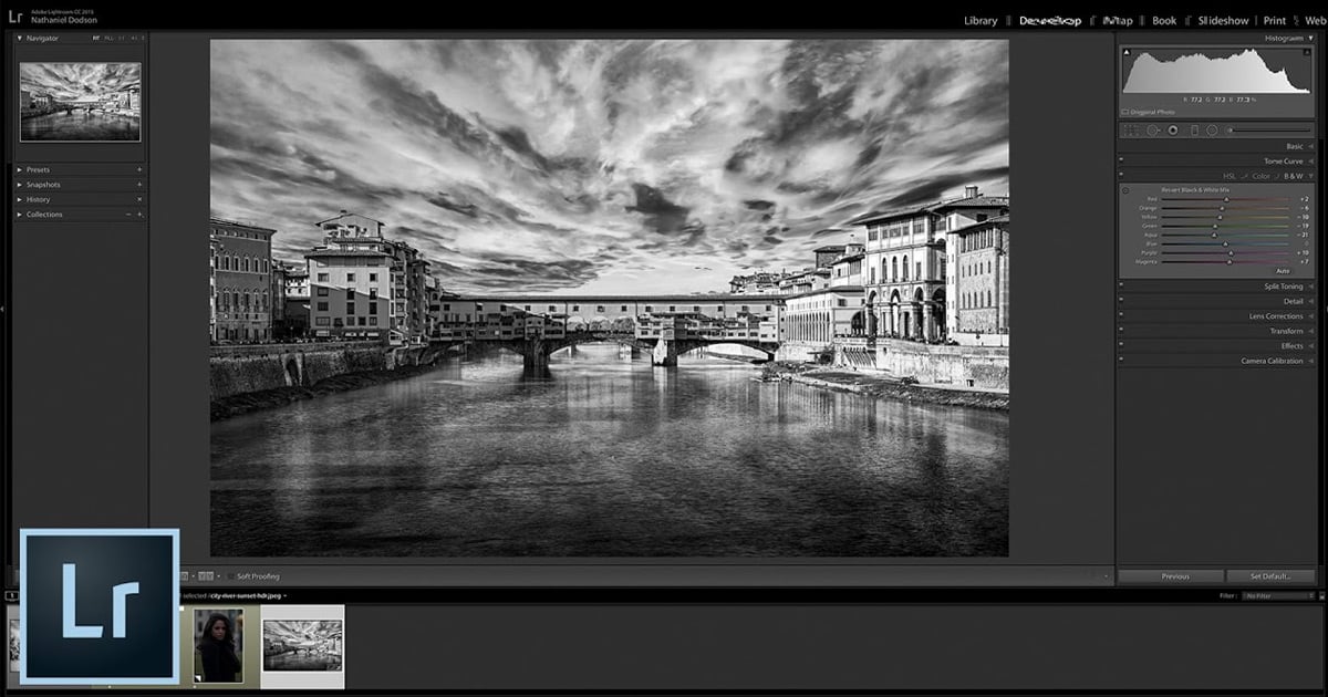
If you click on “B&W” the HSL tool will change your photograph into a black and white image. From here you have control over the individual color range using the targeted adjustment tool. Therefore, you can change the tone of the grass or the subjects to match the feel that you are going for.
I find it incredibly useful to use the selective adjustment button that way you can drag up or down over the parts of the image you want to change. This is fantastic because it will adjust multiple channels at the same time.
#3. How to Use the HSL Tool
Start by identifying the major colors
If you can’t tell where the color you’re manipulating is, flick the luminance slider back and forth and this will show you where you are impacting.
Go color by color until you are pleased
When using the saturation slider, more than likely your number will be negative. I find that when the number is 0 or higher, it can appear a bit too saturated.
The saturation slider, to be incredibly effective in desaturating certain colors that you do not want in your photo.
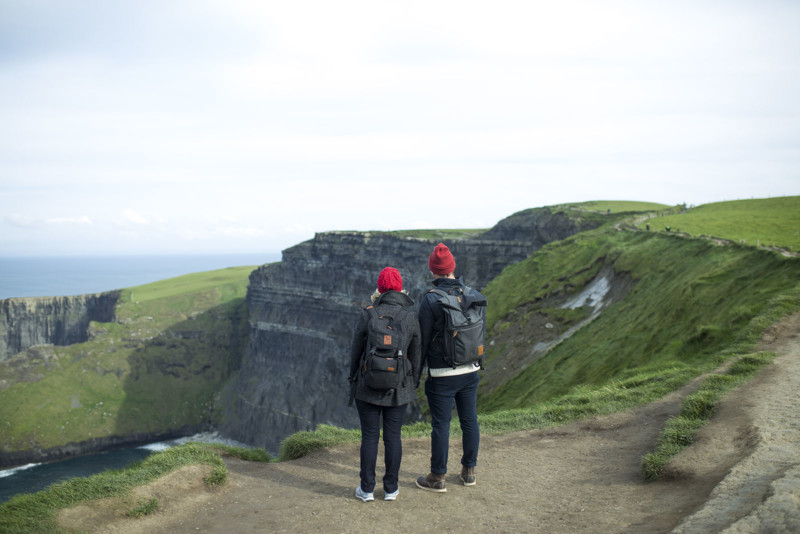
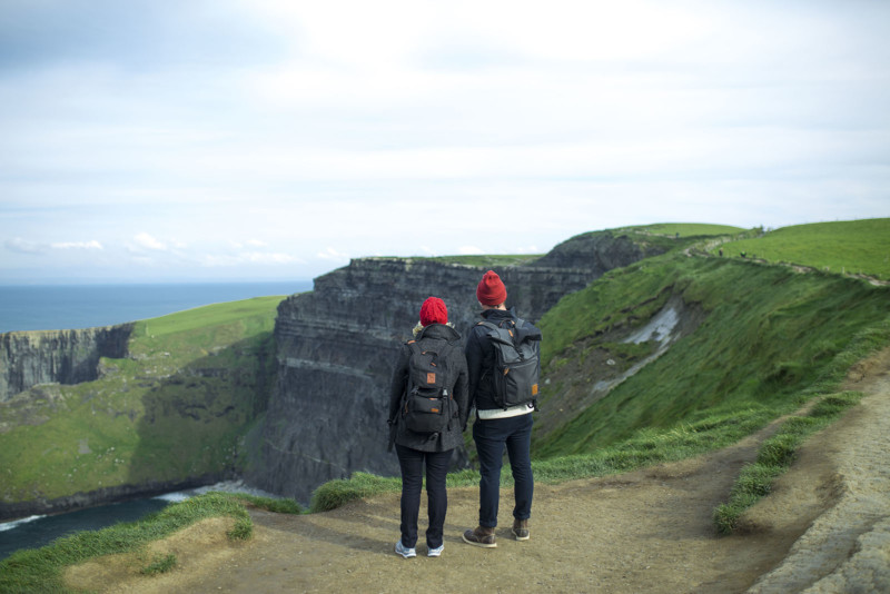
For example, if we really want to accentuate the red and green complementary colors, We can desaturate the blue of the sky, cliffs and ocean. As demonstrated below:
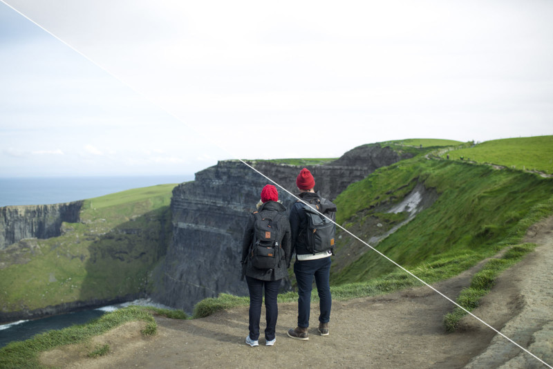
The change in this example is quite subtle but this method can really help emphasize certain colors.
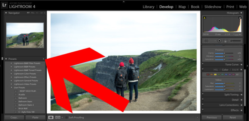
Make a preset to save time
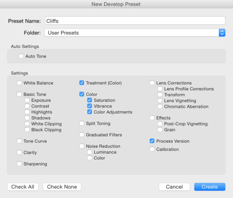
To create a preset click on the plus sign on the left side of the screen.
Select Hue, Saturation and Luminance.
Presets are fantastic if you are working with the same set of photos since the HSL tool impacts the data on each photo differently. That way you can edit one photo to the colors you would like then apply it to the rest of the batch saving you tons of time.
Also, after doing this after several batches of photos, you’ll start to build up a library of presets that you can use into the future.
About the author: Dylan Kim is a photography enthusiast and a co-founder of Brevitē Camera Backpacks. Brevitē launched back in 2015 and raised more than $38,000 from backers through its Kickstarter campaign. This article was also published here.