How the Show Mr. Robot Inspired My Photography
In my photography I draw a huge amount of inspiration from film and tv series. One of my favourite recent series has been Mr. Robot. This is how this series proved to have a profound effect on the way I compose my photos.
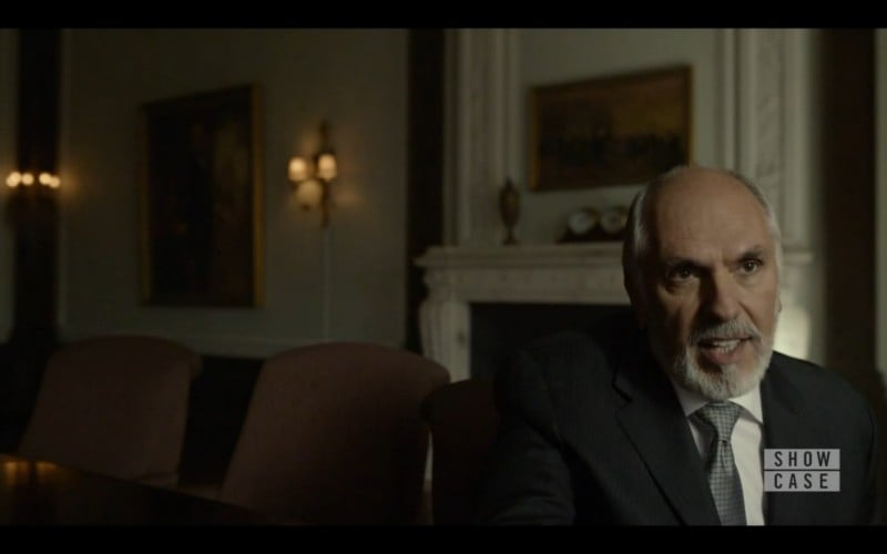
For those of you unfamiliar with the series, Mr. Robot tells the story of a hacker named Elliot, on a mission to destroy the evil corporation E Corp while dealing with some pretty messed up mental problems of his own. I like to describe the series as a mix between the classic Brad Pitt movie Fight Club and the cinematographic production quality of House of Cards.
The storyline, plot twists and general themes of the series are just superb, while the color grading and use of light are insanely well done.
Mr. Robot Composition Analysed
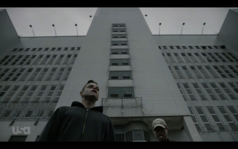
The main aspect I love about this series, though, is the unconventional way many of the shots are composed. As a primer, I’ve included a short video that introduces some of these shots.
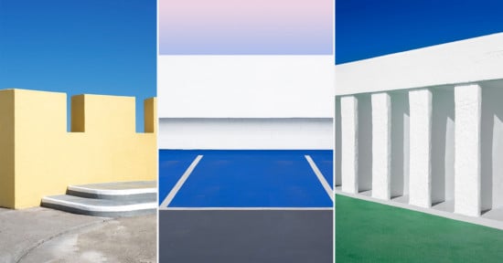
My own take on the subject is this: in photography, a very conventional solution to compositing shots is to use the rule of thirds. This is (very arguably) a step forward from what I would consider the most basic and straightforward approach: just pointing the camera straight at the subject and ending up with a photo where the subject is dead center.
The rule of thirds generally just looks good and its use is widespread. I’d say a fair amount of my own photos adhere to this ‘rule’ to some extent.
At some point, though, photographers will start looking for more interesting and exciting ways to compose their shots.
Personally, I’ve found that I tend to go two ways. One: reverting back to placing the subject in the center of the frame can yield a clean and direct frame, focusing attention on the subject with no distractions. And two: placing the subject close to the edge of the frame can add a huge amount of tension and visual interest to the frame.
The second one is where I think Mr. Robot shines.
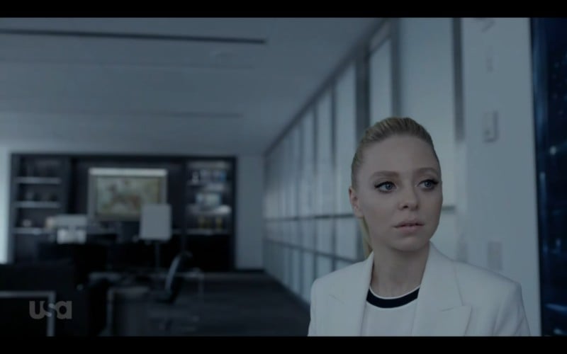
Subjects in this series are regularly placed near the bottom corners of the frame, often looking out of the frame instead of into the negative space created.
The more conventional approach would be to have people looking into this negative space, giving their eye lines some room. Instead, Mr. Robot opts to have their subjects look directly to the edge of the frame, which in my opinion lends the shots a sense of mystery. Even when you know what the person is looking at or who they’re talking with, this framing leaves some room for interpretation.
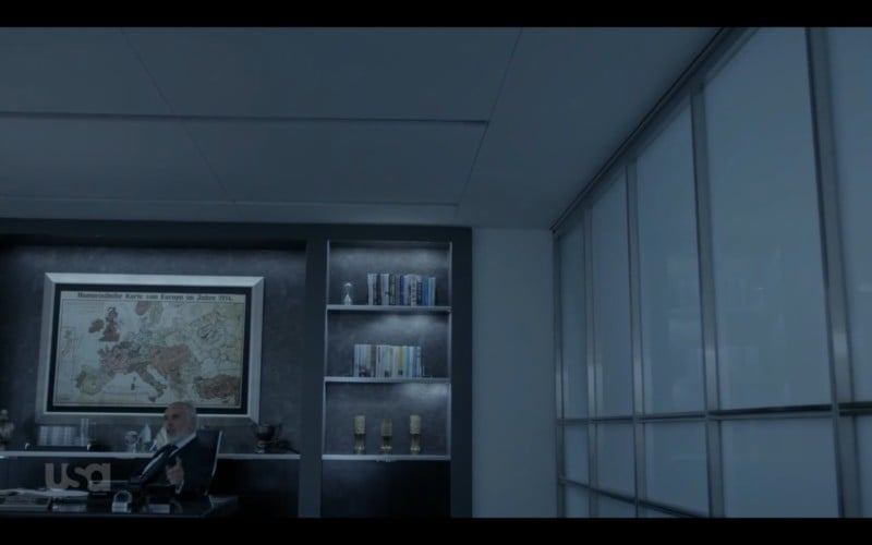
Additionally, the placement near the bottom means a huge portion of the shot is filled with the environment the actors are in. In this excellent piece on the series’ composition, the author argues that this puts a lot of ‘weight’ on the subjects’ shoulders and depicts their state of (social) isolation. I would argue that another reason this works so well is that the subjects’ relation to their environment is emphasized.
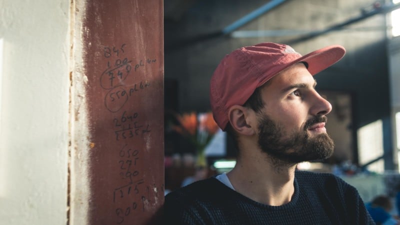
These aren’t just shots of subjects, instead these are shots of subjects and their environment. For instance, in the shot below, the office tells a lot about the person sitting in the frame, and adds an extra dimension to whatever the character is talking about.
Using the Signature Composition in Mr. Robot for My Own Work
After watching the second season of this series, I was tempted to start trying some of Mr. Robot’s approaches to composing shots in my own photography.
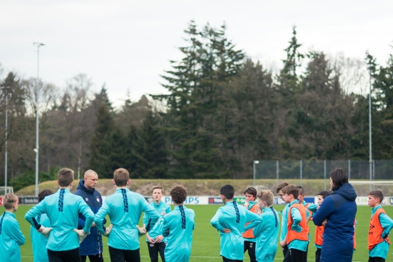
I shoot sports exclusively, focusing on both the action and capturing typical lifestyle moments and portraits. I feel that in sports, many photographers tend to use a very conventional, journalistic approach to shooting the action. Myself, I’m more interested in adding a certain level of tension, trying to add some visual interest and conveying a feeling. I shoot a lot of competition climbing, which lends itself to experimentation quite well.
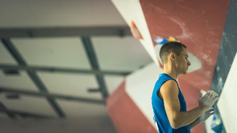
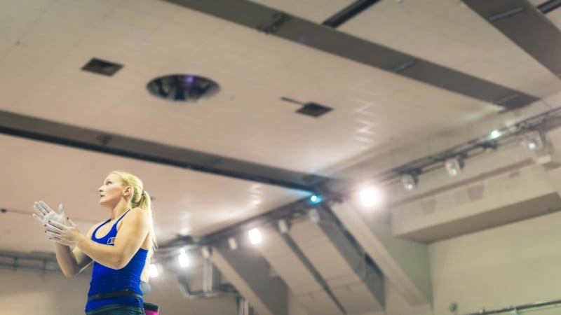
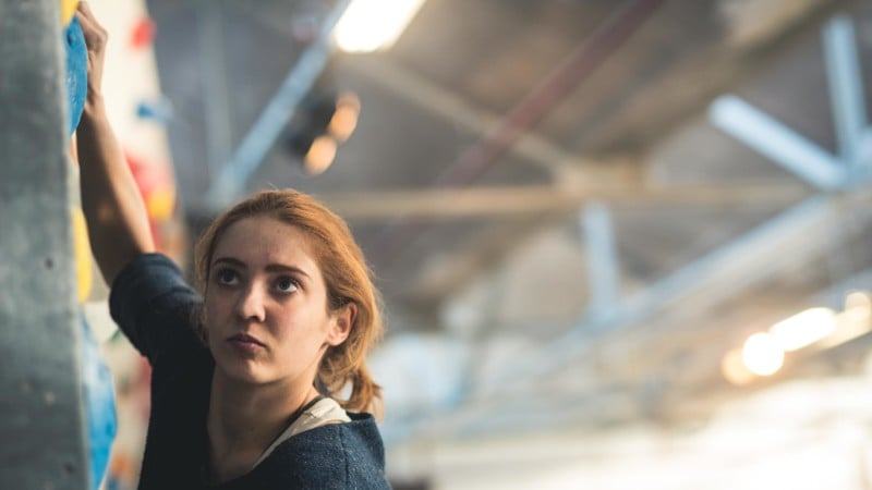
The following photos were shot during the 2016 World Championships in Paris.
In this first shot, the competitor is looking at the climbing wall and about to give it a go. By not including this wall in the frame, I feel that some mystery is added. We don’t know what the wall looks like, but because of all the negative space behind the climber, we get a sense that she’s intimidated by it. At the same time, due to the lights shining on the competitor and the size of the hall she’s standing in, we get a sense that she’s quite a talented athlete and there could be quite a crowd watching. But again, we can’t know for sure since the ground level isn’t visible.
As you can see, opting for this unconventional composition instead of the more straightforward option where both the wall and the crowd would’ve been visible leaves quite a lot to the imagination of the viewer. I like when a photo invites viewers to try and make sense of what they’re seeing—to interpret the scene instead of instantly being given all the answers.
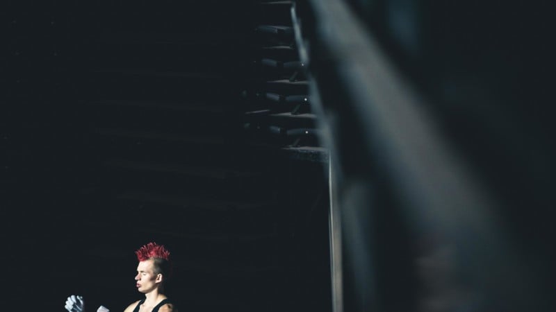
Another reason I feel that this extreme form of composition works is that it lends the subjects placed at the edge of the frame a certain visual weight.
Try to think of this following photo as a balance. On the one side of the balance we have this huge and heavy lump of black nothingness that comprises most of the shot; on the other side, we have this tiny upper body of a climber. Somehow, when viewing a composition like this, our subconscious will reason that if this small figure is balanced with the lump of black, he must be of some visual importance.
Naturally, a more conventional way to obtain a balance in the photo would be to just place that figure at the center of the frame, filling the frame. By looking for a more unconventional balance, a certain tension is obtained, which in my opinion can make a photo far more interesting.
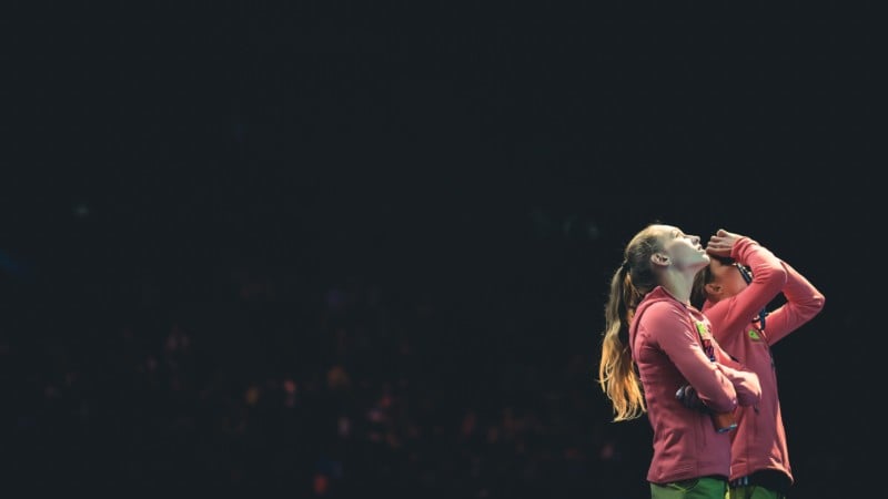
These next few photos were shot at a local climbing competition in The Netherlands, and show some slightly less extreme examples of drawing inspiration from the Mr. Robot series. Mostly, they demonstrate how having a subject look out of the frame instead of into it can make a shot more interesting and leave some things to the imagination of the viewer.
In addition to trying some of Mr. Robot’s composition, I’ve tried to post-process my photos in a more cinematic style for some time now. This includes cropping to 16:9 aspect ratio (though I’ve recently been experimenting with some more extreme ratios like anamorphic 2.35:1), color grading, and trying to leverage the ambient light to add a layer of visual interest.
I also tried expanding this unconventional style of composing to other sports. I’m excited to explore how the style will translate into the many different sports I shoot on a regular basis.
One thing I try to keep in mind is that this may be a fad. I’ve been through all sorts of periods in my photographic style where I went crazy for a certain style, which later became less pronounced and more subtle. The same may be true for this style of rather extreme composing, which will probably end up being just one of a host of tools I have at my disposal to obtain an interesting frame.