28 Composition Techniques That Will Improve Your Photos
There are no unbreakable rules when it comes to how you should compose your photographs. After all, who likes rules except for your old school principal or heads of H.R. departments? There are, however, several photography composition guidelines you can use to help improve the composition of your photos.
Here’s the thing about these ideas; they constantly contradict each other. And that’s ok. No one idea presented here is “better” than another. They can be used on their own, combined, or completely disregarded depending on what you are trying to achieve in your photograph. You won’t get sent to the principal’s office for ignoring them. I promise. After all, there is more than one way to cook an egg. Poached egg is obviously the best way though, and I’ll fight anyone who says otherwise.
In this tutorial, I’ve listed 28 of these guidelines along with examples of each. I’ve started with the most basic ones and finished with some of the more advanced composition techniques.
Photography Composition Defined
First of all, we have to define what is meant by ‘composition’. Composition refers to the way the various elements in a scene are arranged within the frame. As I’ve already mentioned, these are not hard and fast rules but guidelines. That said, many of them have been used in art for thousands of years and they really do help achieve more attractive compositions. I find that I usually have one or more of these guidelines in the back of my mind as I’m setting up a shot.
At a Glance
Here is an index of the 28 composition techniques covered in this article:
We’ll start with probably the most well-known composition technique: The Rule of Thirds.
#1. Rule of Thirds
So I’ve just told you that there are no hard and fast rules when it comes to composition and then the first thing I write about is the ‘rule’ of thirds. In my defense, I didn’t come up with the name. The rule of thirds is very simple. You divide the frame into 9 equal rectangles, 3 across and 3 down as illustrated below. Many camera manufacturers have actually included the capability to display this grid in live view mode. Check your camera’s manual to see how to turn on this feature.
The idea is to place the important element(s) of the scene along one or more of the lines or where the lines intersect. We have a natural tendency to want to place the main subject in the middle. Placing it off-center using the rule of thirds will more often than not lead to a more attractive composition.
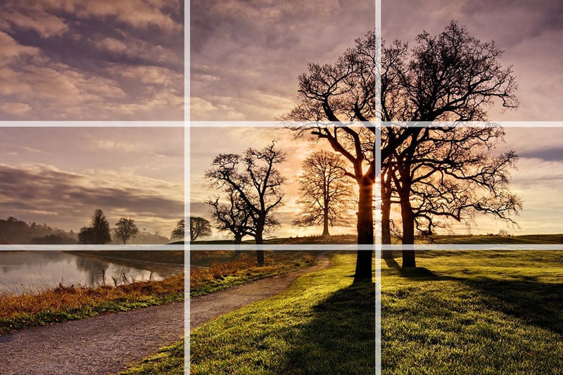
In this photo, I’ve placed the horizon roughly along the bottom third of the frame and the biggest and closest trees along the line to the right. The photo wouldn’t have the same impact if the larger trees had been placed in the center of the frame.
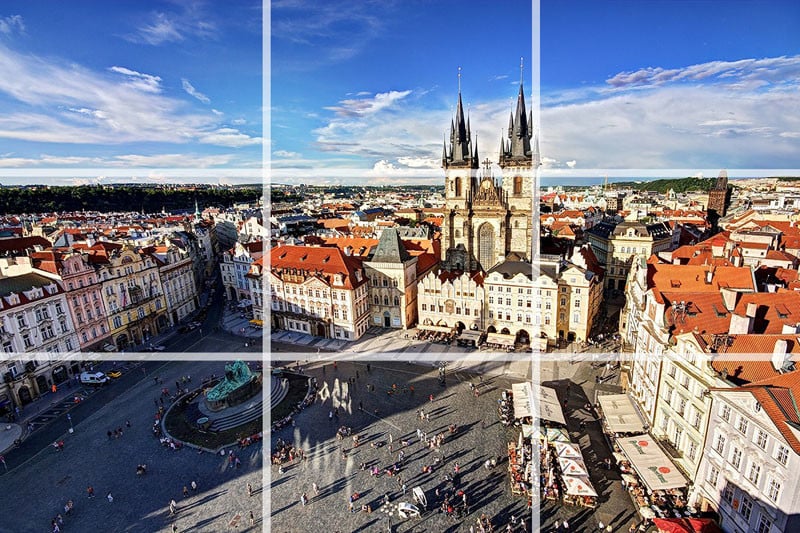
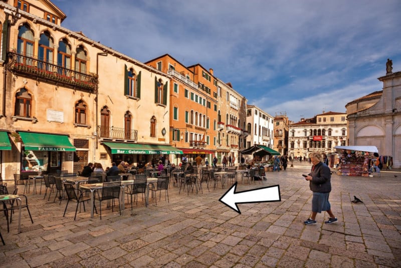
In this photo of the Old Town Square in Prague, I’ve placed the horizon along the top third of the frame. Most of the buildings sit in the middle third and the square itself occupies the bottom third of the frame. The spires of the church are placed near the horizontal line to the right of the frame.
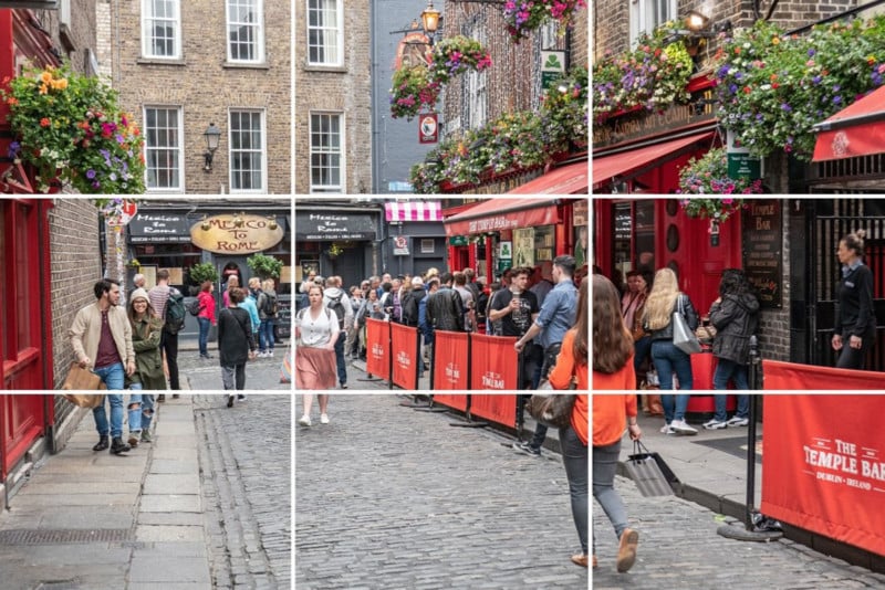
In this street photograph taken in my home city of Dublin, I’ve placed the woman in red walking along the street on the point where two of the grid lines intersect. The cobbled street roughly occupies the bottom third of the frame; the building ground floors frontages occupy the middle third and the upper floors of the buildings occupy the top third. Having the rule of thirds grid activated in live view on my camera really helped me with composition when I took this photograph.
#2. Centered Composition and Symmetry
Now that I’ve told you not to place the main subject in the center of the frame, I’m going to tell you to do the exact opposite! There are times when placing a subject in the center of the frame works really well. Symmetrical scenes are perfect for a centered composition. They look really well in square frames too.
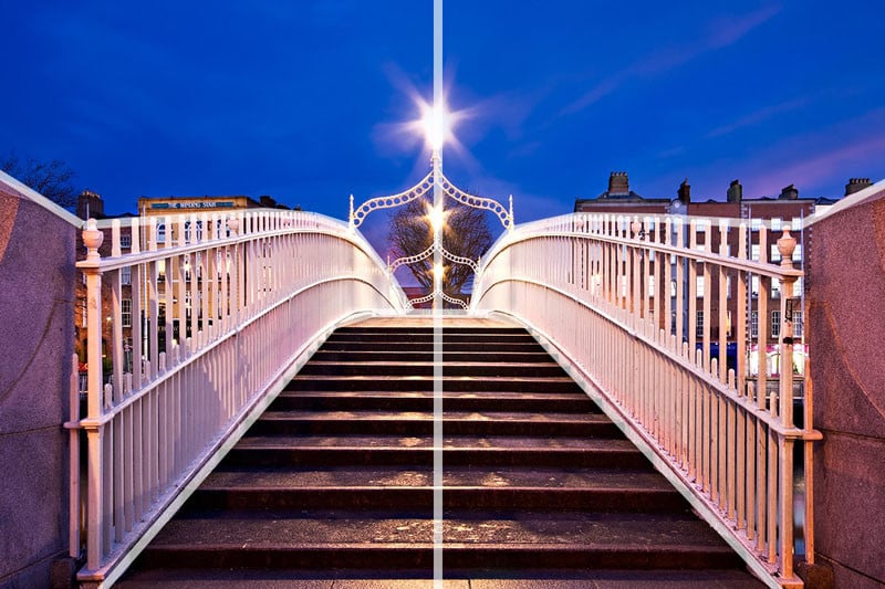
This photo of the Ha’penny Bridge in my home city of Dublin was the perfect candidate for a centered composition. Architecture and roads often make great subjects for centered compositions.
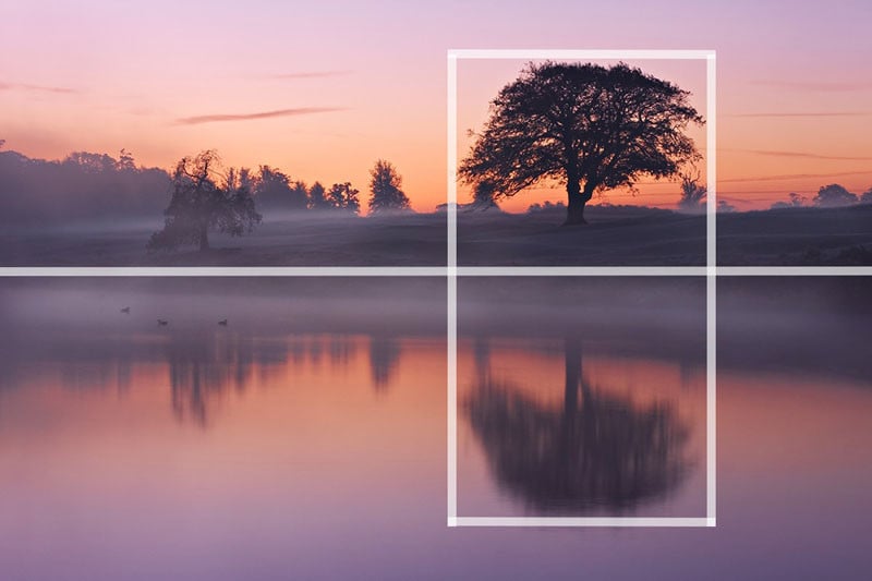
Scenes containing reflections are also a great opportunity to use symmetry in your composition. In this photo, I’ve actually used a mix of the rule of thirds and symmetry to compose the scene. The tree is positioned off-center to the right of the frame but the perfectly still water of the lake provides the symmetry. You can often combine several composition guidelines in a single photograph.
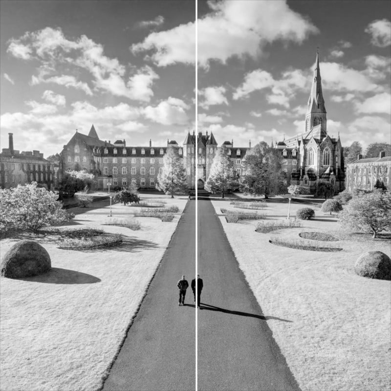
Square cropped frames can be a suitable option for centered compositions. A square is completely symmetrical after all. I actually studied French and history at this university over twenty years ago. I had very little time for photography though as I was just so busy drinking beer discussing eighteenth-century French poetry and the merits of enlightened absolutism in Prussia with my fellow scholars.
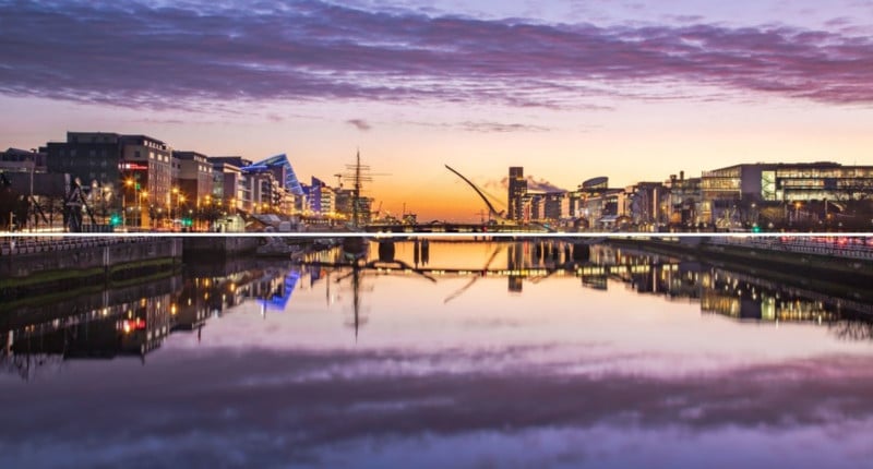
Symmetry doesn’t always have to be vertical in nature. Reflections can create the perfect opportunity to capture some horizontal symmetry. Early morning and evening times often present good opportunities for reflections like this as the air cools and the wind drops.
#3. Foreground Interest and Depth
Including some foreground interest in a scene is a great way of adding a sense of depth to the scene. Photographs are 2D by nature. Including foreground interest in the frame is one of a number of techniques to give the scene a more 3D feel.
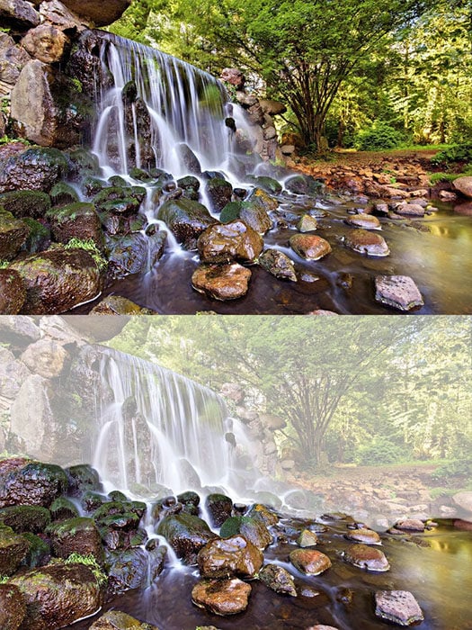
In this photograph of a waterfall in The Netherlands, the rocks in the river provided a perfect source of foreground interest.
Adding foreground interest works particularly well with wide-angle lenses.
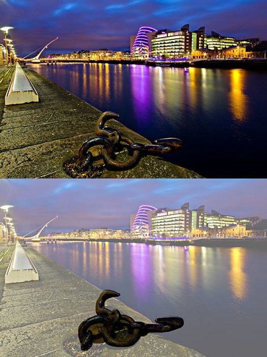
I took this photograph in the Dublin Docklands. The dock cleats along the quay provided the foreground interest in this shot. I think it adds a real sense of depth to the composition. The dock cleat in this scene was only a few meters in front of me when I took this shot. Including it in the frame portrays a sense of depth in the scene by including an element that I was quite close to as well as the bridge and buildings in the distance and everything in between them.
A friend who was with me that evening tripped over one of the cleats and almost ended up getting a very close-up view of the River Liffey. That’s one way of adding depth to the scene I guess.
#4. Frame Within the Frame
Including a ‘frame within the frame’ is another effective way of portraying depth in a scene. Look for elements such as windows, arches, or overhanging branches to frame the scene with. The ‘frame’ does not necessarily have to surround the entire scene to be effective.
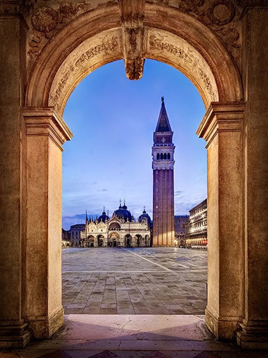
In the photo above taken on St Mark’s Square in Venice, I used the archway to frame St Marks Basilica and the Campanile at the far end of the piazza. The use of scenery viewed through arches was a common feature of Renaissance painting as a way of portraying depth. As you can see, the square was completely empty when I took the shot. This is one of the benefits of getting up at 5 am. Early morning is one of my favorite times to get out and about with the camera.
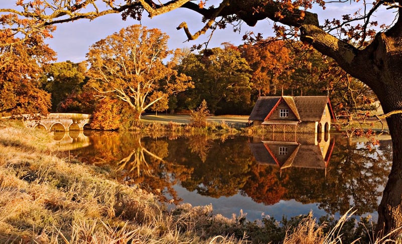
Frames don’t have to be man-made objects such as arches or windows. The photo below was taken in County Kildare in Ireland. This time, I used the tree trunk to the right and the overhanging branch to create a frame around the scene containing the bridge and boathouse. Notice that even though the ‘frame’ doesn’t actually surround the whole scene in this case, it still adds a sense of depth.
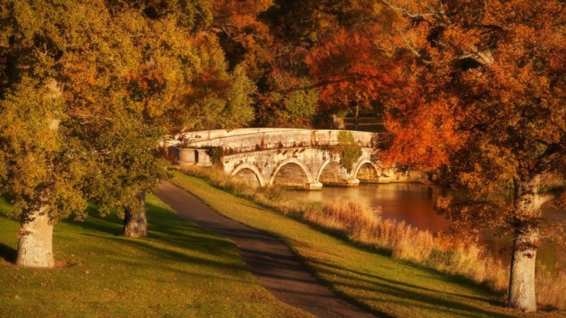
Natural features such as trees can also be used to frame a scene. In this case, the Autumn trees frame the stone bridge. In this case, I also used a centered composition with the bridge in the middle of the frame. Note that the frame doesn’t necessarily have to completely surround your subject. It could be trees on either side, as is the case here.
Using a ‘frame within a frame’ presents a great opportunity to use your surroundings to be creative in your compositions.
#5. Leading Lines
Leading lines help lead the viewer through the image and focus attention on important elements. Anything from paths, walls, or patterns can be used as leading lines. Take a look at the examples below.
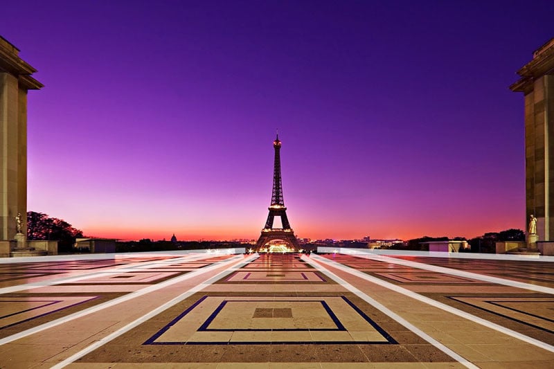
In this photo of the Eiffel Tower, I used the patterns on the paving stones as leading lines. The lines on the ground all lead the viewer to the Eiffel Tower in the distance. You’ll also notice that I used a centered composition for this scene. The symmetry of my surroundings made this type of composition work well.
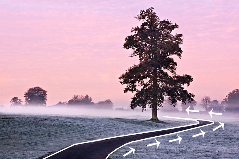
Leading lines do not necessarily have to be straight as illustrated by the picture above. In fact, curved lines can be very attractive compositional features. In this case, the path leads the viewer to the right of the frame before swinging in to the left towards the tree. I also made use of the rule of thirds when composing the shot.
#6. Diagonals and Triangles
It is often said that triangles and diagonals add ‘dynamic tension’ to a photo. My mother-in-law also does an excellent job of adding tension to any scene. What do we mean by ‘dynamic tension’ though? This can be a tricky one to explain and can seem a bit pretentious. Look at it this way, horizontal lines and vertical lines suggest stability. If you see a person standing on a level horizontal surface, he will appear to be pretty stable unless he’s stumbling out of a pub at 2 am. Put this man on a sloping surface and he’ll seem less stable. This creates a certain level of tension visually. We are not so used to diagonals in our everyday life. They subconsciously suggest instability. Incorporating triangles and diagonals into our photos can help create this sense of ‘dynamic tension’.
Incorporating triangles into a scene is a particularly good effective way of introducing dynamic tension. Triangles can be actual triangle-shaped objects or implied triangles. I’ll explain this in more detail in a moment.
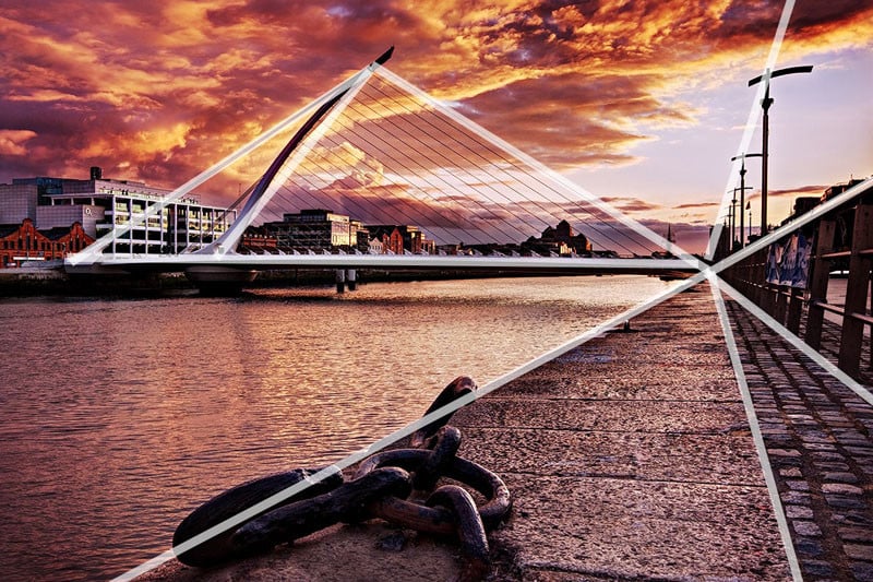
This picture of the Samuel Beckett Bridge in Dublin incorporates plenty of triangles and diagonals into the scene. The bridge itself is an actual triangle (It’s actually supposed to represent a Celtic Harp on its side). There are also several ‘implied’ triangles in the scene. Notice how the leading lines on the right of the frame are all diagonal and form triangles that all meet at the same point. These are ‘implied triangles’. Having diagonals going off in different directions adds a lot of ‘dynamic tension’ to the scene. Once again you can see how I have combined two techniques to compose the image: leading lines and diagonals.
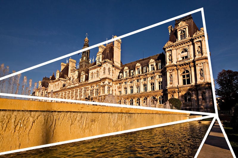
In this photo of the Hotel de Ville in Paris, the implied triangles and diagonals create a sense of dynamic tension. We are not used to seeing buildings leaning at such angles in our everyday life. It is slightly jarring to our sense of balance. This is what creates the visual tension. You can also talk about dynamic tension to sound intelligent (or annoyingly pretentious) in front of your friends.
#7. Patterns and Textures
Human beings are naturally attracted to patterns. They are visually attractive and suggest harmony. Patterns can be man-made like a series of arches or natural like the petals on a flower. Incorporating patterns into your photographs is always a good way to create a pleasing composition. Less regular textures can also be very pleasing to the eye.
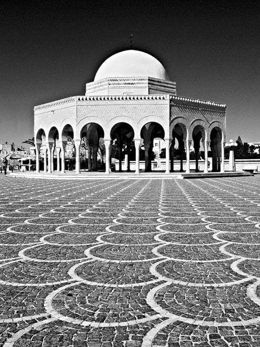
The photo above was taken in Tunisia. I’ve used the pattern in the paving stones to lead the eye to the domed building. The building itself incorporates a pattern in the form of a series of arches. The domed roof also compliments the rounded arches below.
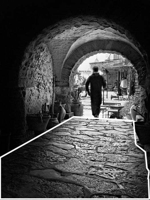
In this second photo, also shot in Tunisia, I really liked the texture of the stonework on the ground. This is less regular than the pattern in the first photo but the play of light and shadow on the surface is very pleasant. There are also interesting textures to be on the walls and roof of the passage. You may also have noticed that the arch creates a ‘frame within a frame’ around the man and cafe on the other side of the archway.
#8. Break the Pattern
Sometimes using a pattern in your composition means breaking the pattern. This was actually suggested to me in one of the comments of the last article I wrote on composition.
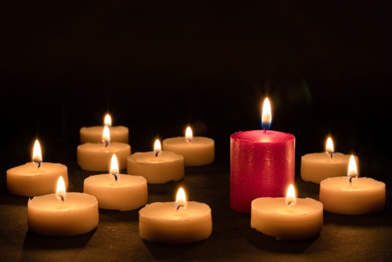
I’ve already said that some “rules” are there to be broken. The same goes for patterns. Breaking the pattern can really make your photograph pop. In this case, the single red candle really stands out among the vanilla-colored ones. It’s also slightly taller than the others which is another way of breaking the pattern. Notice how the photograph still follows the rule of thirds.
#9. Rule of Odds
In the world of photography, there are certainly plenty of ‘odds’ but the ‘rule of odds’ is something different entirely. The rule suggests that an image is more visually appealing if there are an odd number of subjects. The theory proposes that an even number of elements in a scene is distracting as the viewer is not sure which one to focus his or her attention on. An odd number of elements is seen as more natural and easier on the eye. To be honest, I think there are plenty of cases where this is not the case but it is certainly applicable in certain situations. What if you have four children? How do you decide which one to leave out of the shot? Personally, I’d go by future earning potential.
The photo above is an example of the rule of odds. I deliberately framed the scene to include three arches. I think that two arches would not have worked as well and may have divided the viewer’s attention. It also so happened that there were three people in the scene. This composition also makes use of patterns and ‘frames within a frame’.
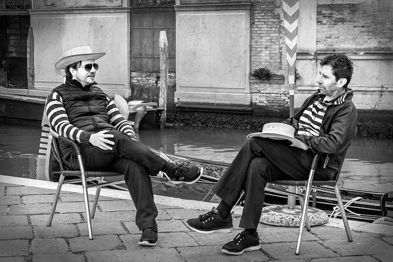
In the photo of two gondoliers in Venice above, you will see that I’ve completely ignored the rule of odds. It is true that your attention may shift back and forth between each gondolier. However, this is exactly what a conversation between two people is like, a back and forth. For this reason, I think the even number of subjects works in this case.
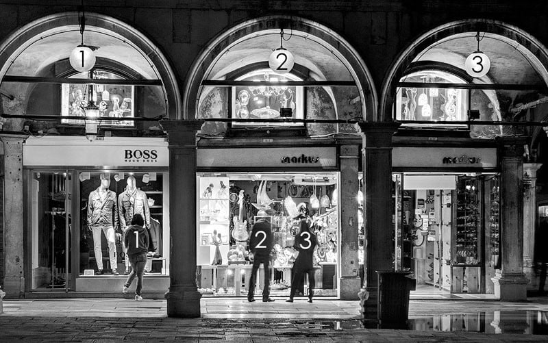
This photo was also taken on Saint Mark’s Square. This time, it completely ignores the “rule of odds” several times in the frame. There are two principal human subjects, four street lamps, and two ornate columns, all even numbers.
It would also be a lot of trouble to get out my angle grinder to cut down one of the street lamps. As for the columns, I don’t know where I’d start. I’d need a very strong rope and a heavy truck at least. In Venice, that would have been a challenge. I could always ask one of the subjects to leave the scene or ask somebody else to join them I guess. Or I could just ignore the rule of odds.
#10. Fill the Frame
Filling the frame with your subject, leaving little or no space around it can be very effective in certain situations. It helps focus the viewer completely on the main subject without any distractions. It also allows the viewer to explore the detail of the subject that wouldn’t be possible if photographed from further away. Filling the frame often involves getting in so close that you may actually crop out elements of your subject. In many cases, this can lead to a very original and interesting composition.
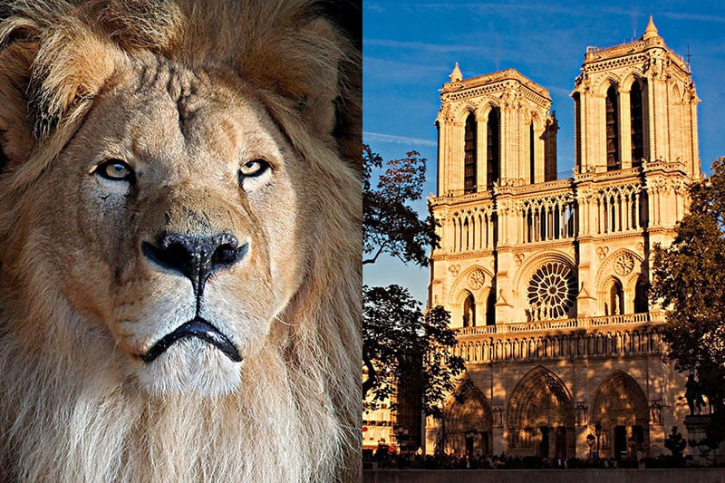
In the photo of my pet cat on the left, you’ll notice that I filled the frame completely with his face, even cropping out the edges of his head and mane. This allows the viewer to really focus on details such as the eyes or the textures in his fur. You may also notice that I used the rule of thirds in this composition. He is a lovely pet but you should see the state of our furniture. He also loves children but he couldn’t eat a whole one.
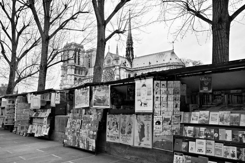
In the second shot of Notre Dame Cathedral in Paris, I have left very little space around the edges of the building. the point of this photograph is to showcase the architectural detail of the front façade of the building.
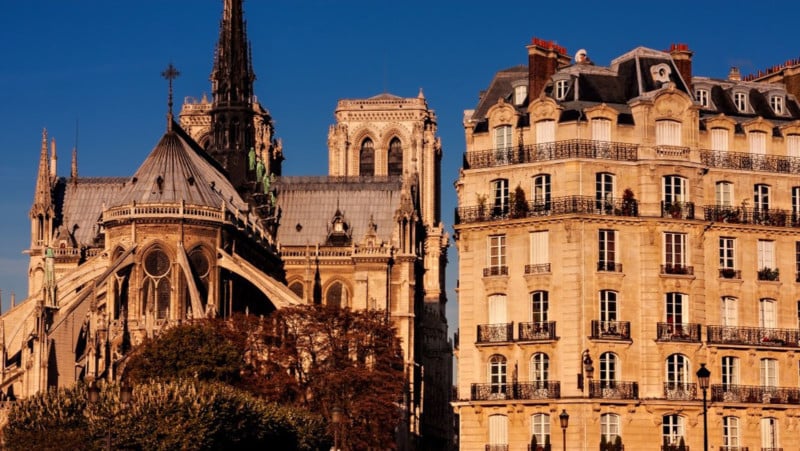
In this photo, Notre Dame Cathedral and the adjacent buildings almost completely fill the frame. This allows us to explore details such as the flying buttresses, the stonework, or the ornate balconies on the building next door. It is a scene where the eye wanders around the frame.
#11. Leave Negative Space
Once again, I am going to completely contradict myself! In the last guideline, I told you that filling the frame works well as a compositional tool. Now I’m going to tell you that doing the exact opposite works well too. Leaving a lot of empty or ‘negative’ space around your subject can be very attractive. It creates a sense of simplicity and minimalism. Like filling the frame, it helps the viewer focus on the main subject without distractions.
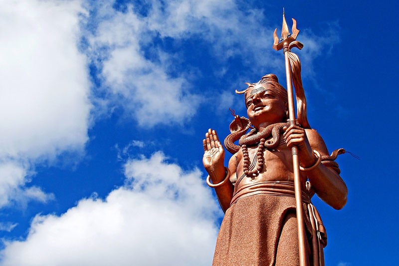
This photo of a giant statue of the Hindu god Shiva in Mauritius is a good example of using negative space. The statue is obviously the main subject but I have left plenty of space filled only by sky around it. This focuses our attention on the statue itself while giving the main subject ‘space to breath’ so to speak. The composition also creates a sense of simplicity. There is nothing complicated about the scene. It is the statue surrounded by sky, that is all. I also used the rule of thirds to place the statue to the right of the frame.
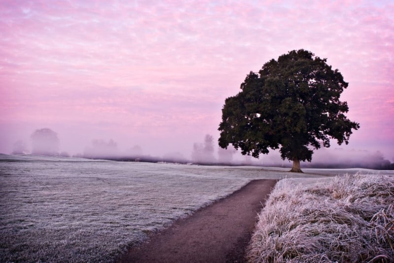
This simple landscape photograph makes use of negative space. The misty morning actually helped obscure some of the background elements making the tree on the left really stand out with little to distract from it.
#12. Simplicity and Minimalism
In the last guideline, we saw how leaving negative space around the main subject can create a sense of simplicity and minimalism. Simplicity itself can be a powerful compositional tool. It is often said that ‘less is more’. Simplicity often means taking photos with uncomplicated backgrounds that don’t distract from the main subject. You can also create a simple composition by zooming in on part of your subject and focusing on a particular detail.
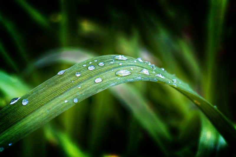
In this first photo, I zoomed in on some water droplets on a leaf in a garden. It’s such a simple subject but is also very beautiful because of its simplicity. A good macro lens can be a very useful tool for creating these types of photos.

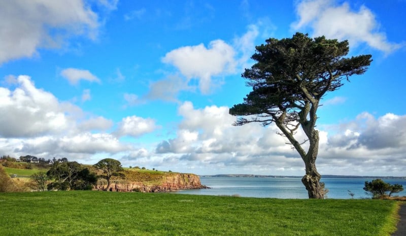
In this second photograph of a tree at dawn, I made use of a very simple and uncluttered background to focus attention on the tree. This photo makes use of ‘negative space’ to create a sense of simplicity and minimalism. I’ve also used the rule of thirds and leading lines in the composition.
#13. Use Black and White
Converting a photograph to black and white can be a very effective method of simplifying your composition. In some ways, color itself can be a distraction. Black and white photography often allows us to focus on the textures, light, shadows, and shapes in the frame. Take a look at the following photographs taken along the Copper Coast in County Waterford, Ireland.
The light in this version actually isn’t all that interesting. It’s that harsh daytime light that is rarely conducive to spectacular landscape photography. The location itself has potential though. Let’s see what happens when we convert this image to black and white.
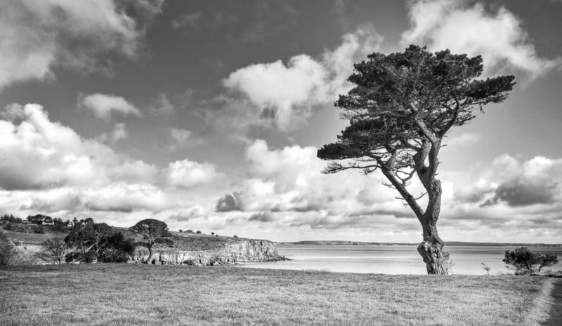
With the “distraction” of color removed, I think this becomes a much stronger shot. That harsh light now helps to highlight the textures on the tree, in the grass, on the cliffs, and in the sky. The bold shape of the tree stands out against the sky and the scattered clouds in the sky look more dramatic. The color was hiding much of this in my opinion. Not every shot is suited to a black and white conversion but in this case, I think it was.
#14. Isolate the Subject
Using a shallow depth of field to isolate your subject is a very effective way of simplifying your composition. By using a wide aperture, you can blur the background that might otherwise distract from your main subject. This is a particularly useful technique for shooting portraits. You can learn more about how to use different aperture settings in my tutorial on Aperture, Shutter Speed and ISO.

In this photo of a cat hiding in a box, I set an aperture of f/3.5 which is very wide and results in a very blurred background. This focuses attention on the cat as the blurred background is now less distracting. This technique is an excellent way to simplify a composition. You may have noticed that I also used this technique to focus attention on the water droplets on the leaf in the last guideline.
#15. Shoot from Below
The vast majority of photographs are taken from head height. That’s not very high in my case as my experience with the borrowed Dutch bicycle demonstrates. Getting down low or up high can be a great way of capturing a point of view that is more dynamic or interesting. I have often seen wildlife photographers lying on their bellies to get that special shot.
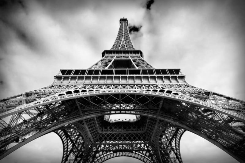
I took this photograph of the Eiffel Tower while standing at its base and pointing my camera up. This was also a perfect occasion to use a centered composition due to the symmetrical subject. It means I have a photo that’s a little different from the majority of shots of this Parisian landmark.
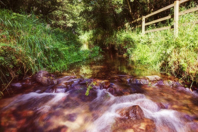
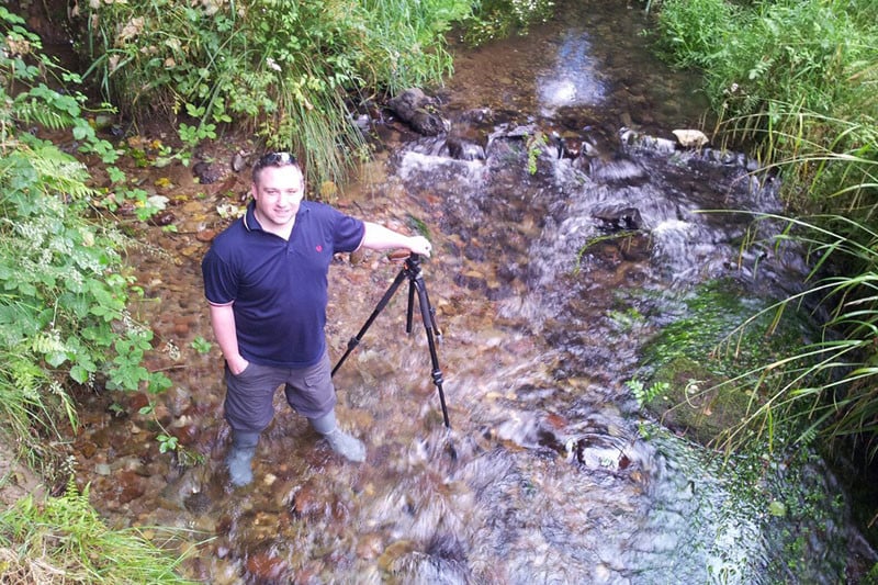
Sometimes finding that perfect point of view means getting your feet wet. Above is a shot I took while standing in a stream in Ballyhoura, County Limerick, Ireland. I actually had to wait quite a while for a rain shower to pass and the sun to come back out. It was worth it though to get low down and capture the motion of the water as if flowed over the rocks. I needed several hot whiskeys after to warm myself back up though.
#16. Shoot from Above
Whenever I visit a new location, I like to get high at least once. I also like to take photographs from a high vantage point at some point during my trip. Before my trip, I always research the possibilities to take some bird’s eye photos. Most cities and towns usually have a high building or bell tower you can climb to get some shots from high above your surroundings. Just make sure they allow tripods if you plan to bring one.
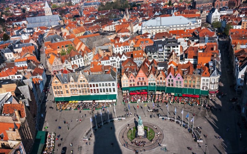
I had to work extremely hard to get this shot of Markt Square in the heart of Bruges. For a start, I had to lug my camera gear up 366 narrow steps to the top of the Belfry. Now thankfully I’m in shape. Well I mean, round is a shape, isn’t it? As I wheezed my way to the summit, I think some of my fellow climbers were worried I might require medical attention. I actually met a guy whose office was right at the top of the belfry. He told me that he made the trip up and down the tower several times a day in a suit and dress shoes. Whereas I looked like I’d just climbed Everest; he barely broke a sweat.
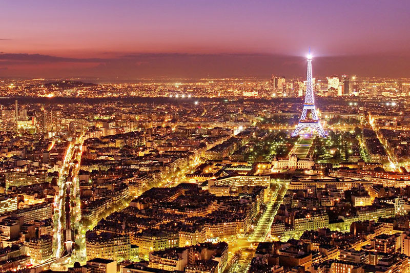
When you think of places in Paris to climb up high, you immediately think of the Eiffel Tower. The problem with shooting from the top of Paris’ most iconic structure is that you can’t include the Eiffel Tower in your shot! This is why the viewing deck of the Montparnasse Tower in the south of the city is a much better location to capture a bird’s eye view of the City of Light. The tower itself is a pretty ugly building, to be honest, so being on top of it has the added advantage that you can’t see it while you are up there.
This photograph was taken just after sunset while there was still some color in the sky. I waited for the “decisive moment” the Eiffel Tower sparkled as it does for one minute on the hour, every hour throughout the night. If I had waited another hour, however, the beautiful purple tones in the sky would have been gone.
#17. Look for Particular Color Combinations
The use of color itself is an often overlooked compositional tool. Color theory is something that graphic designers, fashion designers, and interior designers are all very familiar with. Certain color combinations complement each other well and can be visually very striking.
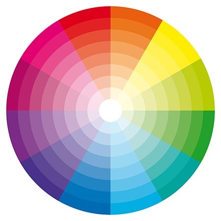
Take a look at the color wheel above. You can see that the colors are arranged logically in the segments of a circle. Colors that are opposite each other on the color wheel are said to be ‘complimentary colors’. As photographers, we can look for scenes that incorporate complementary colors as a way of creating attractive and striking compositions.
Have you ever noticed how many movie posters have blue and yellow/orange color schemes? This is done quite deliberately to create eye-catching adverts.
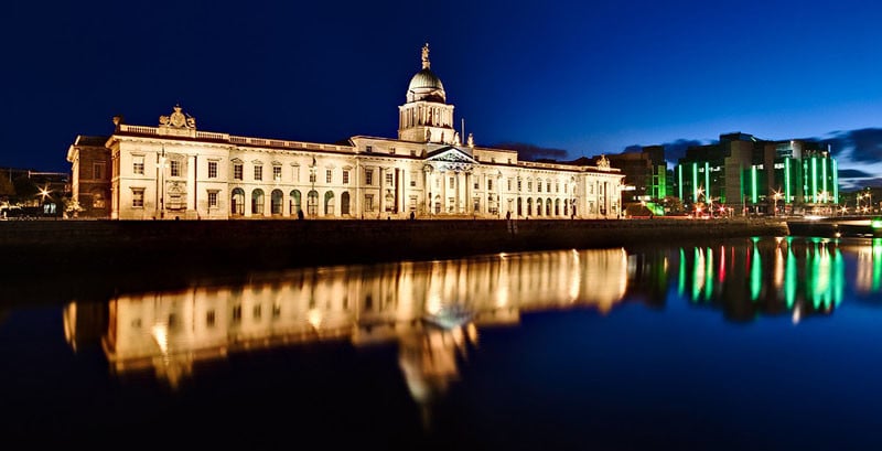
I made use of the striking blue/yellow color combination myself in this photograph of the Custom House in Dublin. The yellow hues of the illuminated building contrast beautifully with the deep blue of the blue hour sky.
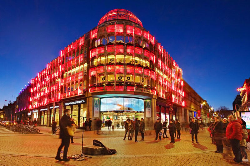
Red and blue are also complimentary colors on the color wheel. The Stephen’s Green Shopping Center in Dublin was lit up red for Christmas last year. This was very striking against the deep blue of the early night sky. I love photographing cities during blue hour. The deep blue of the sky at this time provides a very attractive backdrop to the city’s architecture and lights. The pure black of the late-night sky is not as striking and contrasts too sharply with the lights of the city.
#18. Rule of Space
The rule of space relates to the direction the subject(s) in your photo is facing or moving towards. If you are taking a photo of a moving car, for example, there should be more space left in the frame in front of the car than behind it. This implies that there is space in the frame for the car to move into. Take a look at the example of the boat below.
In this photo, the boat is placed on the left-hand side of the frame as it moves from left to right. Notice how there is a lot more space for the boat to move into in front of its direction of motion (to the right) than behind it. We can mentally imagine the boat moving into this space as it sails along the river. We also have a subconscious tenancy to look forward to where an object is heading. If the boat was right up at the right-hand side of the frame, this would lead us out of the photograph!
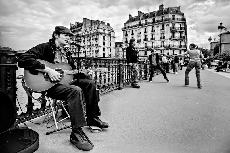
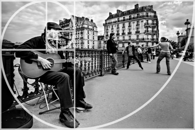
This can also be used for pictures of people. The rule of space suggests that the subject should be looking or facing into the frame rather than out of it. Take a look at the musician in the photo above. I composed the shot with him sitting on the left-hand side of the frame. He is facing to the right (as we look at him) into the area of space between him and the right-hand edge of the frame. If he had been facing the other way, he would be looking out of the frame and this would look odd. By looking into the space in the frame, he leads our eye past the man leaning on the railing and to the couple dancing on the right-hand side.
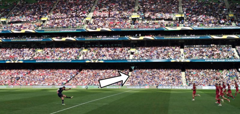
Admittedly, I’m not much of a sports photographer but I quite like this shot I snapped with my camera phone during a rugby match featuring the mighty Leinster. Notice how the kicker (Johnny Sexton) is placed to the left of the frame and the ball is traveling into the space on the right. He made the kick by the way.
When I was a kid, the modern stadium you see in the photograph hadn’t been built yet. Instead, there was a rather basic and decaying old ground called Lansdowne Road. Back then, my dad used to lift me over the turnstiles to get in for free. We tried doing this again recently but with less success. I’m now 41 years old, have put on a few pounds since I was a kid and my dad has had a hip replaced.
#19. Left to Right Rule
There is a theory that says we ‘read’ an image from left to right in the same way we would read text. For this reason, it is suggested that any motion portrayed in a photograph should flow from left to right. This is all very well but it assumes the viewer is from a country where text is read from left to right. Many languages are read from right to left such as Arabic for example. To be honest, I’ve seen plenty of fantastic photographs that ‘flow’ from right to left.
I was once criticized by a judge for the fact that a woman in a photo I took was walking from right to left. He told me it didn’t follow the ‘left to right’ rule. I reminded the judge that the photo was taken in Tunisia where people read from right to left. I didn’t win.
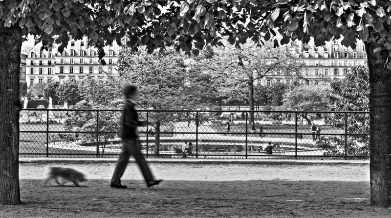
The photo above follows the ‘left to right’ rule. The woman walking her dog in the Tuileries Garden in Paris is walking from the left to the right of the frame.
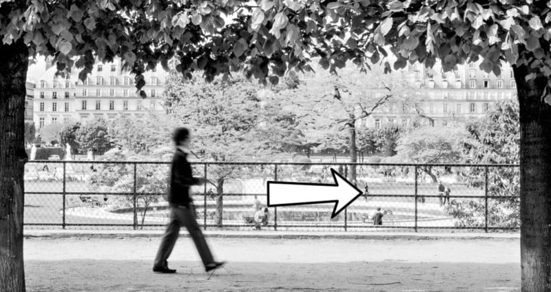
This photo also adheres to the ‘rule of space’. You will notice that there is much more space in front of the woman than behind her. She has plenty of ‘space’ to walk into in the frame. I also used the rule of thirds and a ‘frame within a frame’ to compose this photograph.
In this photograph, I completely ignored the left to right rule. Does the photograph suffer as a result? I don’t think so. What interested me was the woman walking across the beautiful campo while staring at her phone (as we so often do these days) as well as the colorful buildings bathed in the evening light. Frankly, I don’t really care what direction she is walking in. I suppose I could have asked her to walk back from where she came from.
Once during a club competition, a judge docked points from I photo I took in Tunisia for not adhering to the left to right rule. I argued that as the photograph was taken in an Arab country where people read from right to left, this should not apply. Unsurprisingly, I did not win.
#20. Balance Elements in the Scene
The first compositional guideline we looked at in this tutorial was the Rule of Thirds. This of course means that we often place the main subject of the photo to the side of the frame along one of the vertical grid lines. Sometimes this can lead to a lack of balance in the scene. It can leave a sort of ‘void’ in the rest of the frame.
To overcome this, you can compose your shot to include a secondary subject of lesser importance or size on the other side of the frame. This balances out the composition without taking too much focus off the main subject of the photograph.
Take a look at this photograph of the ornate lamppost on the Pont Alexandre III in Paris.
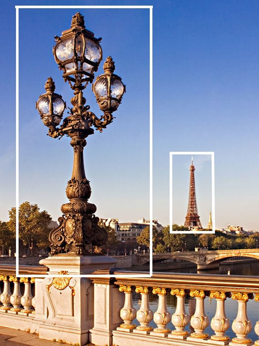
The lamppost itself fills the left side of the frame. The Eiffel Tower in the distance counterbalances this on the other side of the frame.
You may have remarked that this seems to go against the idea of negative space mentioned in guideline number 10. It also contradicts the ‘rule of odds’ as we now have an even number of elements in the scene. As I said at the very beginning of this tutorial, there are no unbreakable rules in photographic composition. Some of these guidelines contradict each other and that’s ok. Some guidelines work well for certain types of photographs and not others. It’s a question of judgment and experimentation.
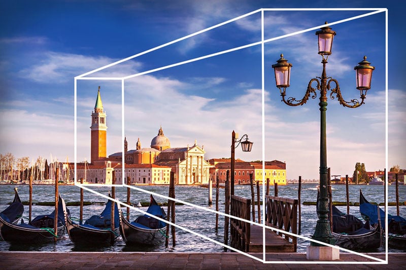
The photo above was taken in Venice. Once again, a decorative lamppost dominates one side of the frame. The church tower in the distance provides balance on the other side of the frame.
This also has a secondary effect on the composition. The church tower in the distance is obviously much bigger than the lamppost in real life. It appears smaller in the photograph as it is far away. This helps add a sense of depth and scale to the scene.
#21. Juxtaposition
Juxtaposition is a very powerful compositional tool in photography. Juxtaposition refers to the inclusion of two or more elements in a scene that can either contrast with each other or complement each other. Both approaches can work very well and play an important part in enabling the photo to tell a story.
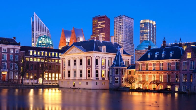
In this photograph, there is a juxtaposition between the beautiful older buildings of the Hague in the bottom half of the frame and the modern skyscrapers that rise up behind them. The handsome building in the center is the Mauritshuis Museum which houses paintings such as “The Girl with the Pearl Earring” and “The Anatomy Lesson of Dr. Nicolaes Tulp” by Rembrandt.
I spent a few days cycling around the Hague on a borrowed bike made for a 6 foot 4 Dutchman. I am a 5 foot 5 Irishman so that was fun and quite terrifying as I dodged trams on the uneven cobbled streets. On several occasions, I got my bike wheels stuck in a tram line. In this case, you basically have two choices: fall to the left or to the right. I tried both on multiple occasions.
Take a look at this photo taken in Paris. In the bottom half of the frame, we have the slightly rough and ready book stands full of clutter and posters hanging from the tops. Rising above all of this, however, is the magnificent medieval Notre Dame Cathedral. This architectural gem is the epitome of order and structure unlike the unsophisticated but attractive bookstalls below. They seem to be in direct contrast with each other yet they work well together. They both represent the city of Paris in different ways. They tell a story about two different elements of the city.
Contrasting the natural and built environments is another way of using juxtaposition, In this case, the delicate pink roses contrast with the solid man-made building in the background. In this case, I blurred the background but not so much that we can’t make what is there. We saw this in the section on letting the background provide context.
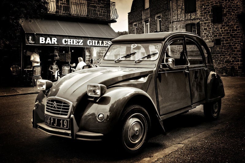
The photo above was also taken in France, but this time in the picturesque little village of Meyssac in the South West. In this shot, the old Citroen 2CV car looks perfectly at home in front of the typical French cafe in the background. The two elements complement each other perfectly. The man with his back to us in the cafe is the owner of the car and he seemed surprised when I asked if it was ok to take a picture of his car. He asked why I’d ever want to take a photo of ‘that old thing’. He didn’t seem to realize that he had unwittingly set up a quintessentially French scene by parking in front of that particular cafe.
#22. Golden Triangles
The golden triangles composition works in a very similar way to the rule of thirds. Instead of a grid of rectangles, however, we divide the frame with a diagonal line going from one corner to another. We then add two more lines from the other corners to the diagonal line. The two smaller lines meet the big line at a right angle as is illustrated below. This divides the frame into a series of triangles. As you can see, this way of composing helps us introduce an element of the ‘dynamic tension’ we learned about in guideline number 6. As with the rule of thirds, we use the lines (of the triangles in this case) to help us position the various elements in the scene.
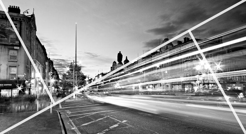
The photo above contains strong diagonals that follow the lines of the ‘golden triangles’. The light trails from the traffic perfectly follow the diagonal line running from the top right-hand corner to the bottom left-hand corner. The tops of the buildings on the left are close to the smaller diagonal on the left. The small line on the right meets the larger line at the top corner of the buildings.
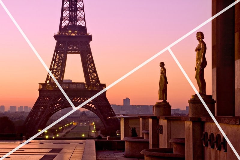
The photo above makes use of the ‘rule of triangles’ in a more subtle way. The heads of the statues create an ‘implied triangle’. This line leads us to the Eiffel Tower in the distance. The smaller line on the left meets the longer line right at the halfway point of the Eiffel Tower. The smaller line on the right goes right between the two statues. The rule of triangles can seem like a complex way of arranging a photo but it can result in some really striking compositions.
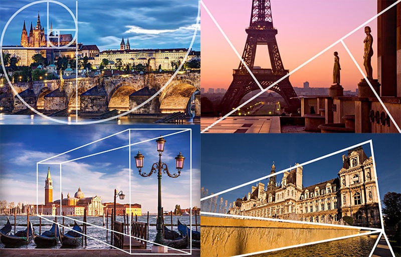
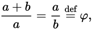
#23. Golden Ratio
What is the golden ratio? Well, it’s actually very simple: two quantities are in the golden ratio if their ratio is the same as the ratio of their sum to the larger of the two quantities. Wait, what now? Ok, if that sounds too complicated, perhaps this mathematical formula will help:
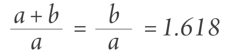
What do you mean you’re even more confused now? Is this form clearer?
Ok, that seems to have just made things worse. Forget all that.
I often describe the golden ratio as being a slightly more complicated version of the rule of thirds with a little bit of the golden triangles method thrown into the mix. Take a look at the image below.
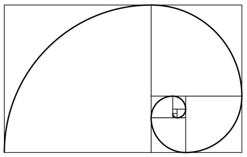
Rather than dividing the frame into equal rectangles, it is instead divided into a series of squares as in the example above. This is known as a “Phi Grid”. These squares are then used as a guide to add a spiral that looks like a snail’s shell — this is known as the “Fibonacci Spiral”.
These squares, lines, and spiral are then used to lay out the elements in the frame as with the rule of thirds and golden triangles. The spiral is supposed to lead the eye around the frame and show us how the scene should flow. It’s a bit like an invisible leading line. We will look at leading lines in more detail shortly.
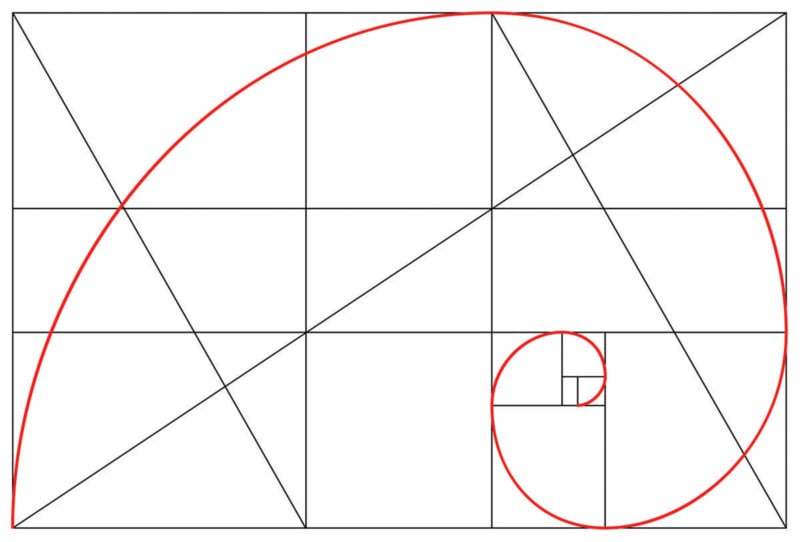
The similarities with the rule of thirds and golden triangles become clearer once we add a few lines to the diagram. The golden ratio also divides the frame into 9 parts although this time they are not all the same size and shape. The diagonals we saw in the golden triangles examples can also be added here.
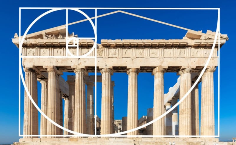
It is believed that the golden spiral method of composition has been in existence for over 2,400 years having been devised in Ancient Greece. It is widely used in many types of art as well as architecture as a way of creating aesthetically pleasing compositions. It was particularly well employed in Renaissance art.
Ok, I have to admit something here. I have never actually purposely set out to compose a photograph using the golden ratio. When I looked back through my photographs, I did notice that I had unintentionally used it a few times.
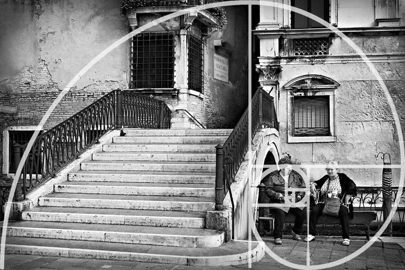
Here is a perfect example of one of my accidental uses of the golden ratio. I took this photo in Venice. The bridge and steps on the left occupy the large square to the right. The Fibonacci Spiral then leads us from here across the top of the bridge and down to the two women sitting next to it. It may have been a lucky accident but it seems to work!
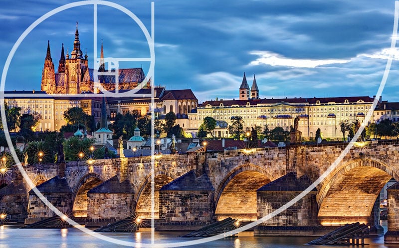
The golden ratio can be set up in different directions. In this photo taken in Prague, the spiral leads us across the bridge to the castle on the far bank. Another lucky accident!
In this case, the Fibonacci Spiral starts in the top right-hand corner, passes under the couple dancing and finishes on the street musician’s face. The fact that I accidentally stumbled upon the golden ratio a few times shows how many of these composition “rules” may actually be manifestations of our internal aesthetic preferences that come naturally to us. Woah. Deep. It reminds us that these should be used as ideas and not strict rules.
#24. Let the Background Give Context to the Subject
Now it’s time to contradict myself again. There are times when I like to use a busy background. In these cases, I want to background to provide some context to my subject.
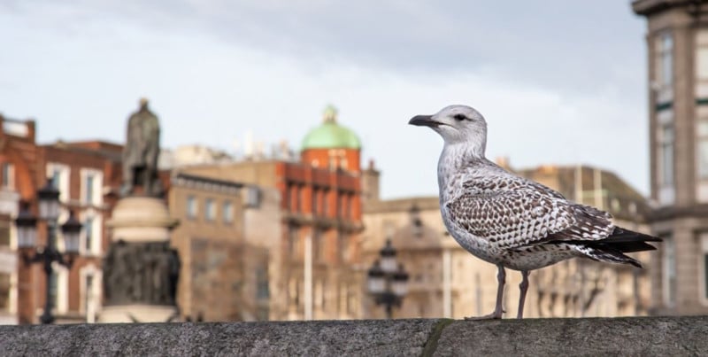
This photograph doesn’t contain any old seagull. This is a Dublin seagull! The slightly blurred O’Connell Street in the background gives the subject some context. The fact that he was eating a bowl of coddle and drinking Lyons Tea when I spotted him also lets me know that he was indeed a Dublin seagull. Notice, how the background is still blurred but not so much that the seagull doesn’t stand out. It’s about getting a balance between not distracting from the subject and providing background context.
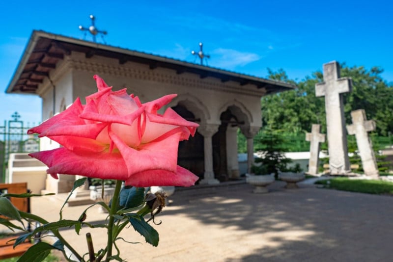
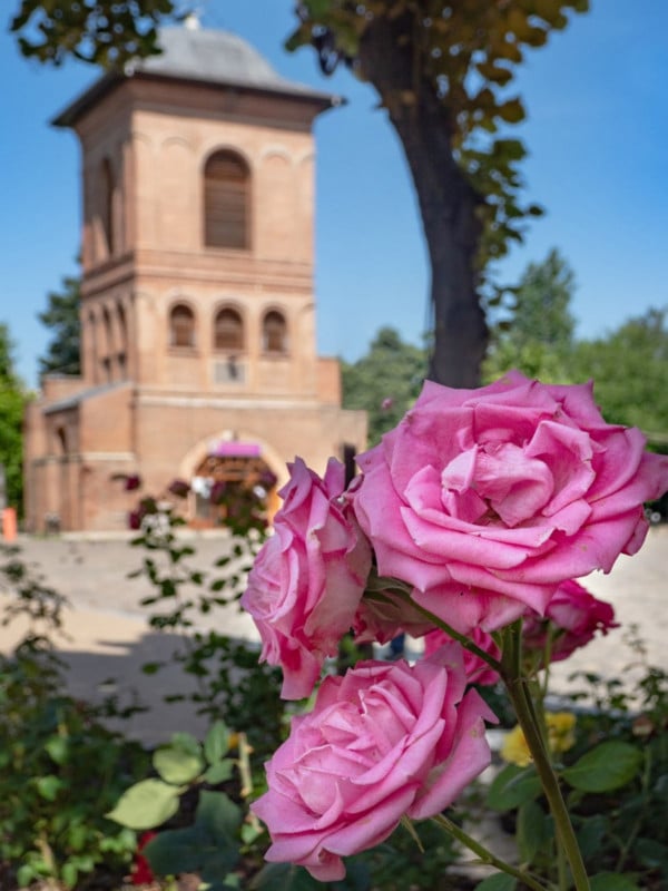
I took this photograph of a rose at a monastery complex on the outskirts of Bucharest, Romania. Once again I blurred the background just enough to let the rose stand out. There is still however enough detail to show the viewer the context that the rose was photographed in.
#25. Let the Eye Wander Around the Frame
And for my next trick, I will once again completely contradict myself. This is the antithesis to the concept of simplicity and minimalism. There are some occasions I like to take photographs with plenty happening in the frame. Take a look at the paintings of Pieter Bruegel to see an excellent example of art with plenty of different characters and activities going on in the frame.
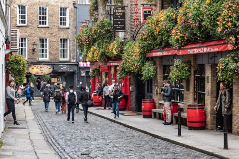
This photograph was taken in the Temple Bar area of Dublin City. The frame is full of different characters and activity. In this case, the eye can wander around the frame noticing all the little details such as the flowers, the building details, and various people walking, exiting a building, or checking their phone outside a pub. There is no one main subject.
It is not a question of simplicity being preferable to complexity or vice versa. One isn’t inherently “better” than the other. It all depends on what you are trying to achieve with a particular photograph.
#26. Use Layers in the Frame
A very effective way to add a sense of depth to a photograph is to shoot a scene that contains layers of elements at varying distances from your vantage point. These layers can lead the eye through the scene from the foreground, through the middle distance to the background.
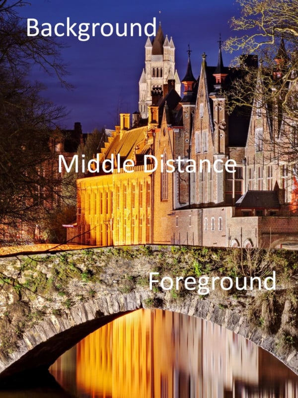
In this photograph of a canal in Bruges, the bridge acts as foreground interest. The buildings along the canal provide the next layer in the middle distance. These buildings then lead the viewer through the image towards the more distant elements. Finally, the bell tower from a distant church rises from behind the other buildings in the background. In this case, I did the opposite to the photos with foreground interest; I used a zoom lens to compress the perspective.
#27. Add Human Interest
Including some human interest in a scene can make a photograph far more engaging as well as adding a sense of scale. this is something I sometimes forget as a mainly urban landscape photographer. I’ve noticed that most of my best urban photographs include people somewhere in the frame.
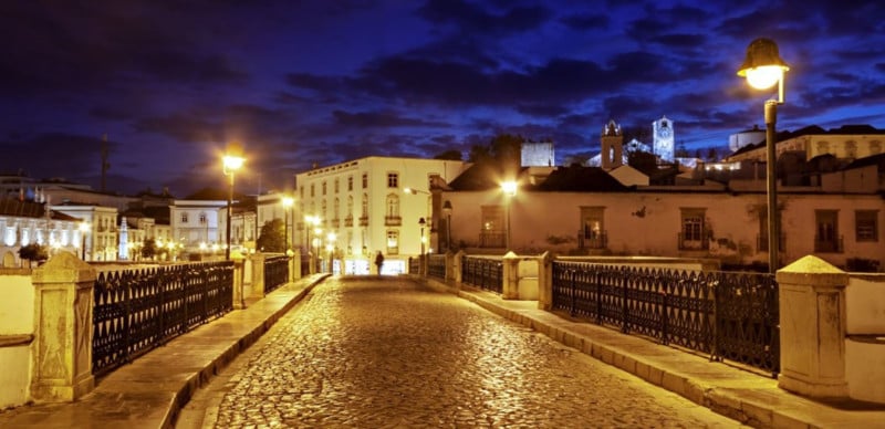
The old bridge in the large town of Tavira in Portugal is a very attractive photography location in itself. This photograph would have been quite good without any human interest but I think the lone figure really makes this shot. The person adds life to the scene as well as giving a sense of scale to the surroundings. I had to wait a while for the right person to enter the scene and click the shutter at the right moment. We will see more about capturing these “decisive moments” next.
#28. Wait for the “Decisive Moment”
The idea of the “decisive moment” in photography is of course most associated with the great French street photographer Henri Cartier-Bresson. But what did Cartier-Bresson mean by the “Decisive Moment”? The great man himself said the following photography quote:
Your eye must see a composition or an expression that life itself offers you, and you must know with intuition when to click the camera. —Henri Cartier-Bresson
In the case of Henri Cartier-Bresson, this meant clicking the camera at the exact moment a man leaped over a puddle behind Gare Saint Lazare or capturing the fleeting cheeky expression of a French boy as he joyfully carried a bottle of wine in each hand through the streets of Paris.
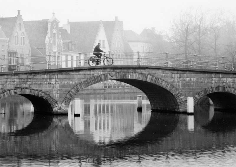
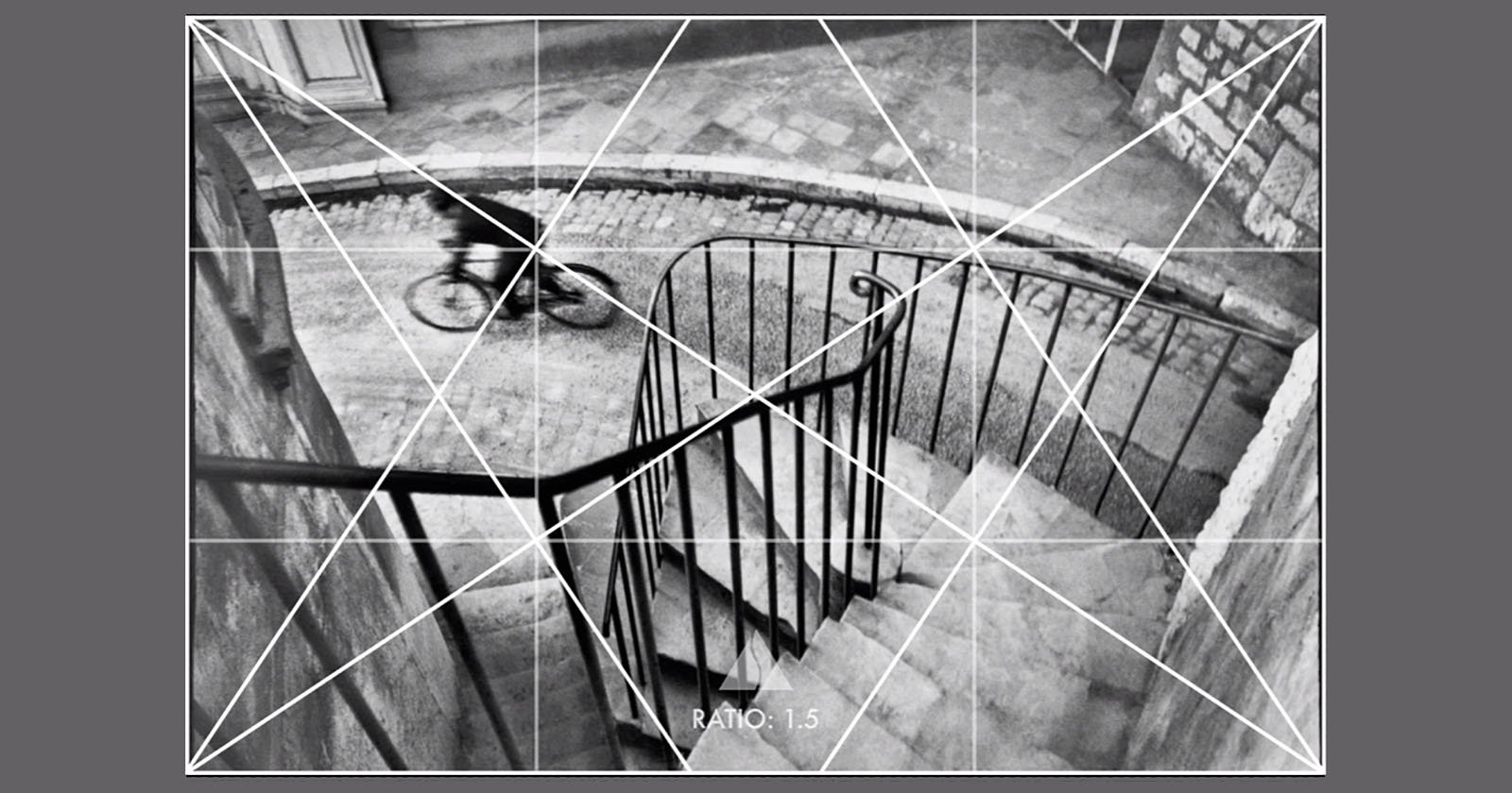
This is actually one of my personal favorite photographs from my portfolio. I took it on an atmospheric misty morning in the picturesque Belgian city of Bruges. The location for this photograph was certainly interesting but for me, it is the man crossing the bridge on his bicycle that makes this photograph special.
This was one of those occasions when I had to wait for that exact right moment to press the shutter. I crouched beside a canal sidewall, composed my shot, and waited…. and waited…. and waited some more. Every so often, someone would cycle across the bridge but the shot would be ruined by a car coming in the opposite direction or perhaps the cyclist would look too modern for the mood I was trying to create in the final photograph – very inconsiderate in my opinion!
Finally, after about 45 minutes, I saw the gentleman you can see in the photo approaching the bridge. I waited until he was right in front of the light-colored building you see right behind him so he would stand out and pressed the shutter.
It was one of those moments I knew straight away that I’d gotten the shot I wanted from this location. I think it was worth the wait. I was quite lucky as there was a car coming from the opposite direction ready to spoil my shot. Thankfully for me the cyclist just beat him to the bridge. I think he should consider taking part in the Tour de France this year.
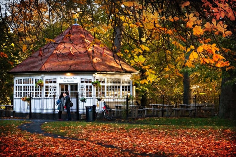
Sometimes capturing the “decisive moment” can be a case of being in the right place at the right time. In this case, I had already set up my camera to photograph the old tea rooms in the Victorian Era Phoenix Park in Dublin. As I was waiting, a young couple entered the frame and said goodbye with a tender kiss in front of the doors to the tea rooms. Patience and luck both play a role in capturing the “decisive moment” in your photographs.
Applying These Composition Tips to Your Photography
I have told you that it is often possible to combine two or more of the composition ideas I’ve covered in one photograph.
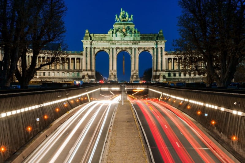
This shot taken in Brussels combines several of the ideas we covered in this section: centered composition, symmetry, rule of thirds, leading lines, rule of odds, frame within a frame, and color theory.
Obviously, it would be impossible to have all of these compositional guidelines in your mind as you are out shooting. Your brain would melt! However, a good exercise is to make an effort to use one or two of them each time you go out. You could do a photo session where you look for situations to use a ‘frame within a frame’ for example.
After a while, you’ll find that a lot of these guidelines become ingrained. You will begin to use them naturally without having to think about them. As you can see from the golden ratio, I even used one of them without even realizing it!
I hope you found this tutorial useful and that it will help you bring your photography to the next level.
P.S. Another exercise you could do is to look at some of the photos in my galleries or any collection of photos and try to see if you can tell which compositional techniques have been used.