How I Post-Process Hard Light and Overwhelming Tones
Ever since the middle of high school, I’ve been immensely interested in “the process.” You know, that middle bit between point A and point B that nobody but the artist ever sees. I’ve always loved peeking behind the scenes to see where something started and what kind of work and thought went into creating the finished product.
Hard Light
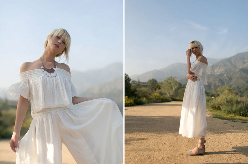
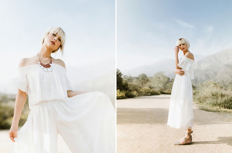
Hard light is a whole different beast. It’s a monster with hard shadows, distracting backgrounds, and strong colors. Luckily, we can calm that beast down. And for the record, I know: this isn’t “Hard Light” but it’s modified hard light (I had a diffuser blocking the sun from her top half) and the background is in hard light. Sheesh.
I love soft light. You know I search for shade and you know that back light gets me giddy. Well guess what friends… experimentation fosters progression and lately I’ve been experimenting in harder light!
Light / Exposure
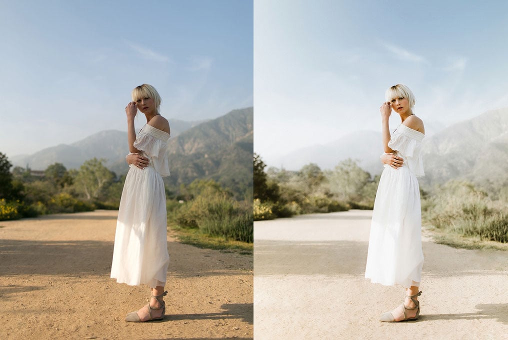
Let’s start with what we should always focus on first, the light. The type of light you work with is one of the most influential factors on your editing. Editing for hard light and soft light is a completely different ball game. My typical images have soft light on both the subjects and the backgrounds. That’s very important to my style since my tends to have a softer (although still contrasty) feel. In the images above, I wanted to keep that softness in my subject while playing with harder light in the background. My setup was simple. The sun was coming through a small circular diffuser on her right (your left) which shaded the top half of her body. Other than that, I let the hard light takeover.
Exposing shots like this is the same as I’d expose anything else. I underexpose the brightest thing I want to keep detail in. Did you follow that? In this shot, I wanted to keep detail in the sky and the skin (I wanted to keep some blue sky) and since the sky was brighter, I underexposed that. That left the skin much darker, but that’s okay because we can bring that up in post without losing details. On the other hand, if I exposed for the skin, I would have kept details there but would have blown out the sky. When shooting digital, if you blow something out, it’s gone forever. It’s always best to err on the side of underexposure (unless you’re shooting film).
Tones
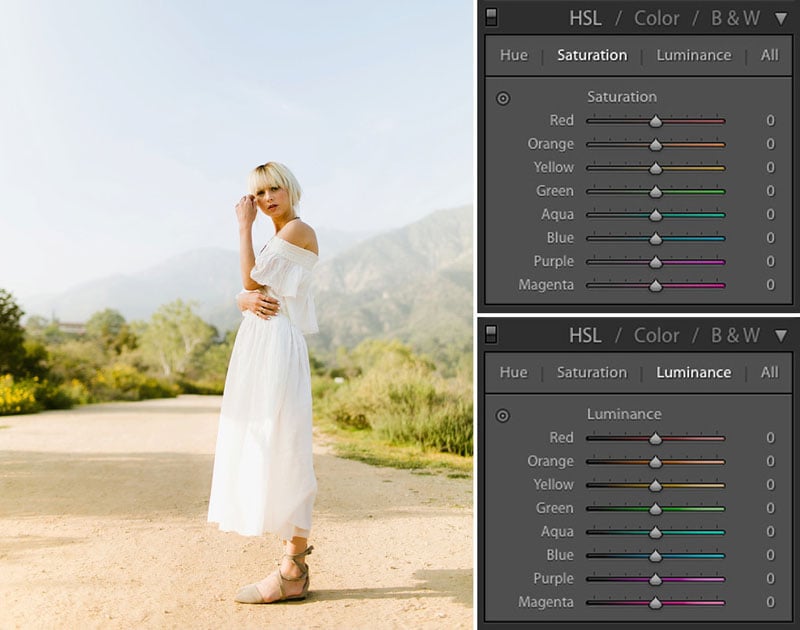
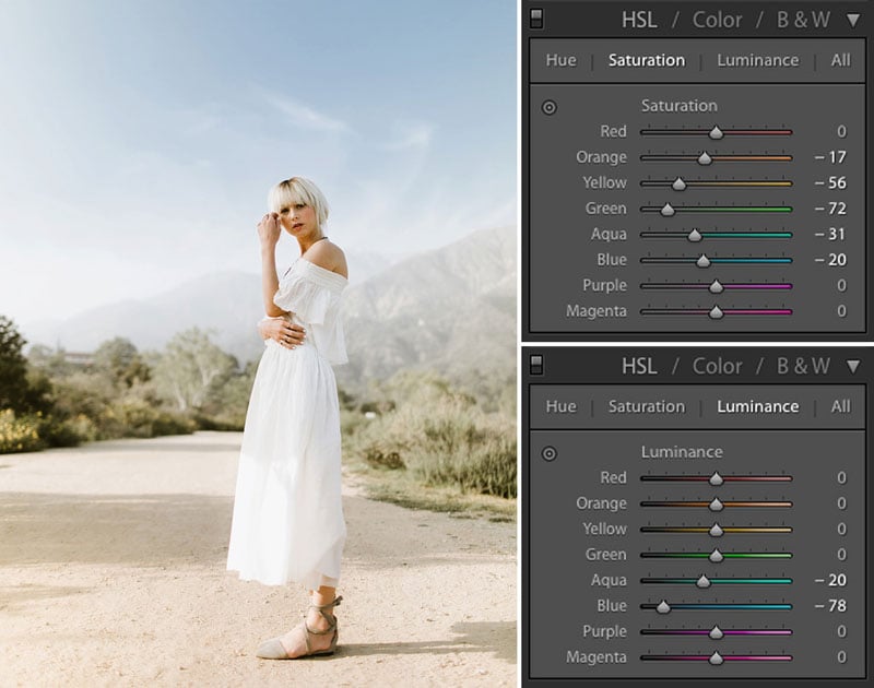
Tones! Woohoo! If you’ve shot in both, you may have already realized that one of the biggest differences in soft/hard light is saturation. If you look at a blade of grass in the shade, you’ll see a soft, peaceful green. Move it into the sun and it turns into a freaking neon blaze of green hell fire. Sun = Saturation. It’s just simple math.
Why does this matter? If I want to keep my images in hard and soft light consistent with each other, I have to understand how to manipulate that saturation. This is where the glorious HSL tool comes into play. If you don’t know where that is, it’s the super confusing looking patchwork of sliders under the Tone Curve in Lightroom. This panel allows you to manipulate three things about each specific color: the hue, saturation, and luminance. For example, I could change the blues in the image (make them a different color, add/kill saturation, or change the brightness of them) without affecting any other color in the frame. Pretty dang handy.
The HSL slider is something I’ve rarely dug into when I’m working on images with softer light but it can be crucial for taming the bonkers colors that hard light can give you. When shooting outdoors with hard light in the background, you’ll likely be seeing strong greens, yellows and oranges taking over your image. To subdue those colors a bit (bringing them closer to how they would look in soft light), you can simply drag down the saturation for each specific color you feel is too strong. So dang easy! The only other thing I did in the in the HSL for this image is to bring down the luminance on the blues/aquas to darken the sky just a tad.
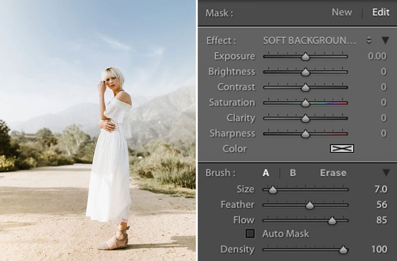
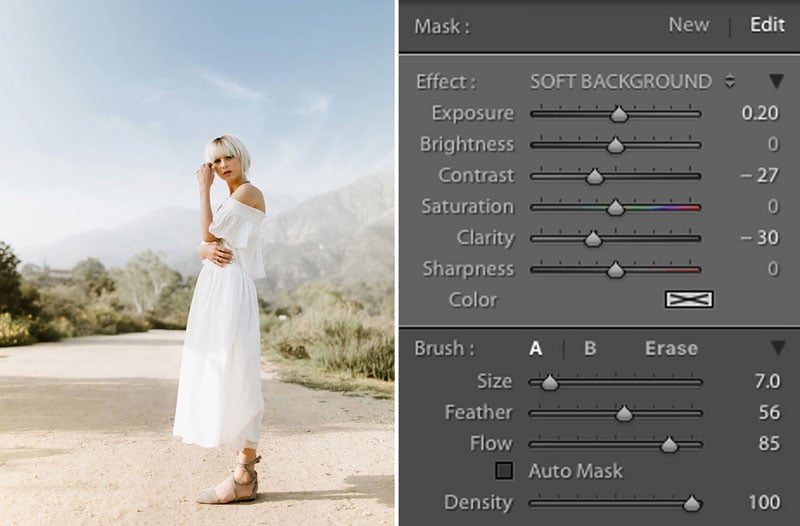
Harsh Backgrounds
The main reason I shoot with soft light in my backgrounds as much as I do is because it helps me keep a muted tone in an image and it allows the subject to pop. Hard light in the background can have the opposite effect. The background can go from soft to harsh leaving you with a subject that doesn’t draw your eye and a background that feels abrasive and busy.
Good news, we have a fix! Wouldn’t it be weird if I posted one of these before/after blogs where I just talked about all of the problems but didn’t give any solutions. If I ever decide to annoy a ton of people at once, I’ll do that. (And for those of you wondering, that’s what we call a tangent). Lightroom has a killer tool right under the histogram called brushes. These allow you to paint over any part of the image and change almost anything about that part of the image. If I wanted to make her left arm bright orange and contrasty (you know, like on myspace), this is how I can make that happen.
In this case, I’ll use the brush to take the background from harsh to soft by painting on everything except for her and the sky, and lowering the contrast and clarity of that area. Bringing down the contrast subdues the difference in light/shadow and lowering the clarity takes the harshness out of the lines/shapes behind your subject. That creates a softer, more visually pleasing background and a subject that pops out of it. Bingo!
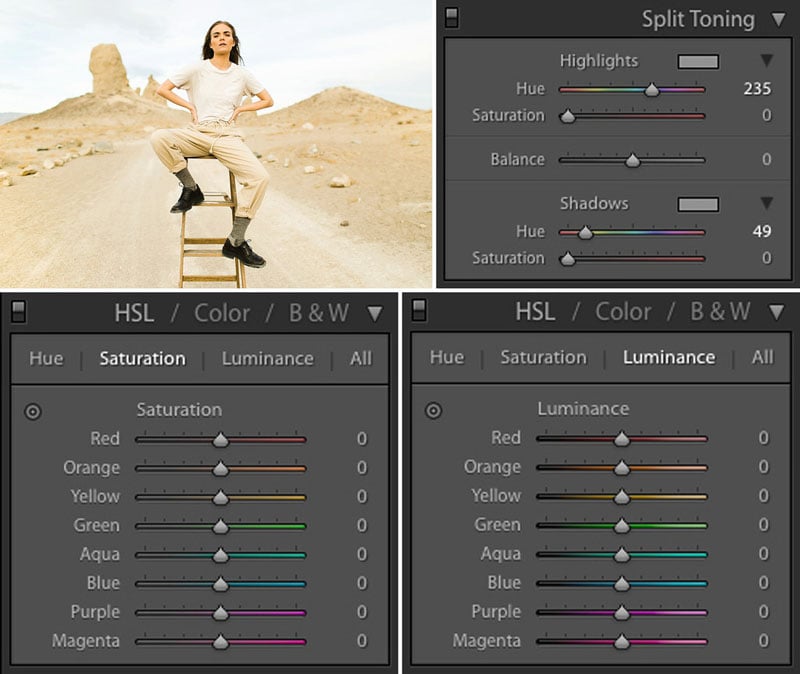
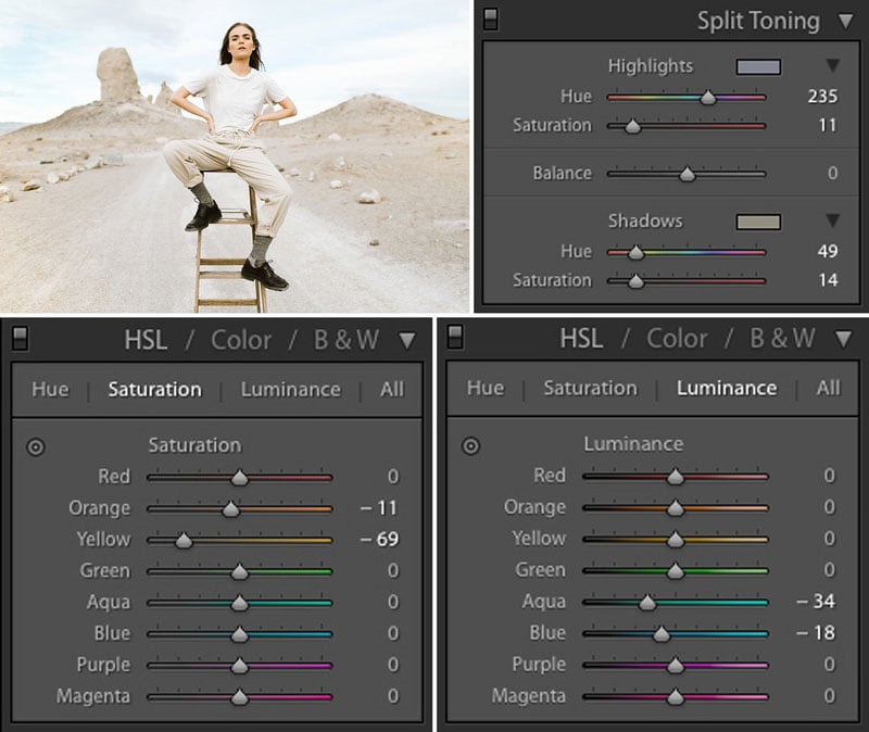
Overwhelming Tones / Split Toning
This shot of Meredith was from a shoot a few months ago that I was hoping would be a dive into playing with hard light. Instead, I showed up to our shoot spot to find nothing but cloud cover (sometimes nature has it’s own plans). I ended up shooting most of these front lit using the clouds as a diffuser. That allowed me to have soft, flattering light on Meredith and exposing it in a way that would keep a bit of color in the sky.
HSL Sliders
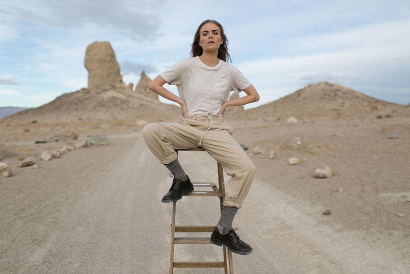
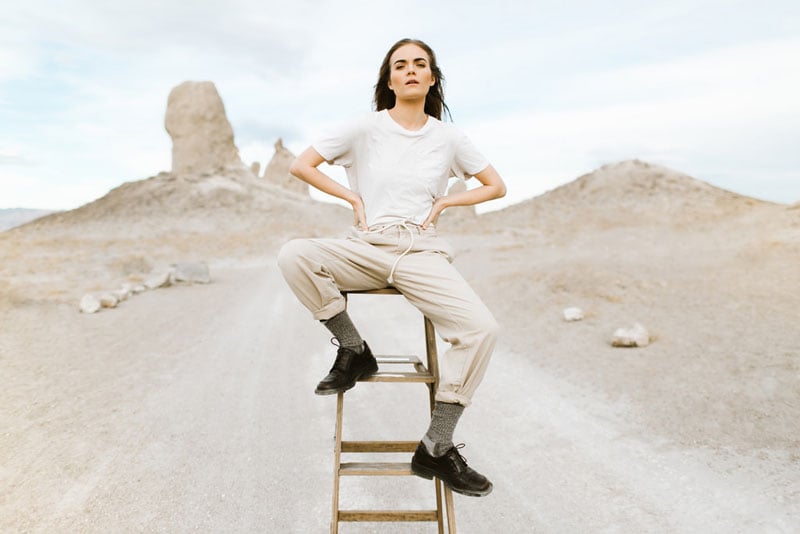
Shooting out in nature as much as I do (and jumping from landscape to landscape) can mean I’m always finding little quirks in the colors that I need to fix. When I shoot out in the desert, I find that the yellows and warmer tones can be overwhelming because the light is reflecting off the ground and spreading those warm tones all over the frame. When I shoot in the forest or anywhere with a ton of grass, I see the same thing happening with greens. Above, I said that I rarely come into the HSL (Hue, Saturation, Luminance) sliders when I’m shooting in soft light and this is one of those rare instances. It’s a pretty simple process:
1. Figure out which color is overwhelming.
2. Desaturate that color.
3. Success.
You’ll see in the image below that I also brought down the luminance of the blues and aqua again to keep the color in the sky.
Split Toning
Next up is my happy place, Split Toning. I love the power of this tool and I LOVE turning people on to it. Split Toning allows you to add a specific tint into the highlights and shadows individually. That means I can have blue shadows and yellow highlights (mimicking Kodak Portra), red shadows and blue highlights (mimicking expired film), or I can just create a palette unique to me. I typically prefer to use only yellow in the shadows and nothing in the highlights but lately I’ve been adding blue into the highlights as well for a slightly different look (check out the rest of the images from this set with yellow shadows and blue highlights here).
The difference that HSL and Split Toning can have is pretty drastic in terms of eliminating overwhelming colors and cleaning up your image.
I hope you found this helpful! I have more free education resources through my blog, my Editing + Consistency class, and my Self Paced Classes.
Feel free to dig in to my other free education in my blog, my Editing + Consistency class (which covers everything I do in post and then some), or my other Self Paced Classes. Until next time, high-fives!
About the author: Ben Sasso is a photographer and educator based in Los Angeles. He’s all about nature (camping, climbing, hiking and running around), and has an unmanly love for cats. He’s a firm believer in fostering a close knit photo community and encouraging individual progression. You can find more of his work and writing through his website, Facebook, and Instagram. This article was also published here.