This Is What All The Metal Extracted from a Single Mine Looks Like as a Massive Sphere
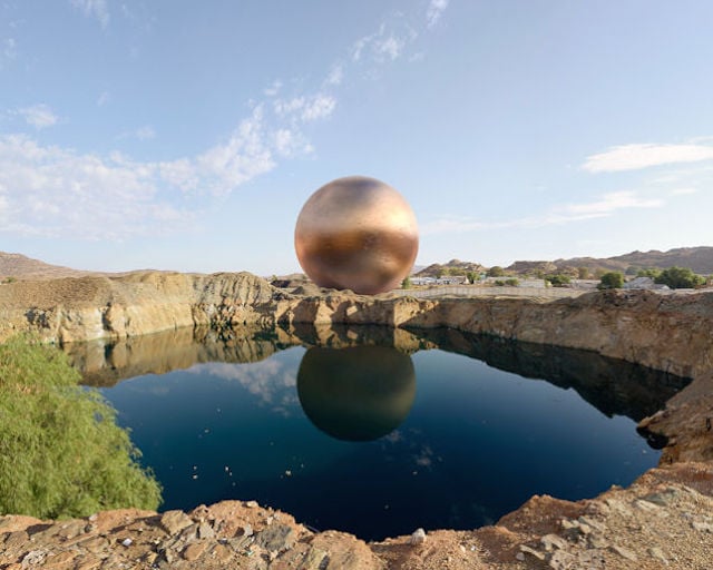
There are precious metals and gems all around us. But have you ever wondered just how much metal comes from the mines we dig to extract the ore from which the final product is made? Maybe not… but one photographer did, and he created the photo series For What It’s Worth to share his findings with you.
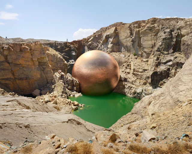
Creating these images was a two-step process. First, he went out and captured five photographs of five famous mines. Then he looked up data from those mines, gathered excavation rates for each mine, and used a rendering engine (along with some adjustments to account for scale) to create a solid metal sphere in each photo that represents the approximate amount of material excavated in comparison to the size of the mine itself.
“Mines speak of a combination of sacrifice and gain,” he explains in the project’s statement. “Their features are crude, unsightly scars on the landscape—unlikely feats of hard labour and specialized engineering, constructed to extract value from the earth but also exacting a price.”
His images beg the question of whether or not the value extracted justified that ‘price.’
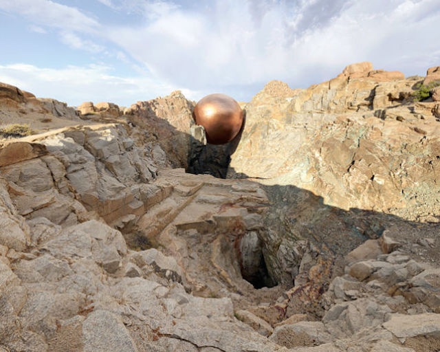
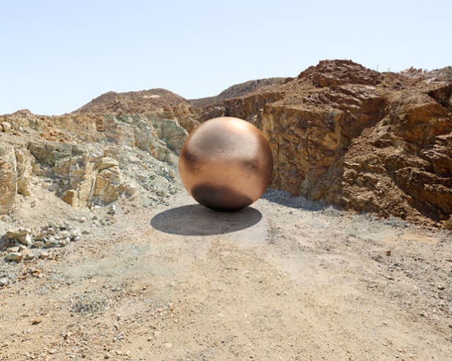
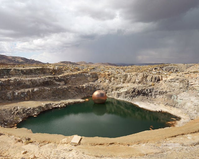
Currently, the five images he has up were all taken at/created about Copper mines. But as the project carries on, he intends to do the same with other precious metals, rocks, gems and even coal, so be sure to keep an eye out for further updates by heading over to his website or giving him a follow on Behance.
Image credits: Images by Dillon Marsh