Why Do Photo Contest Winners Look Like Movie Posters?
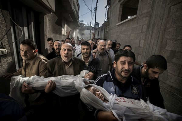
This is an incredible photo. The range of emotions expressed (anger, grief, despair), the position of the people and bodies, and proximity of the photographer to the subject make it an incredible moment in time. And because of these elements, this photo was deservedly named the World Press Photo of the Year.
It also looks like an illustration.
Here’s another one by photographer Micha Albert:
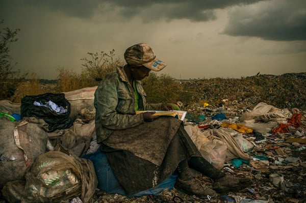
Micah Albert’s image won 1st place for Contemporary Issues – Singles. I am not a photojournalist, but I have traveled to a lot of places around the world, and I have never seen light this color given all the other environmental factors. To me, it looks like the white balance was deliberately moved to be “inaccurate” and some sort of warming filter was applied (“Earlybird” anyone?).
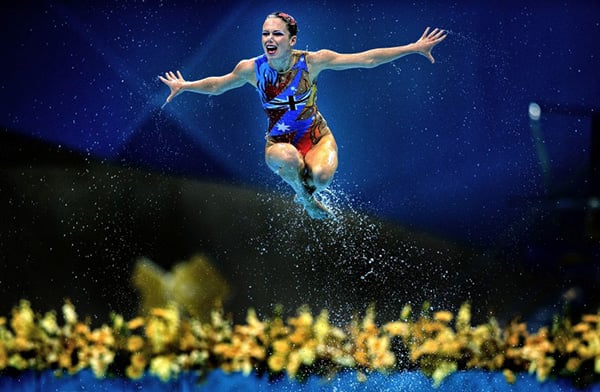
Wei Zheng took third place in Sport Action – Singles for the above photo of a synchronized swimmer from the Olympics. The bokeh suggests a telephoto lens with a wide aperture, so the clarity of the water drops isn’t unusual. But the vignetting seems extremes, and the swimmer appears to be very dodged.
To be clear, I’m not suggesting that there has been any manipulation that falls outside of the rules of the contest, but when images cease to look real and to be overly retouched, we have a veracity problem. And if we subscribe to the common ethos of photojournalism (i.e. that we are trying not to deceive the viewer), then we have an increasingly enigmatic issue. This movie poster look reminds me of this article about Hollywood’s obsession with teal and orange. We have somehow come to believe that the images look better with copious amounts of Photoshop vs what is straight out of the camera.
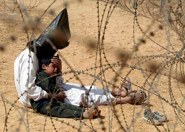
These images are all the more startling when you compare them to winners from past years. For example, Jean-Marc Bouju’s winning photograph from 2003 doesn’t rely on any overt Photoshopping. It is an amazing photo because the context gives you everything you need to know to understand the story. Barbed wire, hooded prisoner, grasping his child in An Najaf, Iraq:
We’ve been living with mainstream use of digital cameras in photojournalism for about 10 years, and photographers have had the same amount of time to hone their Photoshop skills. The enormous popularity of Instagram filters has not helped the veracity issue because now everyone can make an image look different and “cooler” than the original capture. But photojournalism has always been held to a different standard than other forms of photography, and I don’t believe the industry should change that stance.
So what can we do? I argue that high profile contests like World Press Photo should require that contestants submit their original, unretouched photos along side their final entries. That way judges (and public) have the opportunity to view the original image to see if it has been adulterated to the point of being an illustration. Granted, that is an arbitrary line, but we’ve been drifting into Photoshop world for a decade, and we’ve floated too far.
Update: I’ve published a followup article titled, “Darkrooms are Irrelevant and The Truth Matters.”
About the author: Allen Murabayashi is the Chairman and Co-founder of PhotoShelter. Allen authors PhotoShelter’s free business guides for photographers and marketing professionals, including topics like email marketing, search engine optimization, and starting a photography business. Allen is a graduate of Yale University, and flosses daily. This article originally appeared here.