Answering an Age-Old Question: What Makes a Great Print?
When I attempt to make a great photographic print, what do I look for? What process do I go through to make the image as perfect as possible? I have spent 40 years making my exhibition-quality Cibachrome prints and I’d like to explain what goes into making a superlative photographic print.
What really brings a print to life are subtleties and refinements. It takes 10% of the work to get the print 90% of the way to where it looks pretty good. It’s tempting to stop there, since it takes 90% more work to complete the subtle final 10% that brings the print to life. There are no shortcuts, neither can the process be rushed.
To begin the process of making a fine print you need to be clear about what you want to achieve. If you don’t know where you’re going, you won’t get there. The closer you get to bringing the print to life, the subtler are the changes and the more critical are your decisions. Trial and error won’t get you there.
In making a fine print, the most important factor I strive for is luminosity. I want the print to have so much life in it that light actually seems to come out of the print. You don’t have to dig for it. The perception of this light is an experiential process rather than a mental process. You should be able to see and feel it in the print if you expect others to do so.
I believe the goal of fine art, photographic or otherwise, is to convey an experience that is immediate and (ideally) profound and uplifting. The viewer doesn’t just see the image but they experience something that touches and moves them in a profound way, transcending cultural or historical differences. I’ve learned about what makes an image come to life by experiencing it when looking at extraordinary paintings.
As an example, have you ever seen an original Rembrandt oil painting? If you have, your experience didn’t depend on your knowledge of the history of painting, the materials, and techniques involved, the intent of the artist, or the painting’s historical context. No. The image instantly strikes your very core with its intensity and life and you walk away a changed person, treasuring that spark which now glows within you. That fiery spark is what I have attempted to share with others through my Cibachrome prints and which has motivated me these many years.
When I’m working on a print, I first make sectional test strips to get the image looking reasonably good by adjusting overall density, contrast, tone reproduction, and color balance. Then I make a full-size work print, put in into a mat, and place it on an easel with proper lighting. I view the print from various distances, ranging from 30 feet to one foot away, since we experience prints differently, depending on how far away we are from it.
From a greater distance, we see the overall composition and cohesiveness (or lack thereof) of all parts of the image. From a medium distance, the structural details emerge and our eye is led in various ways throughout the image, which is important to observe and plot. And close up, the fine details become an integral part of the composition and suddenly the image becomes startlingly three-dimensional. Move even closer and the very fine details display their own fascinating micro-compositions.
At this point, I fine-tune the image by adjusting overall density, local densities with dodging and burning, and very fine adjustments in color balance. I study the print to see where it leads my eye and pay attention to what I’m actually seeing, not my expectations of what I want to see. And most importantly, I ask myself what I feel and experience when I gaze at this print. If I see a flicker of fire and light in the image, I think how can I help breathe life into it?
I can’t emphasize enough that you have to divorce yourself from what you’re expecting from the image or what you experienced when you photographed it. What do you see and experience in the print right now? The longer you stare at it the better it will appear to you. Look away for a minute then quickly look back at it. What is your first impression? It will be the most accurate. If you’re not sure, take a break for 10 minutes or so and try again. If you’re not sure where to go with it, look at it the next day. Often it will be immediately clear to you.
When I know how I want to make the print better, I make another full-size test print and evaluate it. Then another, repeating this process as often as it takes.
As the print gets better and better, I become hyper-vigilant. When I realize I’ve reached the point where it is the best I can do, I’m still left with the feeling that much more is possible. At that point, how do I choose when a “work print” made the leap to an “exhibition print?” I make that choice the next day when I’m no longer intoxicated by the intensity and passion of the creative process.
One of the most important aspects of making a fine print is understanding the importance of precise color balance to achieve maximum tone and color separation. Our perception of color has as much to do with colors that are in proximity to each other as it does to the color values themselves. Opposite colors intensify each other.
“Opposite colors” means color pairs such as red and cyan, blue and yellow, magenta and green. This includes many other subtle warm and cool tones. This effect applies not only to obvious patches of discrete color but also to subtle relationships in the fine details.
As an example, green leaves often have fine details consisting of subtle shades of yellow-green and blue-green. If the overall color balance is slightly green or slightly magenta, color differentiation is obscured and the green leaves look flat. If it is slightly yellow, the yellow-greens become more prominent and the blue-greens become less prominent; thus, the color contrast between the two is less pronounced and the tonal separation is muted. If the color balance is slightly blue, the effect is reversed but with the same muted results.
When fine-tuning an image, all aspects have to be in balance and working together for the maximum effect. Using the above example of color balance, in some cases there can be too much tonal separation and the image begins to feel fragmented and loses cohesion. Ditto for overall contrast, edge sharpness, and tone reproduction. Delicacy and balance are required to bring the print to life.
Adjusting the cohesiveness of the image is done primarily through dodging and burning. When you stand at a middle distance, pay attention to how you perceive the image. How do your eyes roam and put together various areas in the print? Which parts are emphasized or minimized? Do all parts of the image work together to bring it to life? By adjusting the densities and visual weights across the image, you are able to sculpt the image into a cohesive whole. This effect of a cohesive whole is one of the aspects which give my Cibachrome prints a somewhat painterly quality.
With experience, prints become better but never easier or quicker to produce. Through patience and constant striving to produce the best possible work, over time you gain extensive technical knowledge and skill but, more importantly, a greater aesthetic sensibility that opens and enlightens the eyes of our understanding. It’s worth the effort.
The article is courtesy of ELEMENTS Magazine. ELEMENTS is the new monthly magazine dedicated to elegant landscape photography, insightful editorials, and fluid, clean design. Inside you will find exclusive and in-depth articles and imagery by the best landscape photographers in the world such as Bruce Barnbaum, Christopher Burkett, Hans Strand, Erin Babnik and William Neill, to name a few. Use the PETAPIXEL10 code for a 10% discount off the annual subscription.
The April edition of ELEMENTS Magazine features the personal story of Christopher Burkett written by the photographer himself. A must-read!
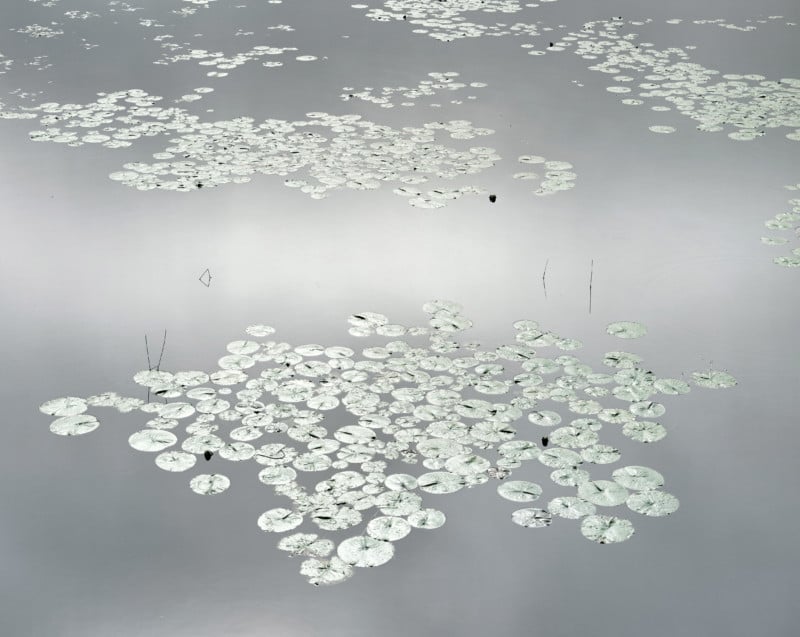
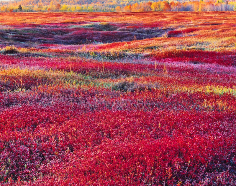
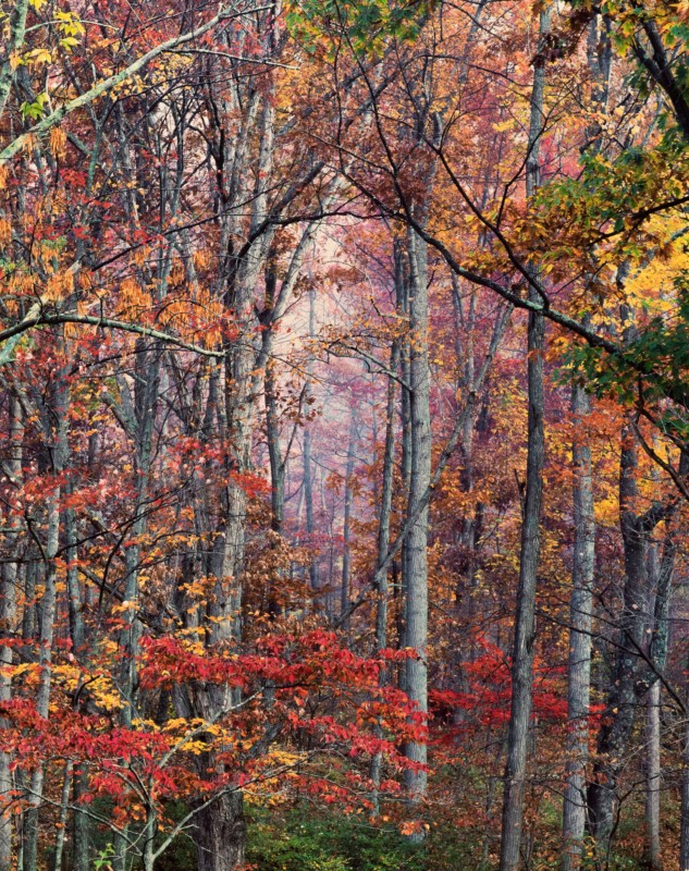
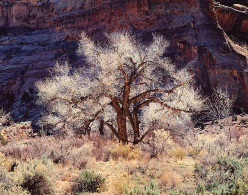
About the Author: Christopher Burkett is a legendary American photographer specialising in large format photography of woodlands. His prints are regarded as the most impeccable and luminous color photographs in the history of photography. Christopher is known to produce each photograph by hand from 6×6 and 8×10 sheet film, using now-discontinued Swiss Cibachrome photographic paper. His photographs are featured in many public and private fine art collections such as the Portland Art Museum, Museum of Fine Arts Boston, Center for Creative Photography, and Tucson Museum of Art.