Contrast is More Than Light vs Dark: How Color Contrast Affects Your Photos
There are different types of color contrast, and how we use them radically changes the look and feel of our photographs. An often-overlooked aspect of photography, the various types of contrast play an essential role in creating our images. What are the different types, and how can we use them to improve our pictures?
In photography, we often think of contrast solely as the difference between light and dark. However, there is a lot more to it than that. Much of our understanding of color contrasts comes from a Swiss painter and educator from around 100 years ago.
From 1919 to 1922, at the Bauhaus school in Weimar, Germany, a Swiss impressionist painter, Johannes Itten, developed the groundbreaking “preliminary course.” It taught students the basics of material characteristics, composition, and color. Itten’s course was the gateway for all Bauhaus students, no matter what branch of art and design they were studying, be it wood or metalwork, weaving, ceramics, bookbinding, theatre, or the fine arts of painting, drawing, and sculpture. It focused on freeing creative intuition through exercises in texture, form, and colour.
His training went way beyond the norms one would expect on an art and design course. He included spiritual and physical training, incorporating Mazdaznan breathing techniques and meditation, thought to heighten artistic sensitivity through spiritual and physical harmony. Using tactile and visual experiments, the students explored unconventional materials to understand their expressive potential.
Itten’s teachings are arguably best remembered for his colour theory. His seven colour contrasts became a cornerstone of Bauhaus visual education, profoundly influencing students’ later work and shaping design today.
He proposed seven types of color contrast and devised exercises to teach each. In photography, we can adapt these exercises to improve our work.
1. Contrast by Hue
Itten developed his own 12-part color wheel. That was based on primary (red, yellow, blue), secondary (orange, green, violet), and tertiary colors. Students used it to identify hues and their relationships. Itten devised exercises, which included creating compositions using pure hues to explore their visual impact. The students would mix pigments to create pure hues. He believed that each hue had a psychological and an emotional character. For example, red is active and passionate, blue is calm, distant, and yellow is radiant and cheerful.
Photographic Exercise
Take photos where one, two, or three intense colors are abundant. If you can, avoid or minimise variation within a single hue so you can focus on the colors themselves. How do those colors and their placement in the photo affect visual balance and the emotions evoked by the image?

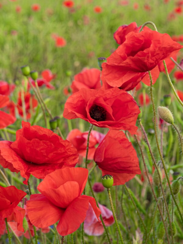
2. Contrast by Complementary Colors
If you recall your art lessons at school, you almost certainly mixed paints. You would have learned that red, yellow, and blue were the primary colours. Mixing two primaries resulted in the secondary colours:
- Blue + red = purple,
- Red + yellow = orange, and
- Yellow + blue = green.
As you can see, each of those secondary colours comprised two primaries but lacked the third:
- Purple lacks yellow,
- Orange lacks blue, and
- Green lacks red.
Those hues in each pairing are complementary. When placed side by side, they contrast with one another. That is why a red poppy stands out in a green field.
Contiguous colors (those that are close together on the color wheel), such as orange and yellow, have low contrast.
Itten got his students to explore pure colors and their interactions. One exercise was creating compositions using only primary and secondary colors, observing how hue alone could create visual impact.
Photographic Exercise:
Look for subjects with either complementary or contiguous colors. Notice the different feelings the images evoke due to their color mix.
3. Contrast by Value
Contrast by value is what we usually think of as contrast. It is the difference between light and dark tones. Itten would require his students to focus on lightness and darkness, rather than on color. Mixing pigments with black, white, and grays (or light and dark versions of different colors), he asked them to build contrast and depth into their works. They would explore how those contrasts would affect the apparent depth in their work.
Photographic Exercise:
Take some high- and low-contrast images. Low-contrast images will appear flatter with less depth than high-contrast images. Explore how you can build that into a compelling image. Next, take high-contrast photos and discover how they add depth to an image.
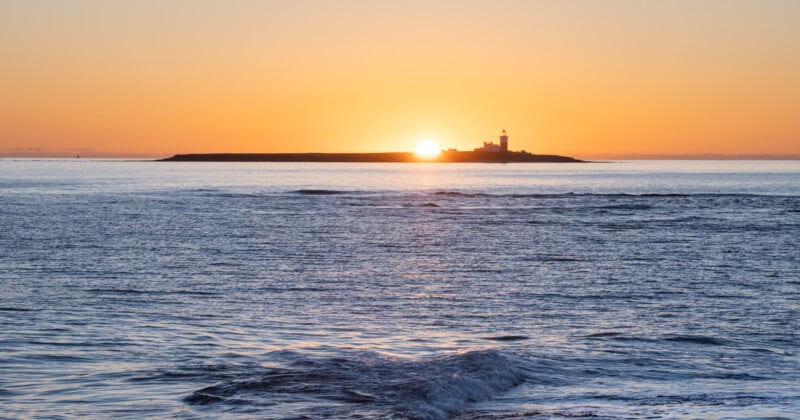
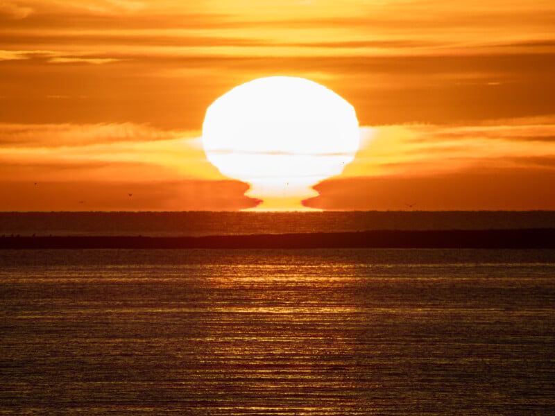
4. Contrast by Temperature
We think of yellows, oranges, and reds as warm colors. Meanwhile, violets, blues, and greens are the colors we think of as cold. That is our psychological response, not how they are considered in physics; as a metal bar heats, it will pass through red and yellow, then to glowing blue-white.
Itten asked his students to mix paint colors and experiment with how warm and cool colors alone and together affected mood and spatial perception. Our brains interpret warm-colored objects as closer than blue ones. Warm and cool colors also affect emotions.
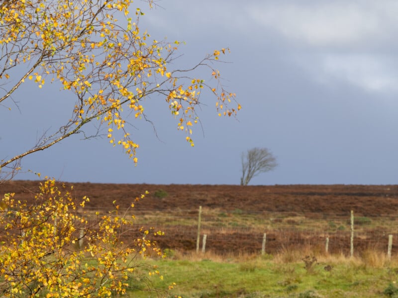
Photographic Exercise
Go outside during the golden hour (just after dawn or at sunset) and take photographs in the warm light. Especially look for lit subjects against a distant horizon. Wait a couple of hours and retake the same scenes. Look at the photos and how the light affects your mood and the photo’s depth.
5. Contrast by Saturation
That is the contrast between pure, intense colors and more muted ones. Itten got the students to mix pigments with grays or their complementary colors to reduce their intensity. He then explored how saturation levels affected a painting’s emotional tone and the viewer’s focus.

Photographic Exercise
With your camera, look for areas of bold, saturated color against duller hues. Notice how the saturated colors stand out against the more muted ones.
6. Contrast of Proportion
Based on Goethe’s color theory, Itten demonstrated how a small amount of bright colors can balance larger dark areas. Goethe had theorised that there were proportional relationships between different colors, and the students were encouraged to explore these to achieve visual equilibrium.
For example, yellow is a bright color. Therefore, the artist would need a much smaller area of that to balance a larger area of darker violet. Meanwhile, pure red and pure green are of equal brightness, so the same proportion of each would balance each other.
Photographic Exercise
If you have Photoshop, Affinity, Gimp (free), or a similar editing program, create a layer of deep violet. Then, in a new layer, gradually increase the paintbrush size and start small, adding more and more yellow until you think they are balanced. Try that with different color combinations.
Then explore the world around you with your camera and discover how different amounts of light and dark colors work to help achieve balance in your photographs. In nature, look for reds and greens. Do those work in equal amounts?
7. Simultaneous Contrast
Simultaneous contrast is how colors affect each other when placed side by side. The Bauhaus students explored how colors appeared differently when positioned next to each other, and how the hue, brightness, and saturation can appear to change. His practical exercises involved placing the same color against different backgrounds.
Photographic Exercise:
Similar to the exercise above, in your editing software, start with the violet background layer and the painted yellow area above. Now change the background color from violet to red, blue, green, white, and black. How does it affect your perception of the yellow? Note down your results. Now try the same with different foreground colors.

Alternatively, acquire some colored cards and a small, boldly colored object, such as a cup, vase, or other ornament. Repeatedly photograph the object with different coloured backdrops. Does the object appear differently with each color?
In Conclusion
As you can see, the way that hues, saturations, and values work with each other changes the way a photograph appears. When photographing nature, it might seem we have little control over it. However, we can choose to shoot at different times of day, in various weather conditions and lighting directions, and with varying amounts of the subject in the frame, all of which affect the image’s feel.
Color contrasts are not the only contrasts we can employ in a photo. We will explore others in a future article.