Nik Collection 8: The Ultimate Beginner’s Guide to Color Efex
![]()
Beyond basic RAW adjustments lies the world of creative color grading where photographers define their signature style. DxO’s recently updated Nik Collection 8 unlocks a staggering amount of creative potential, but knowing where to start with its powerful Color Efex plugin is key. This guide, created with expert advice from photographer Dave Kelly, demystifies the most impactful tools for enhancing mood, texture, and detail. We explore a non-destructive workflow for Photoshop, Lightroom Classic and DxO’s own powerful PhotoLab 9, that will transform simple captures into compelling, professional-grade photographs.
Full disclosure: This article was brought to you by DxO. Use the code PetaPixel at check out to get 20% off of any DxO product, including Nik Collection 8.
All photos taken in Mongolia by Michael Bonocore.
At a Glance
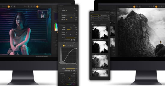
What is Color Efex 8 and What is New in Nik 8
For photographers looking to move beyond foundational edits, DxO Color Efex 8 is a powerful suite of creative editing tools and presets designed for nuanced color correction, professional retouching, and applying distinct artistic styles. It functions as a plugin inside a host application, intended as the next step in the editing process after initial RAW adjustments are complete.
![]()
The most significant changes in Nik Collection 8 include a redesigned dockable UXP panel in Photoshop and enhanced masking capabilities. This includes the ability to import selections directly from Photoshop, even those generated by AI tools like “Select Subject,” and the introduction of powerful new Color Masks that allow precise color-based selections.
“The new Color Mask tool in Color Efex is a scalpel, not a paintbrush,” Kelly explains. “You can use the eyedropper to select a very specific color range then refine it with luminance and chrominance controls. It gives you surgical precision to adjust something like the blues in a sky without affecting the rest of the image.”
The new Photoshop panel streamlines workflow by providing one-click access to favorite filters, while the improved non-destructive editing options ensure maximum flexibility for client work and creative iterations.
Installing and Launching
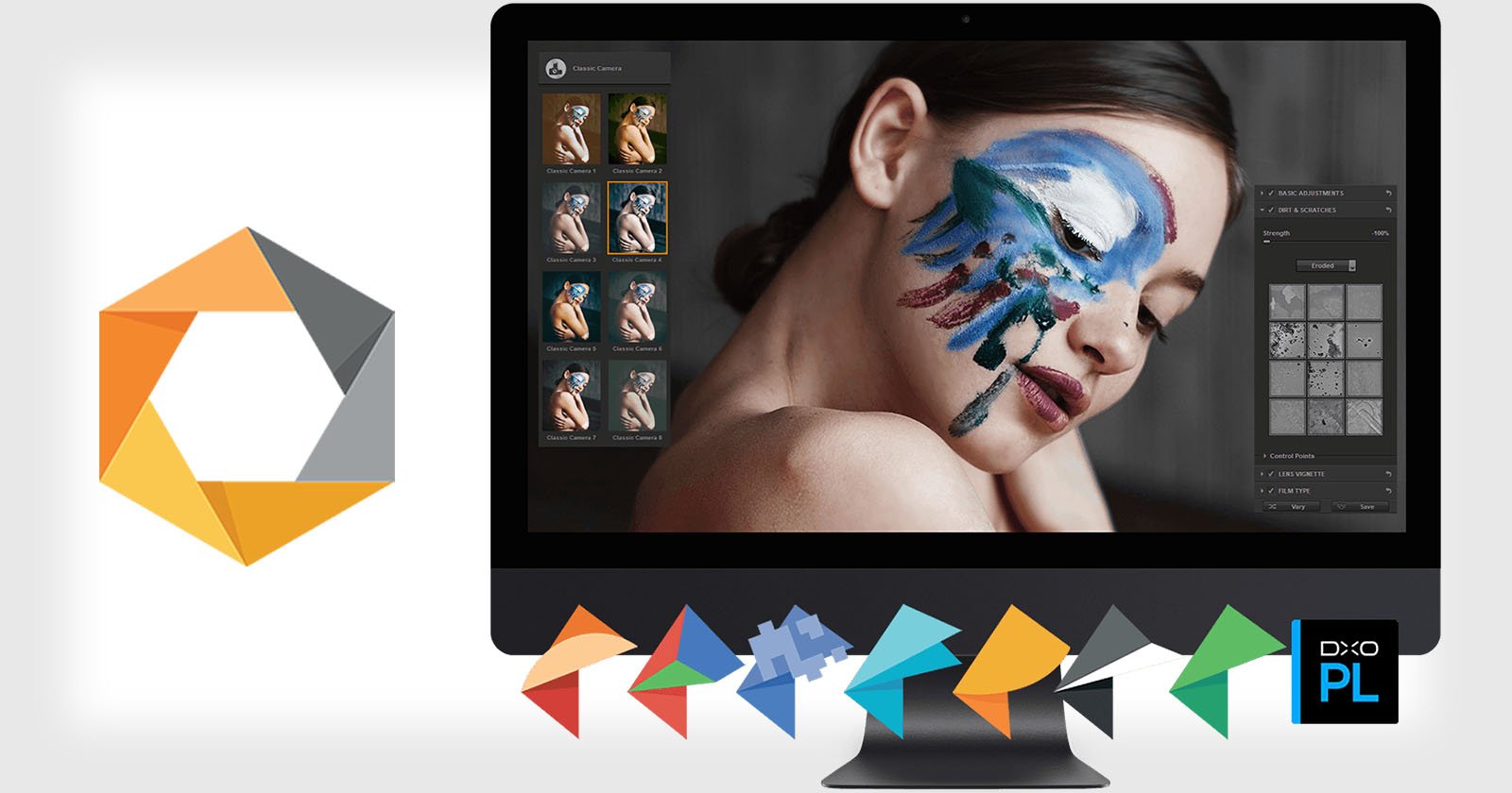
Getting started with Color Efex 8 involves straightforward installation and understanding how to launch it from your preferred host application. While this guide focuses on Adobe Photoshop and Lightroom Classic, the installer also detects other compatible software like DxO PhotoLab 9 and Serif Affinity Photo.
Photoshop Nik 8 Panel
For Photoshop users, the new UXP panel serves as the central hub for the Nik Collection. During installation, ensure Photoshop is closed. Once installed, access the panel from Plugins → Nik Collection 8.
“Honestly, the new panel is a complete game changer for my Photoshop workflow,” Kelly says. “Instead of breaking my concentration to hunt through menus my favorite tools are always sitting right there. When there’s no friction between your creative idea and the tool you need you make better more intuitive edits. It’s that simple.”
![]()
By clicking the star icon next to a filter’s name inside Color Efex, you can mark it as a Favorite. These favorites then appear directly in the Photoshop panel for one-click access. “Build a small Favorites panel to speed the rhythm,” Kelly recommends, keeping the panel uncluttered with just a few go-to filters.
The panel’s “Last Edit” button proves invaluable for consistency across image series. “That button is a huge time-saver for consistency,” he explains. “I can perfect the look on one photo and then apply that exact same recipe to the next image in a series with a single click.”
![]()
Before launching any filter, decide how the edit returns to Photoshop. The Apply button offers several options: Smart Object (recommended for re-editability), New Layer, or New Layer with Mask. Smart Objects maintain full editability while preserving image quality.
Lightroom Classic Round-Trip
The workflow for Lightroom Classic requires one-time setup for optimal quality. Configure external editing preferences by navigating to Preferences → External Editing → Additional External Editor. Set File Format to TIFF, Color Space to ProPhoto RGB, and Bit Depth to 16 bits/component.
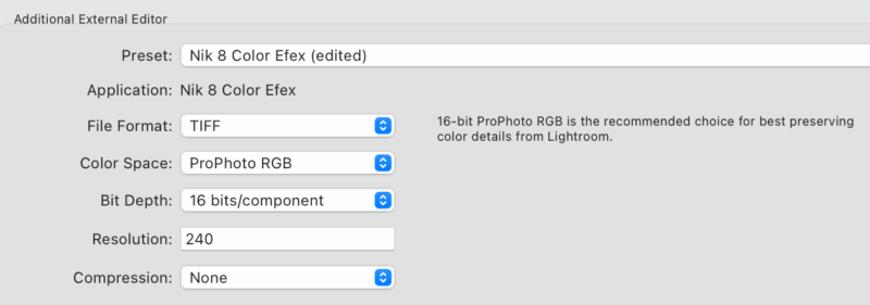
“This setup step is something you only have to do once but it’s critical,” Kelly stresses. “Setting your file format to a 16-bit TIFF is non-negotiable for me. It gives the software the maximum amount of data to work with which prevents color banding and artifacts when you start making bigger adjustments. It’s the foundation for getting a high-quality professional result.”
After configuring preferences, right-click an image and select Edit In → Nik Color Efex. In Color Efex, check either ‘Edit a Copy with Lightroom Adjustments’ or ‘Edit a Copy’, which, since they are copies, are non-destructive edits on the original file. Click ‘Edit’ to open the copy in Color Efex.
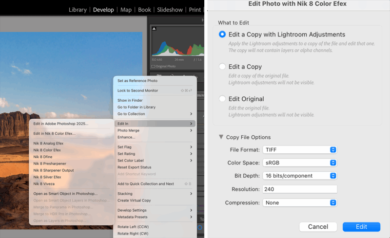
If you want to be able to re-edit a Color Efex 8 TIFF file’s applied filters, you need to enable “Non-destructive edits (larger files)” when you first save from Color Efex. Later, from Lightroom Classic use Edit In → Nik Color Efex → Edit Original to send the same TIFF back to Nik, which reads the embedded recipe and restores your filter stack. Choosing ‘Edit a Copy with Lightroom Adjustments’ creates a new TIFF with Lightroom changes baked in, so Color Efex opens it as a new file without your previous stack.
“It all comes down to one question: do you want the ability to adjust your Nik recipe on that photo in the future?” Kelly advises. “If the answer is yes, you have to save the original Color Efex file as ‘Non-Destructive’ and choose ‘Edit Original’ when you want to adjust the Nik recipe. That’s the only way to get your Color Efex sliders back. If you’re happy with the Nik recipe and just want to stack more Lightroom edits on top then making a copy is fine. Understanding that trade-off is the key to a flexible workflow.”
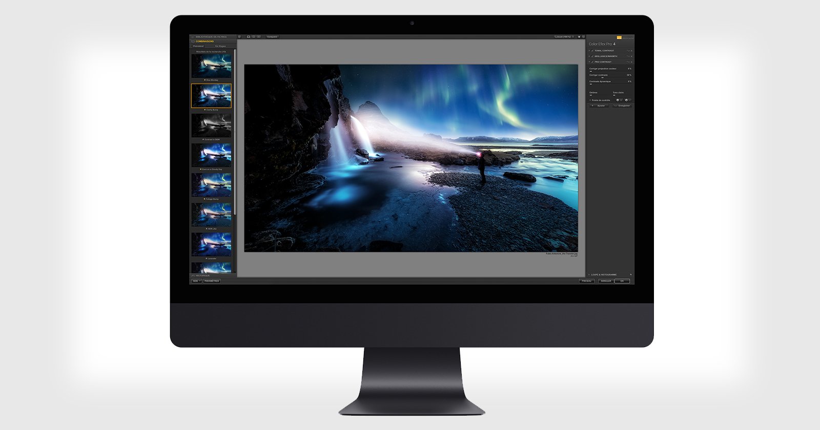
Interface Tour
Color Efex 8 organizes into three main zones: the left panel contains Presets, custom Recipes, and the full Filters list; the center provides image preview with compare modes; the right panel displays the “stack” where active filters and controls appear.
“I like to think of it like building a recipe,” Kelly says. “Each filter is an ingredient. You can add them one by one, change their order and adjust the strength of each until you get the exact flavor you want.”
![]()
The left panel serves as your creative starting point. Presets apply complete multi-filter looks instantly, while the Filters list enables manual look construction. Many individual filters also include a dropdown of “Filter Looks,” which are preset variations of settings for rapid stylistic changes. The History tab allows stepping back through recent changes.
“The real power of Color Efex comes from learning how to make your own custom recipes, however, presets are fantastic learning tools that will help you learn the process,” Kelly notes. “Apply a preset you like and then look at the filter stack on the right to see exactly how that look was built. It’s like a chef sharing a recipe; you can see all the ingredients and how they work together.”
Understanding Non-Destructive Workflows
Professional workflows demand complete re-editability. Understanding the distinctions between how Photoshop and Lightroom handle non-destructive editing ensures maximum flexibility.
Photoshop Smart Objects (The Gold Standard)
Smart Objects provide the gold standard for non-destructive Color Efex workflows in Photoshop. “I always use Smart Objects when sending a file from Photoshop to Nik,” Kelly states. “It keeps my workflow flexible and efficient.”
To ensure this workflow, either convert the layer to a Smart Object before launching Nik or, after opening the file in Color Efex through Photoshop, choose “Smart Object” from the “Apply” dropdown menu inside Color Efex. To re-edit, double-click the “Nik Color Efex 8” Smart Filter in the Layers panel to reopen Color Efex with all sliders exactly where you left them.
Lightroom Non-Destructive Workflow (The TIFF Method)
Lightroom Classic requires the use of TIFF files for its non-destructive workflow. The key feature is a checkbox at the bottom of the right panel labeled “Non-destructive edits (Save and edit later).”
“In Lightroom that little ‘non-destructive’ checkbox is your safety net,” Kelly insists. “Checking it means you can always come back and tweak your sliders just by re-opening the file in Color Efex through Lightroom. Forgetting to check it means your edit is baked in forever. To be safe, I always choose either ‘Edit a Copy’ or ‘Edit a Copy With Lightroom Adjustments’ when I open a file in Color Efex through Lightroom. I always double-check that I have selected the ‘non-destructive’ checkbox before I hit ‘Apply’, however, editing a copy provides me with an extra safety net just in case I forget to check the box.
This embeds the filter settings into the TIFF file. To adjust the settings later, select the TIFF in Lightroom, right-click → Edit In → Nik Color Efex.
Core Beginner Workflow
A repeatable process ensures consistent, high-quality results. This five-step method, adapted from Dave Kelly’s professional workflow, prioritizes both image quality and flexibility.
1. Prepare and Launch
Complete basic RAW adjustments first, then prepare your file. In Photoshop, right-click your layer and choose “Convert to Smart Object.” In Lightroom Classic, use the “Edit In” command to create a 16-bit TIFF file, then make sure to check the ‘non-destructive edits’ checkbox.
![]()
“This first step is everything,” Kelly stresses. “You’re building a safety net before you even start. It’s a habit that separates amateurs from pros.”
2. Choose a Starting Point
Select either a pre-made Preset or manually select a foundational filter. “Start with Pro Contrast to set a clean baseline,” Kelly recommends. “Fixing color casts and balancing contrast first makes every other filter you stack on top work better.”
3. Tweak and Stack
Make subtle adjustments to active filter sliders. Add additional filters as needed by clicking the + symbol to the right of the filter name in the left sidebar. “I think of stacking like building a flavor profile,” Kelly says. “Pro Contrast is the salt; it corrects the foundation. Then you can add pepper with Tonal Contrast for some bite. It’s about adding layers of nuance, not just one heavy-handed effect.”
![]()
4. Localize the Effect (Optional)
Use Control Points or Color Masks (see Local Adjustments and Masking section below) for selective adjustments if an effect should only apply to specific areas. “My rule is to fix the big picture first,” Kelly explains. “Get the global color and contrast right and only then use local tools like Control Points as a final precise touch.”
![]()
5. Apply and Return
Send the image back using your prepared non-destructive method. In Photoshop, ensure “Smart Object” is selected in the Apply dropdown if you aren’t editing a Smart Object already. In Lightroom, ensure the “Non-destructive edits” box is checked before clicking “Apply.”
Local Adjustments and Masking
Applying a filter globally is a starting point, but professional control comes from making selective adjustments. Color Efex excels at this through Control Points (U Point technology), Color Masks, and the ability to import Photoshop selections.
“My philosophy is always global first local last,” Kelly advises. “Get the overall image looking great with your main filters then use Control Points as the final touch. They’re for surgical adjustments, not major surgery.”
Control Points (U Point Technology)
Control Points allow selective adjustments without complex masking. When you add a Control Point, it samples the color, tone, and texture directly under the point and intelligently applies the filter’s effect only to areas with similar characteristics.
![]()
“Control Points let you paint with light and color without needing a PhD in Photoshop masking,” Kelly says. “You just click on the area you want to change and the software is smart enough to figure out the selection for you. It’s incredibly intuitive.”
How to use Control Points:
1. Click the Control Point icon under ‘Local Adjustments’ in the right panel for the active filter.
2. Click the area of the image you want to affect.
3. Adjust the top slider (Size) to control the radius of influence.
A positive (+) Control Point (right of center) applies the effect to the selected area. A negative (–) Control Point (left of center) prevents the effect from applying to that area (e.g., removing Glamour Glow from eyes).
“The mask is the truth,” Kelly emphasizes. “Check Mask View to verify selections before proceeding.” Use the mask view icon (or M key) to see what is affected. White reveals the effect, and black conceals it.
New: Color Masks
Color Masks allow selection based on a specific color range, regardless of location. This is ideal for isolating specific colors like adjusting autumn foliage.
![]()
How to use Color Masks:
1. Add a filter that can modify color (like HSL, Colorize, or Brilliance/Warmth)
2. Click the Color Mask icon in the Local Adjustments section
3. Use the eyedropper to select your target color in the image
4. Refine the selection using the gradient handles in Mask Options to adjust the color range
5. Make sure the Color Mask remains active (highlighted/selected in Local Adjustments)
Note: The Color Mask only determines where the effect applies. You still need to adjust the filter’s settings to create the actual color change.
6. Adjust the filter’s sliders (like Hue, Saturation, etc.) to transform the selected color
7. Use Mask View (M key) to verify your selection
“When you need to target specific colors regardless of location Color Masks provide better accuracy than spatial-based Control Points,” Kelly notes.
Troubleshooting Common Masking Issues
Halos and Edge Artifacts: If masking creates visible halos or unnatural edges, the issue is often that the selection is too broad or the effect too strong. Always use the Mask View. For Control Points, adjust the Size slider and place points more precisely. For Color Masks, tighten the gradient handles in Mask Options to narrow the color range. Reduce the filter’s opacity if the effect is too strong.
Color Spill/Bleeding: The effect impacts unwanted areas with similar colors. Check the Mask View. For Control Points, reduce the Size slider and place the point precisely. “I always suggest placing Control Points precisely, as size only limits influence,” Kelly advises. For Color Masks, tighten the Luminance/Chrominance range. Add negative Control Points to block the spill.
Complex Edges (e.g., Trees against Sky): Automatic masking struggles with fine details. Use multiple smaller Control Points rather than one large one. Place points in the major color zones, then use negative points to clean up the edges.
Essential Filters for Beginners
With over 50 filters available, the library can feel intimidating. Kelly recommends beginners master a core set of tools. These filters form the backbone of many professional editing workflows.
“I always tell my YouTube viewers to start with the fundamentals,” Kelly explains. “Master these and understand how they interact and you’ll have a professional toolkit that works for everything from portraits to landscapes and everything in between.”
Pro Contrast
Think of Pro Contrast as your clean slate. Before you add any creative effects, you need a neutral baseline where colors are accurate and contrast is balanced. Otherwise, every filter you stack on top will behave unpredictably.
![]()
Start here on almost every image. Pro Contrast quickly fixes two common problems: color casts (that weird orange or blue tint) and muddy contrast.
Here’s how to dial it in:
Correct Color Cast should be your first move. Slide it slowly until your neutrals (whites, grays, concrete) look natural. Not orange, not blue, just neutral. Most images need somewhere between 0% and 10%. Only push higher if the cast is really obvious.
Correct Contrast adds a gentle snap to the overall image. Try 5% to 15% and watch your histogram, as you don’t want to clip highlights or crush blacks.
Dynamic Contrast is where the magic happens. This adds micro-contrast that makes details pop. Start around 10% to 25%, but go easy, as small moves make a big difference.
The protection sliders at the bottom are crucial. Set Highlights (protection) to 10-20% to keep skies and bright edges clean. Set Shadow (protection) to 5-15% to avoid crunchy blacks. If you see halos or blocking, increase these.
Why order matters: Always run Pro Contrast before detail filters like Tonal Contrast or Detail Extractor. They’ll build on this clean base and behave much more predictably.
If your overall look gets too strong, just lower the filter Opacity to 80-90% or use Control Points/Color Masks to protect skin and sky.
“Get your color and contrast right up front,” Kelly says. “Every filter you add afterward dials in faster and behaves more predictably.”
What can go wrong: Push Dynamic Contrast past 30% and you’ll get bright-edge halos. Go too aggressive on cast correction and you’ll strip out intentional warmth or coolness. If artifacts appear, raise those protection sliders or back off the Opacity. If the image feels “de-warmed,” dial back Correct Color Cast a bit.
Detail Extractor
Once your baseline is set, Detail Extractor reveals fine texture and micro-contrast in things like wood grain, fabric, and foliage while keeping smooth areas like sky and skin looking natural.
![]()
The key is to start light. Set Detail Extractor around 5-15%. You’d be surprised how much impact even 10% makes.
Here’s how to dial it in:
For Contrast, add just 5-15% for a gentle pop. Don’t make big jumps or edges start looking brittle.
For Saturation, wait until you’ve settled on the details, then add 0-10% if needed. If colors start shifting weird, dial it back.
Structure size (there’s a dropdown) lets you target different textures. Choose Fine for foliage, feathers, fabric. Normal for most scenes. Large for broad stuff like rock faces and architecture.
Protecting smooth areas is critical here. Raise Highlights (protection) to 20-40% for skies and bright walls. Raise Shadows (protection) to 10-20% to keep dark tones from getting gritty.
Want to be more surgical? Add a Control Point directly on what you want to emphasize (like driftwood grain or lichen on a rock), then lower the overall filter Opacity to 80-90% so it blends naturally.
Workflow tip: The sequence should be Pro Contrast then Detail Extractor then Tonal Contrast (or other creative looks). Building on a clean base prevents that “stacked crunch” look.
“Detail isn’t a special effect,” Kelly says. “It’s a nudge that helps the eye land where you want. If the texture shouts, people stop looking at the photo.”
Watch out for: Going past 20% often reads as crunchy or noisy, especially if you shot at higher ISOs. If it’s looking ‘sandpapery,’ back off the Detail Extractor, bump those protection sliders, and reduce Opacity. For portraits and big skies, use Control Points or Color Masks to keep it local instead of global.
Tonal Contrast
Here’s where you add dimension. Tonal Contrast lets you increase contrast separately in Highlights, Midtones, and Shadows so you can add texture to rocks and foliage while protecting smooth skies and skin.
![]()
The sweet spot: Set Midtones to 10-20% and Shadows to 10-15%. This adds shape and texture where you want it.
Keep Highlights low, somewhere between 0% and 5%, especially when you have big skies or skin tones in the image.
Those two small controls at the bottom (Highlights protection and Shadows protection) are your safety net. Start with Highlights (protection) at 20-40% for skies and Shadows (protection) at 10-20% to prevent blocked blacks.
If the overall look feels a bit strong, dial the filter Opacity back to 70-85%.
For the cleanest results on skies or faces, add a Control Point or Color Mask to limit the effect to just the textured areas you want.
“The goal isn’t to make the picture brighter or darker,” Kelly says. “It’s to shape texture so the image feels dimensional. Start small in the midtones and shadows, then use highlight and shadow protection so skies and skin stay clean.”
Common mistake: Cranking these sliders too high creates that harsh, “HDR-crunchy” look nobody wants. Also, extreme protection can actually make skies look darker than the original. If you see halos or darkening, reduce the Highlights amount, keep Highlights (protection) below 40%, lower Opacity, or mask the sky out entirely.
Brilliance/Warmth
Now you’re ready to set the color mood. Brilliance boosts color in a perceptual, “smart” way that’s more sophisticated than just cranking saturation. Warmth shifts your image warmer or cooler. Together, they let you quickly establish the feeling you want.
![]()
When to add it: After you’ve nailed your detail and contrast work. The sequence should be: Pro Contrast then Detail Extractor then Tonal Contrast then Brilliance/Warmth. Lock your baseline first, shape detail, then set color mood.
Here’s how to dial it in:
Brilliance (perceptual saturation) is your safest first move. Add 5-20% for richer color with way fewer artifacts than raw Saturation.
Warmth is subtle but powerful. Nudge it +5 to +15 to add golden light, or -5 to -15 to cool a scene down. Judge it by how neutrals look (clouds, white shirts) and especially by skin tones.
Saturation (global) should be your last resort, not your first. Keep it between 0% and 10%. If color starts looking “painted,” back it off and lean on Brilliance instead.
Protecting skin and sky: Add Control Points or Color Masks to these areas. If faces over-saturate, add a control point and dial Opacity down to 80-90%.
Before you move on, toggle the filter on and off to make sure you’re enhancing color relationships, not just making everything louder.
“Color is where viewers feel the photograph,” Kelly says. “A little Brilliance sets the mood; Warmth decides the feeling it conveys. If you reach for Saturation, do it last and lightly.”
Red flags: Heavy-handed settings create banding, clipped channels, and orange skin. Always prefer Brilliance over Saturation for the main lift. Keep Saturation at 10% or less. If skin shifts, reduce Warmth and/or lower Opacity, then target color with local tools. If skies go neon, mask them off or trim Brilliance a few points.
Polarization
Polarization isn’t just about “bluer skies.” It’s about cutting glare. When you remove that shiny layer off leaves or water, the real color comes through and detail pops without needing extra crunch.
![]()
Where it fits: Apply this after your contrast/detail work but before your final color mood. That way saturation stays predictable. The flow: Pro Contrast then Detail Extractor then Tonal Contrast then Polarization then Brilliance/Warmth.
Here’s how to dial it in:
Strength should start around 10-30%. Only push as far as you need to tame glare or deepen the sky.
Rotate is your secret weapon. Sweep it slowly and watch what happens. You’re looking for the angle where glare reduces and the sky deepens evenly. Keep an eye on the horizon while you adjust it.
What to target: This effect shines on water, leaves, wet rocks, and sky. Use Control Points or Color Masks to keep it off skin and buildings where it can look weird.
Blending: If the look gets too heavy, lower filter Opacity to 70-90% so blues don’t go neon and foliage doesn’t look plastic.
Balance check: After Polarization, re-check your Brilliance/Warmth settings. Polarization often makes colors feel richer on its own, so you might need less global saturation than you think.
“Polarization isn’t just ‘bluer skies,'” Kelly says. “It’s glare control. When you cut that shiny layer off leaves or water, the real color comes through and detail pops without extra crunch.”
Troubleshooting:
Uneven sky bands at wide angles: Lower Strength and mask to keep the gradient smooth. Avoid maximum Rotate where the sky splits into bands.
Over-saturated blues/greens: Reduce Strength and finish with a lighter hand on Brilliance/Saturation.
Lost reflections you wanted to keep: Mask back specific highlights (windows, puddles) with Control Points.
LCD/metallic surfaces: Polarization barely affects metallic reflections. Manage those with exposure and local contrast instead.
Darken/Lighten Center
This is your compositional guide. You’re going to lift your subject area slightly while gently darkening the frame edges, so the viewer’s eye naturally lands where you want it.
![]()
Placement matters here. Use this near the end of your stack, after color and detail work: Pro Contrast then Detail Extractor then Tonal Contrast then Polarization then Brilliance/Warmth then Darken/Lighten Center.
Here’s how to dial it in:
Place Center by clicking directly on your subject (a face, your key object). You can reposition it as you refine.
Center Size controls how big that bright area is. Expand it until the transition feels natural, usually 40-60% for portraits and 60-80% for landscapes or architecture.
Center Luminosity lifts your subject area. Try +5% to +15% so it reads just a touch brighter than everything around it.
Border Luminosity darkens the edges. Go with -5% to -20% for gentle falloff. Keep it subtle. You’re guiding attention, not spotlighting.
If you can see the vignette edge, increase Center Size, reduce Border Luminosity, or lower filter Opacity to 80-90%.
Special case: If corners have important highlights (streetlights, reflections), protect them with Control Points or Color Masks so the vignette doesn’t flatten them out.
“Vignetting isn’t an effect, it’s direction,” Kelly says. “A small lift at the subject and a quiet falloff at the edges is often all you need to make the photo feel intentional.”
Avoid this: Over-darkening borders or using too small a center creates an obvious oval halo, especially on skies and clean walls. Enlarge Center Size, lighten Border Luminosity, and/or lower Opacity until the transition disappears. If faces go muddy when you darken edges, raise Center Luminosity a few points and reposition the center directly on the face.
Vignette
While Darken/Lighten Center gives you a movable focal area, Vignette creates a symmetric, lens-style edge falloff that’s perfect when your subject is centered or your composition is balanced.
![]()
When to use which:
Darken/Lighten Center: Movable focal area, ideal for off-center subjects
Vignette: Symmetric falloff, ideal for centered subjects with balanced composition
Placement: Use this near the end: Pro Contrast then Detail Extractor then Tonal Contrast then Polarization then Brilliance/Warmth then Darken/Lighten Center then Vignette.
Here’s how to dial it in:
Amount should start subtle, try 5-15% for most images.
Size/Shape: Expand until corners darken without forming a visible oval. Round works great for centered subjects. Oval fits horizontals and off-center compositions better.
Feather/Transition: Crank this up to keep the falloff invisible. If you can see the edge, it’s too hard.
Subject safety: If important detail lives in a corner (eyes in a portrait, a lighthouse, a car headlight), either protect it with Control Points or Color Masks or just reduce Amount.
If the image feels boxed-in, lower filter Opacity to 80-90%.
“Good vignetting feels like intent, not an effect,” Kelly says. “You’re nudging the eye toward the center of interest, not painting a tunnel.”
What goes wrong: Over-strong vignettes crush corners or show a hard oval on skies and plain walls. Reduce Amount, enlarge Size, and increase Feather until the transition disappears. If your subject sits off-center, consider Darken/Lighten Center instead or combine both very lightly.
Glamour Glow
This adds a soft, luminous bloom that flatters skin and highlights without turning everything hazy. Think of it as adding a gentle glow to light sources, not blurring the whole image.
![]()
Where it goes: Near the end, after your core tone/detail and color work: Pro Contrast then Detail Extractor then Tonal Contrast then Polarization then Brilliance/Warmth then Glamour Glow then Darken/Lighten/Vignette.
Here’s how to dial it in:
Glow should start small, around 10-20%. That’s enough to soften micro-contrast while keeping edges intact.
Saturation: Keep this between 0% and 10%. The glow often makes colors feel richer on its own, so don’t double up.
Warmth can nudge the feeling. Try +5 to +10 for a golden feel, or -5 to -10 to keep it neutral in cool scenes.
The key to making this work: Apply it with Control Points or Color Masks to favor skin, highlights on hair, and specular highlights. Reduce the effect on textured backgrounds so detail doesn’t smear.
If the overall look gets too dreamy, lower filter Opacity to 70-85% so you keep the lift without losing clarity.
“Glow works when it looks like light, not blur,” Kelly says. “Give faces a gentle bloom, then let edges and texture stay honest.”
Perfect for: Portraits, backlight situations, and night scenes with practical lights. You’ll get more forgiving skin, smoother highlights, and a cohesive, cinematic sheen.
Common problems: Too much glow makes images look smeared or plasticky. If detail collapses, drop Glow a few points, reduce Opacity, and keep Saturation conservative. If faces go orange, back off Warmth or add a control point to cool only the skin. For landscapes, confine glow to highlights and avoid foliage/rock where it reads as blur.
Colorize
Think of Colorize like placing a translucent gel over your entire frame. You’re laying a controlled color wash to unify the palette or create a specific mood: warm sunset, cool dusk, cinematic teal.
![]()
Timing: Add this late in your stack, after you’ve set tone and base color: Pro Contrast then Detail Extractor then Tonal Contrast then Polarization then Brilliance/Warmth then Colorize then Glamour Glow then Darken/Lighten/Vignette.
Here’s how to dial it in:
Color (hue): Click the swatch and choose a subtle hue that suits your scene. Warm amber for deserts, cool cyan for snow, gentle teal for urban night shots.
Strength is the overall weight of the wash. Start around 5-20%.
Saturation should stay between 0% and 15% for natural results. Only raise it if the wash looks gray.
Preserving realism: If skin or neutrals shift too much, lower Strength, then re-balance with Warmth in your Brilliance/Warmth filter (or target specific areas with Control Points).
Local control tip: Add Control Points or Color Masks to keep the wash strongest in the background and gentler on faces or key objects.
If the look feels “filtery,” reduce filter Opacity to 70-90% so the tint reads as light, not paint.
Quick recipes to try:
Warm evening: Soft amber/orange, Strength 10-15%, Saturation 5-10%
Cool dusk: Gentle cyan/blue, Strength 10%, Saturation 5% (add a touch of negative Warmth earlier if needed)
Teal city/night: Muted teal, Strength 10-20%, Saturation 5-10% (keep skin protected with Control Points)
“Colorize is mood control,” Kelly says. “A light wash ties the scene together so the colors feel intentional instead of accidental.”
Red flags: Over-strong washes make skin look fake and whites go tinted. If people turn orange or green, lower Strength, use Control Points to protect skin, and finish with lighter Brilliance/Saturation. If whites won’t stay neutral, choose a less saturated hue, reduce Saturation, or trim filter Opacity.
Film Looks (Film Efex: Modern / Vintage)
Film Looks give your image a cohesive, film-inspired palette and tone curve: subtle color shifts, gentle contrast shaping, and optional grain and vignette. The goal is to make it feel shot on film, not digitally processed.
![]()
Where it fits: Add this after your foundation work but before final finishing: Pro Contrast then Detail Extractor then Tonal Contrast then Polarization then Brilliance/Warmth then Film Looks then Glamour Glow then Darken/Lighten/Vignette.
Here’s how to dial it in:
Choose a base look that suits your story. Cool teal-leaning modern? Warm amber vintage? Faded low-contrast? Start there.
Control Strength/Amount: Keep this between 10% and 30% for believable results. If the palette feels heavy or “Instagrammy,” back it down.
Contrast curve: Many film looks tweak blacks and highlights. If blacks crush or whites clip, reduce the look’s Contrast slider or lower overall filter Opacity to 80-90%.
Grain (if included): Use 0.3 to 0.7 (fine/medium) for gentle film texture. Avoid heavy grain on high-ISO files where you already have noise.
Color balance: If skin shifts too red or green, reduce the look’s Color intensity and re-balance with Brilliance/Warmth or local Control Points on skin.
Targeting: Protect neutrals (white shirts, clouds) and important brand colors with Control Points or Color Masks so the grade doesn’t overwrite them.
“Film looks work when they disappear into the story,” Kelly says. “You feel the mood, but you don’t notice the effect.”
What can go wrong: Heavy film grades crush shadows, tint whites, and push skin unnatural. If the image turns too stylized too quickly, lower Strength/Amount, reduce Contrast, and keep Grain modest. Use Control Points to protect skin and key neutrals, and finish with a very light optical Vignette (if needed) rather than relying on baked-in vintage borders.
A note on workflow: You don’t need to use all these filters on every image. Start with the foundation (Pro Contrast, Detail Extractor, Tonal Contrast), add color mood (Brilliance/Warmth), then selectively add finishing effects (vignettes, glow, film looks) based on what the image needs. As you practice, you’ll develop your own signature combination.
Presets, Recipes, and Batch Processing
Once you’ve mastered these filters, you’ll want to save your favorite combinations for quick access. Color Efex accelerates this by allowing you to save and quickly apply your favorite filter combinations.
Saving Custom Presets (Recipes)
Once you have built a combination of filters you love, click the “Save Preset” button at the bottom of the right panel and give it a descriptive name.
“A recipe isn’t just a saved setting; it’s your signature style in a bottle,” Kelly emphasizes. “When you find a look that works, saving it means you can get back to that creative starting point instantly. It’s how you turn a one-time creative breakthrough into a repeatable signature look.”
![]()
Saved recipes appear in the “Custom” category in the left panel and are also accessible directly from the Photoshop Nik 8 Panel.
Batch Processing and Last Edit
For photographers working on a series of images, applying a consistent look quickly is essential.
Photoshop (Last Edit): The Nik 8 Panel makes this efficient with the Last Edit button. After editing your first image, open the next image and click Last Edit on the panel. This instantly reapplies the exact same filter stack and settings.
Lightroom Classic (Copy and Apply Parameters): Right-click an edited TIFF in Lightroom and navigate to Export → Nik Collection 8 → Copy and Apply Parameters. This opens a dialog showing all Nik Collection plugins. Click the Copy button next to Nik 8 Color Efex (or whichever plugin you used) to copy the settings from the current image. Then select your target image(s) in Lightroom, right-click again, navigate to Export → Nik Collection 8 → Copy and Apply Parameters, and click the Apply button next to Nik 8 Color Efex to paste those settings.
![]()
Quick Start (6 Steps)
Follow this sequence for a reliable, beginner-safe workflow.
1. Prepare Your Image: In Lightroom, finish basic RAW edits and use “Edit In” (16-bit TIFF). In Photoshop, convert your layer to a Smart Object.
2. Launch Color Efex 8: Use the Nik 8 Panel (PS) or “Edit In” menu (LR).
3. Apply Foundational Contrast: Add the Pro Contrast filter. Adjust Correct Color Cast first, then gently increase Dynamic Contrast.
4. Enhance Texture: Add Tonal Contrast. Keep adjustments subtle (10% to 20% in Midtones/Shadows). Use the Highlight and Shadow Protection sliders.
5. Enhance Color (Optional): Add Brilliance/Warmth. Adjust Perceptual Saturation slightly for a natural boost.
6. Apply and Return: In PS, click Apply (ensure Smart Object is selected in the dropdown). In LR, check “Non-destructive edits” and click Apply.
Final Checklist
Before you hit that final Apply button, here are the key habits that separate a smooth workflow from a frustrating one.
Get Your File Formats Right
If you’re working in Lightroom Classic, always use 16-bit TIFFs for the round-trip. It’s non-negotiable for quality. And in Photoshop? Convert to Smart Objects before launching Nik. This gives you complete re-editability and you’ll thank yourself later when the client wants changes.
Build Your Favorites Panel
Take five minutes to customize the Nik 8 Photoshop Panel with your go-to filters. Having Pro Contrast, Detail Extractor, and Tonal Contrast one click away will speed up your workflow dramatically. You don’t need all 50+ filters in there, just your core tools.
Use the Opacity Slider as Your Friend
When a filter effect feels too strong, your first instinct might be to dial down all the individual sliders. Don’t. Just lower the overall filter Opacity to 80-90%. It’s faster and often gives you a more natural result.
![]()
Those Protection Sliders Are There for a Reason
Especially in Tonal Contrast and Detail Extractor, those Highlights and Shadows protection sliders at the bottom prevent that crunchy, over-processed look. Use them early, not as a fix after things go wrong.
Always Check Your Masks
Hit M to visualize your Control Points and Color Masks before you commit. White shows where the effect applies, black shows what’s protected. If you’re not checking the mask, you’re guessing.
Know When to Stop
Don’t push Tonal Contrast or Detail Extractor past 25% on your first pass. If you think you need more, you probably need better masking or a different approach. These filters are powerful at low values.
![]()
The Non-Destructive Checkbox Matters
In Lightroom, if you forget to check “Non-destructive edits” before hitting Apply, your Nik recipe is baked in forever. Make it a habit to glance at that checkbox every single time. It takes one second and saves hours of rework.
Edit Original vs Edit a Copy
If you want to adjust your Nik sliders later in Lightroom, you need to choose “Edit Original” when reopening the TIFF. “Edit a Copy with Lightroom Adjustments” creates a new file that doesn’t remember your Nik settings. Know which one you need before you click.
Glamour Glow Needs Masking
Glamour Glow applied globally will soften everything, including the details you worked hard to create. Always use negative Control Points to protect critical areas like eyes. You want the glow on skin and highlights, not on eyelashes and texture.
Practice Makes Permanent
The more you use this workflow, the faster it becomes. After editing 10-20 images with the same sequence (Pro Contrast then Detail Extractor then Tonal Contrast), your hands will know the moves before your brain does. That’s when Color Efex stops feeling like software and starts feeling like an extension of your vision.
“When your workflow becomes second nature and your tools respond predictably, you stop fighting the software and start making images that truly express your creative vision.”
![]()
Full disclosure: This article was brought to you by DxO. Use the code PetaPixel at check out to get 20% off of any DxO product, including Nik Collection 8.
All photos taken in Mongolia by Michael Bonocore.