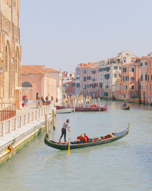
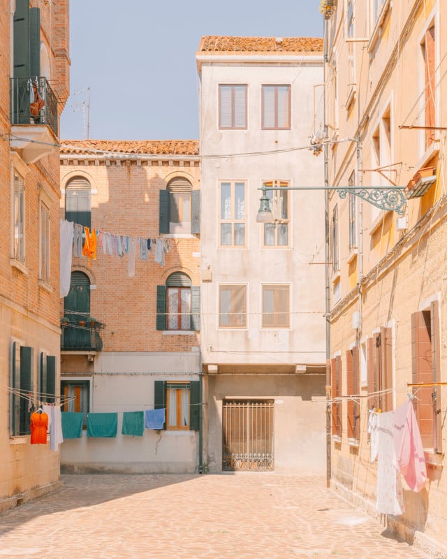
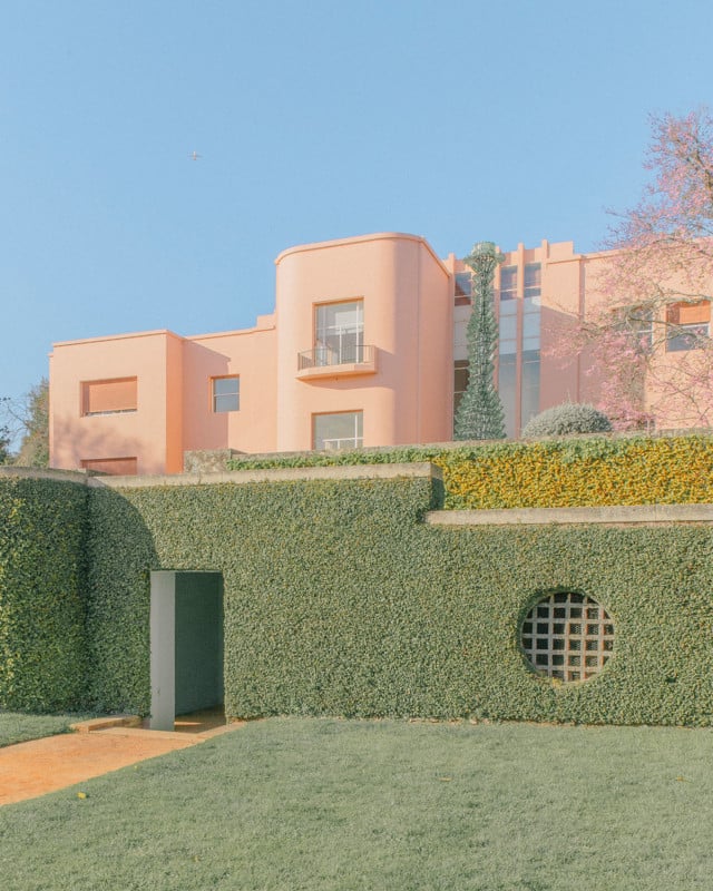
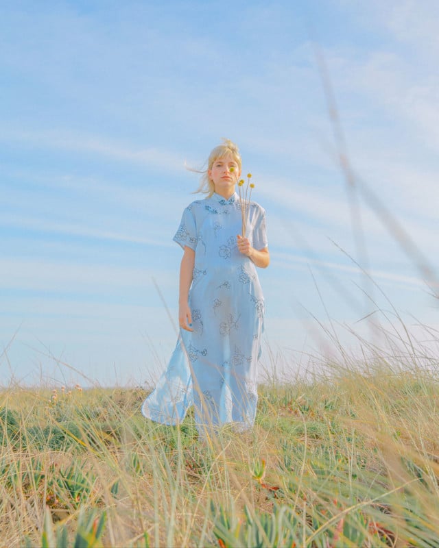
Photographer Paints Pastels with Her Camera
Teresa Freitas is a photographer, although her photographs look more like airy pastel paintings. Her imagery is not just art for art’s sake, but she makes a living as a professional photographer working with brands like Adobe, American Express, Chloé, Club Med, DKNY, Dior, Fujifilm, HP, Huawei, Issey Miyake, Montblanc, Netflix, Olympus, Pantone, Polaroid, and more.
“I was in a fine arts college taking my bachelors in multimedia art,” explains Freitas. “Decided to install Instagram on my phone. Started taking candid shots from home to school with my smartphone. Got some attention for it.
“Then editing apps started showing up, and I gave those a go as well, experimenting with creative editing. Photography in college was quite formal, and Instagram allowed me to be free and loose with whatever I wanted to share. Some brands started noticing my work… and the rest is history!”
Netflix was one of those brands that helped propel her photographic career. She won a challenge called “GramMasters” that took her traveling through multiple countries in Europe, and that’s when she started documenting places outside Portugal.
Freitas has been a full-time photographer since 2018 but started regularly working with brands in 2016.
“I think it [pastels] was a natural and instinctive development,” remembers Freitas. “Like a musician that finds the note that feels right. I found the colors that feel right to me. I don’t think there’s a very objective reason behind it. Pastel colors allow me to give a painterly quality to my images that I find compelling.”
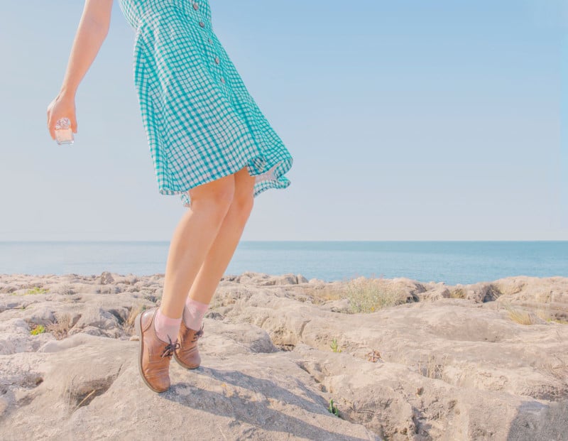
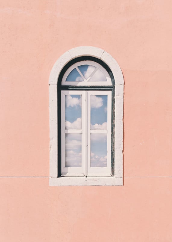
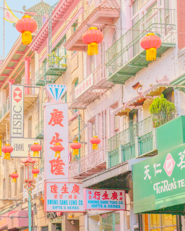
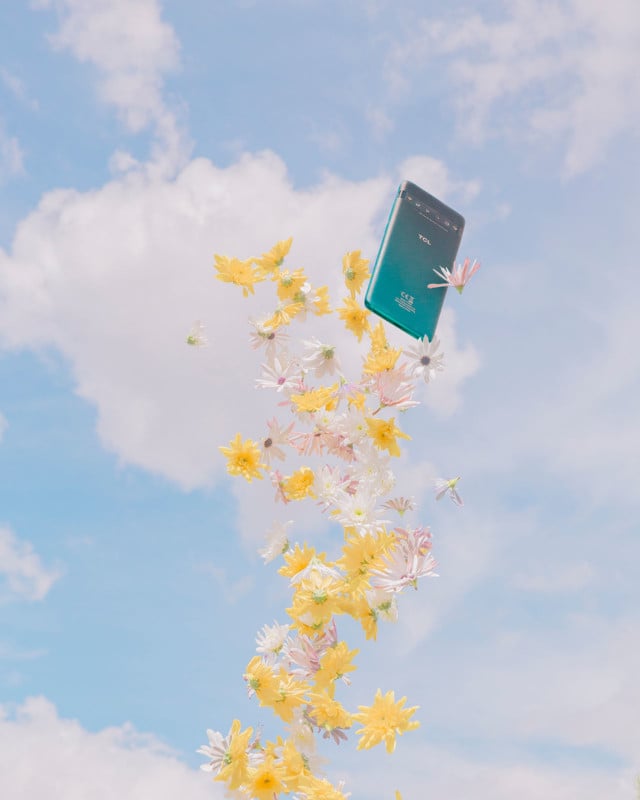
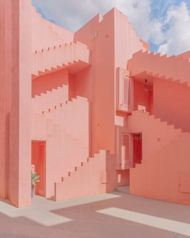
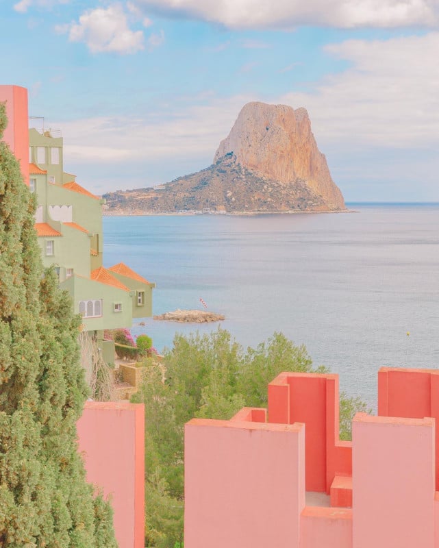
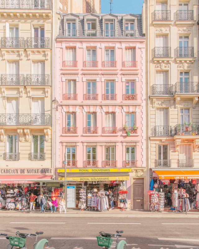
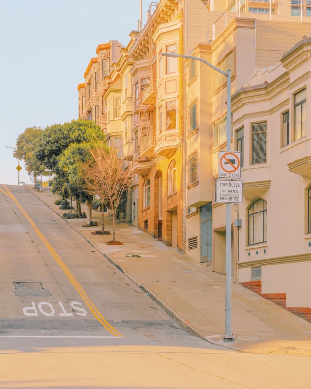
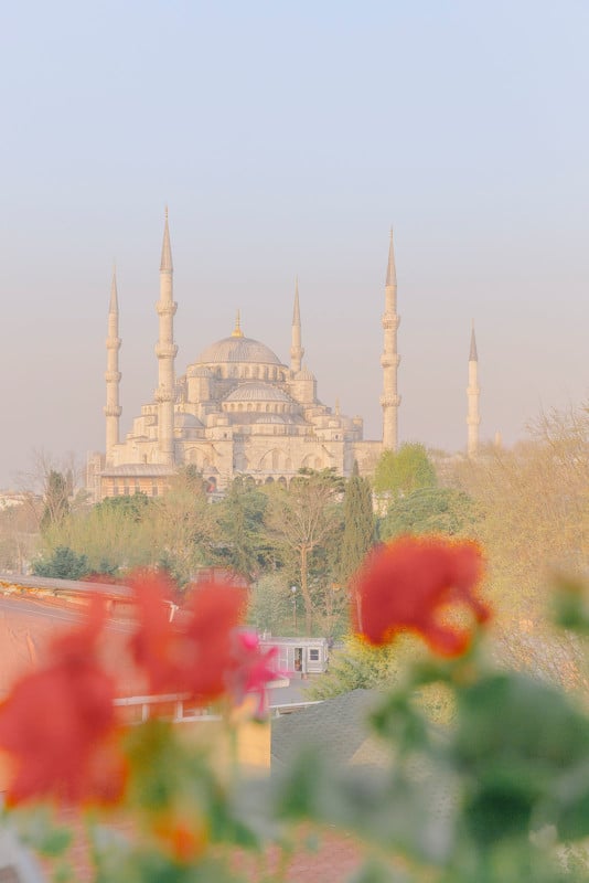
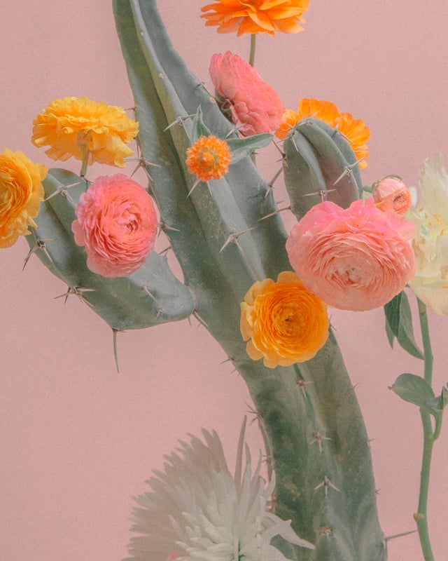
“I’d say that my aesthetic mixes both soft and pastel tones with more vibrant hues, especially in small details,” Freitas says. “I found it a visual combination that our eyes and mind aren’t very used to, so I try to employ them in each image. My color-work does focus on tinted colors nonetheless.”
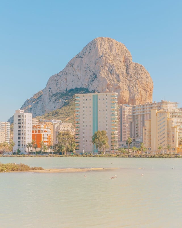
Freitas likes to take pictures in the same conditions of sunny days and in natural light to produce a coherent and consistent outcome in terms of color and tonality. Her ideal time for photography is mid-morning. She always edits all of her images with the same signature style she has been working on for two to three years.
As a photographer, it’s one reason she might stand out and what her work has been recognized for. Her work focuses on color. It wouldn’t make sense for her to use a completely different editing technique if it didn’t produce the same results, as she would “just feel that image wasn’t mine.”
Freitas is currently using a Canon 6D with a 24-70mm “in need of retirement,” as she is about to change to medium format, possibly Fuji GFX-50R or GFX-50S, Fujifilm GF 32-64mm f/4 R LM WR Wide-Angle Zoom Lens, and Fujifilm GF 50mm f/3.5 R LM WR. She also finds the newly introduced Fujifilm GFX 100S interesting as it “looks great, so compact for what it is.”
“The level of detail and sharpness that you can get [from medium format] is outstanding, namely for bigger prints,” rationalizes Freitas. “I’ve been requested some big sizes throughout the years, and I always sweat a bit about it. Am I going to make it? There’s also something very compelling about that medium format look that you just know it’s there. It’s about detail, depth, and quality.”
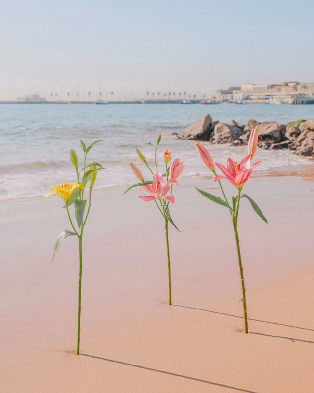
Pastels are basically colors mixed with a quantity of white, but then they have variations in vibrancy. Green is her favorite color (“Well, a certain shade of green,” she says). But she likes pink too, and you see it often in her imagery.
“After considering the colors in the subject of the photograph when I’m out shooting, you won’t see me take a picture of a black building, for example,” Freitas reveals her workflow details. “I move on to editing in Lightroom and focus on contrast, highlights and shadows, tone curve, and especially the HSL tool to tweak Hue, Saturation and Lightness for each color. If necessary, I’ll use the adjustment brush tool for specific details that might need extra tweaking. Pastels usually need higher luminance and lower saturation levels, removing contrast and shadows.”
Freitas likes waking up early and making the most of the light available throughout the day when traveling. She does walk around and shoot a lot but doesn’t shoot more than 1-2 images from the same scene. She developed that shooting style from film photography back in college, where you were generally taught to think about what you are shooting and “pressed the shutter only when it felt right.”
“Light behaves so differently, it can change the outcome completely when you’re editing,” says Freitas. “So, I never know exactly what I’m going to get. But I am trained in how to ‘filter’ the best type of scenes for my work.”
The photography classes that Freitas took in college focused on the subject matter and conceptual references to help define and develop artistic identity. They didn’t teach about the technical side, though, the camera settings or developing and editing that she had to learn by herself.
Freitas feels that Accidentally Wes Anderson is the ultimate travel guide as it really makes you want to visit all the featured locations.
“The obvious similarity is our approach to color as the ultimate tool to set a mood and make a scene stand-out, while also making it look a little bit off and not completely real, more imaginative,” says Freitas. “The differences, I’m sure there are plenty… a lot of people compare my tones to him, but the color palettes aren’t really the same.
“I view my images’ primary purpose as to provide a moment of pure visual pleasure. Focusing on color to change our perception of a place and subject. Before anything, art, for me, has to be beautiful. Meaning can come after and can be given by the viewer rather than the artist.”
In the near future, because of the pandemic and lockdown in Portugal, Freitas expects to be focusing more on still life and exploring the little details through the streets that can best describe this weird time we find ourselves in. She can’t really travel, so that’s how she’s planning to develop the next work over the coming months.
About the author: Phil Mistry is a photographer and teacher based in Atlanta, GA. He started one of the first digital camera classes in New York City at The International Center of Photography in the 90s. He was the director and teacher for Sony/Popular Photography magazine’s Digital Days Workshops. You can reach him via email here.
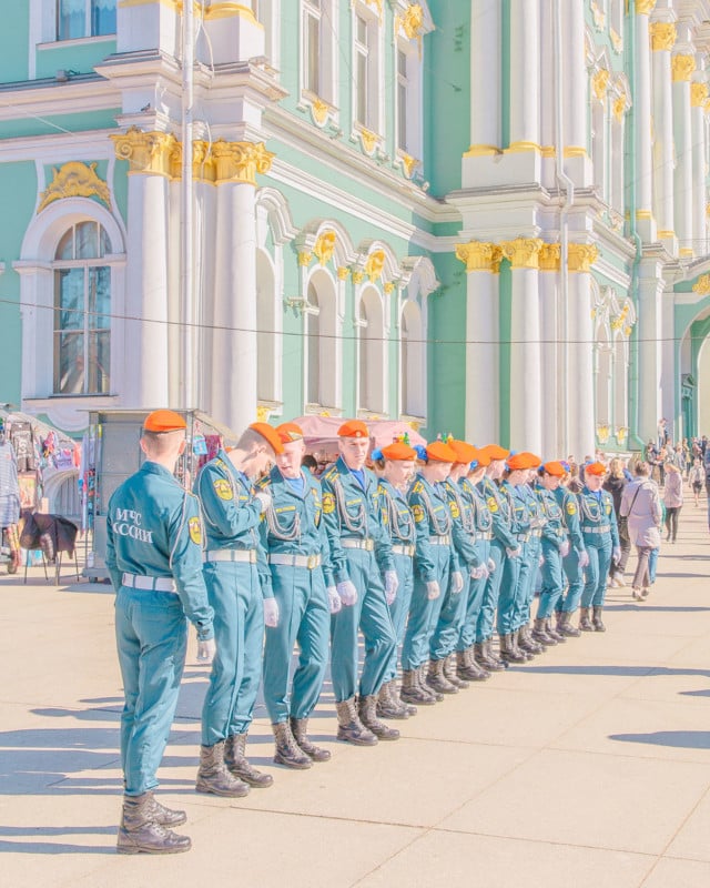
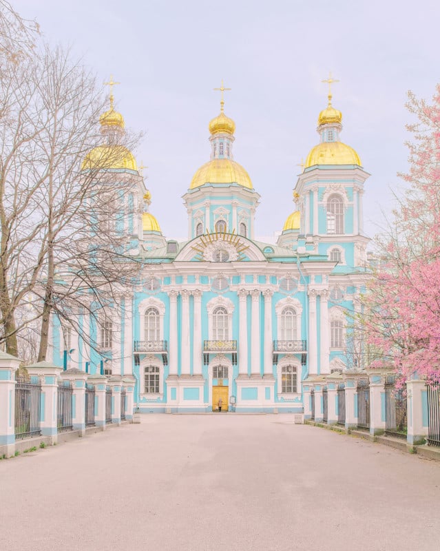
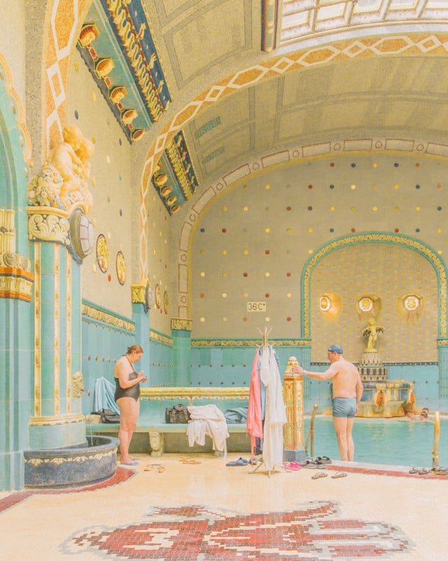
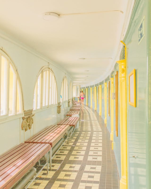
Image credits: All photos by Teresa Freitas and used with permission.