The Power of Transitions: A Theory of Landscape Photography:
![]()
What makes a great landscape photo, great? Some appreciate an image for its technical prowess or adhering to certain rules. It might be focused correctly and sharp throughout the scene. It could be well-exposed, offering wide dynamic range. Some like to see leading lines or the rule of thirds.
The topic of what makes a great landscape photo is one I’ve considered for many years (and one I’m still exploring). Recently, I’ve found that there’s a broad concept that encapsulates many of the aspects of great landscape photos.
One trait common to many compelling landscape photos is the concept of visual transitions.
As with everything in art, there is no one-size-fits all approach to great landscape photography. Nor should theories or techniques be too prescriptive, limiting our expression. But I want to explore here the concept of transitions—in their various forms—and how you might practically apply the theory next time you’re out in the field or back in your editing suite.
Big to Small Transitions
How many times have you heard that ‘photography is storytelling’? In landscape photography we often include foreground elements or compose the scene to reference the surrounding environment. Why? It’s to enrich the scene we are communicating with our audience.
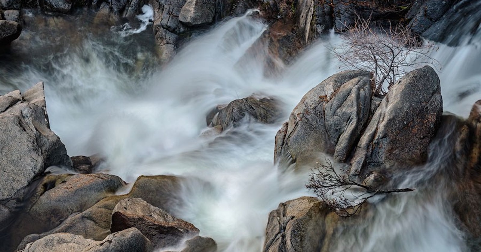
If we point our cameras directly at a grand waterfall or a bold sunset, great, but that’s just a pretty snapshot. It’s nice to look at, but rarely will it hold our attention. To do that, we must tell the richer story of the scene. While that’s a challenging task in a single static frame, surrounding elements—such as lush ferns or jagged rocks—can imbue the scene with deeper meaning.
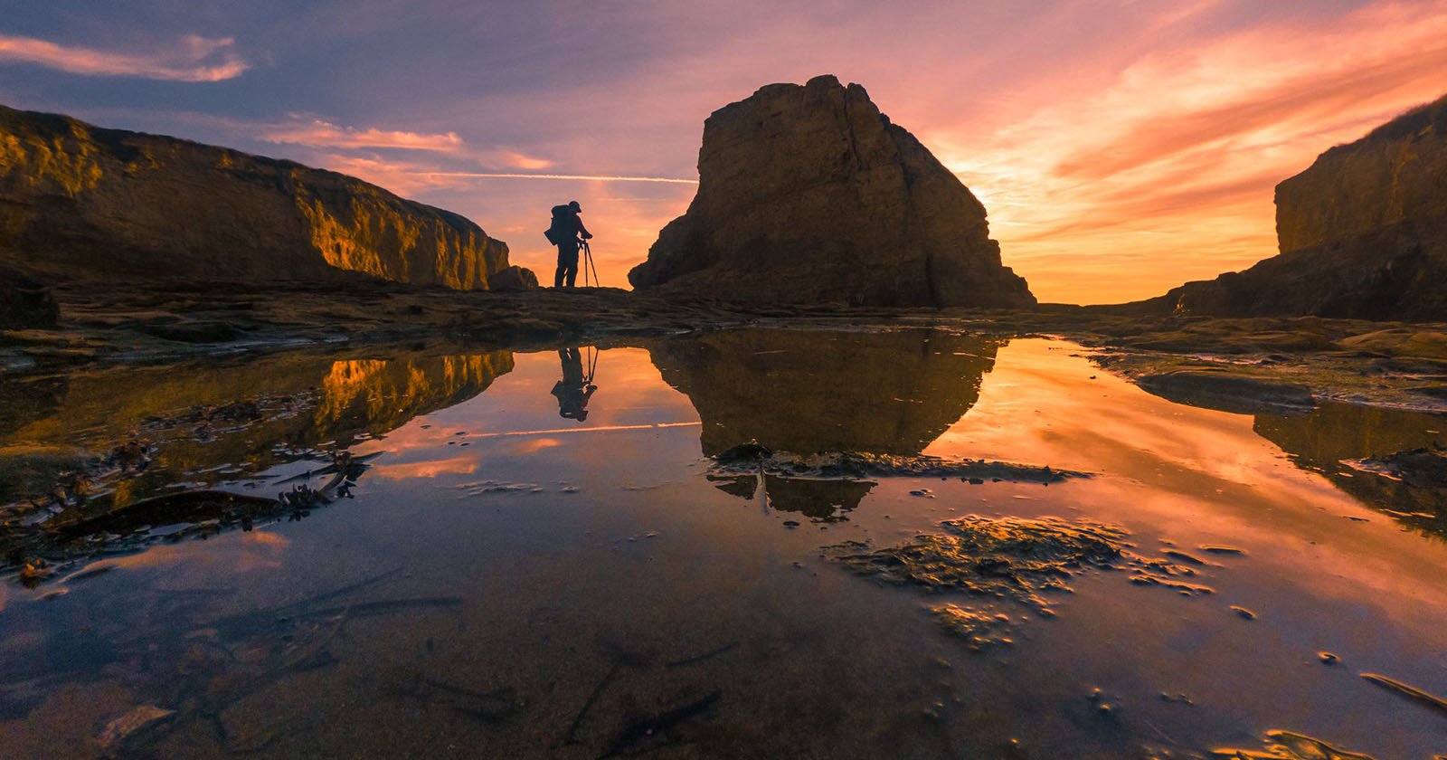
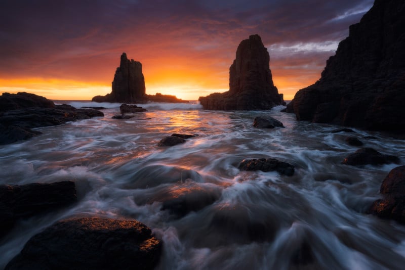
These contextual elements help to direct attention, guiding the viewer through the image, transitioning from near (big) to far (small).
If we simply point our camera at the primary subject and let it fill 80% of the frame, the viewer’s eyes will jump straight to the single, prominent element. Yet if we place the key subject in the top 30-40% of the frame, and fill most of the frame with foreground and midground, the viewer processes the nearer elements first (as the dominant area/zone). This offers viewers a richer understanding of the scene, before their attention turns to the key mountain peak/seastack/waterfall deeper in the frame.
Just because we have a striking subject to photograph, that doesn’t mean it needs to dominate the scene. Conversely, be careful not to make the subject so small as to be insignificant. Take time to consider the prominence of certain zones, and frame these to direct the viewer’s attention through the scene.
Dark to Light Transitions
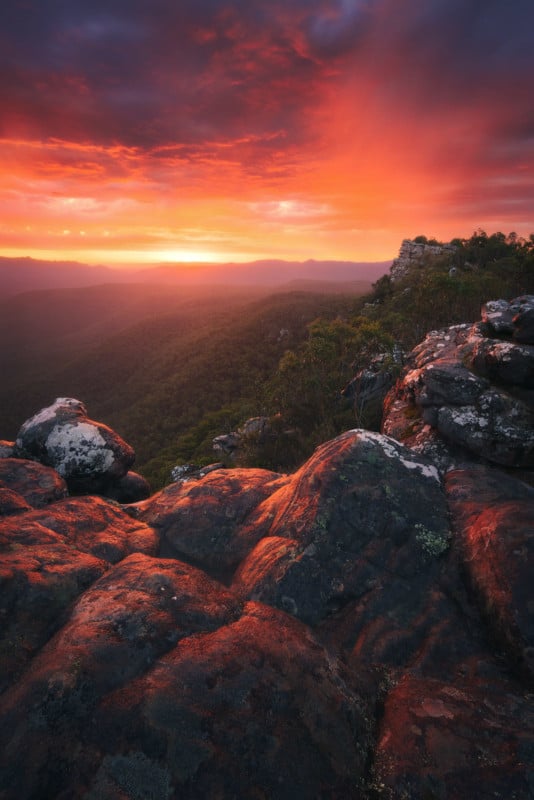
Like leading lines and the rule of thirds, many landscape photographers use vignettes and dodging/burning. Why? Our eyes are drawn to more luminous, brighter areas.
By darkening the edges of an image, we drift towards brighter areas in the centre of an image. Instead of applying a standard oval vignette across the image, examine the periphery of your scene. Perhaps there’s a bright patch of foliage in the corner, or a bright section of sky at the top. Then, you might look to selectively darken these more luminous regions to help the viewer’s eyes remain in the image and not wander off out to the periphery. I’ll often darken my foreground with a gradient, gradually transitioning to a brighter mountain peak or waterfall.
Likewise, dodging and burning helps to enhance the sense of depth in an otherwise two-dimensional image. Consider the natural direction of light and look to enhance this transition from light to shadow in post-processing, shaping how the light falls. As I often shoot seascapes on sunrise, I’ll dodge the side of the rocks facing the sun and burn the side away from the morning light.
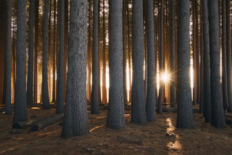
The key here is subtlety. Dark to light transitions don’t need to go from black to white. But I encourage you to be mindful of the luminosity across your images. Consider increasing the light around your primary subject and decreasing it around the less notable features—this is a great technique to hide messy, distracting undergrowth in forest scenes.
Cool to Warm Transitions
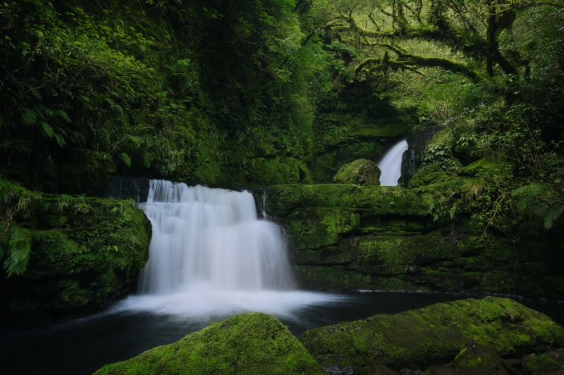
Sunlight is warm (both in temperature and in white balance), while areas of shadow are often cooler in tone. As with dark to light transitions, cooler areas tend to recede into the image, while warmer areas tend to be brought forward out of it.
It’s quite easy to enhance this natural colour separation in post-processing, just don’t get too carried away. Using luminosity masks in Photoshop (or a luminosity range mask in Lightroom), try warming up the brighter areas and cooling down the shadows (the Split Toning module in Lightroom also achieves a similar global effect). This separation between light and dark helps to create greater depth through the image. For example, in a forest scene, you may want to cool down the less important undergrowth areas and warm up the brighter fern fronds to better help them ‘pop’ out of the scene.
With the variety of colour combinations in landscape photography, there is no one size fits all approach, nor is there a single way to achieve a certain effect. The best approach to refining colour is to experiment and then critically review the impact. Did cooling down the entire image help to achieve a certain mood? Did adding warmth to the subject make it more prominent?
And like traditional light vignettes, a similar concept applies to colour vignettes. With our attention drifting towards the warmer areas in a scene, you may opt to cool down the periphery to prevent the viewer being drawn out of the photo.
Final Thoughts
Not every image needs or even suits the transition outlined above. A luminous high key image, such as a tree in snow, will be visually processed from light areas in the periphery to the darker tree branches. But it’s worth paying attention to how size, light and colour transitions influence how our images are perceived.
Likewise, transitions go beyond the three explored above. Sharp to soft transitions can also be used to enhance how your image is experienced. Sharpness naturally fades the further away a subject is—just take a look at distant mountain ranges next time you go hiking. So with your foreground and midground in focus, you might not opt to capture a frame focused at infinity, and instead mirror that natural clarity transition. Likewise, when sharpening for the web, you might exclude sunrise clouds from the final sharpening process to draw more attention to the sharper foreground and guide the viewer’s eye from near to far.
All these techniques can help the viewer to spend more time viewing your work and directly affect how your images are processed. What elements will receive more attention? What secondary elements can be enhanced to offer context and make the subject more memorable?
I’ve never been a fan of theory for theory’s sake. So I encourage you to be mindful of the concepts explored above—not all are appropriate all of the time. Instead, take time to appreciate the influence of transitions on how our images are experienced. Take time to critically apply theory (both in the field and in post-processing) in service of your creative vision.
About The Author: Mitch Green is an Australian landscape photographer. He can be found via his website, on Instagram, or down by the beach at 5am waiting for sunrise.