My Workflow for Editing a Watch Photo
Two years ago, I took an online class about product photography editing that completely changed the way I approach the photographic process. Coming from a background of street photography using film cameras, I have always been very “purist” about the whole process, trying as much as possible to preserve the original image by only making slight adjustments on light and contrast.
Where there is light, there must be shadow, where there is shadow there must be light. There is no shadow without light and no light without shadow. –Haruki Murakami
Part I: Image selection and rough composite
The first stage after importing the photos to the computer and making sure that they are well exposed and focused is to add the selected images as a stack in Photoshop and start playing with them to preview the final result.
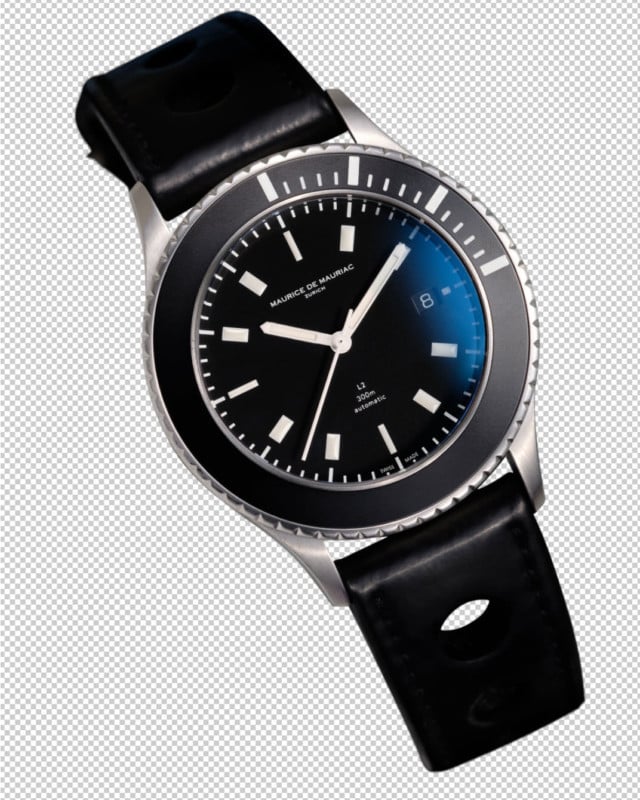
Wait? Did I say images? Yes, for several reasons, I prefer to keep the camera on a tripod and photograph with a single light source (usually a wireless flash) and make several exposures highlighting the different parts of the watch. Think of it as adding many small spotlights to fill an entire room with light. It’s a time-consuming process, but for me, it pays off in the flexibility it gives me during the editing stage. For this photo, I ended up using six photos that were later “blended” together in post. You can see the first composite with the rough layer masks in the picture below.
In this stage, I also take some time to adjust layer opacity and blend mode – most of the stacked layers are blended with the Lighten mode, which, as the name suggests, replaces the darker pixels by the lighter ones on the topmost layer. This “trick” allows me to start with an almost black shot, and lighten the watch parts without needing precise selections.
Part II: Isolate, isolate, isolate!
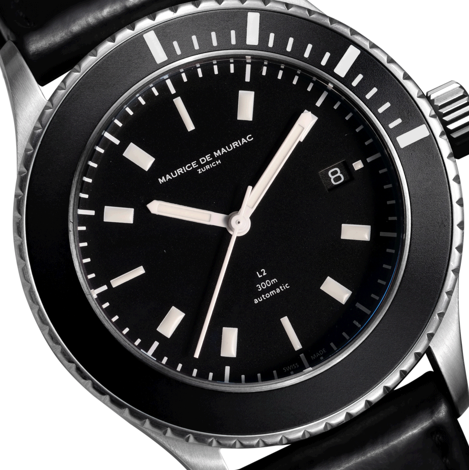
After making sure that I’ve loaded all the images that I need, I start “disassembling” the watch. Unlike most watchmakers, I prefer to use the Pen tool instead of a screwdriver to make sure my selections are pixel-level precise (and also, because there’s no screwdriver tool in Photoshop). This is a slow process, but it pays off if done right. After all the parts are isolated, you can make adjustments that will not affect the rest of the image (for example, you can change the strap luminosity without affecting the rest of the tones of the photo). Also, if you’re serious in photography editing, I recommend getting a graphics tablet, as working with a pen instead of a mouse makes the whole process faster and more comfortable.
The amount of selections and groups depends from image to image – if a watch has several sub-dials or parts that need to be lit in a particular way, I would have to isolate those as well.
The animation below shows how I “built” the dial with two photos for the markers (to make sure they were evenly lit) and an additional photo for the blue reflection on the sapphire crystal.
I always try to include this subtle reflection, as I feel it adds depth to the dial. For this Maurice de Mauriac, however, this blue reflection ended up being the main subject of this photo, as I’ll explain by the end of the article.
Part III: Time to clean
Because we are working with tiny objects, every bit of dust or small scratch will be visible in the final result. For an Instagram post (where the picture will be viewed on a small screen) most of these worries are unnecessary, but for printing or displaying on a large screen, it’s vital to clean all the dust and scratches from the photo – some of them highlighted in yellow in the picture below.
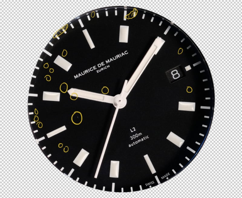
I am by no means an expert in dust removal, so I try to do it as swiftly as possible and without losing details (such as the dial texture or the case brushing). When you are dealing with a patterned dial, this process can become quite tricky, and that’s why it’s essential to clean the watch properly before photographing it!
Part IV: light and color
Ok, so far, we spent a few hours making selections and cleaning dust, and as a result, we got our base image to start doing the actual creative work. By adjusting the light, color, and contrast, we can change the mood of the image to what we had in mind, and also make sure that the image tones are pleasant and balanced.
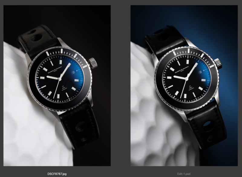
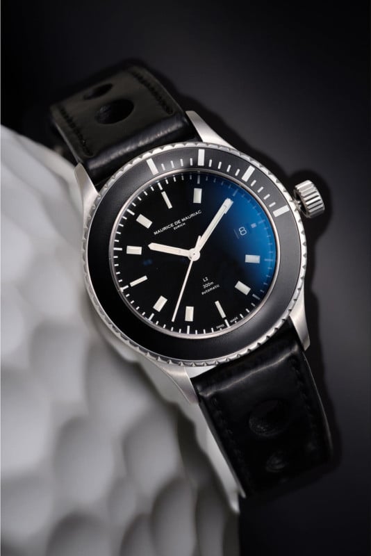
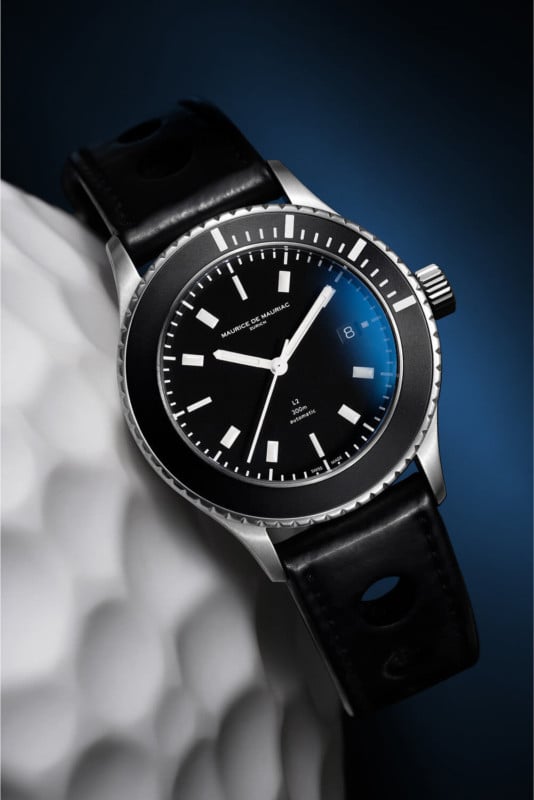
I guided you through my editing process, but I forgot to tell you what was the concept behind this photo. During my first experience with this Maurice de Mauriac L2 Diver, I noticed the durable blue AR coating on the domed crystal, visible in almost all light conditions. When I asked Daniel Dreifuss (the brand’s founder) about his choice for the watch coatings, he explained to me that it was intentional, as the blue glow adds some “mystery” to the dial.
With that in mind, I decided to make a photo that highlighted this detail by forcing a subtle reflection on the dial and a matching shade of blue gradient in the background.
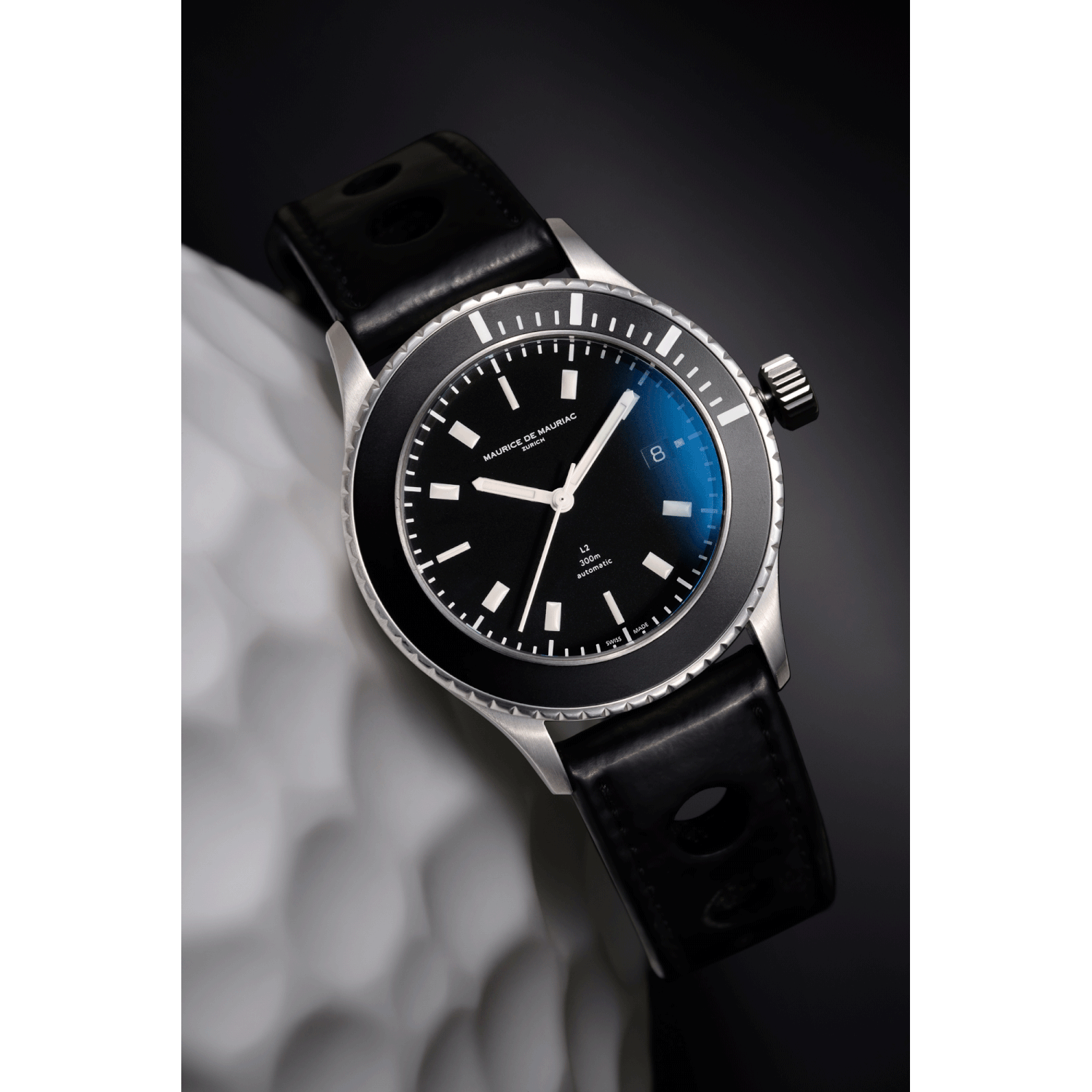
As you can see in the animation above, both the blue reflection and the background gradient were captured in-camera. Still, as you probably noticed, the original background gradient looks grey instead of blue. This happened because, for the background, I placed a piece of black cardboard away from the camera and made a separate exposure using a focused beam of light, which resulted in a grey area surrounding the watch. To match the blue from the crystal reflection, I added color to the background layer, making sure that the “glow” color was a perfect match to the reflection. Again, all about isolation and control!
You can also see that in this stage, I removed all the colors of the image except for the blue – steel typically reflects a red/yellow tone, but in this case, I wanted a calm color tone, so the yellows had to go away.
Part V: Final touches
After the light and color corrections, I usually leave the image for a few days and return with a fresh look – after a few hours with a single image, I start to miss the small details, so it’s always good to take a break before finishing the edit.
When I open the picture again, I search for flaws in the selections, areas that may need retouching or that are too bright or dark. I also take this time to correct the crown (since most of the photos are made with the crown out to stop the movement and place the hands at 10:10), which happens to be a simple task because of all the previous work isolating the different watch parts.
The last step is to export the image for the desired output format, depending on if it’s a print or a social media post. I think that exporting for Instagram deserves a dedicated article in the future, but you can see the final photo below.
As a concluding thought, I’d like to say that Photoshop is a potent tool, and it’s straightforward to overdo edits and make them look unrealistic or simply too perfect. In photography, we deal with real-life objects, not with 3D renders, so it’s only natural to accept small imperfections in the final result. That, in my opinion, is what makes a photo believable! For that reason, you can see that in my photo editing, I never altered the watch, all the pieces that compose the image were taken directly from photographs, and the adjustments were kept to a minimum. This is especially important when you’re photographing a vintage watch for sale, as removing a scratch or mark becomes completely unacceptable, in a situation where showing the piece’s condition is the primary goal of the photo.
P.S. I couldn’t end this article without thanking Miguel Seabra for all the support in my watch photography journey and for lending me this Maurice de Mauriac to photograph in my home studio.