Rant: How Sony Can Fix the Terrible Menus on Its Great Cameras
Many Sony shooters rave about their cameras but rant about the menu systems within them. Camera reviewer Maarten Heilbron has some ideas on what’s wrong and how things can be improved. Here’s his 11-minute video “rant” on the subject.
With the introduction of the new a7R III, Sony has adjusted the menu. Heilbron hoped that with this new generation of cameras there would be a completely redesigned menu, but he was disappointed.
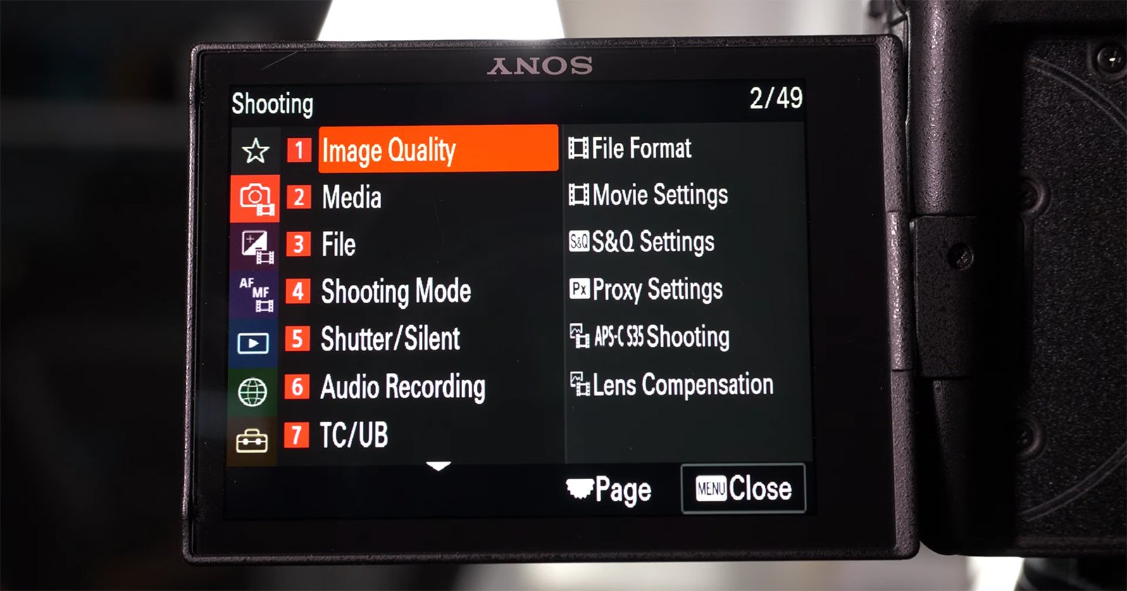
There are a whopping 181 settings, excluding “My Menu,” in the A7R III’s menu. That’s a lot of options that would clearly need some proper organization to avoid having things get messy.
First off, Heilbron suggests that there is clearly room for another tab at the top of the menu system, but this hasn’t been utilized and that only increases the number of pages that need scrolling through.
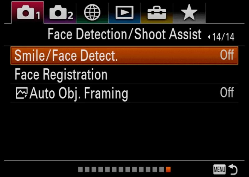
The squares at the bottom only take up space and “duplicate” the page numbers nearer the top. Since these cameras have touch-enabled screens, why is this not possible to use in the menu? Heilbron thinks that’ll make things a lot quicker to navigate.
Another major hang-up is that it appears similar settings are not clustered together and are instead “interspersed” with completely irrelevant settings. This makes it a bit of a minefield to navigate.
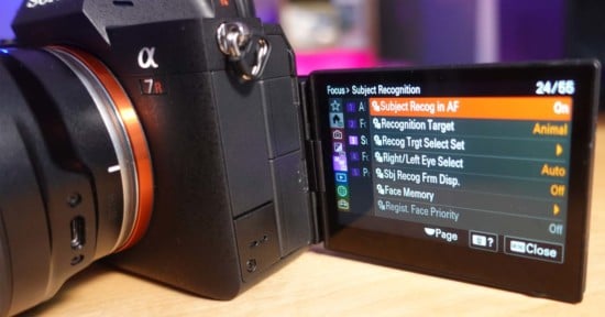
Heilbron likes the changes to the Custom Key selections, which now let you move between pages rather than scrolling an “endless list.”
However, it seems there is still a lot of work to be done. Check out the video above to hear more of Heilbron’s thoughts and suggestions regarding Sony’s menu systems.