How the Leica Logo Has Changed Over the Past 100 Years
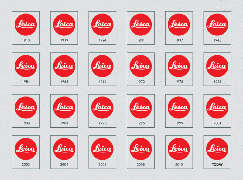
Here’s a helpful graphic that shows how Leica Camera’s famous red circle logo has changed and evolved over the past century, from its creation around 1913 up to the modern day.
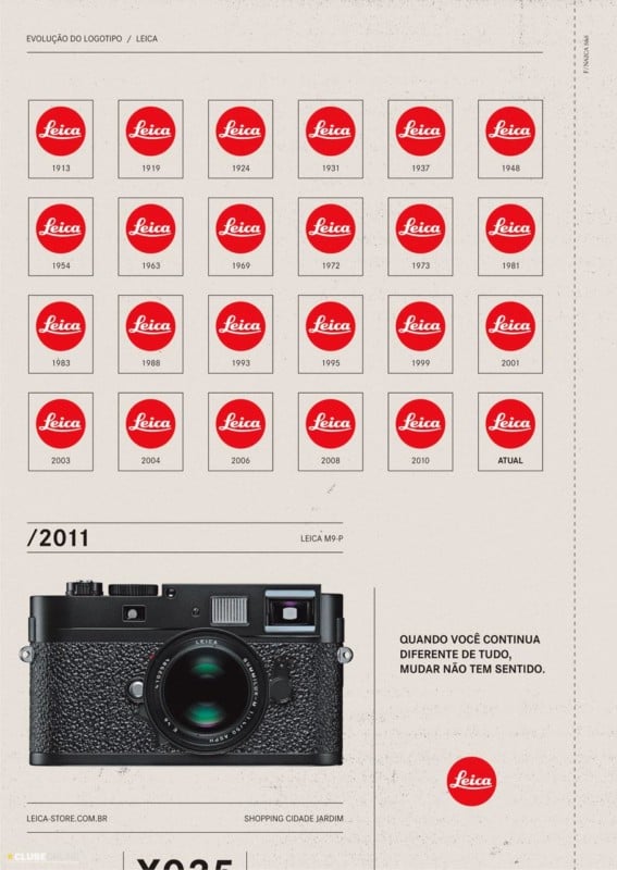
By comparison, companies like Canon and Kodak have seen their logos become completely different from what they were when the companies were founded.
Related Articles


Discussion