How to Edit Color For Consistency and Create Your Own Style
An important part of developing your own editing style is the way that you color grade your images. Photographer Sean Tucker explains his approach in this 15-minute video, showing how he uses edits his photos while adhering to a consistent color palette.
“It means that someone can trust that if they put an image in front of you or a style they want, that you are capable of nailing that on a consistent basis,” he explains.
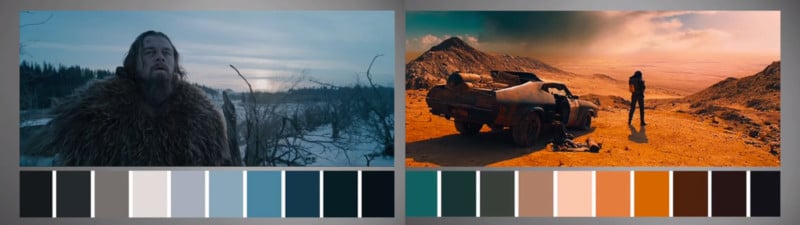
Tucker runs through some examples from cinematography, showing how a color palette is not just about what colors are used, but also about colors that are removed or dampened. Though cinema is probably more stylized that what you want to achieve with your photo editing, it is a good example of how grading can create a certain look or feel.
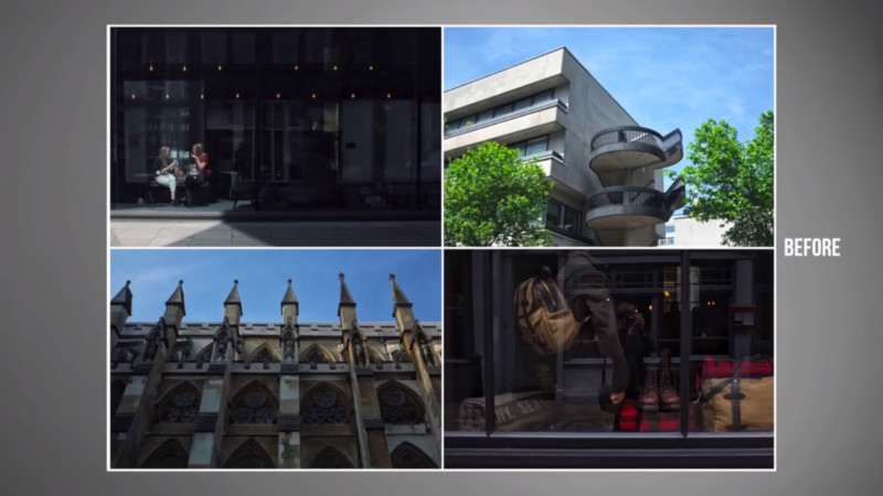
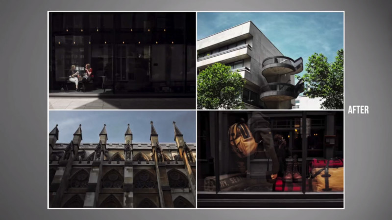
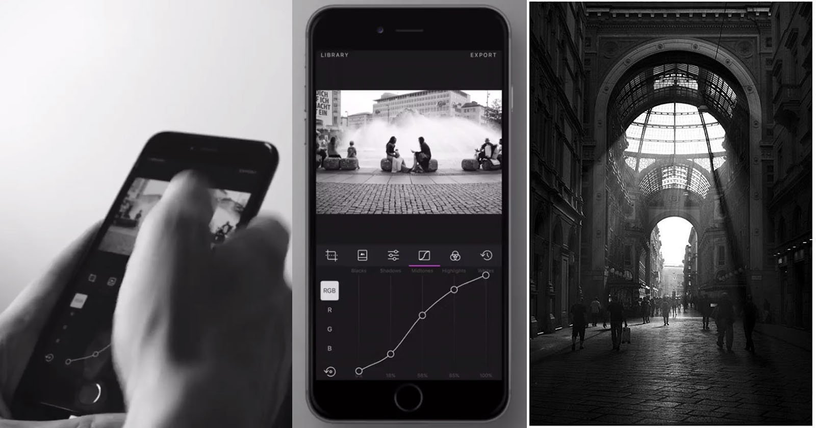
From 7:20, Tucker shows how he uses HSL sliders and some other minor edits to bring together 4 images that have different colors and tones out of the camera. He uses his preferred mobile editor, Darkroom, but the knowledge can be applied to any program that allows editing of colors.