Retouching Interiors in Lightroom and Photoshop: A Crash Course
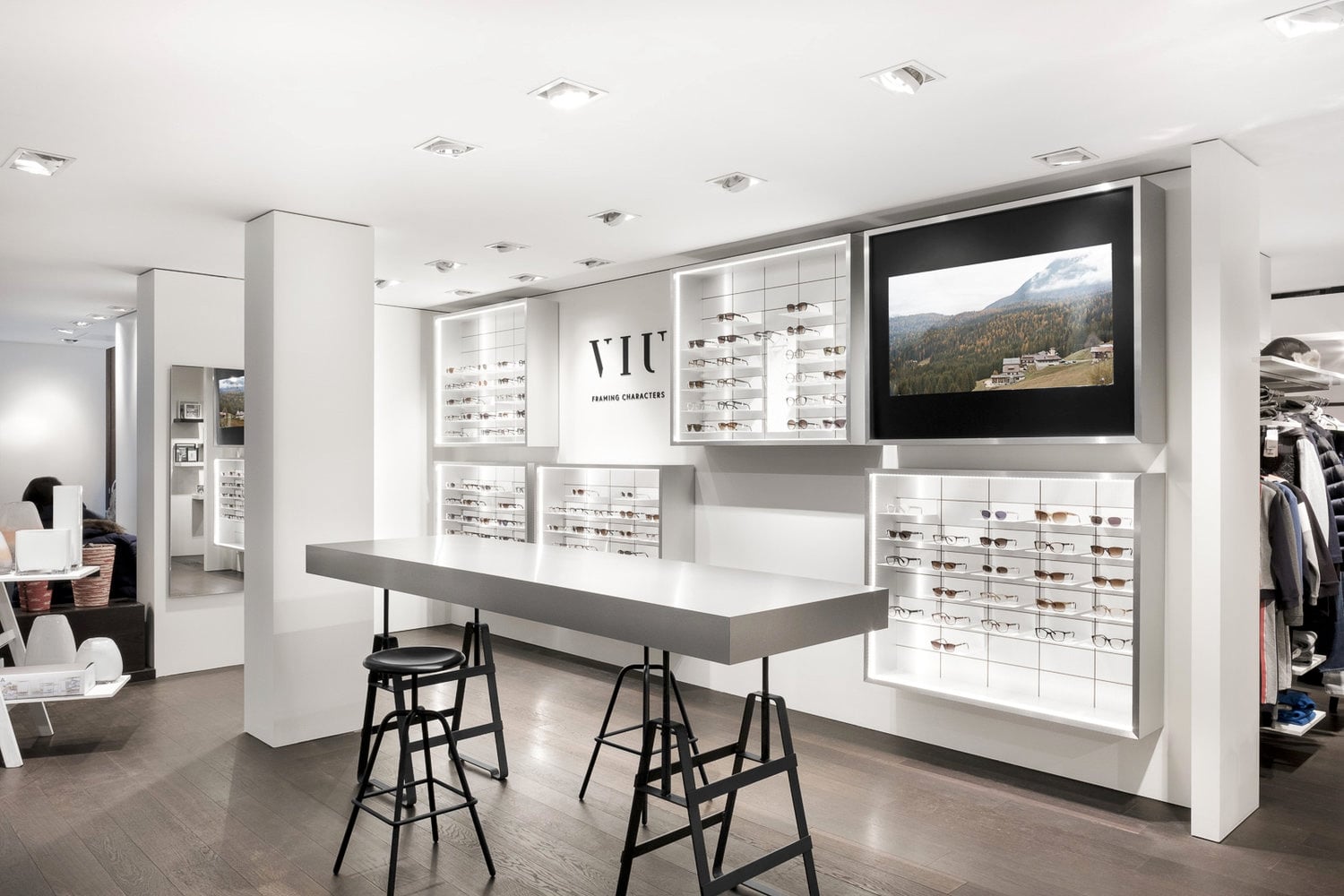
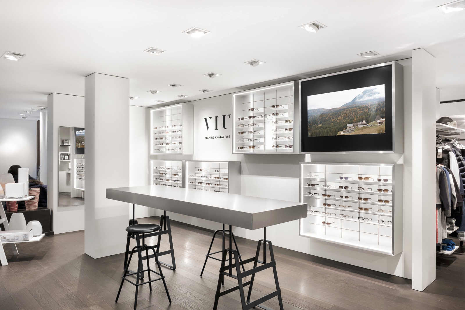
Here’s a typical quick interior photography assignment for a Swiss brand called VIU Eyewear. They contacted me to create three images for their website/social networks. The only rule was to stay in the same style than their other images on their “Stores” page (something simple, white, and luminous with an emphasis on interior design). Here’s how I shot it and edited it.
Shooting
The location of the store is in Geneva, Switzerland. I took my Fujifilm X-Pro2 with two prime lenses—the XF 16mm f/1.4 and the XF 35mm f/1.4—as well as a Cullmann tripod with a Benro B4 ball head. For this kind of job, you don’t really need a zoom lens because you can move around and you work on a tripod anyway.
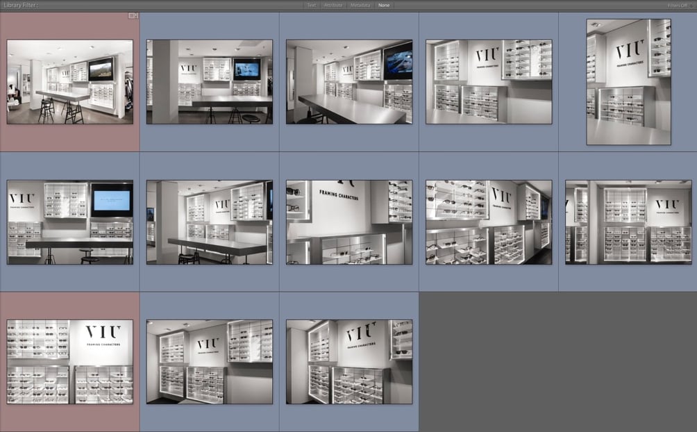
It is not a dedicated store, it’s a shop-in-shop, so I had to reflect that. That is why I also included in the frame parts of the surrounding shops (to show it’s inside another store). Here are some of the images I shot there, the ones in red are the final images, the blue ones just have a basic style and white balance applied.
Editing in Lightroom
Here’s one of the RAW image imported in Lightroom (compressed .RAF file, I don’t use DNG). As you can see the white balance is a bit wrong, I had my white balance on Kelvin at 3600K. But that’s not a big problem.
I set up my XF 16mm to f/11 on most images for two reasons: the first is that I wanted a bit of glow around the highlights (tiny sun stars); the second reason is that, on this particular lens, if you go beyond f/11 it starts to get soft at the edges.
I also had my exposure compensation set to -1EV in order not to blow the very bright highlights (using metering mode: multi) and I used a 2-second timer (to make sure there was no shake due to pressing the shutter button). Now, let’s look at what needs to be fixed in that first image…
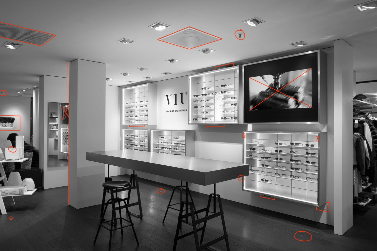
Before starting to edit further my colors/tones/light etc… I always start by removing things I don’t need in the shot.
First thing and probably the most important, especially for interiors, is to fix your verticals (look at the column, it’s not straight). For this, I use the Transform tab under Develop in Lightroom or use DxO Viewpoint (standalone or Photoshop plugin). Once that’s done, you can start editing the rest.
Here I removed a bunch of things: the fire detectors, the speakers on the ceiling, scratches on the floor, and the electrical plates on the bottom right, for starters. Some of the displays also had defects and small metal plates (to put a glass panel). Before taking that shot, I also made sure that all the glasses were lined up correctly, that there was nothing on the table (removed flyers and a plant) and also that the seats were lined up under the table.
If you can fix it before taking the shot, do it.
To remove elements, I first start in Lightroom with the spot removal tool; for more complex things I move to Photoshop (more details later).
Tip: deactivate the noise reduction and sharpening when you edit your images in Lightroom because it slows everything down. Create one preset that applies the default sharpen/noise reduction and one preset that turns it off so you can quickly toggle it off/on.
Local Adjustments
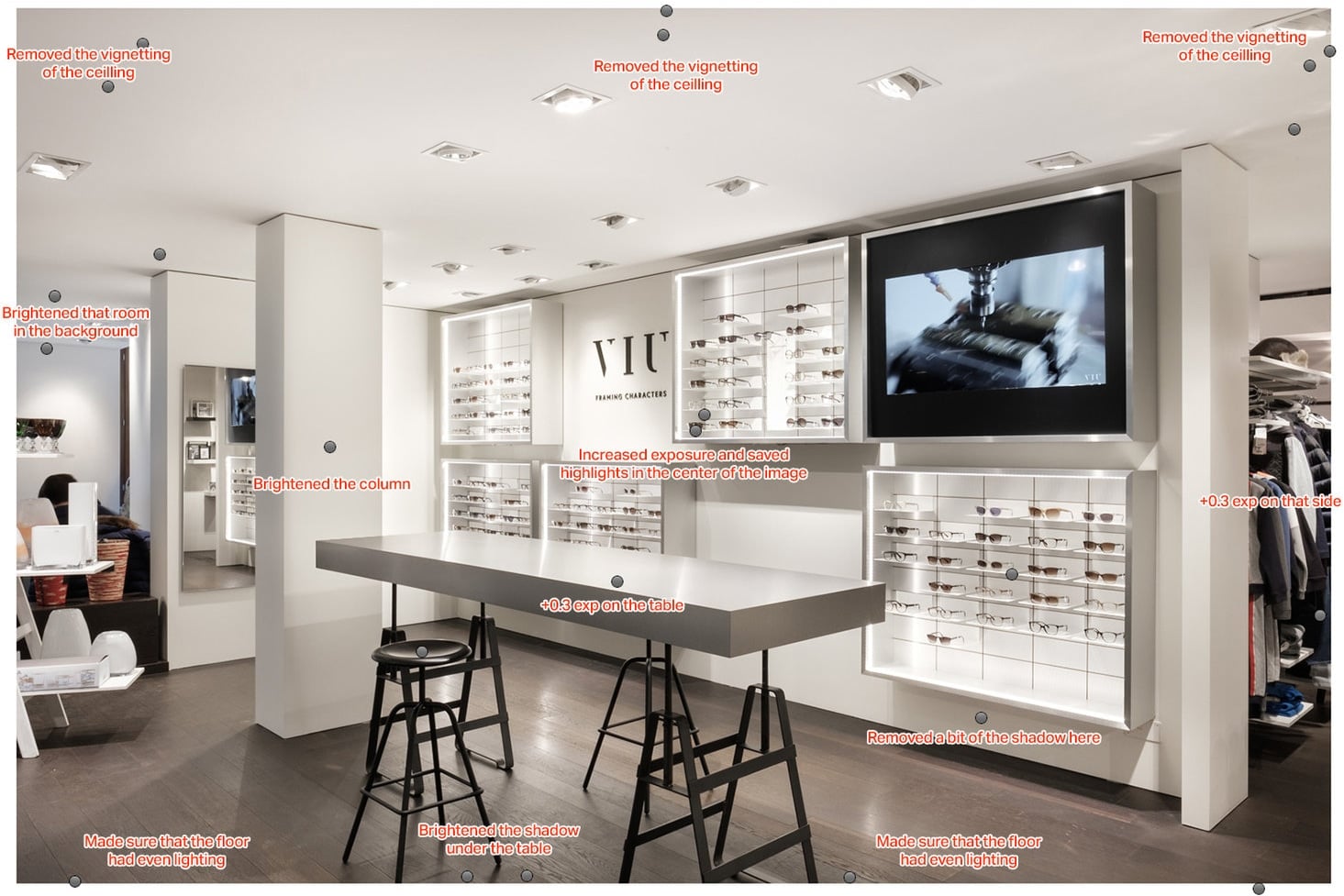
As you can see, the role of the local adjustments I made was mainly to fix the darker parts of the image— to add light where there was not enough, without using flashes. Because I’m shooting at ISO 200, and because Fujifilm files are ISO-Invariant (read more about that here), I can easily push the exposure and shadows without creating too much noise.
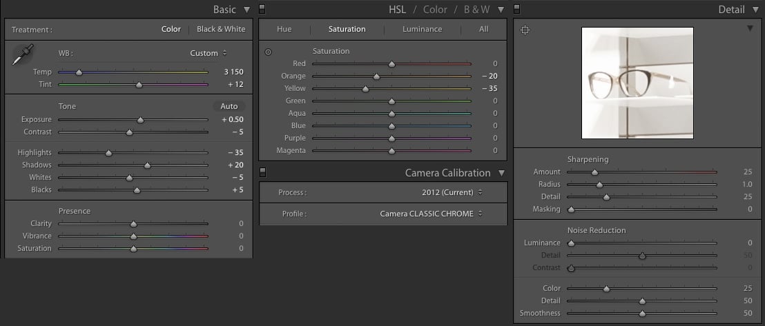
Here are the settings of that image. Basic stuff: I fixed the WB and increased the exposure a bit, saved highlights and shadows, and reduced the orange/yellow color cast. In term of sharpening, I’m using Fujifilm RAF files so I don’t really need to change anything, no need for noise reduction (200 ISO). Also, I set my camera calibration to Classic chrome.
Editing in Photoshop
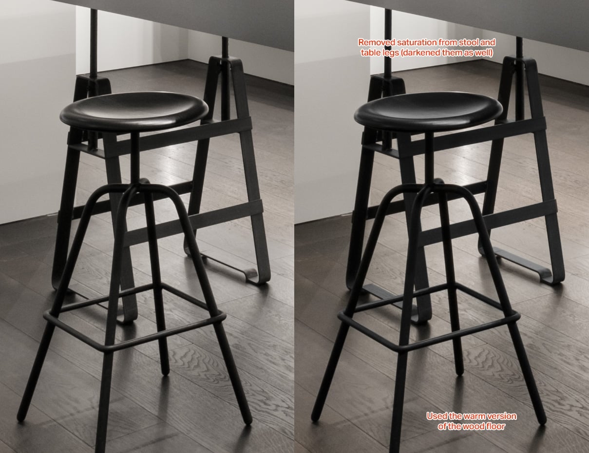
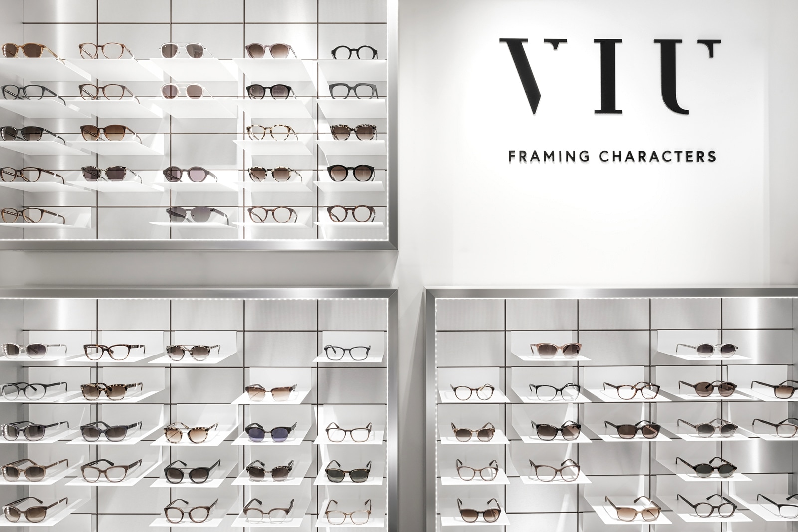
Now that I have a “proper” image, I export it as a 16bit TIFF file and open it in Photoshop. Actually, I export two files: the one you saw above (that still has a strong yellow tint) and another one with vibrance/saturation and yellow/orange toned down even further—an almost black and white version of my image.
Here’s the difference between those two images:
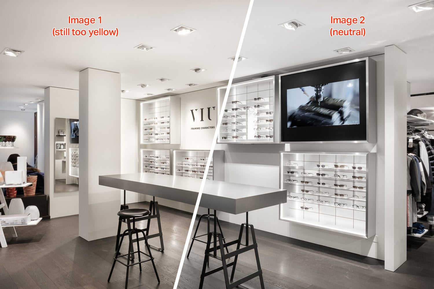
By having those two variations of the same image on two layers, I was able to bring back some of the “yellow and warm” tones from image 1 onto image 2.
Here’s an example, the display on the right. The first thing I did was to add a bit more light inside the top part of the display, but I also made a mask to bring back proper colors from the glasses. Notice how the glasses stand out more on the right image? That’s because they are more saturated.
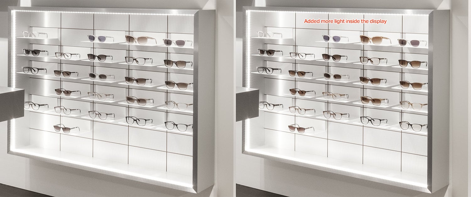
Same thing with the wood floor and the chairs/table leg. I used the floor color from image 1 and applied it to image 2. These seem like small details, but when you look at the overall final image, they really make a difference.
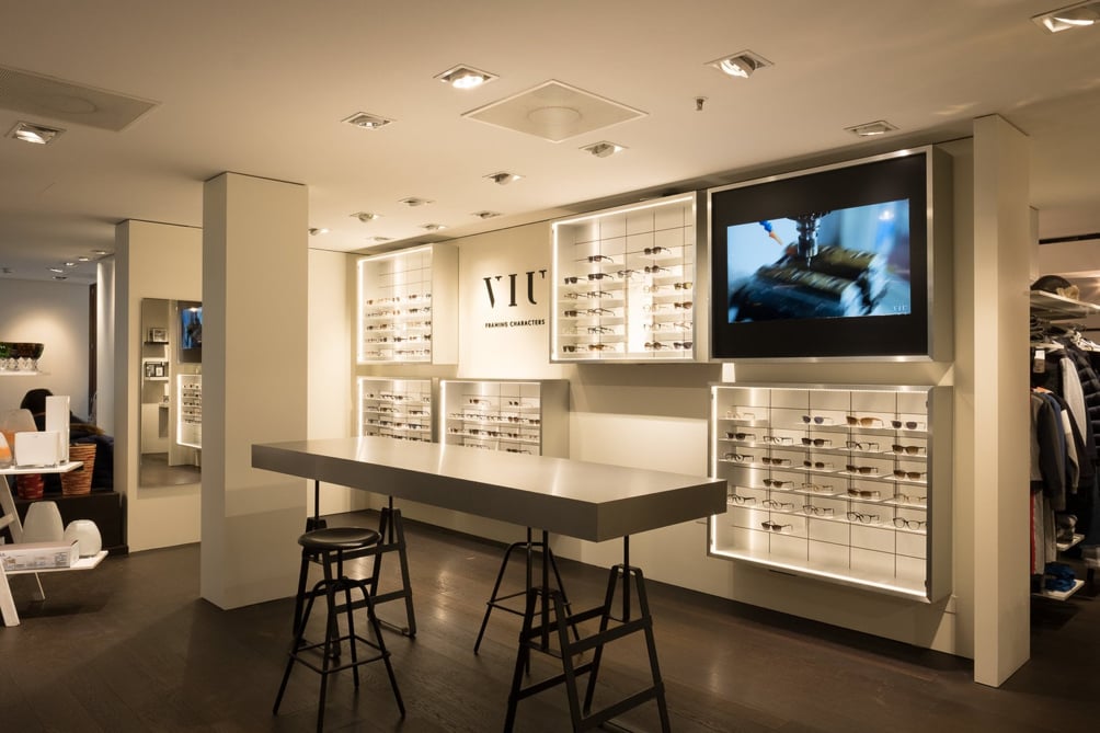
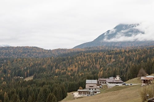
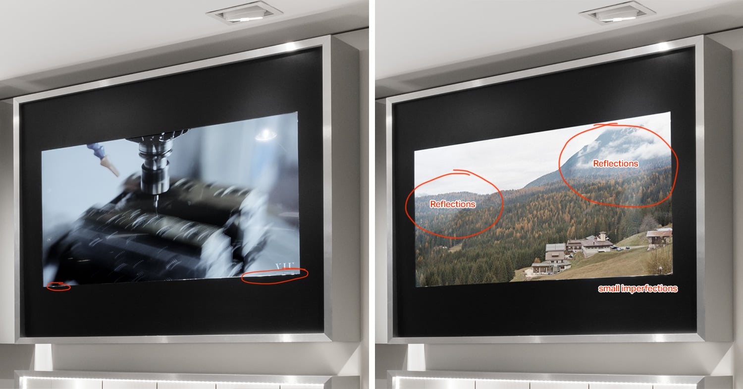
All I had left to do was to change the TV screen (and its reflection in the mirror). The client provided me with this simple .jpeg file:
The first thing to do is to create a rectangle over the existing screen, approximately the same size/ratio than the screen size. Then you convert this rectangle into a smart object, double-click on it to open it then paste your image (the client .jpeg). After that, you can deform your smart object (the rectangle) using transform > perspective (or torsion, or free deform) to match the TV screen perspective and size.
If you need to change the image afterward on the screen you can still double click your smart object, paste another image and it will update. So for example if your client sends you another image to use, you don’t have to paste it, deform it again etc. It can be auto updated.
Below you’ll see the before and after. It’s not just a simple copy paste > deform. I made sure to keep the little imperfections around the screen, and I masked the reflections and the spotlight back in. Because without those imperfections and without those reflections it’s clearly visible that it’s a fake screen.
I also changed the contrast/lightness, blurred the screen a bit, and added noise (to match the original image).
I also made sure to correct the reflected image of the TV screen:
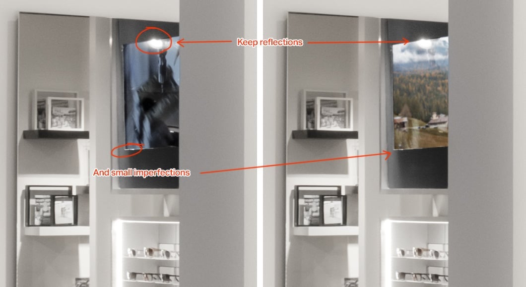
Tip: if possible, ask the people of the store to turn off the TV screens, this way you’ll have a black screen containing only the reflections of the spotlights/environment. By copy pasting that black screen on a new layer on top of your “fake” screen in soft light blending mode, you can easily add back the real reflections.
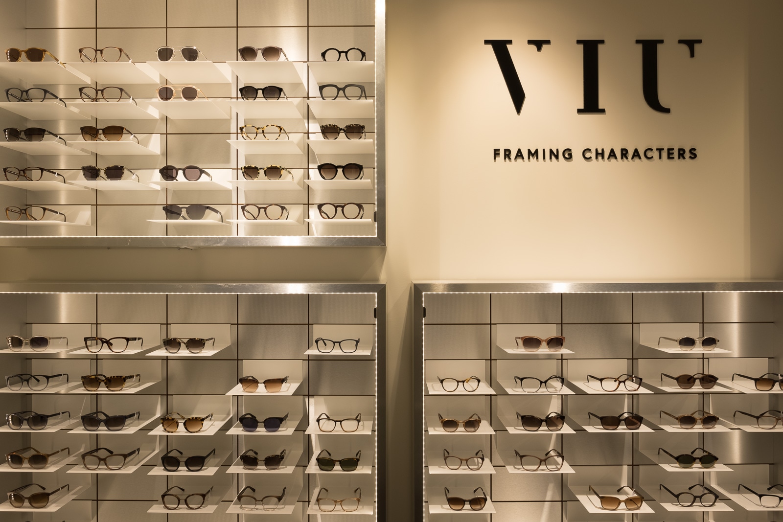
Final Images
Here are the final before and afters:

Exporting for the Web
I saved 1600px JPEG files to use on my portfolio and I wanted them to be extra sharp, like really crisp.
In Photoshop you can just do “save for the Web,” then put 1600px in the width and set the quality to “bicubic sharper.” In Lightroom, you can just export as JPEG and set “output sharpening” to “screen” and amount “low” or “standard” (I use “low” 99% of the time).
If you want something even sharper than this, you can use Intensify on a Mac. Set micro-sharpness to 100% and add some micro-contrast (they call it “pro contrast”). It won’t make a huge difference, but you’ll definitely have a more detailed image.
About the author: Samuel Zeller is a freelance photographer based in Geneva, Switzerland. He’s also a Fujifilm ambassador and the editor of Fujifeed magazine. You can find more of his work on his website or by following him on Facebook and Instagram. This post was also published here.