The Myth of Color Management
It is often stated that, for photography, it is vital to use color management within your workflow, so that you can ensure accurate colors for your work.
Although the whole subject is extremely complex, which I certainly won’t cover fully here, it basically stems from two components: light, which is at the very heart of everything we see, and our visual perception of it.
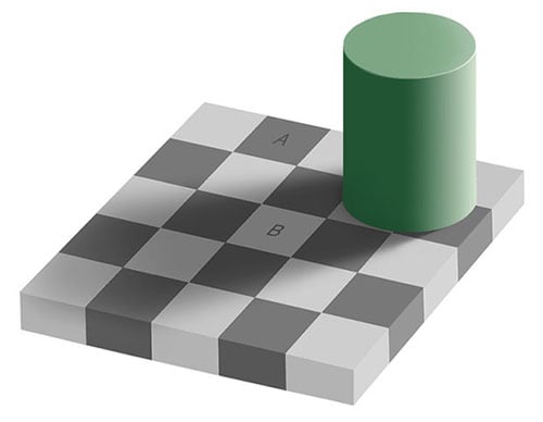
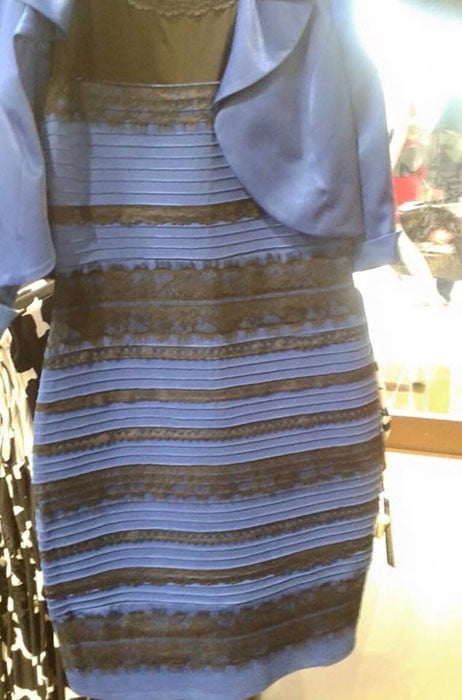
Immediately, the complexity raises its head, as what your eyes “see” is just an interpretation, rather than what actually exists, and is most easily demonstrated by optical illusions and color blindness. We continually need to bear in mind that what we believe we see and what is actually there are often two entirely different things. Remember the recent black/blue or white/gold dress conundrum?
So, do we accept this complexity and weave it into our workflow, or do we ignore it completely to make life, on the face of it, simpler? As so often, the answer is: it depends. To inform ourselves regarding this decision, we need to understand what is happening, what result is wanted, and what options are available. So let’s start at the beginning!
Obviously, this is about color, so what exactly is color? In purely technical terms, it’s a description of a given wavelength of light that we can see. However, the “seeing” part is fully dependent upon our brains and here we have the first consideration. While we can precisely measure a wavelength of light, maintaining the accuracy of that by vision alone is impossible.
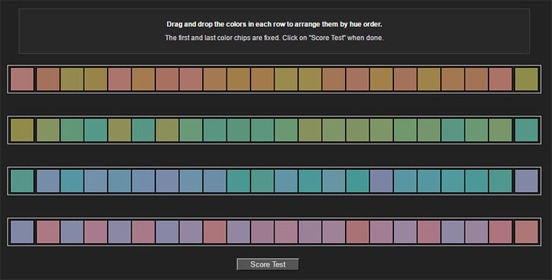
There is plenty of research into our ability to recall colors accurately and it is amongst the worst of our abilities to remember. Also, our ability to discern colors varies from person to person. Some will do this online color test well, whereas others will be poor.
Therefore, unless you have the ability to measure the precise color at the time of taking a picture and then do the same to the resulting image, it would be impossible to judge the accuracy, even though it may appear to be perfect.
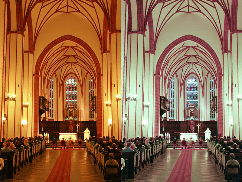
A second issue that affects this is how our brains interpret what we see. For instance, if you attend a wedding and the church is lit by sodium lights, should you ask someone what is the color of the bride’s dress they will almost certainly say, “White!”. What they are actually seeing will be an orange dress (a very specific orange pertaining to the narrow band of sodium light), but because their brain “knows” about sodium light it adjusts the perception. We put things into context and it is exactly the same reason for the blue/black, white/gold dress discussion.
So if we were to take a picture of the ceremony and then reproduce it, what would look right? To be technically correct it should be shown in shades of that very limited orange spectrum, but because the context is different it would be unacceptable. The dress would need to be white. Unfortunately, it isn’t as simple as that, because if we adjusted purely for the dress and made that perfectly white, the colors of all other objects would change too and would look equally as incorrect; all the guests would have those blue faces we don’t want!
Even for those technically adept, setting ‘White Balance’ in the camera isn’t entirely successful as the available spectrum doesn’t allow for it, so we need to find a middle ground based on little but our perception to produce an appealing and acceptable compromise.
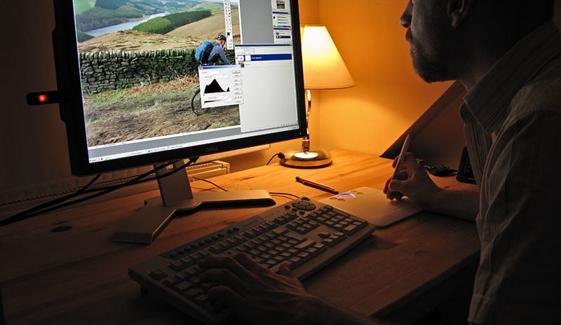
Of course, all of this assumes that the media we are using for display, either print or screen, is accurately portraying the intended color. As we have seen, the eye can’t possibly determine that, so surely they must be calibrated? Well, yes and no. Often within discussions of color calibration the initial work of the manufacturers (screen and printer) is completely overlooked.
It’s self-evident that there is considerable work, which goes on behind the scenes beforehand, to ensure that these devices produce a reasonable accuracy straight out of the box. Otherwise, every time you bought a new television you would have to spend some time calibrating them. Certainly, we often adjust to personal taste, but that is generally limited to brightness and saturation, whereas basic color rendition, on the whole, is pretty good. If you doubt, just go along to a TV store and compare the dozens of sets on offer, all usually showing the same video feed, and see just how far apart they will be. Even if there are slight variations, which one is “right”? Impossible to know!

Effectively, though, that means that any picture you see in front of you will very likely look similar to what anyone else would see using different equipment. Given our poor color memory, it is equally likely that if you looked at your version, then walked into an adjacent room and looked at a second version, you would be unable to tell the difference.
Another consideration in this is that the appearance, no matter how accurate, will be different again if the ambient light varies where the final image is viewed, particularly in the case of prints. Even if this light was to remain fairly constant, the color of a wall on which any picture is hung will have an impact, as will that of the frame. It comes under a phenomenon called metamerism, which is another whole can of worms!
Consequently, much of calibration for photography is a “bodge” (albeit it useful, clever, and of measurable criteria) to produce equitable results between two entirely different ways of producing color: one using light shining out (monitors) and the other of light reflecting off a surface (prints). I qualify this in that I certainly don’t mean bodge in terms of it being inaccurate, or wrong, rather how it pertains to our perception.
Where does this leave us? If we can’t be sure of the original colors (much less the people who weren’t there at the time knowing what they should be) and we can’t know how any image will be viewed, does that make calibration meaningless? Well, no, actually.
While we can’t control how the camera detects colors, nor how we remember them, nor how any result will be viewed, we can make life more consistent, which will make it easier for some people.
For the vast majority, relying on the engineering of the manufacturers of cameras, monitors, and printers, together with the knowledge of the software writers, will be perfectly adequate. There will be a reasonable consistency that enables people to enjoy sharing pictures, without screamingly obvious errors, and spending time and money chasing ‘perfection’ is pointless.
However, for those who sell images for a living, calibration will allow for a solid basis for repeatable results. It will mean that the print they produce will match their screen, so saving a lot of time and expense on wasted prints, and will match a print produced by a third-party (assuming they use the same calibration). They can also be confident that the print they supply today will be the same as the print they supply in ten years’ time. The relatively small investment in color management would be returned very quickly and is indispensable.
The bottom line? If you need it, use it; if you don’t, it won’t be much of a problem.
About the author: Peter Kelly is a full time photographer based in Liverpool, UK. He offers his photography services through his business, Captivating Photography.
Image credits: Pantone colors photo by John Fischer, church wedding photo by Elroy Serrao, Costco TVs photo by torbakhopper, photo editing photo by Phil and Pam Gradwell