Your Display Profile May Be Wrong
Your display profile may be wrong. How is that for a bold statement! But it may very well be true, even if you do it regularly on schedule. Display calibration and profiling is a must for all digital photographers.
Monitor Calibration
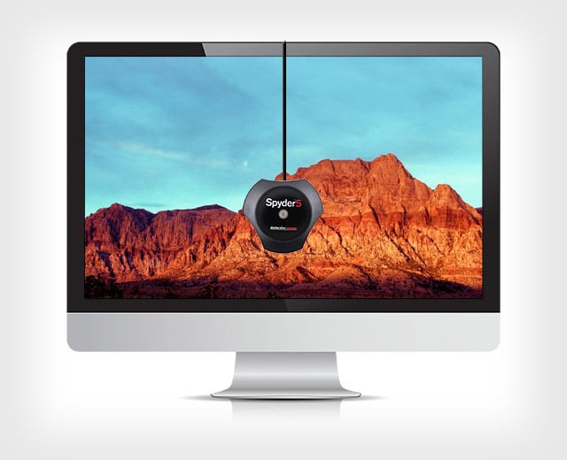
There are many devices in the market, presumably all capable to bring the colors on your monitor where they are supposed to be. I have been using a calibration device for 18-20 years, starting with Monaco Optix XR, then a ColorMunki Photo, finally an i1Display Pro. They are all in the X-Rite products stable. There are other models and other brands, the prices have come down considerably, and there is no excuse for not using one anymore.
They all come with their drivers and calibration software which, in a lay person language, display a series of known color values and reads the displayed value. If they differ, the software creates a profile, something like a look up table, that makes the corrections on the fly. This part is familiar to everyone.
Luminance Setting for Screen
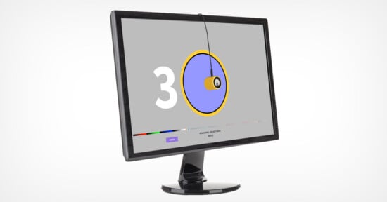
One of the adjustments, in fact one of the critical choices in this process is the luminance level of the monitor. This is worth looking for in a calibration device before picking one up, make sure it allows different luminance levels for the monitor. If you use a calibration device and do not see this in the interface, try first switching to “Advanced” mode even though this could be a little more involved process.
The screen luminance is measured in candela per meter square (cd/m2). When you find a drop-down selector with this unit next to it, you have found a critical piece of adjustment in your calibration process.
The question is what is the right level of monitor luminance? The definitive answer is: It depends. Depends on your environment, how bright a room you work in, whether there are windows in your view or behind you, the wall colors, etc. If your monitor luminance is too bright, a properly exposed image will look too bright and you will make it darker to look correct on the screen. This will make your image project darker in competitions, and produce darker prints.
The opposite is also true, if your monitor is too dark, a normally exposed image will look too dark and you will brighten it, resulting in too bright a projection in the competition or lighter than normal prints will result.
Print Viewing Light is Essential Equipment
This adjustment will take a little empirical effort to get it under control. First, make sure that your environment is as controlled as you can make it, shade the windows, use monitor hoods, etc. Then, this is also very critical and often ignored, get yourself a proper viewing light for your prints. There are lights color experts swear by; Solux is one of them. If you are handy you can build a print viewing booth using Solux lights. I have been using several Ottlite daylight balanced lights for quite a few years and, although their spectrum may not be perfect, they are close enough for my purposes. The important things to remember are:
1. It should be daylight balanced or very close to it
2. If possible, a dimmer will help
3. You use this light to view and evaluate ALL your prints
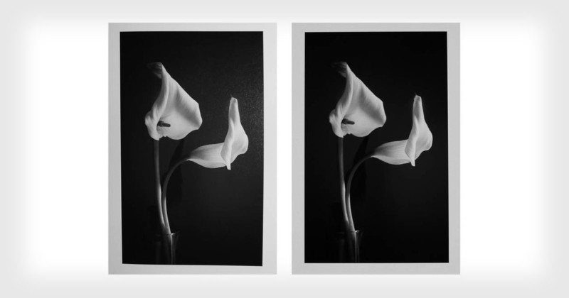
The next hurdle is: how do we compare the screen to a print and make the luminance adjustment on the monitor? By using a standard image, not one of yours. There are many images on the Internet, the Kodak Imagedisc test image is a good one to download and use for this purpose. I downloaded one from Dry Creek Photo Web site, follow this link to download it and unzip the file. You will find a couple of PDF files and a JPEG image file which will be the standard we will use. (The image below is reduced for screen display, do not use it for print testing.)

Open the test image in Photoshop or other software you use to edit images. Make sure that there are no adjustment are applied by way of auto processing on import or the like. Now, print this image on your printer on an 8×10″ paper with proper workflow and color management. When the print is finished take it to your viewing light, if possible next to your monitor while shielding it from the light. Look at the print, look at the monitor. Do they look the same? Is one brighter or darker than the other?
1. If the print is darker, then your monitor is too bright
2. If the print is lighter, then your monitor is too dark
Get your calibration device, start the software and look for the luminance adjustment. If you left it at its default and you are using an i1Display Pro, it may be set at 120 Candela /m2 . Whatever it is set at may need to be adjusted up or down, in case of #1 lower the luminance by 20-40 units, calibrate the monitor and look at the print again, no need to produce another print. After a couple of iterations you will get them look sufficiently similar if not outright identical.
Empirical Luminance Measurement (imprecise but useful)
There are measurement instruments that will give a precise answer to this question, they are not easily accessible. So, I have improvised yet another empirical approach to assess the luminance levels. Bring your camera out, take a picture of the image displayed on the screen in manual mode. Try ISO 800, f/5.6 at 1/60 second exposure, or what your camera indicates while you are in the manual mode.
Then, with exactly the same setting photograph the print under the viewing light making sure that the light is at a distance of normal viewing. My viewing light was at about 18″ and at a slight angle and it is not as even as I would like. You can see a little glare on the right side of the print photo, no problem though. Try to set this distance that makes the print look the same as the screen, within reason of course. It will be somewhere between 1-2 feet from the print. These are my results, not bad if I may say so myself!
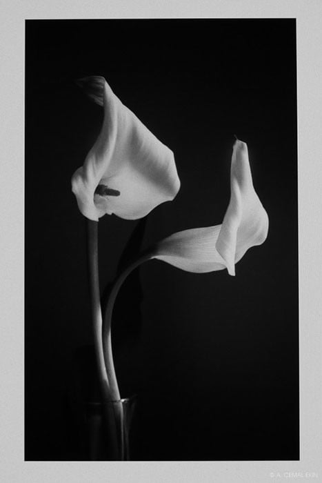
Now, compare the photographs. As your eyes are extraordinarily adaptable to changing light your camera in manual setting will record different images that you can compare on your screen side by side and read values from the same locations of each. Now, before you jump on my neck that this is imprecise, let me say “this is imprecise” as a measurement. It is only a tool that is at our disposal that removes part of the subjectivity of our eyes because of their huge adaptability. But ultimately you will make a judgment using your eyes every time you make a print, this is only to find the optimum level of luminance for your monitor and editing environment.
Get to work! This will take a little time, but you will love the results and know that the results of your edits are going to be accurate.
About the author: A. Cemal Ekin is a photographer based in Warwick, Rhode Island who has been shooting for roughly 60 years. He retired as a professor of marketing emeritus from Providence College in 2012 after 36 years of service there. Visit his website here. This article was also published here.