7 Questions: Douglas Ljungkvist On Ocean Beach, Hurricane Sandy, and Publishing Photobooks
Douglas Ljungkvist is a Brooklyn based fine art photographer originally from Sweden. His personal work explores vernacular beauty that is graphic, colorful, and quiet. Mood and atmosphere are important aspects to the work that often have subtexts of time, memory and identity. Formally, he is interested in the study of color, form, and space.
PetaPixel: Tell us about your project Ocean Beach. How did you get started on it?
Douglas Ljungkvist: I was first introduced to Ocean Beach by a girlfriend when I lived in New Jersey. Her family had vacationed there for years and she wanted us to spend a week there, too. That was in the early 90s, long before I was interested in photography.
It was more than ten years after my last Ocean Beach vacation, in late 2009, when I went back to scout and evaluate it for a possible photography project. Considering its proximity to New York, and the fact that photographers like Robert Adams and George Tice are both from New Jersey, I could not believe my luck that nobody had photographed there before.
PP: For you, what’s the overall message behind this project? What do you want your viewers to walk away with?
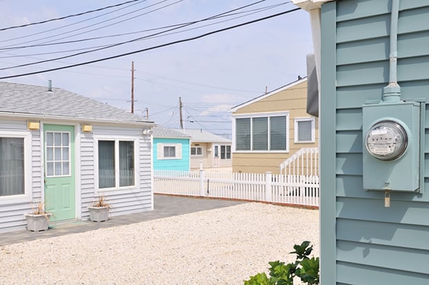
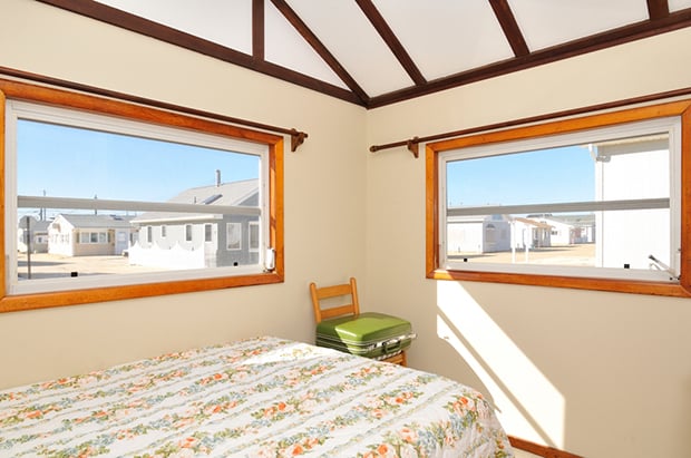
DL: Where the New Topographics was (supposedly) objective in its perspective, my work is definitely subjective, and from a position of love and a personal interpretation of beauty. It’s also a study in form, space, and color, with subtexts of time, memory and identity. Like with most my work, the photos are open for interpretation and invite viewers to use their imagination.
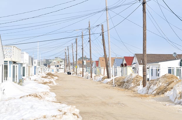
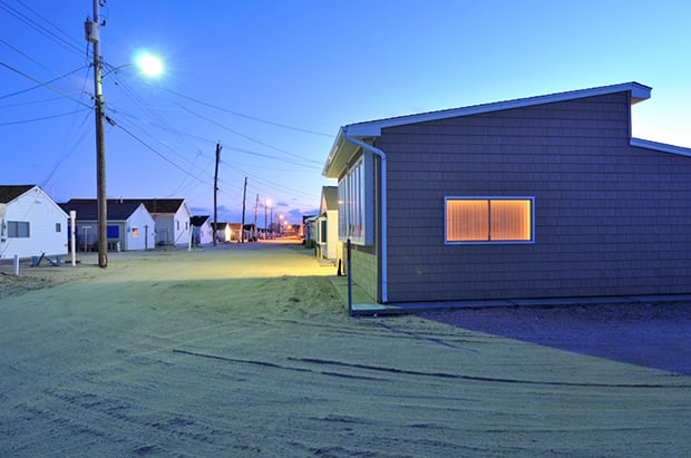
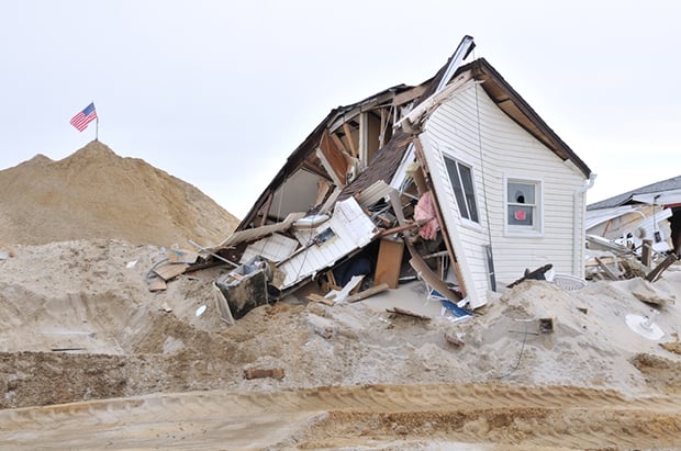
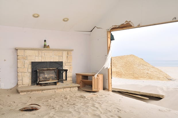
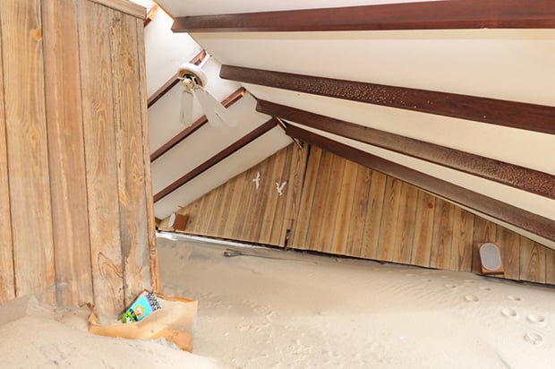
The scope changed a bit after Superstorm Sandy ravaged Ocean Beach. Viewers might notice a change in mood and palette after the storm; from cheerful to somber, from ice cream colors to earth tones. In retrospect, and inadvertently, the book could perhaps serve as a reminder of man’s fragile relationship with nature.

PP: Talk about some of your inspirations, photographic or otherwise.
DL: Whether it’s photography or culture in general, I tend to see and enjoy things (more) from certain decades. I love black & white photography from the 1930s and 40s: André Kertész, Brassai, Bill Brant. But my favorite decade is the 1970s, partly for its color palette, and perhaps because I was too young to enjoy it as an adult. “Uncommon Places” by Stephen Shore was really an eye-opener for me. It persuaded me that one can actually photograph the banality of uncommon places, and make beautiful books of it.
But my greatest inspiration by far is movies. I love Italian neo-realism movies. They were shot using the suburbs that were popping up outside Rome and other Italian cities after WWII as important backdrops and part of the story. There are seldom sidewalks there, hardly ever cars parked, mounds of dirt, weeds, people walking in the middle of the streets. One’s not sure if something is being built or coming to the end.
Another favorite genre is British New Wave from the 60s with its working class heroes, smoke stacks, heavy accents, and foggy urban/industrial landscapes. And French New Wave from the late 50s, too. It seemed like everyone lived in Paris and walked around in trench coats for a decade, looking cool and playing pinball in the cafes, in a constant state of winter fog and drizzle.
PP: You seem to have a knack for making photographs that are simple and colorful, and right to the point. Do you think this is your natural style or is it something that you’ve worked towards developing throughout your career?
DL: My aesthetics feel very natural to me now. But it took me about five years to get there. I recently spent some time deleting photographs from backup drives from 2007 through 2009. It was such an interesting experience to see how different my eye was.
The photographs then were in a lower key, more shadows, more contrast and pop in the colors. The word that comes to mind is “busy.” I think growing up in Sweden for 25 years has had a big influence on how I (like to) see things — clean, orderly, and minimal.
Though color is an important formal part of my work now, it wasn’t that way early on. It was secondary, or even subconscious, until a 2009 portfolio review with gallerist Sasha Wolf. She thought I had a great sense of color and that I should focus more on it. I did, and it has made a big difference in how my photographs look since then. Overall, I guess one could say that form comes before content for me.
PP: The book for this project has gotten quite a bit of press recently. What made you decide that you wanted to make a book? What were some of the challenges you faced during the process of developing it?
DL: After I started adding interiors to the architectural landscapes I thought there would be enough material there for a book. Kerher Verlag had always shown an interest in Ocean Beach and soon after I met them during a portfolio review at the CONTACT Festival in Toronto we decided to make the book.
The biggest challenge was when Superstorm Sandy happened; whether or not to document it and how to possibly include any post-storm work in the book. This would of course delay the launch but after we agreed to include post-storm photographs we set a new deadline for the one year anniversary of Sandy. In retrospect I’m glad we didn’t make that deadline as I don’t want the book to be known as a “Sandy” or disaster photography body of work. I think the inclusion of the post-storm photographs made the book better, deeper, and offer a rare context and contrast.
Another challenge was the funding of the book. It’s common that photographers have to contribute to the production cost of photobooks in today’s market, especially if you’re an emerging photographer. So I created an Indiegogo campaign which unfortunately came up short. But I was lucky to have a patient publisher who wanted to see the book come to market as much as I did. And I had already put in a chunk of my own money so together we made some changes to lower the production cost.
Read also: The Best Photo Book Services
PP: And so what were your takeaways from the book publishing process? What advice would you give to others looking to make and sell books themselves?
DL: An important takeaway is, once the book is published, your work is not done. In fact, it’s just beginning. You have to try and get the book reviewed, placed in stores, do some book signings, hopefully win some awards, and get on some “book of the year” lists, too. Publicity activities might be more important than ever as the contemporary photobook market is very crowded and hyper-competitive.
Alternatives to the traditional photobook publisher are expanding rapidly including self-publishing, smaller indie publishers, and zines as a lower cost alternative to the large hardcover photobook.
If you want to publish a photobook my advice would be to have a clear strategy how you want to produce, distribute, sell, and market your book. Be prepared to invest $10,000-$25,000 for production costs depending on print quality, number of pages, and edition size. I would also suggest reaching out to other photographers who have published photobook(s) the way you would like to, and whose work you admire, to learn how they did it. Most photographers are generous with advice and sharing information.
PP: Finally, what’s coming up for you over the next year?
DL: While work on my typology “Urban Cars” continues, it’s ready for publication if/when I secure a project sponsor. I’m hoping for a 2015 Fall launch.
I want to resume work on “Middletown USA” this upcoming fall and winter. It’s my first long-term project, which I started in 2007. I want to do a 3-4 week road trip to six of the Middletown’s in the Midwest, IA, MO, IL, IN, OH, KY. Hopefully I can secure a grant or fellowship to make that happen.
I’m also finding it hard to stay away from Ocean Beach for too long.