Flickr Rolling Out New Google+ Style Photo Pages with a Nifty Side Panel
Flickr’s recent attempt at a major website redesign didn’t go over very well with many of its users, so now the Yahoo-owned company is taking the feedback it received to try again. A help page on the Flickr website reveals that a new photo page is currently being rolled out across the service.
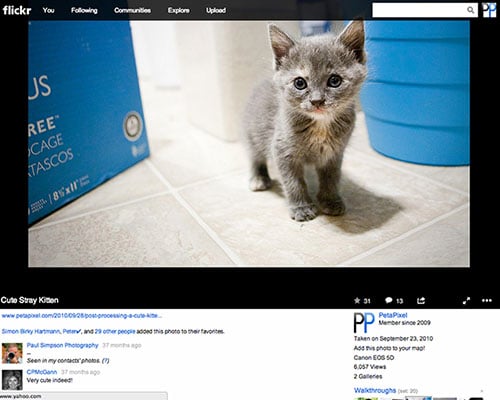
…and a comparison to what Google+ photo pages have looked like for quite some time now:
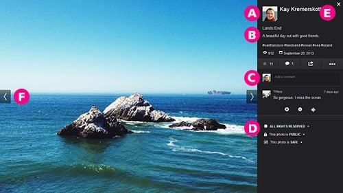
Flickr says that the goal of the new design is to make information easier to get to while still featuring user photos as prominently on the page as possible.
In addition to having information “above the fold” in the sidebar, the things you’ll see will be more fresh. Comments are now displayed with the most recent ones first, meaning you won’t need to scroll to see the latest discussions on images.
The pages are also designed to feel more like lightboxes rather than standalone photo pages. Clicking the “x” in the upper right hand corner of a photo page will return you to the page you were when you opened up the photo. Clicking on the blank space to the sides of the photo will take you to the previous or next photo.
If you haven’t seen a button allowing you into the new design, just sit tight — Flickr says it’s opening it up to more and more users every day.