Apple TV’s New Logo Animation Was Handmade by Human Creatives

Apple TV viewers may have begun noticing a new mnemonic playing before a show streams. While it’s easy to assume it is a computer-generated animation, it was in fact handmade by human creatives.
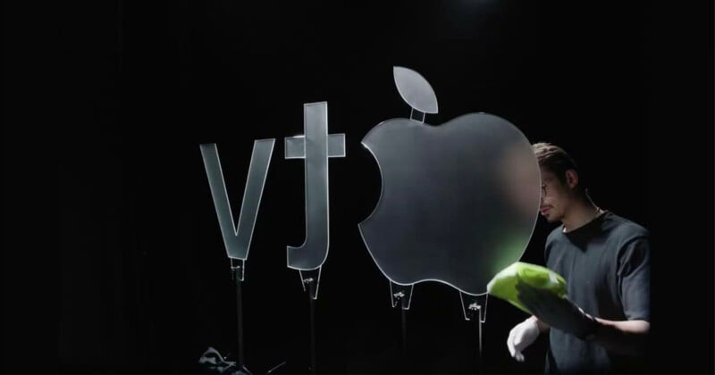
In the age of generative AI, where Coca-Cola is ruining Christmas, Apple has taken a refreshing approach to its new graphics by building a giant glass version of its TV logo in a studio and bringing it to life with clever lighting, macro lenses, and color gels.
The new mnemonic was made to mark Apple TV’s rebranding from Apple TV+, which was confirmed in October. Apple partnered with bespoke creative agency MAL, which was tasked with “reimagining its brand from the ground up.”
“Built from real glass and captured entirely in camera, the new identity explores reflection, color, and light to express the cinematic spirit at the heart of Apple TV,” MAL writes on Instagram. “Every shimmer was made for real, no CG shortcuts, a nod to Apple’s belief that craft should be felt, not faked.”
MAL shared a behind-the-scenes video (above) showing the intricacies of the shoot, which, according to AdAge, was a “weeks-long” production in a London creative studio. It involved designing the logo with the help of Apple’s creative team and then sculpting it from solid glass.
There were ultimately two mnemonics created: a five-second show opener and a longer cinematic version that will play before feature films. The music for each clip was created by singer-songwriter Finneas O’Connell.
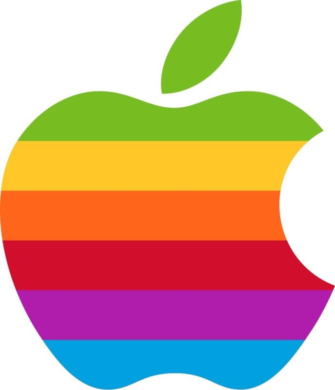
Apple’s logos have been black and white for a long time; therefore reintroducing color was a historic choice. The creative agency sought inspiration from Apple’s iconic 1977 logo, which has six bold colors striped across the bitten-into apple.

The handmade, artisan mnemonic stands in stark contrast to Coca-Cola’s botched Christmas ad, which was AI-generated and criticized for glaring errors — such as the vans not being the same size. Viewers called it “soulless” and “embarrassing.”
“Its labor is the content, the process is the story, and audiences can feel the difference,” adds TikToker Jordan Schwarzenberger. “Coca-Cola took a shortcut and received backlash. Apple took the long road and received admiration.”