Compare How 7 Pro Landscape Photographers Edited the Same Photo
Every photographer tries to develop a personal look to their images, and that is no better shown than by asking a group of them to apply their style to the same photo.
In the above seventeen-minute-long video, photographer Christian Möhrle decided to give one of his RAW landscape images to seven of his professional photographer colleagues to edit in order to see how the image would look after different creative styles were applied to it. In addition to the interesting editing choices made by the group, Möhrle includes a detailed guide on how he edited the file in Photoshop.
“After writing some emails, I got seven pro photographers to participate: Antonio Valenta, Daniel Laan, Enrico Fossati, Gavin Hardcastle, Nick Page, Stefan Forster and Tristan Todd,” Möhrle says.
“All of them have a unique style and most of them I’ve been following for a few years now. It also was important to me to gather a wide range of styles going from heavy image manipulation to natural post-processing.”
The RAW File
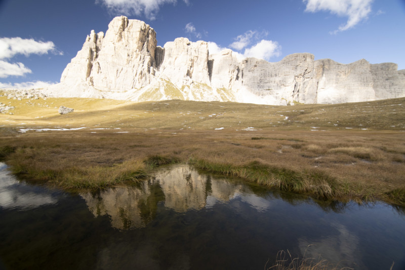
Möhrle says he chose this particular RAW file since there were many different directions it could be taken.
“There is a hard edge between the landscape and sky, so there’s the possibility for an easy sky replacement, there is some subtle golden light so it could either be a warm golden hour shot or more natural daytime shot depending on the white balance, and with the extreme foreground present some depth of field and additional color/compositing elements could be added,” he says.
The Edits
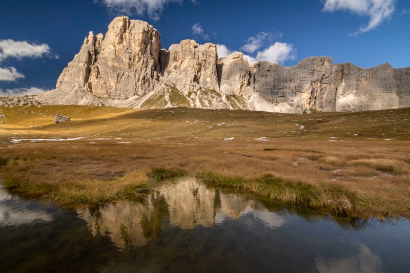
“Just as I was hoping for, Stefan was going the more natural approach with a well-exposed scene, vibrant, but not too saturated colors and lots of details,” Möhrle says.
“This leads us to a very different image from all the other entries since his version is the closest to what the human eye would have seen. As far as I can tell, Stefan was also the only participant to create an HDR version out of the provided raw files which makes sense as it’s easier to get a natural exposure this way.”
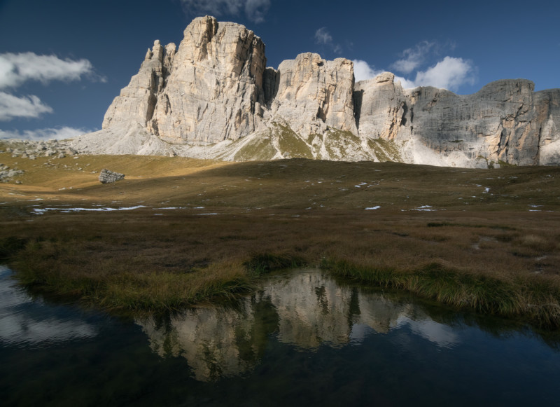
Tristan Todd’s edit shows a different approach. The biggest difference here is the chosen white balance as the whole image is a lot colder than the other entries. Again, the whole photo got quite a bit darker to make it look more dramatic plus he also seems to have dropped the saturation of the green and yellow tones quite a bit resulting in more apparent blue tones. His version definitely helped Möhrle get more open for colder landscape scenes as he would have never thought about a cold style on this particular shot.
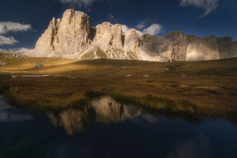
Here we have a strong dreamy style and again the overall picture has more of a golden hour look to it,” Möhrle says.
“Nick made the whole scene noticeably darker while keeping the brightness of the highlights on the mountains in the back and thus creating a very pleasing contrast. Plus, it seems he intentionally darkened the foreground to get the focus more on the mountains in the distance.”
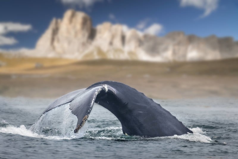
Apparently, Gavin’s version made Möhrle laugh when he opened it because he wasn’t expecting a whale to make an appearance in any of the images. Nonetheless, Möhrle said he appreciates the time Gavin put into this composite.
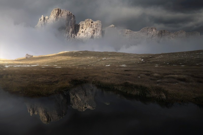
Above, Fossati’s edit shows the first version with heavier photo manipulation. He created a dark scene with artificial fog and replaced the sky with heavier, gloomy clouds without losing the highlights on the left side, again there is a softness visible which applies a subtle dreamy look with desaturated colors.
“I know these kinds of image manipulations are not for everyone, but I have to say this is certainly in the top three for me! I love this version!” Möhrle says.
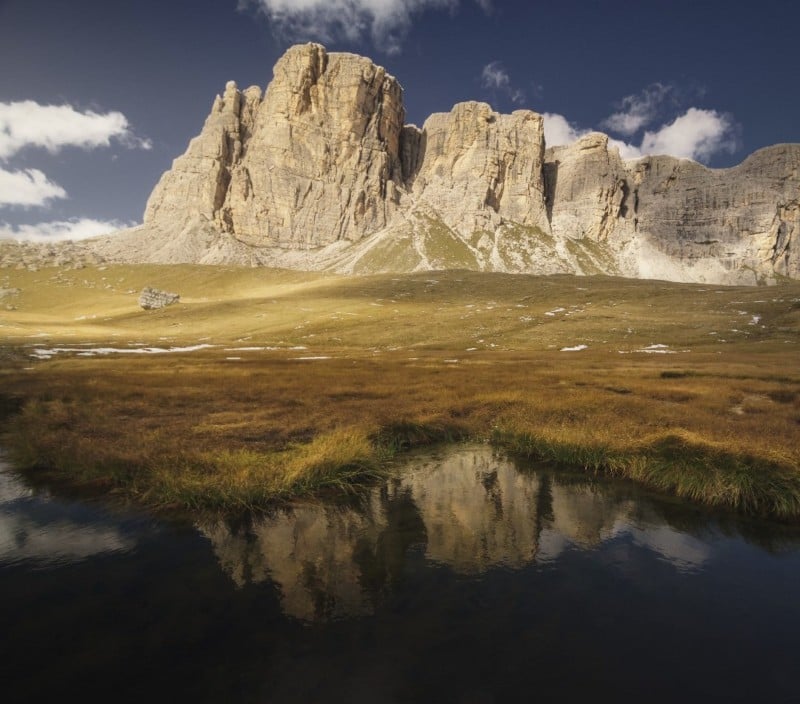
Laan cropped the photo to center the reflection in the foreground. Overall, he went for lower contrast and a soft effect and the colors are again more on the warmer side, however, there is slightly less saturation involved.

Valenta has created a strong golden hour look with high contrast and although the original raw file had slightly out-of-focus mountains in the back Antoni managed to nicely sharpen everything. What Möhrle really loved about this version, besides the golden warm colors, is the darkened sky towards the left side.

Finally, Möhrle’s is above and those interested can follow along with the end of the video to see how and why each editing move was made.
For more from Möhrle, check out his YouTube channel.
Image credits: Photos provided courtesy of Christian Möhrle