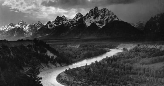
10 Reasons to Shoot Black and White Photos (and None are Nostalgic)
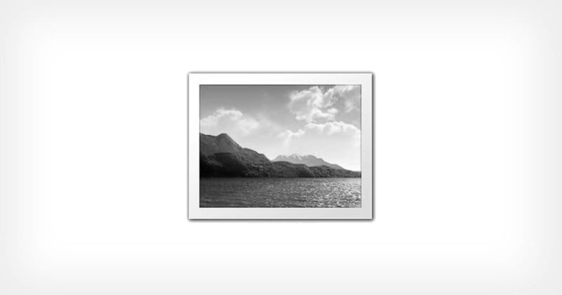
One of the more divisive positions that I find in photographers is their rationale for, or dislike of, black and white photography. “I love color,” I hear often. “I’m all about the colors.” Absolutely, color is cool. But I think the arguments in support of black and white are strong (some better than others!).
1. Abstractions
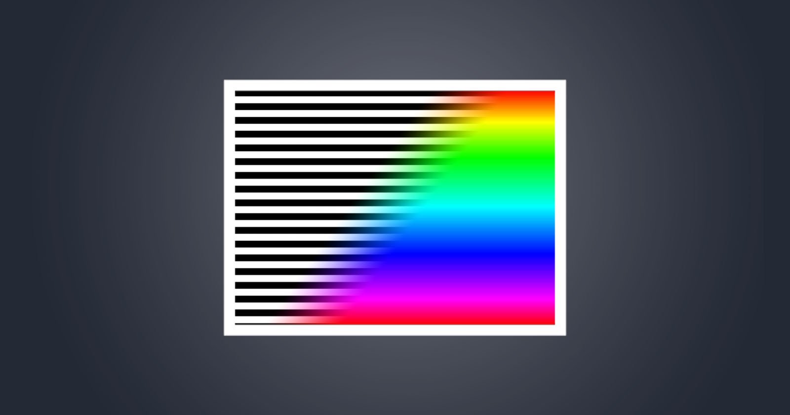
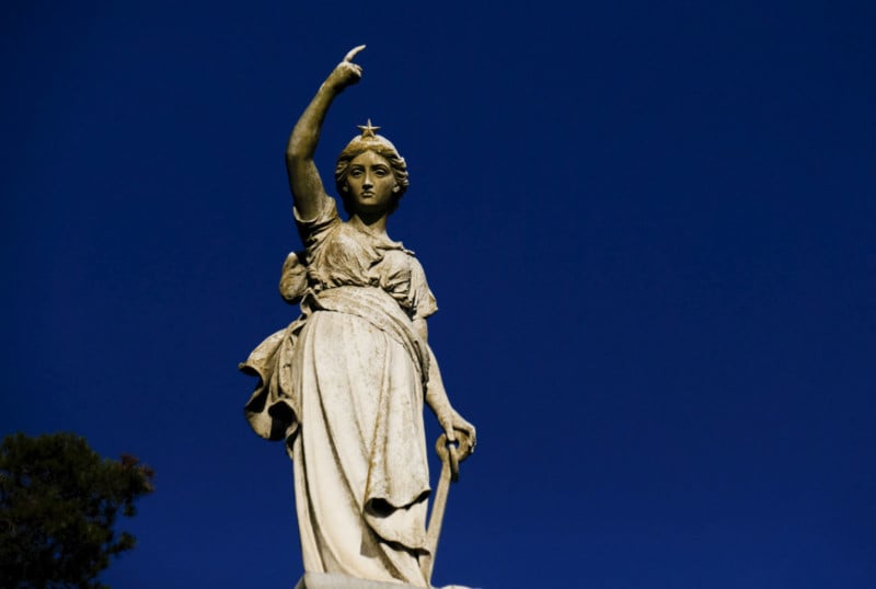
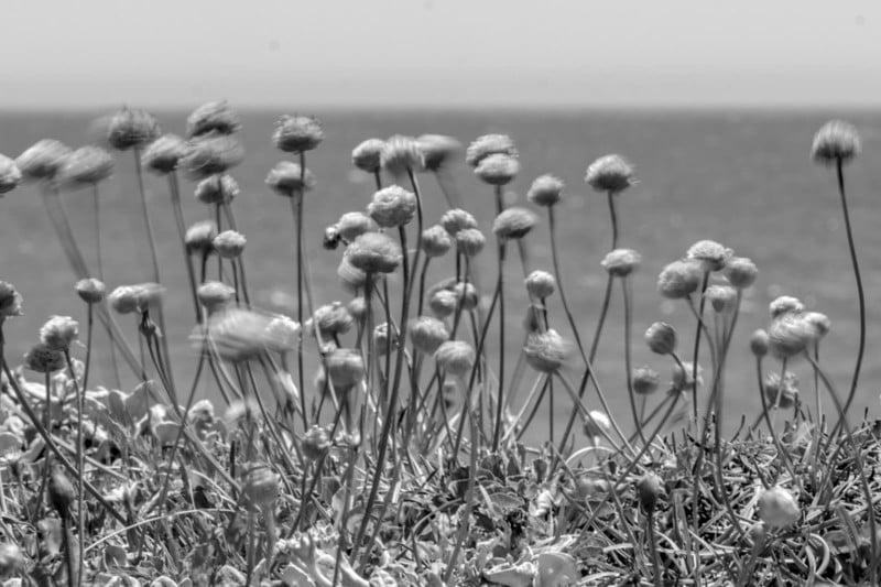
A greyscale image is a bit surreal, and a tacit reminder that all photography is surreal: it’s always a creative invention. It’s more obvious when pictures are B&W and less so when they’re in color. We tend to think of color pictures as a kind of objective reality. They’re not.
2. Distractions
Color can be distracting from what’s going on. The eye is attracted to color. So if the color is part of the subject, great. But frequently it’s not, it visually complicates a scene. Clutter. More little things for your eye to get pulled to, whether you want that or not. Color can be easily overwhelming, like adding salt to a dish you’re preparing. It adds taste, certainly, but it’s easy to add too much.


3. Adjustment Latitude
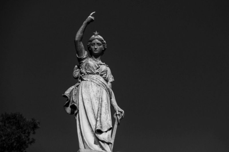
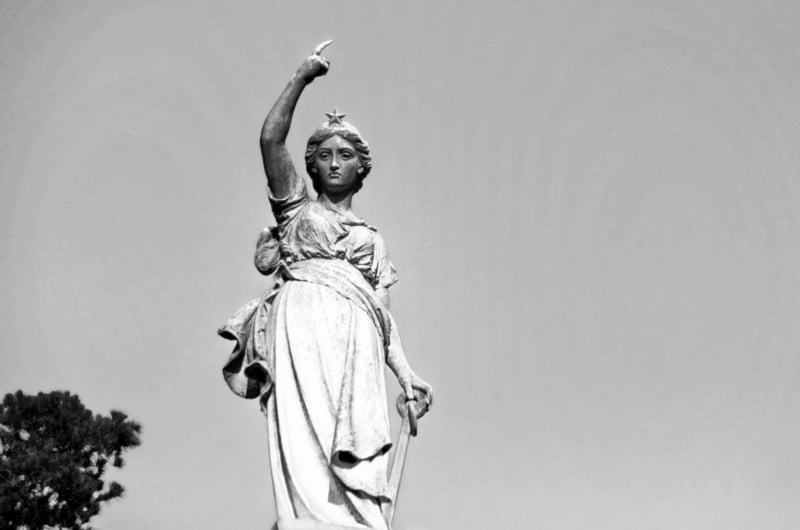
Post-production in color is generally trying to make a still image look like what you saw with your eye. So if something is blue, you try to make it really blue. But it’s still always blue. But in B&W you have more ability to adjust how the things in the frame look, how strong they are, how much attention they draw.
Blue could end up dark grey or light grey, and neither are experienced as “strange.” Even with highly manipulated greyscale, we don’t tend to have a reaction to B&W as being made weird by post-production, it’s all surreal, so we can mess with the image a lot and it stays the same. Try that in color and it often comes across as “false.”
Note: If one is exceptionally good at Photoshop (or comparable tools) it’s certainly possible to manipulate strong colors into other colors that might feel less distracting; so this power is not limited to greyscale, it’s just considerably easier in greyscale.
4. An Uncanny Valley
It’s impossible to reproduce colors in print to match the experience of seeing something in real life. Prints are never as bright and magical as seeing with your eyes. Color slides were some improvement, with light shining through a transparency, but still imperfect (and not a viable distribution method). And digital screens, while they can be better than prints and continue to improve, still cannot faithfully reproduce natural vision and are frequently inconsistent in color presentation.
So color pictures always provide a weird discrepancy from reality, and the color images always feel “less-than” the scene as I saw it in person. This uncanny color valley is moot in B&W. It’s not even trying.
5. Composition
B&W forces me to focus on structure and composition. Ideally, I’d do this in color too, but sometimes I don’t. It’s easy to get lulled into making bad photos that’s only merit is the color. Shifting a photo into B&W gives us a moment to assess composition and story without the colorful distraction, to see if it “really works.”
6. Too Pretty
Color images are often pleasing because they’re “pretty” — which is nice at first but generally gets dull over time. I’m reminded of Susan Sontag’s essay that suggested that a beautiful photograph is not just a picture of a beautiful thing. Many amateurs push this by over-saturating colors to make everything… prettier. Dripping with beauty. Instagram is designed for quick-toss images that are small and, generally, colorful enough to attract attention. And forgettable.
7. Creative Constraint
Working in B&W is a forced constraint. It’s not better or worse than color, it’s just an arbitrary limitation I put on myself when I make photographs, and it’s fun to work with constraints. It’s a little harder to produce a likable image, and that’s the point. Constraints catalyze creativity: it forces you to be inventive. If you’re already good, it’s fun to have a challenge. So many things make shooting easier these days — it’s nice to have some creative boundaries to push up against.
8. Everything Should Matter
A popular photographer once told me that everything in the frame should matter and should be consciously present, and that goes for the color too. If there’s going to be color in the image, it should be important to what the image is saying, and not just documenting the scene. Certainly, the photographer gets to decide whether the color is important or not. But begin by asking the question.

9. Consistency
Consistency creates a more cohesive body of work. Even if you’re not an artist trying to create a professional portfolio the pictures you take still constitute your “work,” and over years you may want to display them together in photo walls or in books. Color images can look nice together, but the natural ranges of color light and temperature make it less cohesive to show images shot in bright sun alongside images in firelight, or incandescent bulbs… the color tones and feeling can all end up misaligned.
Perhaps it’s a subtle advantage, but when a group of images is all monochromatic (and particularly if they’re all the same aspect ratio), no matter when they were taken or in what lighting condition, they sorta fit together. They still can vary, but on the whole, a set of B&W photos spanning over 30 years will still feel oddly cohesive. This is harder in color.
10. Timeless
Greyscale images feel timeless, and photos are simultaneously dated and undated because of this process. New things feel classical; old things feel contemporary. (It’s sort of the opposite of nostalgic — the images are not presenting that old-timey feeling, they’re actually removed from time.)
Background Color
For the first 100 years of photography, there were primarily only B&W images, and even when color was developed, it was far easier (and considerably less expensive) to do B&W photochemical processing than color, so it continued to dominate in journalism as well as among hobbyists.
In the 1970s the color landscape and economics were shifting. Color was a new treat in news photos (USA Today pioneered the printing of news photos in color in the 1980s, but they were frequently maligned as not feeling journalistic, and dubbed “McPaper” by critics). The public associated the B&W image with both historical photos and news photos, which in all cases gave them a presumption of veracity and significance.
Even as color became feasible, its use in fine art photography was problematic; images would fade and color shift over time and were not considered “conservation ready” and thus were not particularly collectible. Because of the industrial process utilized to mass develop and print color images, the rise of the Photomat, and the relative difficulty in controlling color fidelity in prints, color photography was the domain of consumers and amateurs.
But slowly artists explored the medium and the chemical process became sufficiently stable such that some began to get collected: William Eggleston had a breakout show at MOMA in 1976, and other artists such as Lee Freelander, Gary Winogrand, and Nan Goldin followed. These artists used the way color images felt ordinary to accentuate their photographic objectives. Still, even as digital processes have made the color stable and accurate, fine art photography is still largely monochromatic, although that shift is underway.
So there you have it: ten excellent reasons to shoot in black and white — both philosophical and pragmatic — and none of them are simply that it makes pictures “arty” or nostalgic. Certainly there are excellent reasons to make a photo in color — some photographs need color, or are about color in some way. It’s the mindless application of color “because it’s there” and “because that’s real” which is problematic for me. And too many colorful images are not particularly good in any other respect. If you’re using color, make it worthwhile.
P.S. Thanks for reading! If you want to see my range of black-and-white photography, check out my @droidmaker Instagram. I encourage you to take one of my workshops through the Santa Fe Photographic Workshops. There are periodic 3-week online programs (6 sessions), and this August there is an in-person 1-week intensive that should be fun for any creative amateur, maybe if you’ve plateaued, feel like you’re good at picture taking, but want to push yourself. Anyway, thanks for listening.
Image creditsHeader photo from Depositphotos. All other images copyright © 2021 MH Rubin.