New Photo Map of the Milky Way Shows Never-Before-Seen Details
The European Space Agency (ESA) satellite observatory Gaia, whose mission is to produce a 3D map of the Milky Way, has sent back a new and updated map of the galaxy that contains detailed information on more than 1.8 billion sources and is being called a “treasure trove for astronomers.”
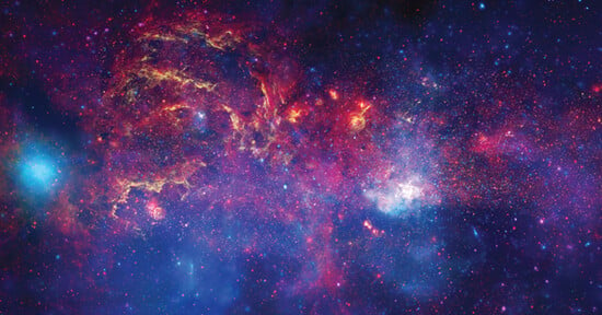
The star-mapping satellite observatory] mapped evidence of the Milky Way’s past by looking in the direction of the galaxy’s “anticenter,” the exact opposite direction in the sky from its center. This latest batch of data is the third in a series that will receive its final segment and be compiled completely in 2022, but this Early Data Release 3 (EDR3) already provides monumental findings for understanding the nature of the Milky Way Galaxy.
Those 1.8 billion sources that have been detected by Gaia in EDR3 represents more than 100 million additional sources over its EDR2 release made public in April of 2018. This latest batch of data also contains color information for 1.5 billion sources, which is 200 million more than EDR2. This latest batch of information from Gaia is not only more data-rich but is supposedly more accurate and precise.
“The new Gaia data promise to be a treasure trove for astronomers,” says Jos de Bruijne, ESA’s Gaia Deputy Project Scientist.
One of the data points that Gaia collects involves the motion of the stars in the Galaxy, and Gaia was able to predict stellar motion for the next 1.6 million years. The image below is a still photo representation of the motion of stars for the next 400 thousand years, while the video below it actually depicts the animated motion.
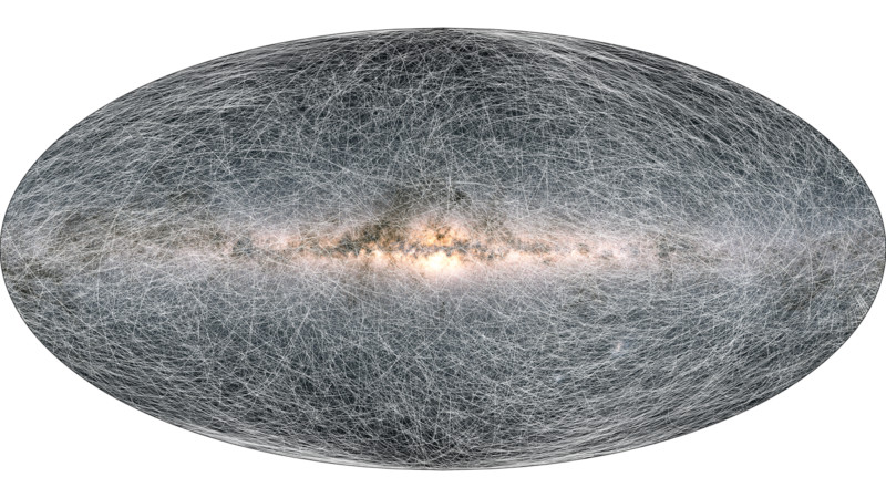
“As the animation begins, the trails grow, showing how the stars will change position over the next 80,000 years,” the report describes. “Short trails indicate that the star is moving more slowly across the sky, whereas long trails indicate faster motion. To avoid the animation becoming too difficult to interpret, the oldest parts of the trails are erased to only show the newer parts of the stellar motions into the future.”
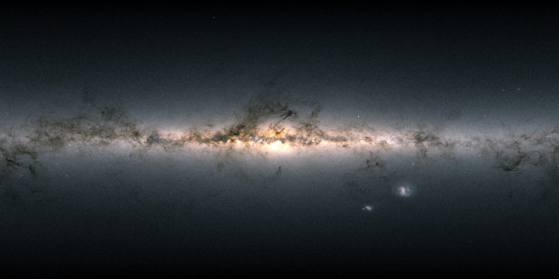
Gaia also captured density information, as illustrated by the image below. Brighter regions indicate denser concentrations of stars, while the darker regions correspond to patches of the sky where there are fewer observable.
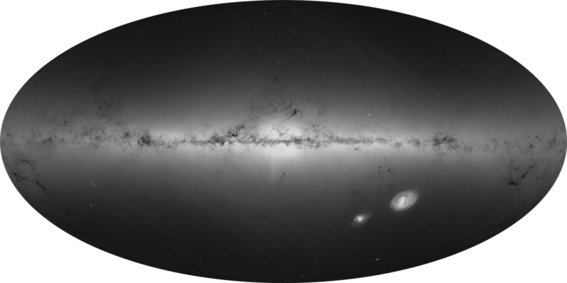
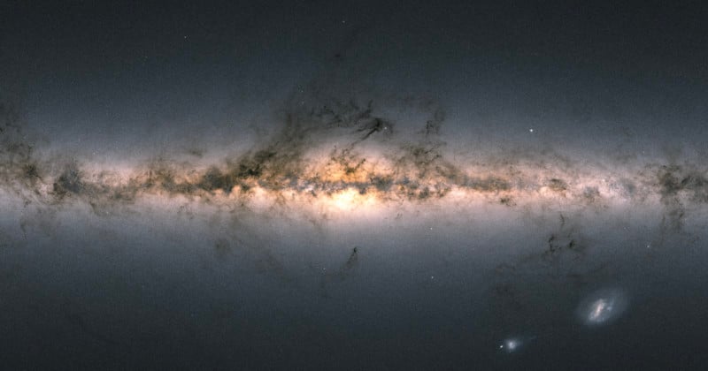
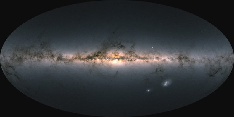
In contrast with the image above, this color map is enhanced by the brightest and most massive stars. The color of the image is obtained by combining the total amount of light with the amount of blue and red light recorded by Gaia in each patch of the sky.
The Gaia EDR3 contains detailed information on what has been sent back as well as exactly what astronomers are looking for from the reports. You can watch the video below for a preview of those findings and read that full report here.
(via Thrillist)
Image creditsESA/Gaia/DPAC