Find Your Creative Style With Split Toning
In my opinion, the most under-appreciated tool within all of Lightroom has got to be Split Toning. Not only is this a great option to solve many photo-related problems, but it’s also an excellent way to work towards developing your own creative editing style.
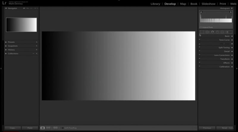
Below is a great example of how Split Toning works – this is a standard gradient map going from pure black to pure white showing the shadow region transitioning to highlights.
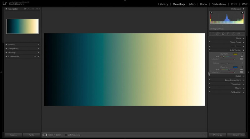
If we go to the Split Toning module in Lightroom and apply a yellow tone to the highlights and a blue tone to the shadows, we’re left with a gradient map that looks like this:
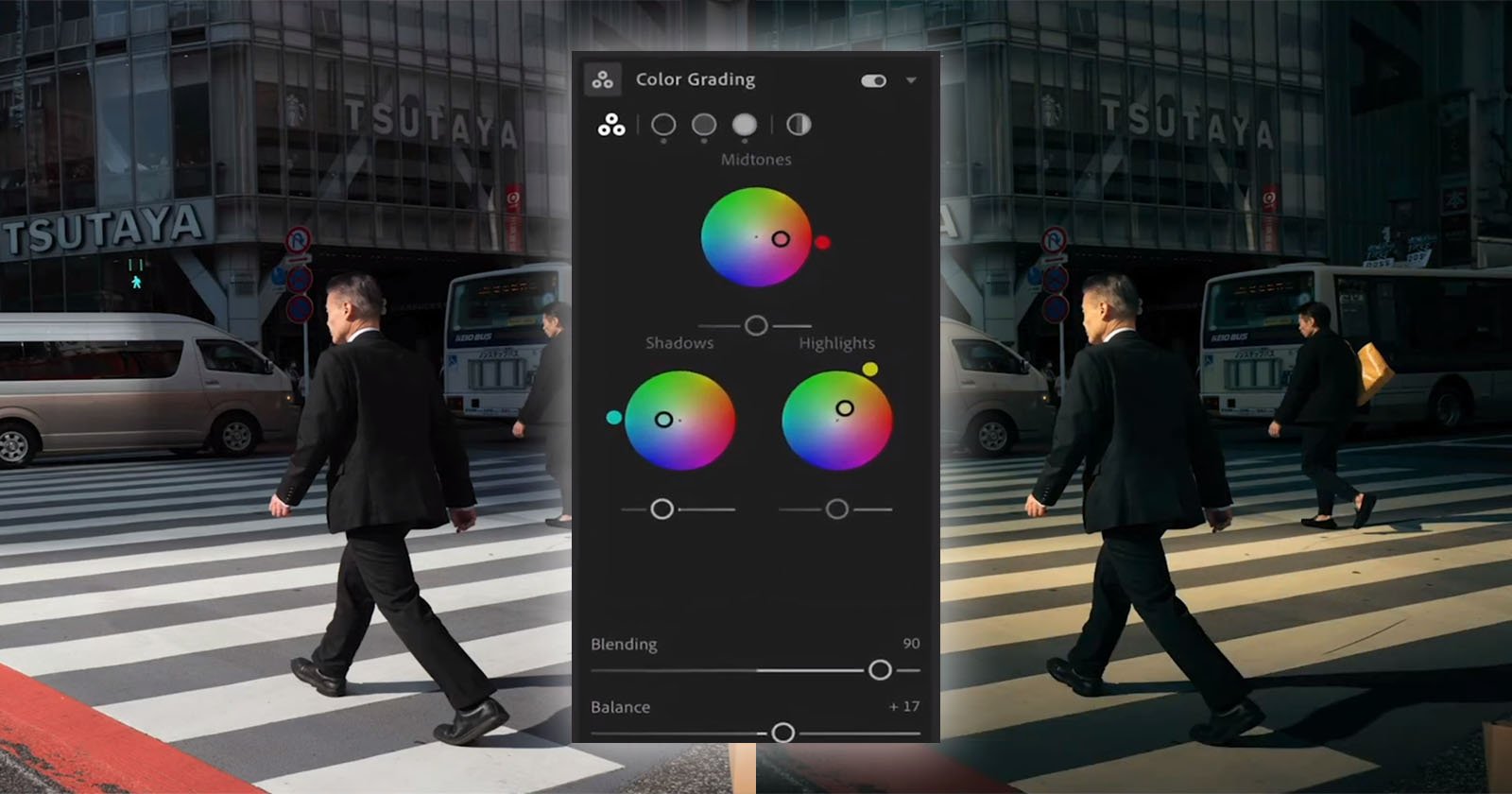
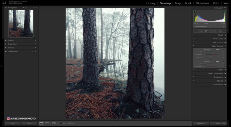
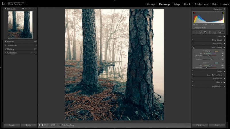
In the 11-minute video above, I discuss the different techniques that can be used to apply Split Toning to your images and review the specific problems that it can solve. In this example, I want to add a subtle warm tone to the highlight areas to more closely resemble what the scene looked like when I originally photographed it.
There are a few ways to select the tones to apply, but a quick trick is to move the ‘Hue’ slider while pressing the ‘Option’ key (‘Alt’ on PC) – this will set the saturation of any specific hue to 100% in order to make it easier to decide which hue you’d like to choose.
Once you identify the color you want to apply, just release the option key and move the saturation slider to the desired strength.
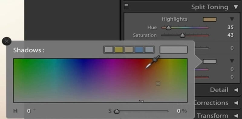
Another option is to select the rectangular box to the right of the highlight and shadow area and use the eyedropper tool to select the exact color you want to apply.
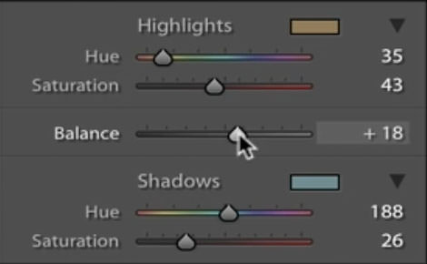
Once you have your tones selected, Lightroom gives you the option to balance the amount of emphasis you’d like to apply to highlights vs shadows. If you want to put a greater emphasis on highlights then move the slider to the right, if you want to emphasize shadows move the slider to the left – or you can just leave it at 0 applying an equal weight to both.
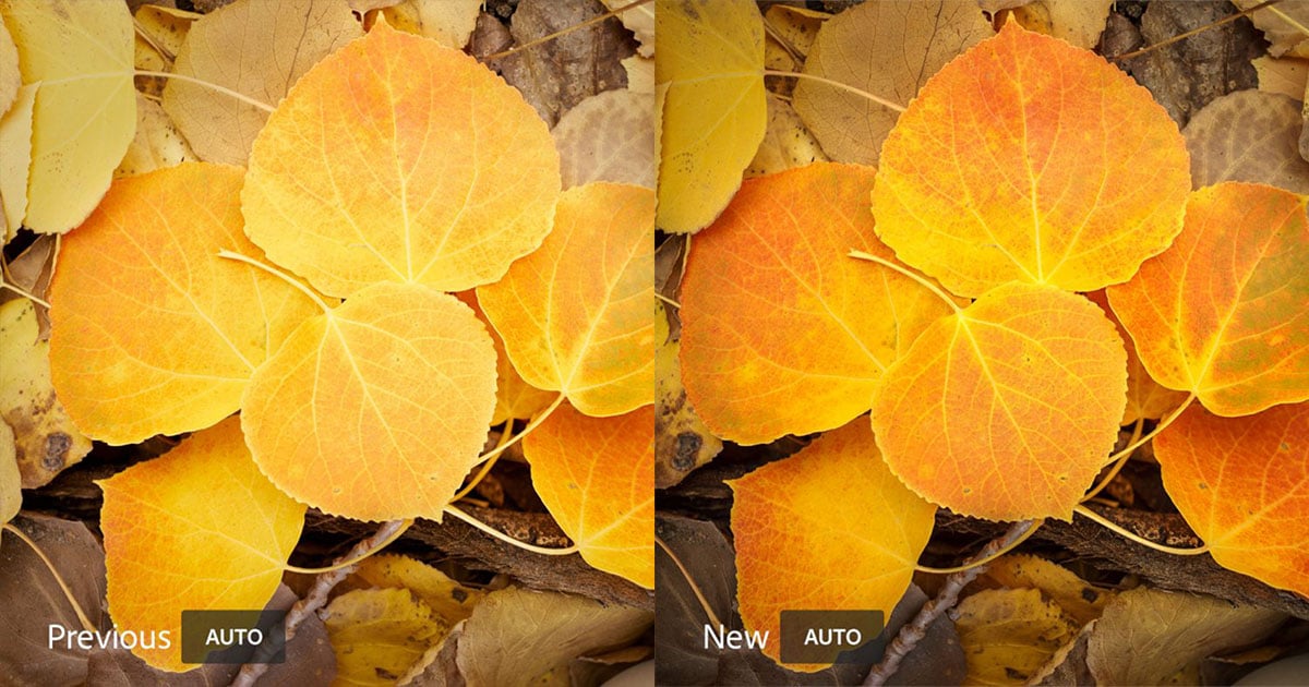
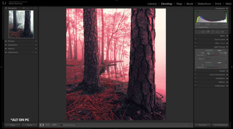
Below is what we’re left with after the split tone adjustment is applied. We were able to warm up the highlights and cool down the shadows using the cinematic color combination of teal and orange. This is a great example of fixing a problem and at the same time getting a bit creative with the edit.
When you land on a highlight/shadow combo that you really like, you can simply save the split tone adjustment as a preset and then apply it to any image you’d like moving forward. This is a great time saver and an excellent way to create consistency within your editing workflow that’ll enable you to work towards developing your own creative style.
P.S. If you enjoyed this video and article, you can find more by subscribing to my YouTube channel.