How to Accurately Color Match in Photoshop
Adjusting colors of specific elements in a photograph can be used to bring harmony to an image or to add creative flair. Here’s a 5-minute video that shows how to match colors in Photoshop.
Rather than using color balance, hue/saturation or levels, Brown uses grayscale values in order to match the colors.
Brown has done some leg work to set the image up for alteration by moving the flippers to their own layer. Next, he takes a small selection of the color that he wants to alter – in this case, the orange of the flippers.
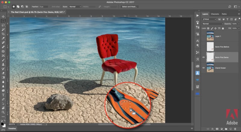
By duplicating this swatch and placing it on top of the fabric of the chair, Brown is able to use it as a tone reference. He uses the magic wand tool to select all of the orange of the flippers. Switching to the red channel, he brings up the Levels panel and adjusts the midtones until the swatch matches the chair’s fabric. He repeats the process for the green and blue channels.

Switching back to the RGB channel, the result is red flippers, perfectly matched to the tone of the chair.

The beauty of this technique is in its simplicity and in its accuracy. As Brown says, it’s something to store away in the back pocket for that one time you need to color match some flippers to a chair.
The video at the top explains this technique in full. Brown, a senior creative director at Adobe Systems, has plenty of other tips on his Vimeo account, found here.