10 Myths About the Rule of Thirds
My name is Tavis Leaf Glover, and I’m an artist just like you, trying to create art that I can be proud of and share with the world. Though, something really hindered me in the beginning… the Rule of Thirds.
I want to shed some light on the Rule of Thirds Myths we’ve all been forcefully spoon fed during our creative infancy, which continues to linger as our compositions mature.
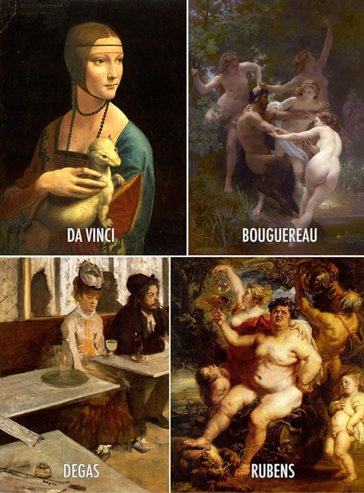
Like many other artists, I was brainwashed into thinking that the rule of thirds is an acceptable method of composing an image. I guess that depends on the standard of art you’d like to produce. Art at the Master Level, like Da Vinci, Bouguereau, Degas, Rubens, or art like a Sunday painter whose goal is to hang their painting in the local antique store… not the prestigious gallery or museum.
Without composition, art cannot flourish. And when using the rule of thirds to guide your composition, you’ll end up in a dark alley waiting to be maliciously fondled by mediocre art. This might sound harsh, but… well, it kinda is.
It’s my experience that people don’t like rules, and they certainly don’t like to follow them. They are always saying the same cliché phrase “well, rule’s were meant to be broken” or “I think it’s good to learn the rules, but then know when to break them.”
The word “rule” has a meaning that can be looked upon as negative. What I’m striving to demonstrate isn’t a rule that needs to be broken. It’s a canon of knowledge that you can choose to incorporate into your art if you wish. Your choice, simple as that.
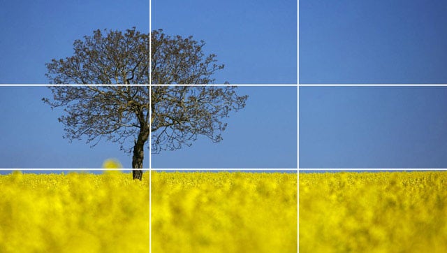
MYTH #1: “It makes it visually pleasing”
To debunk this, we have to know what makes an image visually pleasing, and I assure you, it’s not plotting your subject on a rule of thirds crosshair. To be visually pleasing is to apply your composition techniques in a way which is clearly read by the viewer… without getting caught up on distracting elements or creating confusion by lack of hierarchy. How do we do that?
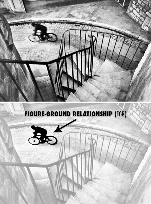
Well, we need to understand how the mind perceives visual stimuli. For this we use Gestalt psychology techniques like Figure-Ground Relationship (FGR) to clearly separate the subject from the background.
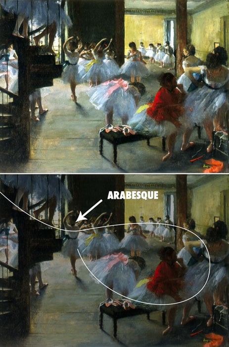
Or we can use the Law of Continuity, which will allow us to create a sweeping arabesque by using multiple objects.
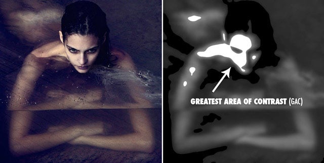
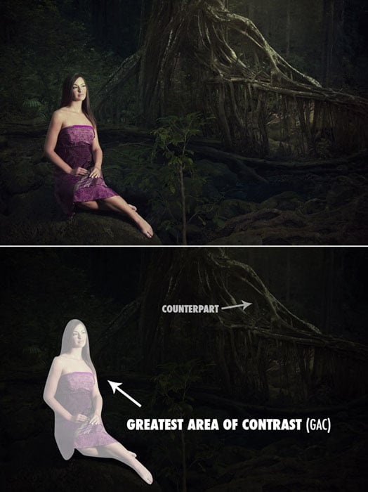
We can even use the Greatest Area of Contrast to help direct our viewer’s eyes towards the main subject.
MYTH #2: “Pros use it”
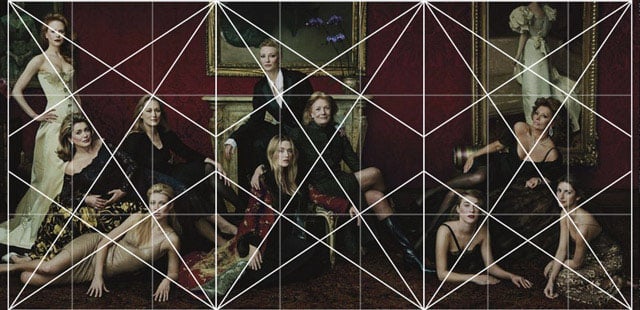
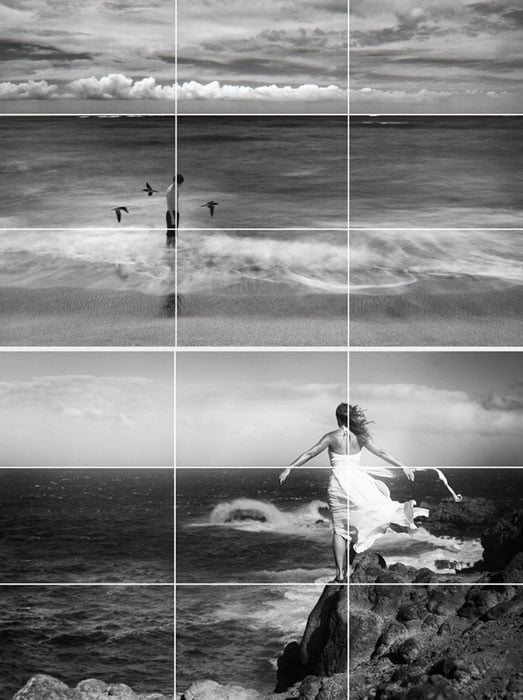
The next myth we have is “pros use it.” Annie Leibovitz is definitely a pro, and one of the most inspirational photographers of today. So let’s grab one of her photos and simply line it up to the rule of thirds grid, then we’ll see if she used it or not.
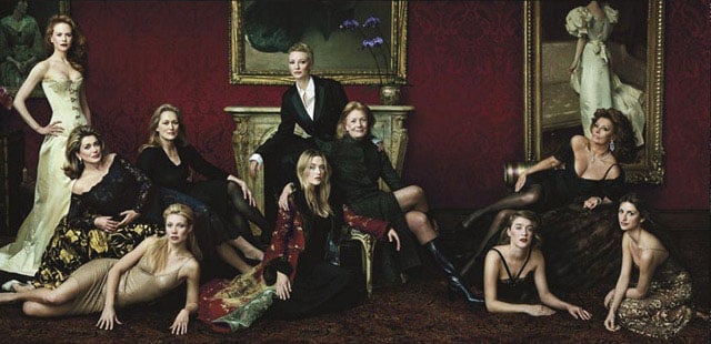
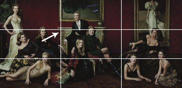
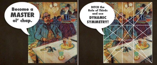
We can see how the mantel lines up perfectly to the rule of thirds grid. Hmmm, I guess she did use it… but wait, how did she pose the models? How did she create such a great composition when there are only horizontals and verticals to guide us? What do I do next? I have some of the models on the rule of thirds, but where do I go now? How do I position their arms, legs, dress, and gaze? This is where we introduce dynamic symmetry.
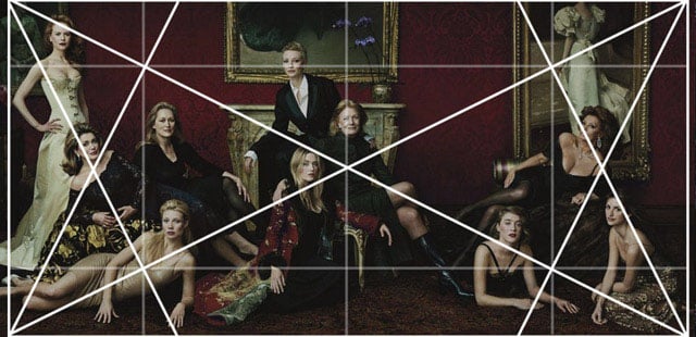
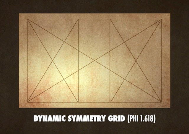
In order for Annie to properly pose the models, she uses dynamic symmetry. That’s basically a fancy term for grid system.
To put it simply, a grid system is something we can use in our photography to help us organize our composition. We can use the diagonals, verticals, and horizontals to help us create rhythm and unity throughout the image… whether it’s a painting, photo, or sculpture… dynamic symmetry can be used for all of them.
We could get really involved into explaining this system more, but let’s not lose focus of the main purpose, which is to expose the rule of thirds for what it is… a watered down rule that has brain washed us all into thinking it’s worth sharing with the world.
MYTH #3: “It moves the eye around the image.”
This couldn’t be further from the truth. Plotting your subject on a point without consideration for the whole will not help create movement within your composition.
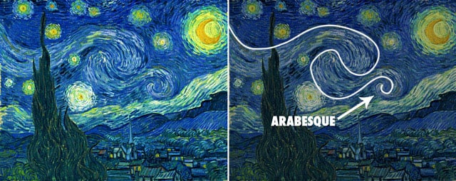
When we learn of another Gestalt psychology technique called the Law of Continuity, we’ll discover several tools we can use to create movement and unity, which will move the eye around the image. The most visually pleasing one is an Arabesque.
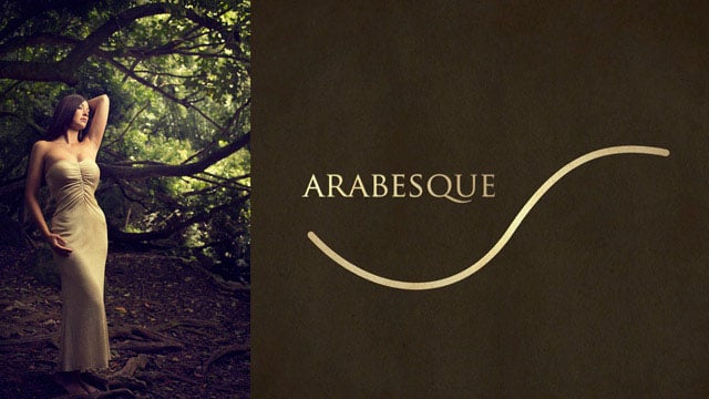
This is a curvilinear element you can incorporate into your art to create a beautiful sweeping movement throughout the image. Master painters used these extensively throughout their work.
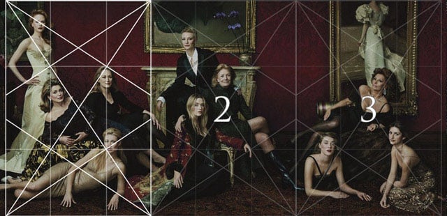
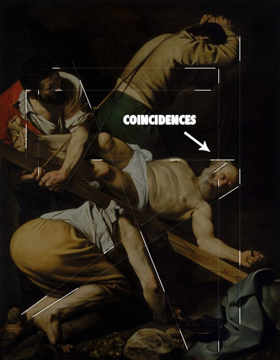
Another technique used to create movement is called a Coincidence. This is defined as edge-to-edge relationships, which unify multiple elements and can create movement side to side and up and down.
It’s not a solid line as you might think when you hear the term “leading lines.” It’s broken, hidden, and a magic trick which we can use to allow the mind to easily close the gaps.
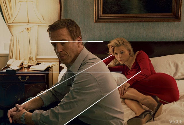
In this photo we can see the edge-to-edge relationships Annie Leibovitz creates by using the limbs of the models.
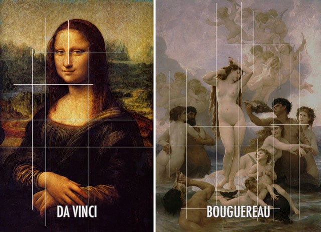
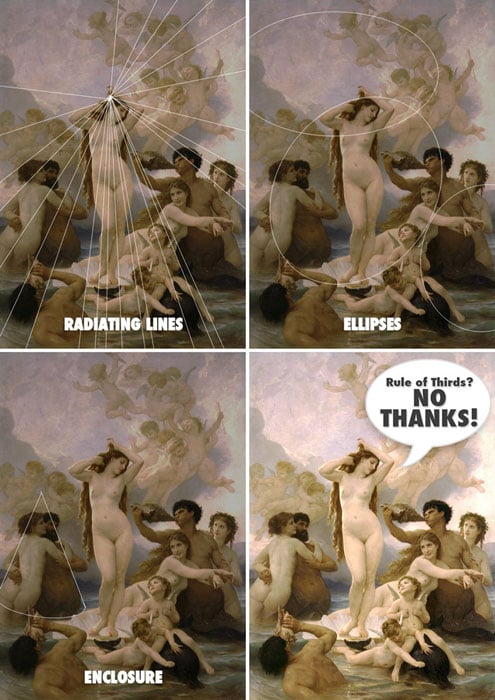
We can also see it in this painting of the Mona Lisa by Da Vinci, and in this complex composition by Bouguereau.
MYTH #4: “It gets the subject out of the center.”
First off, who decreed that the center of a frame is so bad? Why are we lead to believe this?


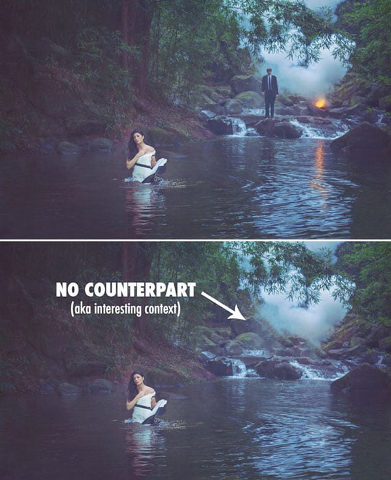
There’s a Gestalt psychology technique called the Law of Symmetry, which basically means the human mind is always trying to find balance in visual stimuli. So if we use the rule of thirds and place the subject off center, then we will need a counterpart to help us balance the image. If there’s no counterpart, then we’ve just created horrible balance within our composition.
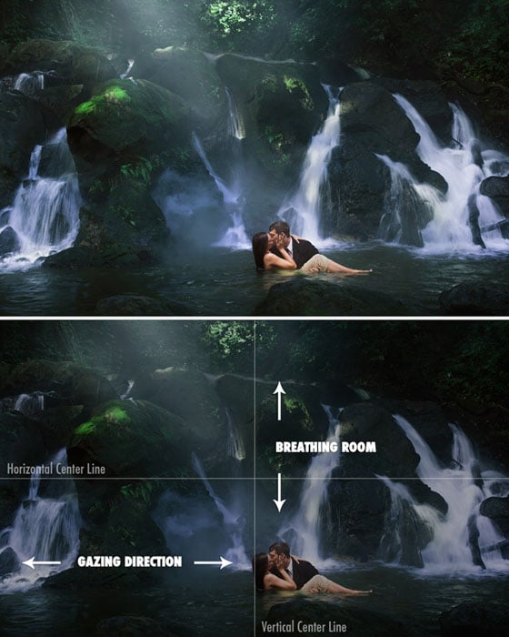
There is vertical balance (which I call breathing room), and there is horizontal balance (which I call gazing direction), and we must understand how to control each of these in order to create a properly balanced composition.
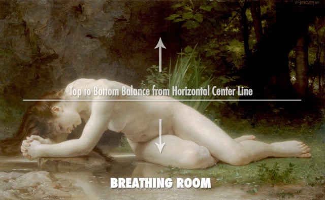
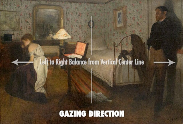
Here’s a photo I created which has the main subject centered, but is properly balanced because vertical and horizontal balance was considered.
It took me years to erase the damage the rule of thirds caused on my compositions. I was always placing the subject on one side or the other without consideration for the image as a whole.
MYTH #5: “Basis for a well balanced and interesting shot”
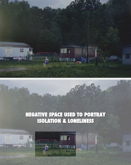
We already covered the Law of Symmetry, which covers the proper balance of an image, but what we didn’t mention how the rule of thirds gives birth to unwanted negative space. If we are generically placing our subject into one of the crosshairs without consideration of the whole, then we won’t have a counterpart on the other side of the composition and we’ll have negative space that takes attention away from our subject.

Negative space can be properly used to create a feeling of isolation or loneliness, but to use it without sophistication is a rookie move.
MYTH #6: “It’s a great starting point for beginners”
In my own experience, the rule of thirds only lead me down a dead end road. I thought of it as revolutionary at first and I was boasting its powers to photographers who were just starting out.
Later I found myself at a plateau and not able to understand how to properly compose an image because the rule of thirds was guiding me.
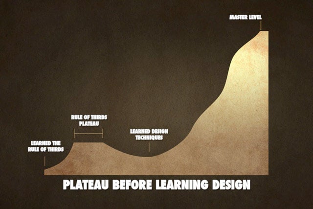
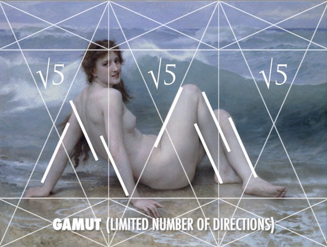
If new artists start with the grid of dynamic symmetry instead of the rule of thirds, they’ll be able to later take advantage of the diagonals, which they can create rhythm with… by posing the model, or applying paint strokes. The available diagonals within the rectangle will limit the number of directions you use, called a gamut, which will create a more powerful composition…rather than the spokes of a bicycle tire.
MYTH #7: “Artists from the Renaissance, or Greek artists, created the rule of thirds”
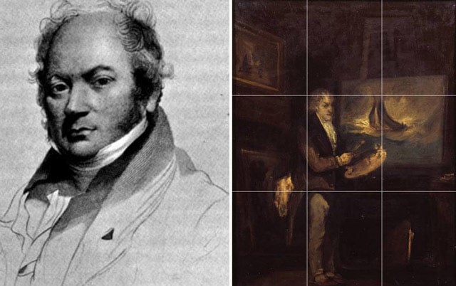
The rule of thirds was first documented in a book by Smith (around 1797), and if you take a look at his painting, you’ll see that he wasn’t a master at all.
Da Vinci would be rolling in his grave if he heard anyone say he was using the this. The amount of schooling, studying, and practice he put into his compositions, and someone is going to water it down to something as simple as the rule of thirds? No way!
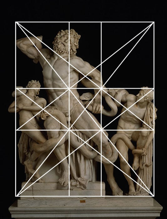
Da Vinci, along with other master artists, Greek included, used dynamic symmetry, the golden section, and other design techniques like arabesques, gamut, coincidences, radiating lines, figure-ground relationship, ellipses and enclosures.
MYTH #8: “The human eye naturally gravitates to the intersection points”
I truly wish composition were this easy. Place your subject in a crosshair, and BAM, you’re automatically controlling the viewer’s eyes. Not so fast! What about the fact that we are drawn to areas of high contrast?
When we make our subject the Greatest Area of Contrast (GAC), won’t we look there first…no matter what position they are in?
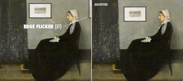
Another thing that pulls our eyes is something I call Edge Flicker. It refers to high contrasting elements near the edge, which greatly distract the viewer from your subject.
Creating a hierarchy of contrast and keeping the edges free of distractions will help you control the way your viewer’s eyes move around the composition.
MYTH #9: “Cropping to the rule of thirds after shooting a photo is a great way to save an image”
Cropping a poorly composed, badly lit image will not save anything. That’s starting at the end and working backwards.
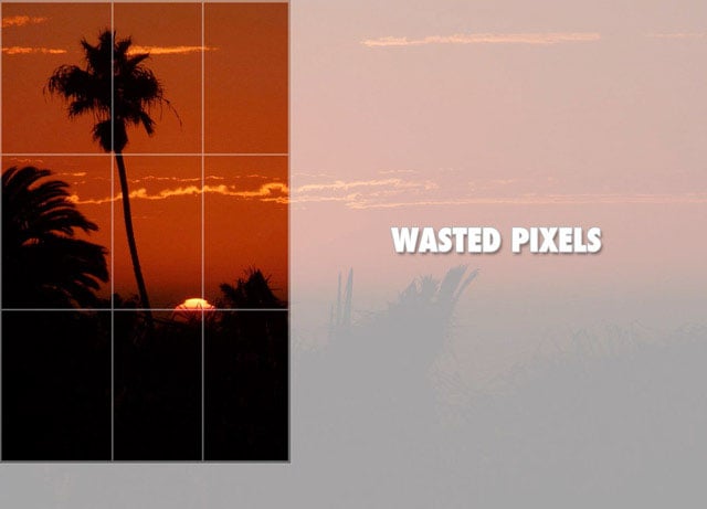
Learn composition and Gestalt psychology techniques so you know what to look for, how to solve visual problems, and get it right in camera. Don’t sacrifice precious pixels for the rule of thirds. Your creativity deserves better.
MYTH #10: “The power points, or golden points, create tension”
Placing your subject on a third is not going to create tension as we’ve learned so far.
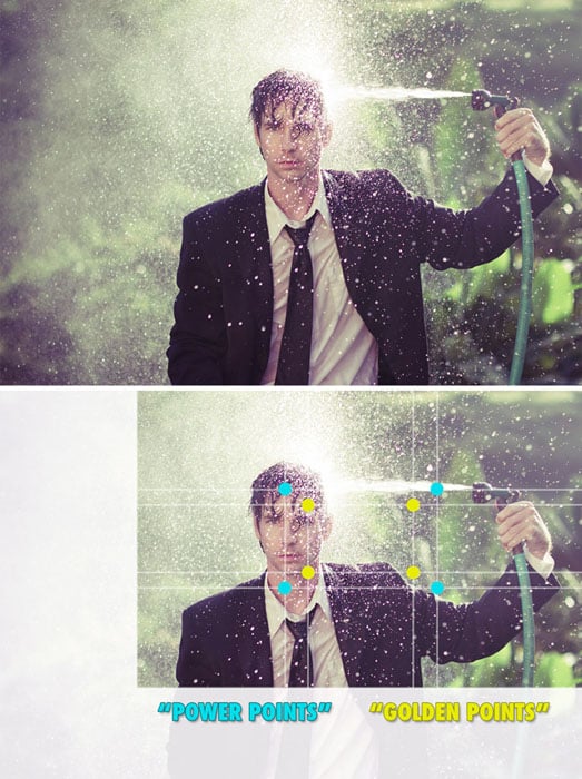
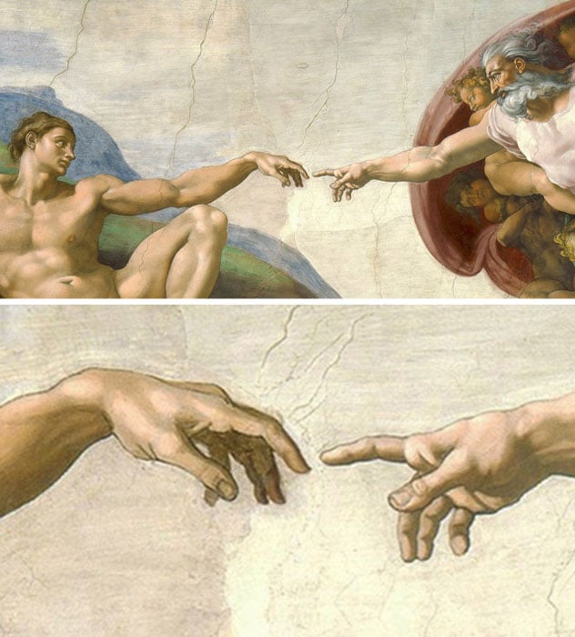
If we take a look at a Gestalt psychology technique called the Law of Proximity, we’ll see how visual tension can be created. Like this painting on the ceiling of the Sistine Chapel…they are clearly unified by their proximity, but another thing to notice as we view this is visual tension created by the fact that they are almost touching, but not quite. It’s the moment before impact.
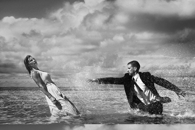
Or this photo where the man is almost within reach of his dying wife. It’s that close proximity that creates the tension.
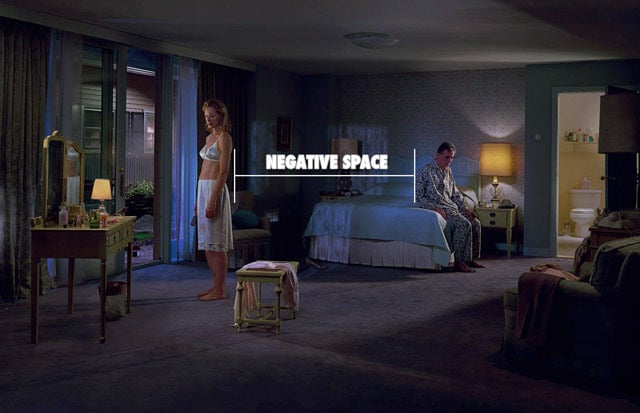
When considering the Law of Proximity, distance can create negative space, which in this photo creates a tension in the room.
Conclusion
So many tricks and techniques can be applied to create a remarkable composition, which communicates clearly to your viewer. Abandon the rule of thirds. Leave it behind and adopt the dynamic symmetry grid which is just as simple to use, but can leave many more options open for you as your art progresses.
If you found this information useful, please share it with your friends. Help me tackle this rule of thirds beast, kill it, and introduce better techniques to others who are in need of powerful composition. Learning powerful composition is the only path to becoming a master of your craft.
About the author: Tavis Leaf Glover is a fine art photographer and author based in Honolulu, Hawaii. You can find more of his work on his website and on Flickr. Glover is also an educator about applying Gestalt psychology principles to photography and art.