Is Capture One’s Default Color Profile Any Better Than Lightroom’s Adobe Standard?
A few months ago I stumbled upon a very interesting article on PetaPixel titled “Why I Stopped Using The DNG File Format.” In this article the author mentions that Capture One give us a better starting point for color processing. This point made me excited about the whole idea that my portrait images could turn up a lot better and that I only need to start using Capture One.
By having integrated countless camera brands, makes and models, Capture One knows how each one of those camera models is built and how each model’s specific sensor interpolates the light hitting its surface and how the camera stores that data in its raw file. Sony makes a majority of the world’s camera sensors (including all Nikon sensors), but the sensors in the Sony A7s and Nikon D810 are vastly different. As are the sensors in the Fuji X100T, the Phase One IQ3 backs, Mamiya Credo 60, Canon 60D, etc….If you take the same raw files (not DNG files!) and open them in both Lightroom and Capture One, side by side, without doing anything to the files, you will notice immediately — IMMEDIATELY — that Capture One does a much better job of accurately rendering the image. The colours are better. The exposure is better. Everything is just better.
In this short post, I argue, based on my own impressions and those of others, that this statement does not apply entirely to all situations, It is confined to how the light behaves, which lenses you use, which camera and sensor combination you have, which application you use for editing, and, lastly, which screen you use. All of these factors should be considered before we conclude that one profile (or algorithm) is superior to the other.
In other words, Capture One is not always better than Lightroom for color processing. Additional and systematic research should be done in order to give us a more complete view of the differences between color profiles.
In the following test I used 4 different images in slightly different light conditions, I created 4 variations for each RAW image, using Adobe Standard, Camera Portrait and Camera Neutral color profiles within Lightroom, and an additional image with Capture one default color profile. I chose these profiles because they are always mentioned as an alternative to Adobe Standard. Other than changing the color profile I did not do any editing.
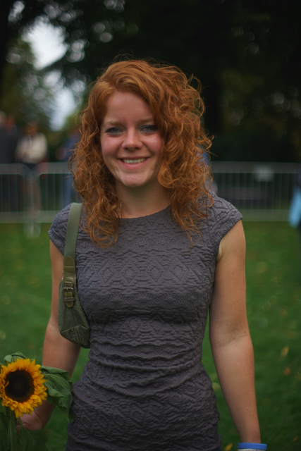
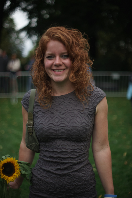
Please try to make up your own mind before peeking at the end of the article to know which profile is assigned to each image. All images were exported as SRGB, which is how it was exported in the article as far as I can tell. Everything was shot using a Sony A99 with a Minolta 24mm f/2.8 lens at 1/1600 and ISO 100.
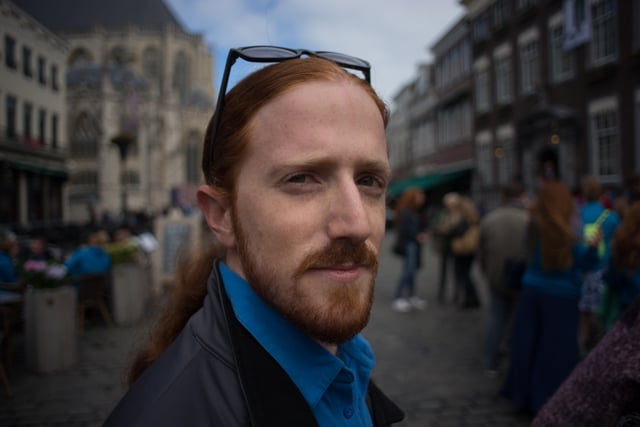
Test Photo #1


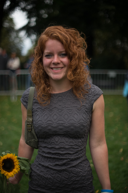
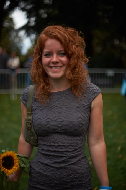
Test Photo #2
Test Photo #3


Test Photo #4


Now that you’ve seen the photos, here’s what you were looking at: all the shots appear in the following order:
1) LR Default (Adobe Standard)
2) Capture One Default
3) Camera Portrait
4) Camera Neutral
Surprisingly, contrary to much of what I’ve read on the Web, my opinion (and the majority opinion of the 15 other Sony photographers I talked to) is that the images with color profile #1 (Adobe Standard) are more acceptable for light skin color and seem to hold well for the environment, and that color profile #2 (Capture One default) makes light skin seem too red and is more acceptable for darker skin tones, which achieve a more natural-warmer skin tone. Color profile #3 seems similar to #2 with a touch of yellow and #4 is just too flat and desaturated to begin with.
Keep in mind that these observations are based on natural light (overcast sky), using Minolta lenses (24\2.8, 50\1.4), shooting with a Sony A99, and various screens. The consensus was that for light skin tones Adobe Standard should be used and for darker skin tones Capture One default color profile provides a better skin tone.
However, can we generalize again and say that Adobe Standard is only good for light skin and Capture One default profile is only good for dark skin? No.
There are simply too many free variables that affect our observation. We should question all generalizations made toward one choice or the other; as I mentioned, it may work differently on other sensors, with various lenses, in different light conditions (flash, Sun, etc), and on different screens. Color perception is also very subjective, some may like one profile, others may like another. We should do our own research regarding our own photography and determine which tools makes it better.