Typeface Made by Taking Long-Exposure Shots of iPhone Streaks in the Dark
Long exposure photography and light painted letters have been used in many a situation. One of the more elaborate we’ve seen was a massive light-painting proposal we shared with you back in 2011. But what do you get when a graphics designer and self-proclaimed Apple geek decides to use the technique? Well, in the case of Marcus Byrne, you get the typeface known as Phone Streak.
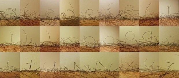
One night, when he wasn’t putting something together for one of his clients, Byrne decided to break out his iPhone and Canon 5D and create his own custom font. Each letter was created by using 3-4 second exposures, and he performed each stroke 5 or 6 times to make sure he had plenty of great options to choose from.
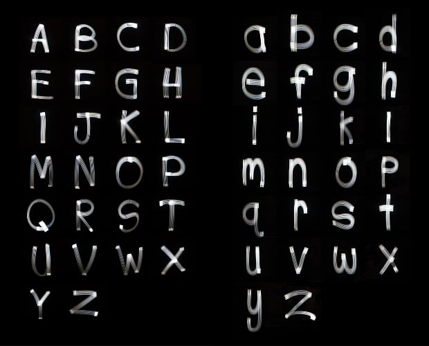
Here’s a look at all the letters:
It might seem like a silly pet project to some, but Byrne took it very seriously, wanting to get the best possible results. He restored the icons on the front of the phone to default so they were easily recognizable.
He also played around with holding the phone steady for a bit longer at certain points in the stroke so the camera could catch the detail in the icons. “I really wanted the icons to be visible when viewed in full color,” he tells Wired, “[to] be part of the character of each individual letterform.”
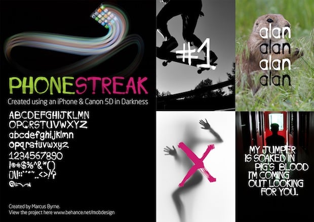
The font is available for free through Dafont, and can be used without restrictions. In Byrne’s words, “Feel free to use it, abuse it, damage it, smash it, break it, colour it, kern it, track it, space it, place it, care for it, love it. It’s free to do whatever the hell you want with it!”
To see more examples of the font in use or download your own copy of the .otf and .ttf files, head over to Bēhance or Dafont by clicking the corresponding links.
(via Gizmodo)
Image creditsPhotographs by Marcus Byrne