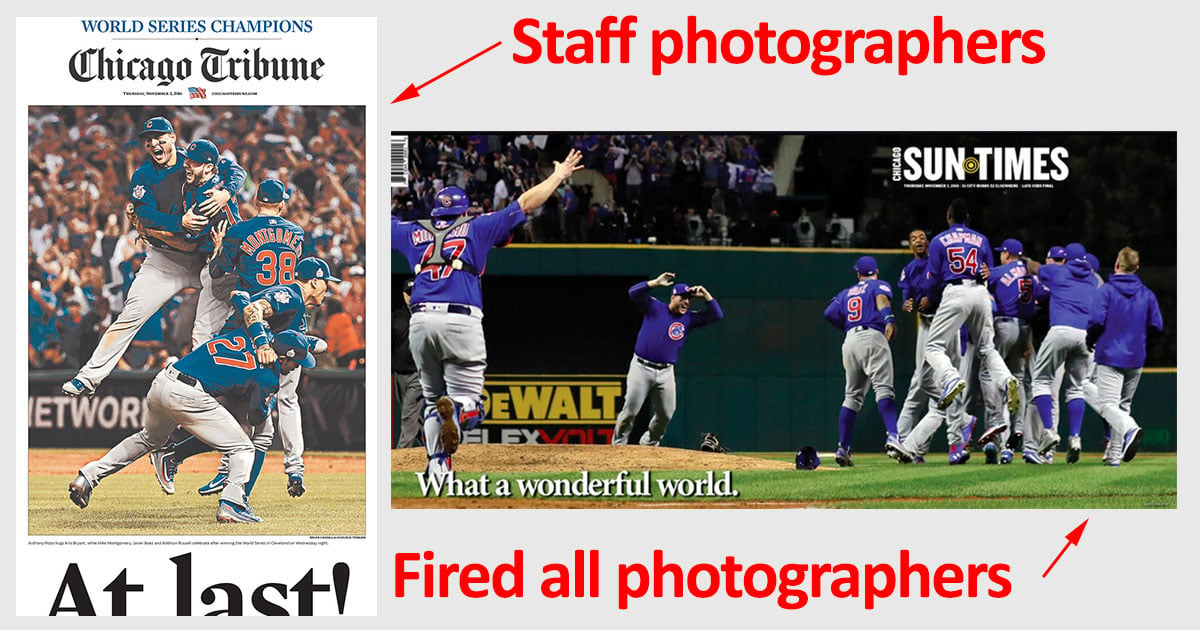
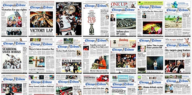
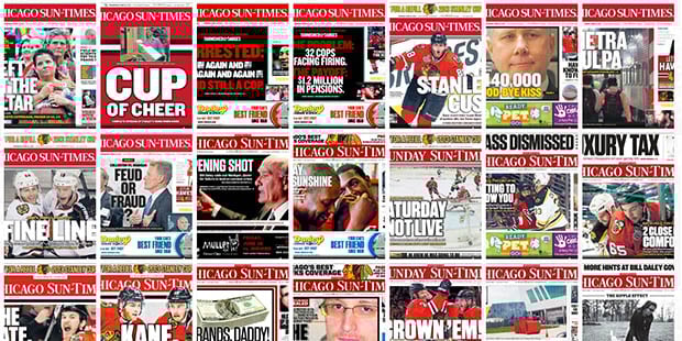
Chicago Tribune and Sun-Times Covers After the Stanley Cup Finals
After the Chicago Sun-Times laid off its entire staff of photographers at the end of last month, the newspaper’s editor sent out a memo stating that employees would be trained in using their smartphones to contribute photography (“iPhone photography basics,” it was called).
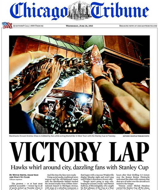
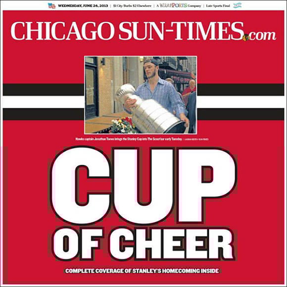
We may be starting to see the negative effects of having an army of staff iPhoneographers rather than photojournalists. The side-by-side comparison above shows what the Chicago Tribune and Chicago Sun-Times newspaper covers looked like on June 26th, 2013, two days after the Stanley Cup finals.
…and of the two photographs:
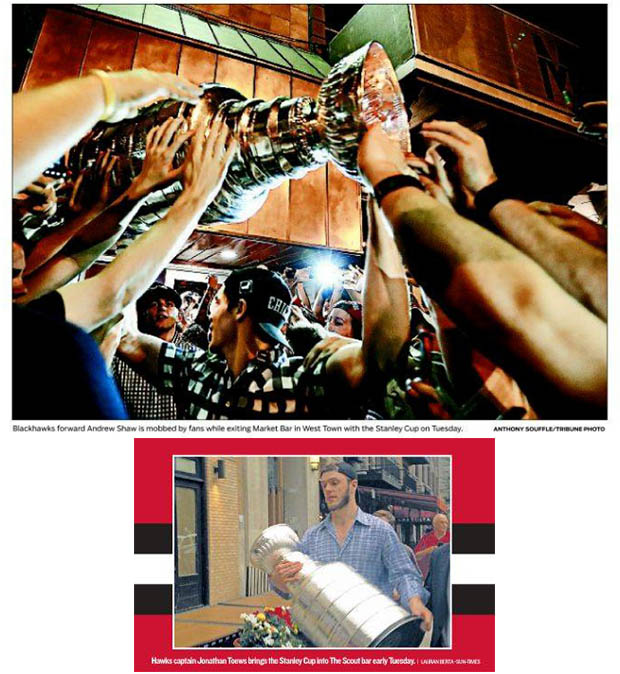
One of them looks like a photograph captured by a photojournalist, while the other looks like an iPhone snapshot. Why was the Sun-Times cover photo used when there were plenty of photographs floating around on the wires that could have been licensed? Perhaps it was done in protest.
“I miss the Sun-Times photographers. This is a disservice to your readers,” tweets Tribune photojournalist Brian Cassella.
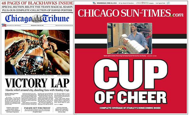
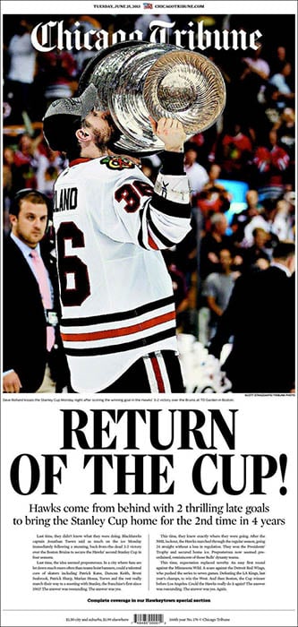
A comparison of the newspaper covers the day before is also quite interesting [Update: see below]:

These are simply two cover comparisons that stand out as being “lacking” on the part of the Sun-Times. In general, the newspaper has still been doing a good job of featuring breaking news photographs prominently on its cover:
You can compare recent covers yourself over on CoverTimes (here and here).
(via Brian Cassella via Reddit)
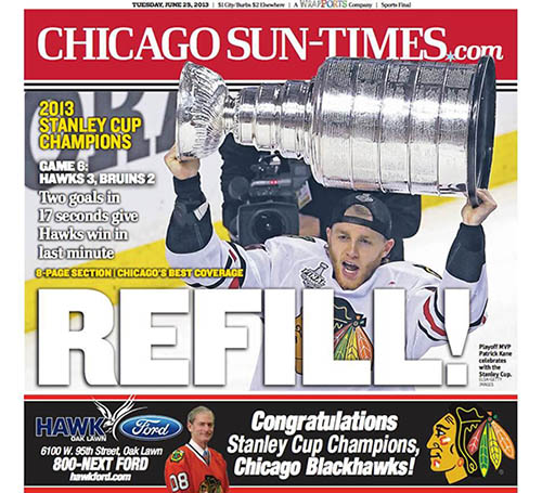
Update: It turns out the June 25th cover comparison isn’t entirely accurate. The Sun-Times actually had a special wrap-around for that day’s paper:
The June 26th comparison (the one that started off this article) still stands.