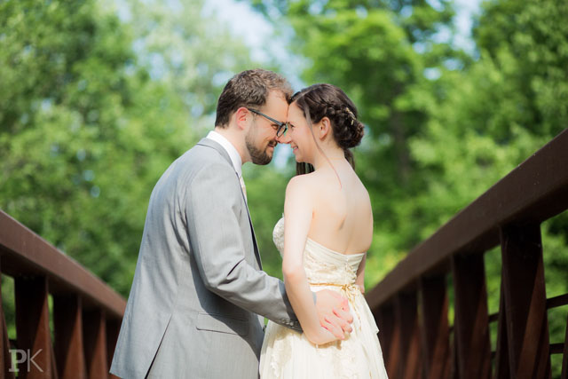
Post-Processing Trends in Wedding Photography

Wedding photography, much like the entire business of weddings, is highly influenced by the ebb and flow of trends. They come, they go, and they’re cyclical. When I plunged into the business in early 2012, I committed myself to research the industry: what works, what’s popular, and what sells? I quickly discovered that there’s a common, predictable, and heavily relied upon set of post-processing trends in wedding photography.
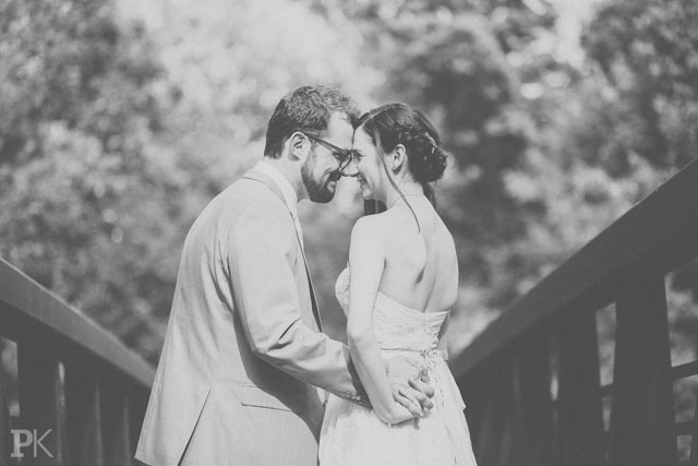
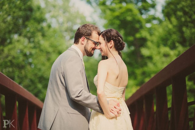
The Au Naturale
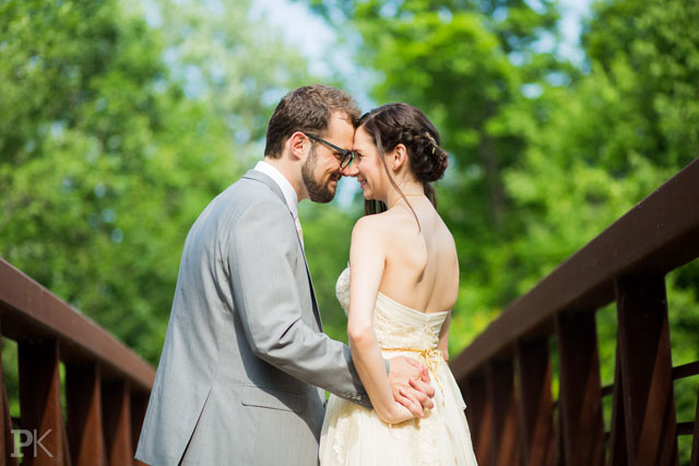
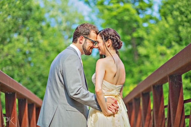
This is perhaps the most authentic rendition of the scene. I preferred my original edit over this because of its more uniform skin tones and darker, slightly cooler, greens (I used a modified VSCO preset). However, I have great respect for any wedding photographer that chooses to go with a natural rendition of the scene.
The Shoot & Burn
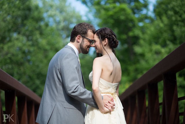
This is either straight out of the camera or straight out of their RAW converter. They couldn’t even bother to adjust the color balance.
The Paper Cut
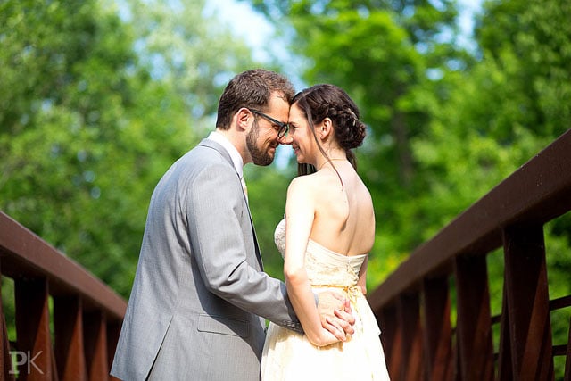
No photo is too crisp or highlights too blown. If your photographer does this, run, don’t walk. Your images are being exported in MS Paint.
The VSCO
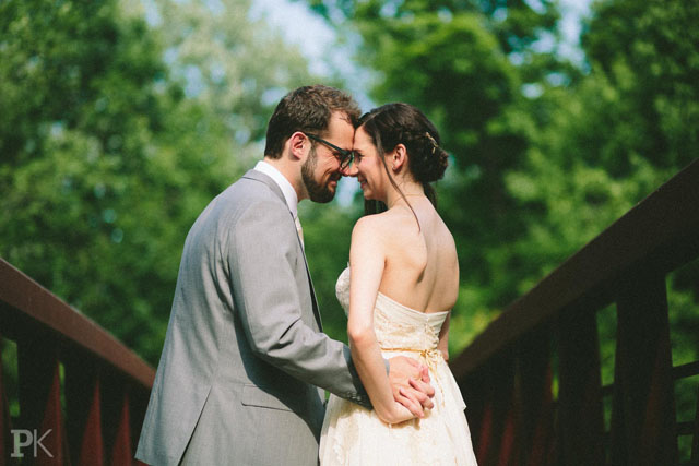
There’s a reason this looks familiar: everyone is using it. The stronger the filter’s settings (more ++’s), the better. Because why should you exert more effort than the push of a button?
The Tilt-Shift Surprise

Photoshop made it easy: when distracting details are causing a problem, add a field-blur and it’ll be no bother. Commonly used on long shots with lots of fine details.
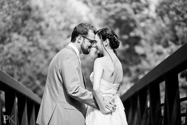
The Daguerreotype
Calling this black and white would be reaching; it’s grey and greyer. Used to disguise distracting details in medium to close shots and portraits, and hide poor exposure.
The Dirty Polaroid
This “antique” is fresh out of the attic with the dust swept off, kind of. Fortunately, this trend is joining the Dodo bird. Fun variations: swap dust for water stains or grandma’s wallpaper patterns.
The Moody Hipster
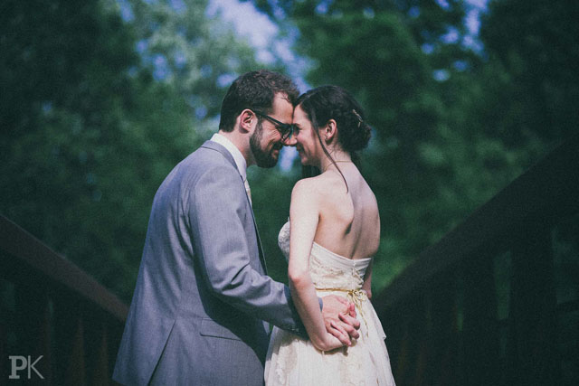
Sunny days too typical? Try this variation on film simulation. For that rainforests-in-Oregon-on-a-cloudy-day feel, guaranteed. [Serious side note: did you know that although the faded shadow look is quite popular, it simulates the results of poor photographic technique? In the film days, if you delivered an underexposed roll to a consumer lab, the technician would manually push your prints, which would raise the darks and expose the film grain.]
The HDR
I continue to see this style every now and then and I simply don’t get it. No photographer who’s respected by their peers would produce such a garish Technicolor monstrosity. Most of the post-processing techniques on this list are used to improve an image, whether by concealing a distraction or emphasizing a strength. This approach brings out the worst in everything: The greens are toxic; the skin looks sunburnt; and it lacks all three-dimensionality. Any theories why some photographers do this?
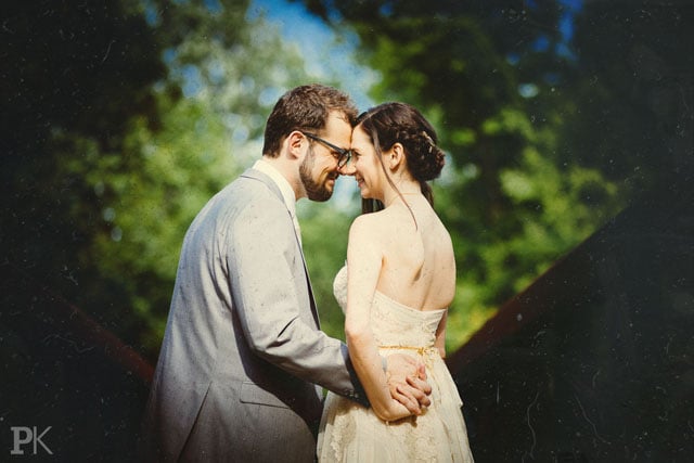
The Peaches & Cream
Cream, pink, or pale yellow, pick your poison. This style has been growing in popularity on many of the frillier wedding style blogs. How do you like it? Tinting a photo can significantly improve its look. It creates an overall color uniformity and mutes distracting and unflattering colors. However, I still feel that with some thoughtful framing, a more accurate rendition of the colors would give the photos greater longevity. This is especially true when you acknowledge that the true value of wedding photography is realized in the years ahead, when former trends are just another Buzzfeed article.
The Jeff Ascough B&W Special
Just like Jeff used to do it, using the luminance channel of the LAB Color Space. This method creates very pleasing tonal transitions between highlights, midtones, and shadows. Need a bit more punch? Use the High-Pass filter. I really admire this look – it’s how black and white should be done, you know, with blacks and whites and all the tones in between them (I’m looking at you, Daguerreotype).
The Madame Tussauds Extravaganza
I frequently see this approach to skin “enhancement” committed by photographers with a broad brush and a very 1990s mindset. I like nothing about this approach; it makes adults look like cherubs from Renaissance paintings. The results are unnatural and waxy, hence the name. Far superior results are obtained with a little help from the Spot Healing Brush, a Wacom Tablet, and lots of time.
The Selective Color
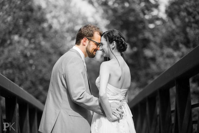
This is my favorite. Usually reserved for colorful details, such as red roses and … that’s it. Unfortunately, I only had the groom’s face to play with. The results are far superior.
When selecting a photographer based on your preferred post-processing style, always ask to see a wedding or two to ensure that the photographer sticks to a consistent look across the entire set of photos. This will help you decide whether a particular visual approach works beyond a single image.
About the author: Pavel Kounine is a Toronto wedding photographer and filmmaker. You can connect with him through his Facebook page, and his blog here. This article originally appeared here.