Graphing the Dominant Colors in Photos of Europe
A friend (Eric) and I were hanging out one Sunday and we decided to do something fun with EyeEm data. We obtained and then graphed the predominant photo colours for every photo uploaded or tagged in Europe. We then generated these pretty pie graphs for each country.
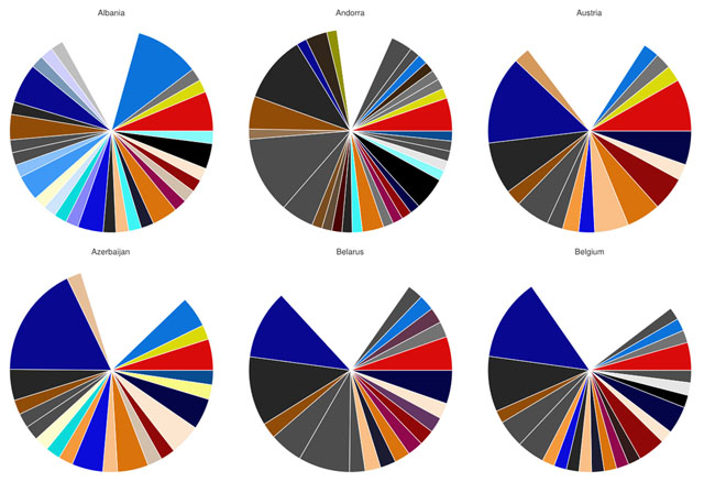
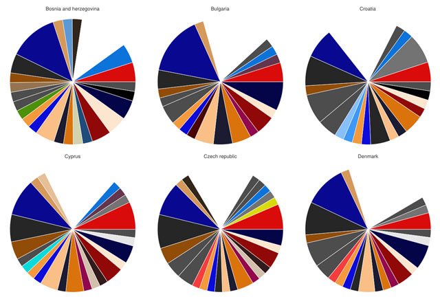
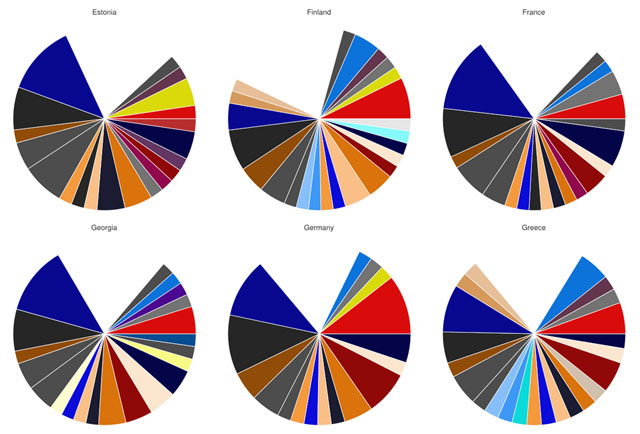
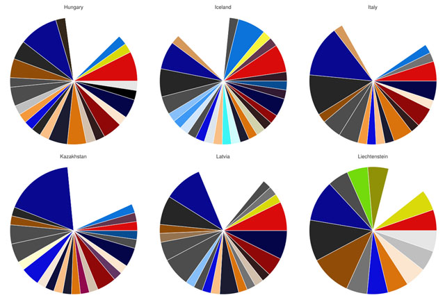
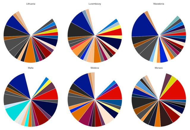
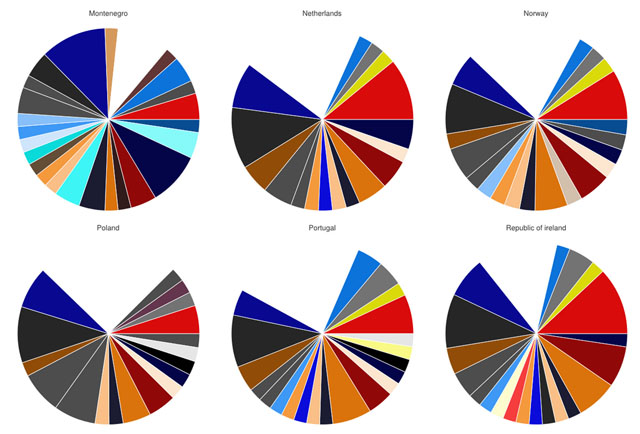
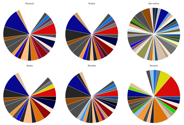
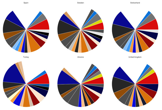
The countries
The method
First we spoke with an engineer on the EyeEm search team (thanks Michele).
We learnt that, given an album ID, we could query the search API for the total number of photos for any HSL colour. As each country is simply an album on EyeEm we would just need album IDs for each country.
The first problem was that HSL supports over 16 million colours. A query for every colour would not be practical. Instead, we learnt that the search team map predominant colours to 316 discreet buckets (by rounding colours in between).
By obtaining this colour list we could now make 316 queries per country. With a small Ruby script I also fetched IDs for the 48 countries of Europe.
This soon presented another problem. As we didn’t have direct database access we would need to make queries using the public API — which the apps and website use too. 48 x 316 however is 15,168 requests. To reduce time these would also be made in parallel. This could be pretty very stressful for a server but we decided to do it anyway.
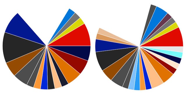
This aspect was written in Scala. Once it had finished we took the JSON output and wrote some Ruby scripts to convert it into graphs using a GoogleCharts gem.
Whats next?
We were pretty excited once we saw the results. Comparing the blues and greens of oceanic Iceland to the greys and blacks of alpine Andora provide some interesting insights.
We haven’t finished yet and have some tweaks in mind for the next iteration. Perhaps printing out a poster, comparing continents or consolidating certain colours.