ColorChecker: How to Get Perfect Skin Colors With Every Camera
One of the best kept secrets within the fashion and beauty photography is the way to obtain absolutely perfect and flawless skin colors, brightness and texture. That’s an art, absolutely, and often a quite technical challenge.
In this article I will explain how to obtain perfect skin colors, with the help of a ColorChecker. But not just a simple ColorChecker workflow with the standard, bundled software. No, there’s a neat trick which saves a lot of time and a lot of custom color editing (and desaturating) of skin tones.
It’s a quick, transparent automatic workflow, once set up and created. Your camera needs to shoot in RAW.
The Differences
Many of you use the X-Rite ColorChecker Passport already. That’s fine! It’s an invaluable tool and I use it every day, everywhere. The bundled software (standalone or as an Adobe Photoshop Lightroom plugin) works fine too and it creates color profiles which are way better than the standard Adobe color profiles. But there’s more to improve, especially when looking at skin tones and saturation in their shadows.
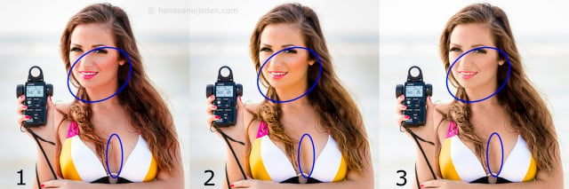
The image above shows 3 versions of the same image of Bibi. This was a quick shot, to measure the ambient light with my light meter which she’s holding. The light is overcast, without flash. The white balance is accurate in all of the 3 images. The image is imported as RAW directly from the camera into Adobe Photoshop Lightroom (version 5.2 Mac). No exposure adjustments are made.
As you can see, there are huge differences when you look at the shadow areas of the skin tones:
- This first image is developed with a standard Adobe DNG camera profile. The skin is too red, did you notice the reddish shadow areas under her chin already? That’s NOT what we want. And that’s not what the makeup artist wants too.
- This second image is way better. It’s developed with a ColorChecker Passport profile, created with the X-Rite ColorChecker Passport software. But if you look closely under her chin you will notice a too saturated, yellow color cast. That’s easier to correct but again that’s NOT what we want. And not what the makeup artist wants.
- This is how skin has to be. Exactly the same as I saw in real, with my own eyes. And exactly like the makeup artist wants it to be: a contiguous area under the chin and in other shadow areas of the same skin saturation. How I developed this image? Also with the ColorChecker Passport. Not with the X-Rite ColorChecker Passport software but… with the Adobe DNG Profile Editor.
The Adobe DNG Profile Editor has been a real time saver to me. No more Photoshop painting with colored brushes onto color layers. No more extra masking. No more struggling with exposure-introduced hue changes in RAW. No, everything is right from the first time.
In this article I will explain how to create such a profile with the ColorChecker and the Adobe DNG Profile Editor. But first another example, this time in studio light. More subtle, yet significant differences.
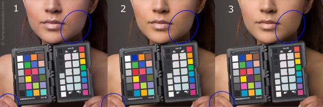
You can click the image above for the large version. Again I’ve placed blue circles around some of the problem areas. I used a simple large beauty dish as main light and I adjusted the white balance exactly like it has to be. Also this time the image was imported directly into Adobe Photoshop Lightroom without making exposure adjustments.
Also in this case there are some difficult areas with a wrong color saturation, when using one of the standard Adobe profiles. You can clearly see some rough edges around her cheekbones with the darker makeup, which is transitioning to the lighter part. In reality, with the naked eye, those transition areas were subtle. But not in the first and second image: you see sharp lines and high color contrasts. That would require very much time in post processing to even out all those red tones:
- Again, this first image is developed with a standard Adobe DNG camera profile. The skin is too red. There’s too much color and brightness variation in the area around her cheekbones.
- This second image is better. It’s developed with a ColorChecker Passport profile, created with the X-Rite ColorChecker Passport software. The red skin is gone and it almost has the right hue. Most of the colors are more saturated. There are still problems with the areas around her cheekbones though.
- This image is the best. The skin seems softer, more even and more flattering. Also this color profile is made with the ColorChecker Passport… not with the X-Rite ColorChecker Passport software but with the Adobe DNG Profile Editor.
I really didn’t change anything in the 3rd image. No extra skin softening, no extra coloring, no brightness changes. The only thing I changed was the color profile. And that made a huge difference, which can save many minutes of retouching.
The second image has more saturation in some of the colors. But in my opinion image 3 is also better because it has more details in the color areas. It’s always possible to give it more vibrance in post processing because vibrance doesn’t touch the delicate skin colors.
The cause of our problem
Every camera is different: every lens, every sensor, every filter. Some brands like Canon or Nikon are applying tricks to the JPG image processing in camera, to render the colors slightly different than in reality. They’ve done much research and discovered what people like more: pleasing colors, with more saturation in the shadow areas. Orange tones in those areas more to pink, blue areas a little bit more to the red. Sometimes that works great for nature photography and for Asian skin (which has less of the red color component in it, while compared with average European Caucasian skin). Those color conversions only apply to the in-camera JPG processing, after the RAW capture.
Companies like Canon and Nikon are keeping those color conversions as a proprietary secret. So, software like Adobe Photoshop Lightroom and Adobe Camera RAW can only guess and mimic the color conversions, and do the best they can. But there are too many variables in the game of color conversions and other proprietary algorithms, so Adobe can only try to get as close as possible: it will never be exactly the same as the proprietary in-camera JPG rendering.
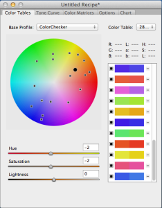
Those color conversion algorithms are also called “hue twists”. You can see a graphical representation of those hue twists in the image on the right. Thanks to the amazing work of Sandy and with a little help of Apple’s Grapher program, it’s possible to see what’s happening in an Adobe color profile, mimicking a Canon EOS 5D Mark II camera profile.
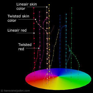
The straight vertical lines are the linear interpretations of the sensor data. This is the most ideal case for rendering skin tones: no extra saturation in the shadow areas, no color changing while brightness changes. But the curved lines are lines from the Adobe DNG camera profiles with hue twists: they are quite heavy twisted here. As you can see, on a certain dark level, the skin tones are curving to the red, red is going to pink and yellow is going to the less saturated center.
That makes it difficult to work with: changing the exposure sliders in Adobe Photoshop Lightroom or Adobe Camera RAW will also change those colors on the fly. You keep correcting continuously.
Fortunately, the color profiles generated with the ColorChecker are much more forgiving. I couldn’t visualize them yet, but as far as I could see there aren’t any hue twists.
See this comment of Mike Blume for a more technical explanation.
The colors seem to be interpreted in a 2D color space, just as like the ColorChecker chart has been photographed with one level of lighting. To me, that makes it easier to work with. Thanks to the dcpTool website, which made me understand more and more of these rather complex color conversions.
What we will create
We will create a DNG camera profile with the help of a ColorChecker chart. This profile is a small file, the extension will be dcp. The profile will only work with your camera model (type), so every camera model has another DNG camera profile.
After creating the DNG camera profile we will place that file in a special folder so Adobe Photoshop Lightroom, Adobe Camera RAW and the X-Rite DNG ProfileManager will recognize them immediately.
We will change the default settings of Adobe Photoshop Lightroom, so it applies the new DNG camera profile automatically on every import.
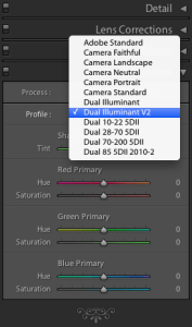
The DNG camera profile we will generate will be Dual Illuminant: a more universal, flexible kind of profile which can be applied with every white balance setting. More about Dual Illuminant profiles below.
What you need
- A computer with a hardware-calibrated screen, preferably a Mac (as Windows has a different color management)
- Adobe Photoshop Lightroom and/or Adobe Photoshop with the newest Adobe Camera RAW plugin
- Optional: The Adobe DNG Converter (when Lightroom doesn’t recognize your camera yet)
- The Adobe DNG Profile Editor
- The X-Rite DNG ProfileManager (free download if you buy the X-Rite ColorChecker Passport)
- The X-Rite ColorChecker Passport or another ColorChecker chart
- Optional: an external calibrated light meter so you can make sure you expose the ColorChecker evenly and perfect
- A camera which shoots RAW
- A location outside at noon, under a cloudy grey sky, for making the first calibration shot
- A location inside with only a single yellowish (tungsten) light bulb, without daylight coming in, to make the second calibration shot
Photographing the ColorChecker
First of all we need 2 different photos of the ColorChecker, taken with your camera. We will take one of the photos in cold daylight and we will take the other photo in warm tungsten light, coming from a single light bulb. That light bulb has to be a normal light bulb, so no TL-bulb, energy-saving FL bulb or other semi-normal-bulb. We want the old, cheap, normal ones which will emit a consistent color spectrum.
1. The outside “cold” ColorChecker calibration photo
We need cold, bluish sunlight for our first image of the ColorChecker. So, wait until high, midday noon. I always use golden-hour.com to check for the best time. Mostly around lunch time, when the sun is as high as possible.
Overcast is the best. Else, look for a place with shadow. Make sure to have no heavy color casts. No green grass, no red leaves, no blue reflections in the water, etc. If you found it, take your external light meter and measure the right exposure. Make sure to evenly lit the ColorChecker chart. The white balance on your camera doesn’t matter, but please set the file format to the largest RAW format. Take the photo, with the ColorChecker chart as big and as sharp as possible.
2. The inside “warm” ColorChecker calibration photo
For this second image of the ColorChecker we need warm, yellowish lamp light: tungsten, an ordinary old-fashioned light bulb. You know, those inefficient but beautiful old standard bulbs. Wait until it’s dark, or look for a room which you can make completely dark so no daylight is coming in (with some slow lenses you will have to raise the ISO). Light the room with the light bulb. Again, make sure to have no color casts. Use your external light meter when possible and expose the ColorChecker evenly. White balance on the camera doesn’t matter, but use the largest RAW size. Take your photo and make sure to capture the ColorChecker big and sharp.
Creating the DCP profile
Converting the RAW files to DNG
Before we can work with the RAW files you just captured of the ColorChecker chart, we first have to convert them to DNG: Digital Negative.
As you can see on the right, it’s possible with the Adobe DNG Converter. This small free program accepts almost all of the available RAW formats, more than Adobe Photoshop Lightroom and Adobe Camera RAW.
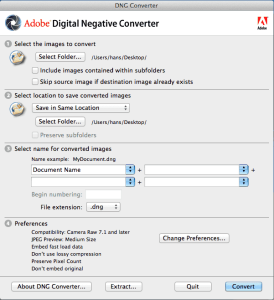
You can use Lightroom to convert the 2 shots to DNG, but in this example I use the Adobe DNG Converter because it’s easier to explain. Just select your source folder with your 2 RAW files and press Convert. The program will convert your 2 ColorChecker photos to the DNG format.
After converting you can delete your two original RAW files which came from your camera. You don’t need them anymore, since we losslessly converted them to the (much more future-proof) DNG format.
Creating the first color table
Open the Adobe DNG Profile Editor. Select as Base Profile “Adobe Standard” or “Camera Neutral”. Go to “File” -> “Open DNG Image…” and open the first shot of the ColorChecker chart: the one outside, in daylight. The image opens in a new window.
Right click in a grey patch of the ColorChecker chart to set the perfect white balance.
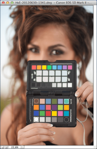
Go to the “Chart” tab in the main window, it’s on the right. There will appear four colored circles in the image window. Move them to the corners of the ColorChecker image, as shown in my example. You can also zoom the image to make them fit better. And yes, you only need that lower part of the ColorChecker Passport.
Go back to the main window of the DNG Profile Editor. You’re still in the “Chart” tab. There, on step 3, make sure to select the “6500 K only” option in the pulldown menu. This way you tell the program this image has been taken in cold daylight conditions.
Click the button below, at step 4: “Create Color Table…”. You will receive a pop-up message with “Color table(s) built successfully” and you will be directed to the main “Color Tables” tab. The Base Profile setting (drop-down menu) will change to ColorChecker. Yay!
Creating the second color table
Go to “File” -> “Open DNG Image…” and open the second shot of the ColorChecker chart: the one made inside, in tungsten lamp light. The image opens in a new window.
Right click in a grey patch of the ColorChecker chart to set the perfect white balance.
Go to the “Chart” tab again. There will appear the four colored circles in the image window again. Move them to the corners of the ColorChecker image, as shown in the previous example above. You can also zoom the image to make them fit better.
Go back to the main window of the DNG Profile Editor. You’re still in the “Chart” tab. There, on step 3, make sure to select the “2850 K only” option in the pulldown menu. This way you tell the program this image has been taken in warm tungsten lamp light conditions.
Click the button below, at step 4: “Create Color Table…”. You will receive the pop-up message with “Color table(s) built successfully” and you will be directed to the main “Color Tables” tab. Look at those differences on the right!
Saving the color profile
In the DNG Profile Editor, go to the “Options” tab. There you can fill in the profile name and your copyright. You don’t need to type your camera name, because that’s automatically attached to the profile which we will generate.
I will type “Dual Illuminant V2″ here, because this is my second dual illuminant profile version. You can choose what you want, whichever will work for you.
Now go to “File” -> “Export profile…” and save the profile. Use the profile location the program suggests (so don’t change the folder). You will receive a pop-up message which will say “…exported successfully”. You can now close the Adobe DNG Profile Editor.
Applying the DCP profile
Applying the profile is very easy. I will explain it for Adobe Photoshop Lightroom, but it’s the same for Adobe Camera RAW (as both use the same engine and have the same develop controls).
Open Adobe Photoshop Lightroom, I use version 5.2 which is the most recent one at the moment of writing. Open a RAW photo taken with your camera (not JPG, not PSD, not TIFF) in “Develop” mode (D).
In the right panel you see “Camera Calibration” near the bottom. With… a “Profile” drop-down menu. Select it. Look what’s there? Our newly created profile.
Select the new profile and see the differences in your image. Do you like it? Is it better? Start playing with the develop tools like exposure, contrast, shadow, highlights… and notice how predictable they became. No more spontaneous hue changes in dark areas. A smooth silky skin with beautiful flesh tones, just like they were in real light.
The only thing we have to do, is making the new profile the default profile. That’s easy too, but little known.
In the right bottom corner (you’re still in the Develop mode of Lightroom) you see 2 large buttons: “Previous” and “Reset”. Press “Reset” and your image is back to its starting point (with also the quite ugly Adobe standard profile selected).
Now, select in the “Profile” drop-down menu your brand new generated profile again. Then, press the Alt or Option key on your keyboard. The “Reset” button will change to “Set Default…”. Confirm!
From now on, your new profile will be automatically applied to all newly imported photos from your camera.
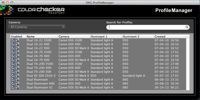
When you buy the X-Rite ColorChecker Passport you’ll receive a download link by mail to the DNG ProfileManager software. Open the DNG ProfileManager and see your new profile, together with all the other profiles of all the other cameras too. Here you can enable or disable profiles.
Summary
Obtaining great skin tones without heavy editing is one of the most difficult challenges to overcome. There’s no perfect solution because every model is different, every light has another character and style and every makeup artist has his/her own signature.
But creating your own custom color profiles with the ColorChecker and the Adobe DNG Profile Editor can be a real time saver with more precise results.
We created a Dual Illuminant profile. That profile is quite accurate and has a great linearity. But of course you can create a custom, Single Illuminant profile for tough situations like fluorescent lighting, high altitudes or other types of exotic light. But the differences with Dual Illuminant profiles won’t be that huge though.
I hope this article can help you, doing a lot of more work in less time with better, more consistent results.
If you have any comments, experiences to share or questions, feel free to react below. In English please, so we can all learn from it and contribute to it. And above all: have fun!
About the author: Hans van Eijsden is a portrait, fashion and glamour photographer from the Netherlands. You can find more of his work and words on his website or by following him on Facebook, Twitter and 500px. This article originally appeared here.