Your Photo’s Background Can Matter Just As Much As the Subject

Although we think a lot about a photo’s subject and its sharpness, what’s happening elsewhere in the photo is critical to its success.
During the very first lesson of the photography courses I teach, I stress to my clients the importance of looking at what is happening in the foreground and the background. That is paramount to the photo’s success. It is so easy for us to become fixated on the subject that we can overlook the critical elements in front of, behind, and around the edge of the frame. Furthermore, many DSLRs have small, poor-quality viewfinders that make it difficult to see everything in the frame.
However, it isn’t just the inclusion or placement of secondary objects in the photo that affects the image’s appeal. The picture’s background quality matters too.
Occluding Objects
A basic mistake that many novice photographers make is taking a photo of someone with, say, a lamppost growing out of them. I should add that it is not an issue limited to beginners. I have seen wedding photographs in which the bride or groom has trees or door frames sprouting from their heads.
To avoid this error, the photographer must find ways of separating their subject from the background object. Usually, this involves the photographer or the subject moving to one side.
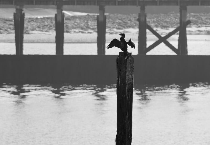
The issue doesn’t just happen in the background, nor is it limited to pictures of people. For example, a twig running across the body spoils many a bird-on-a-stick photo. Photos of small mammals and ground-feeding birds can show blades of unwanted grass bisecting their bodies.
Even in landscape photography, the main subject can look awkward if it aligns with something important behind it.
Moreover, it’s not just items positioned poorly relative to the primary subject that are problematic. Secondary elements in a photo can also spoil the composition if they occlude jarringly with other secondary or tertiary elements. When I photograph the beacon at the end of the pier near me, if I put the camera at the wrong height, the railings line up with the horizon, so the sea is below them and the sky above. It looks rubbish.

Talking of rubbish, it’s not just objects occluding unwanted. Litter is an ugly distraction in landscape photos. Although it’s easily removed with the plethora of editing tools available to us, it’s a far better practice to get the shot right in camera. Ideally, one picks up the rubbish and takes it away, considering one’s personal safety, of course; I would not recommend picking up discarded syringes, for instance.
Natural distractions can also appear in the background. These can throw the image’s balance off. For landscape photographers, this could be a patch of blue in an otherwise clouded sky, a rock at one edge, or a poorly positioned bird flying just into the frame.

Blurred Background’s Quantity
We often aim for a shallow depth of field in images. When you focus on a subject, the foreground and background will appear blurred to varying degrees. That depends mainly on three variables: your proximity to your subject, the lens length, and the aperture. That is one of the rare circumstances where the camera settings work in our favor.
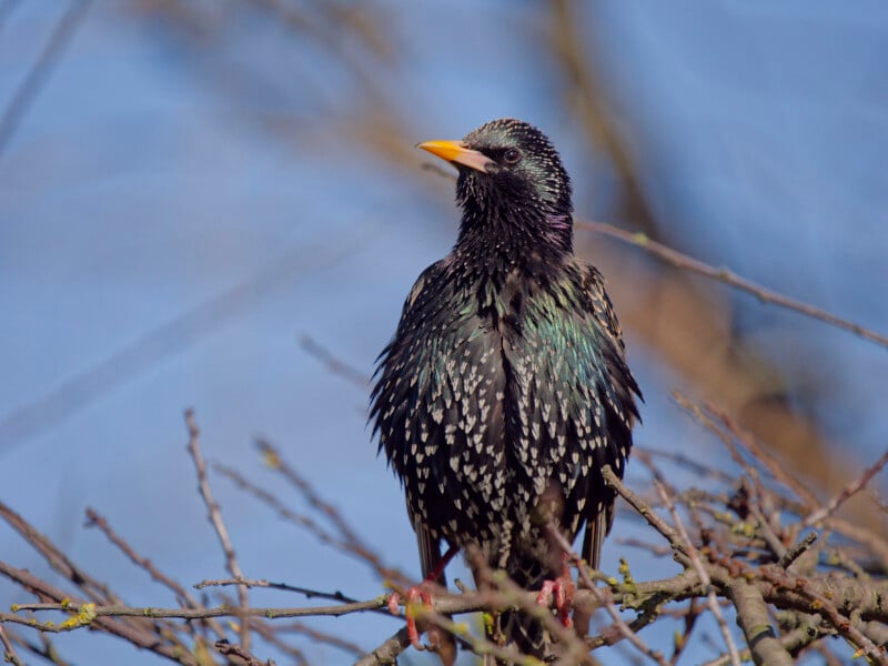
When taking a photo of a bird, you use a long lens. You also shoot with a wide aperture (lower F-number), partly to get a faster shutter speed and to blur the background, which helps isolate the subject from foreground and background distractions. Ideally, without disturbing the subject, you get closer so it fills more of the frame and eliminate atmospheric interference. All those factors help separate the subject from the background.
Conversely, with a landscape photo, you generally want the entire photo to be sharp. So, you normally use a wide-angle lens, which helps you get that extra depth of field. You’ll also have a smaller aperture (higher F-number) for the same reason. It often doesn’t matter if the shutter speed is slower because the landscape is usually still. Finally, you focus on the hyperfocal distance, which is relatively close to the camera, to achieve front-to-back sharpness. Thus, the blur is eliminated.

Blurred Background’s Quality
While we can change the amount of the photo that is blurred, that blurriness can vary in quality, too.
The quality of the out-of-focus area is referred to as the bokeh. I’ll be pleased by any Japanese speakers who want to correct me, but I understand it comes from the word “boke” (ぼけ), meaning “blur” or “haze”. You’ll often see it written phonetically as /ˈboʊ.keɪ/ in English dictionaries. That means it is pronounced “bow” (as in bow and arrow) and keh (Like the name Ken, with the ‘n’ removed). It is a two-syllable word with equal emphasis on each.
Bokeh refers to how pleasing the out‑of‑focus areas of an image look. It is not the quantity of blur but its quality. You can have lots of blur with poor bokeh. Similarly, you can have only a little blur with beautiful bokeh. The difference is in its character.
Good bokeh has out‑of‑focus areas that fade smoothly, with no harsh outlines. Highlights (like out-of-focus lights) will appear soft and evenly shaped. Consequently, the background will feel calm and non‑distracting, helping to separate the subject and make it stand out.

By contrast, poor, “busy”, or bokeh looks harsh. Sometimes called “nervous bokeh”, textures in the background will be aggressive and over-defined, thus competing for attention with the subject. Often, out-of-focus light sources will have bright rims, and there may even be double outlines, onion-ring patterns in the blur, and chromatic aberrations (colored lines in high-contrast images).
Occasionally, there can be an asymmetry in which a lens produces smooth background bokeh but harsher foreground blur, or vice versa. Then, bokeh can feel strange. It’s especially noticeable in close‑up or wildlife photography.
The biggest factor determining bokeh quality is the lens’s optical design. Different lenses produce distinctly different bokeh due to how well aberrations are corrected and how even light distribution is in out‑of‑focus areas. If you have a low-quality lens filter, that can also lead to poor bokeh.
Nevertheless, some aspects of bokeh are subjective. Take, for instance, the swirling pattern that some lenses produce. That is usually considered poor-quality bokeh. However, it is also a highly desirable feature of some classic film lenses.
Aperture Shapes
Apertures comprise a series of blades. The number and shape of the blades affect the quality of the bokeh. Generally, better lenses have more curved blades, which produce disks of highlights in the blurred area and a smoother overall appearance. However, lenses with six straight blades will produce hexagons instead of disks, and that can be attractive too.

There was an aesthetic pushback against “perfect” bokeh, and ultra‑smooth, round bokeh became ubiquitous and too commercial‑looking. Therefore, a hexagonal or polygonal bokeh has become a deliberate, fashionable look in recent films, TV, and prestige streaming drama, with cinematographers choosing older such lenses for a vintage style. The classic looks of movies like Citizen Kane (1941), The Third Man (1949), The Man Who Knew Too Much (1956), and Vertigo (1958) were sought in more modern productions like John Wick (2014), Moonlight (2016), and At Eternity’s Gate (2018). On TV, series like Breaking Bad (2008-2013), Narcos (2015-2018), The Crown (2016-2023), and Slow Horses (2022-present).
For the same reason, several photographers, including me, seek vintage lenses adapted for their cameras. The old lenses are valued because they don’t look clinically perfect and have straight-edged apertures that give a polygonal appearance.
Why Primes are Better than Zooms
At first sight, one might assume that higher‑quality lenses generally produce a smoother background rendering, even at similar focal lengths and apertures. Therefore, you expect that the more you pay, the better the bokeh is likely to be. But that is not always the case. Price and prestige do not guarantee beautiful bokeh. There are well‑documented cases where very expensive, professional lenses were criticized for poor bokeh, even though they excelled in sharpness, autofocus, or versatility.

The relatively expensive Sony FE 24–70mm f/2.8 GM (original version), Nikon Z 24–70mm f/2.8 S, and Canon RF 24–70mm f/2.8L IS all cost about three times as much as slower zooms in the same range. Yet, they are all described as having harsh bokeh, bright edges, and busy textures. There is a reason for that. Designed for event photographers and photojournalists who require reliable performance, manufacturers maximized sharpness across the frame and aggressively controlled aberrations. Like everything in photography, there is always a compromise, and pursuing those resulted in hard blur transitions. A lens can be clinically sharp and still have unpleasant bokeh.
Conversely, the cheap “Nifty Fifty” (50mm f/1.8) lenses can give a beautiful blur, but at the cost of sharpness and chromatic aberrations. So, while zoom lenses are optimized for flexibility, sharpness, and consistency, prime lenses are usually optimized for bokeh quality. As a rule, cheap primes give better bokeh than expensive zooms.

Post Processing
If you are unhappy with it, bokeh can be improved by carefully applying specific settings when developing or editing an image file. Using masks and carefully reducing the sharpness, clarity (microcontrast), and texture (fine contrast), and adding blur can improve the bokeh. Be gentle! Overdoing it looks dreadful.
In Conclusion
We very rightly focus on the main subject, but thinking about what is happening around it is important too. Avoid occlusions, remove distractions, and care about bokeh.