Three More Elements of Fine Art You Can Use to Improve Your Photography
Previously, I wrote about five elements of art and how they can impact our photographs. However, there are three more elements that work in conjunction with points, lines, shape, and form that can elevate your photography further.
Like those five elements previously mentioned, color, value, and saturation also affect the visual weight of objects within the picture.
1. Color
We instinctively know what color is. It is the visual experience we get when light of different wavelengths is reflected off objects. Our eyes detect these different wavelengths, and our brains interpret this light, making it appear as color in our minds.
Colors Have Meanings
Diverse colors evoke different emotional responses in us. This is partly due to their societal and psychological impact, as well as how they interact with one another.
There are deeply ingrained psychological meanings associated with colors. Those meanings may vary according to the viewer’s own social background, influences, and prejudices. For example, in the USA, red is associated with the right-wing Republican Party. Meanwhile, in the UK, it is the color of the left-of-center Labour Party. However, it was also the color used by both the communist Soviet Union and the Nazis, too. The Manchester United soccer team and the Cincinnati Reds also employ that hue. Meanwhile, in some Asian cultures, brides wear red.
A similar variety of meanings can be applied to most colors.

Primary and Secondary Colors
Although not entirely accurate and by no means the whole story, a very simplified way to understand colors is to think back to when you mixed paint in primary school. We were taught there were three primary colors: red, yellow, and blue.
You could mix any two of those colors to get a secondary color.
Red + Yellow = Orange.
The excluded primary color is blue, so blue is the complementary color of orange. Orange lifeboats stand out against the blue sea.

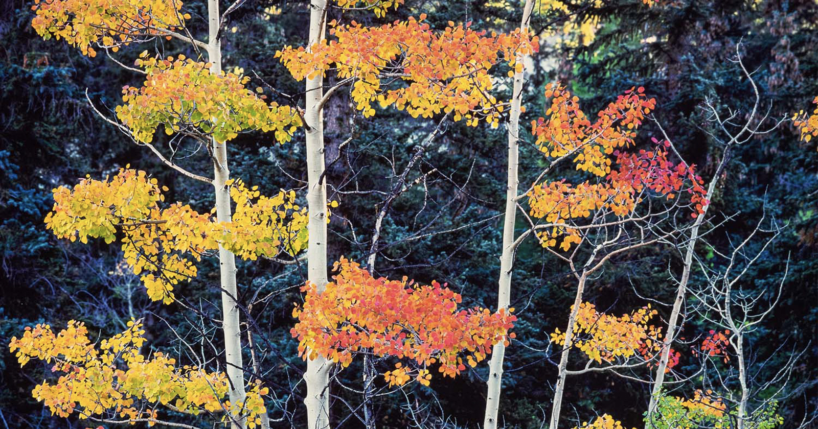
Yellow + Blue = Green
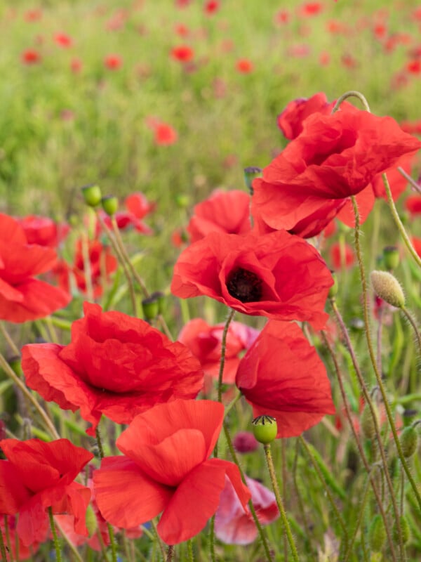
The excluded primary color is red, so red is the complementary color of green. Red poppies stand out in a green field.
Blue + Red = Purple
The excluded primary color is yellow, so yellow is the complementary color of purple. The yellow stamens of the Virginia Spiderwort, the Maypop, and the Eastern Pasque Flower stand out against their purple petals.
Complementary colors can add tension and excitement to an image. Meanwhile, contiguous colors give a calmer feeling. Yellow has orange and green next to it. Red is contiguous with orange or purple. Meanwhile, blue sits alongside purple and green.
It’s worth briefly mentioning here the difference between additive and subtractive colors. While we used red, yellow, and blue when we mixed paints in photography, we use red, green, and blue. The difference is between how paint reflects light and how a screen projects it. But that is a whole other article.
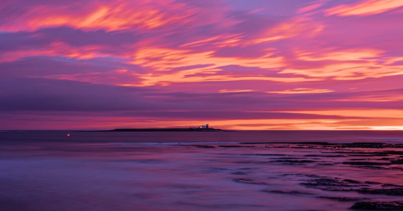
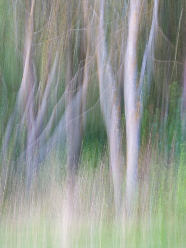
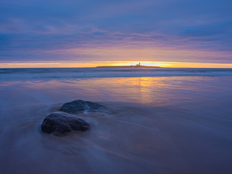
2. Value
Value describes brightness in tone. In photography, we change the overall value of an image by making it brighter or darker. Midnight blue and baby blue are both shades of blue, but with different brightness levels. Periwinkle, neon, electric, twin, smalt, royal, process, and navy are all names we give to other blues with different values.
Differing values in an image result in contrast. The distribution of different values, or tones, affects the composition of a photo and dictates our exposure decisions, with the overall brightness of an image affecting the mood of the image. Compare the dark, atmospheric chiaroscuro paintings of Caravaggio with the evenly toned work of Constable, and the light and airy impressionism produced by Monet. Each has a very different feel to it.
When developing and editing a photograph, experienced photographers are aware of and use tools such as the histogram, levels, and curve adjustments. The various exposure, brightness, blacks, shadows, midtones, highlights, and white sliders commonly found in high-grade raw development and editing tools all control the value of an image.
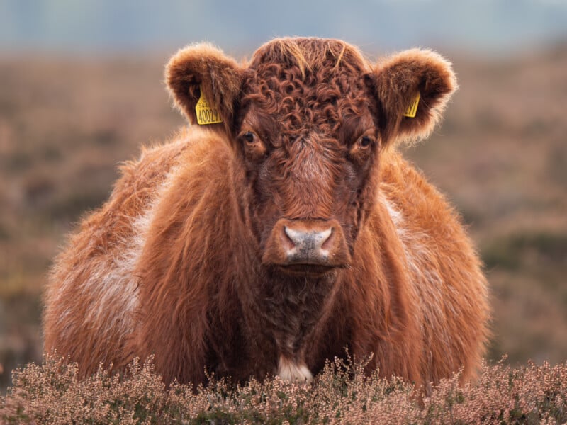
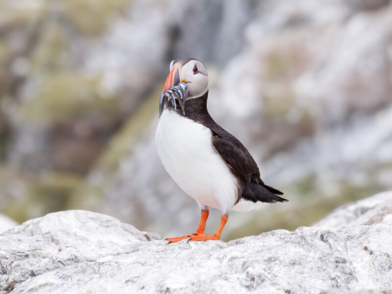
3. Saturation
Where value dictates how bright or dark an image is, saturation is the intensity of the colors. The difference is between strong, bold colours and more muted ones.
It’s obvious that, psychologically, a bold color will elicit different feelings than a muted, pastel shade.
There are exceptions, but most of what surrounds us in nature features muted colors. That is probably why wildlife photographers have a penchant for creatures that have brightly colored features.
The Relationship Between Colors.
As we’ve seen, when examining different hues, brightness, and saturation, we rarely consider them individually. However, colors not only interact with other colors, but also with the other elements of art mentioned in my previous article.
Let’s take the form of a red poppy standing in the vertical lines of a lush, green field of grass. Because the colors are complementary to each other, the flower’s form stands out against the background far more than if it were in monochrome, or if the poppy were against the light yellow of dry hay.
Alternatively, think about the yellow and black stripes of a wasp. That combination shouts danger to us. Meanwhile, a more muted primrose-colored summer dress with a grey floral pattern will project a very different feeling than a black dress with red features.
Interior designers are very aware of this. Consider a low-lit, high-class restaurant. It will probably feature a color palette of warm, muted autumnal tones, which will encourage diners to linger, whereas a fast-food café will be bright with bold primary colors, prompting people to eat and move on.
An Exercise
Consider the colors that dominate your surroundings. For example, I live in a Victorian sandstone house. Consequently, the building’s bricks are a light straw color. It is a seaside town. Therefore, the marram grass on the dunes is a muted green.
Head out with your camera and see how close you were to your perceived idea about your neighborhood’s color palette. Photograph subjects that cohere with your idea of your surroundings, and also explore the subjects that digressed from that, especially if they took you by surprise.
Look for complementary and contiguous colors, as well as those with different brightness levels.
In Conclusion
Understanding colors and how hues, saturation, and tones work is paramount in photography. Although not immediately apparent, even in black and white work and the development of monochrome images, an understanding of color and tones is crucial.
There is clearly much more to it than can be covered in a short article like this; multiple volumes have been written about color, and it is a fascinating subject to explore in greater depth.