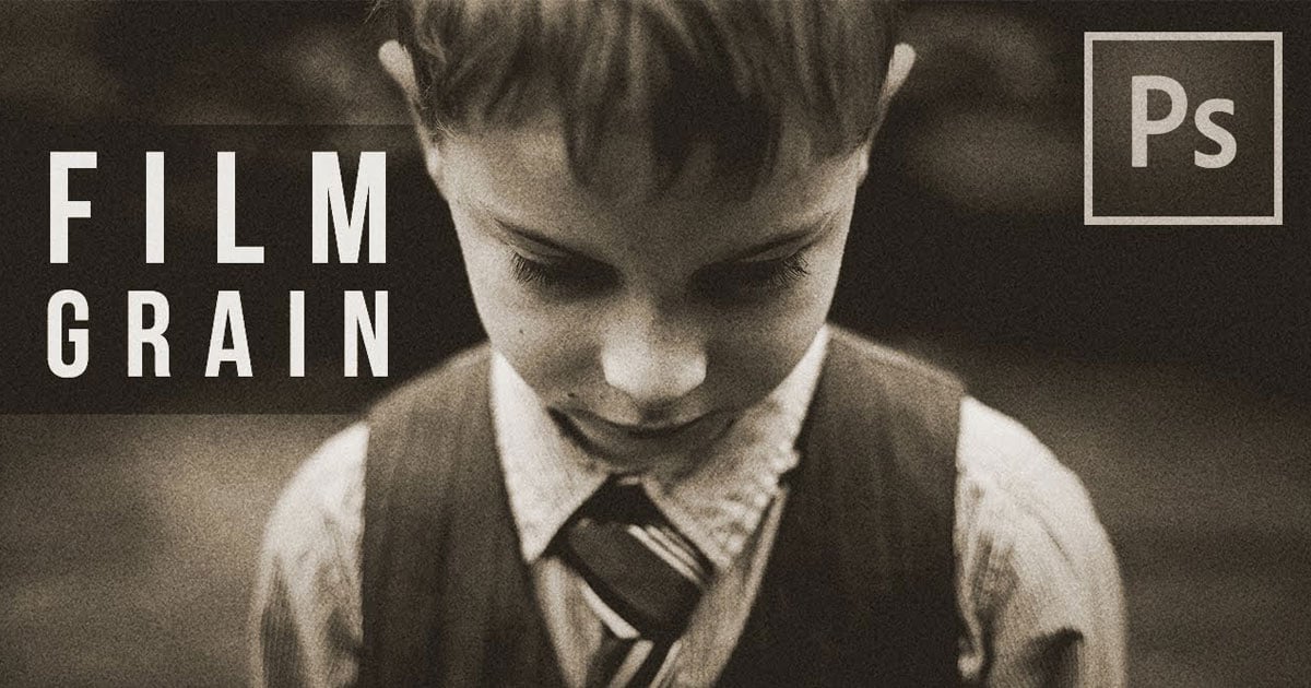
How to Emulate Film Grain in Your Digital Photos
Every few years, I write an updated version of the Film Grain Emulation guide. I do this because my passion drives me to learn more, and my understanding of film grain changes significantly. Today, I am going to try to break this down based on grain characteristics and make this complicated topic easy to understand for all photographers chasing a nostalgic feel in their edits.
What is film grain?
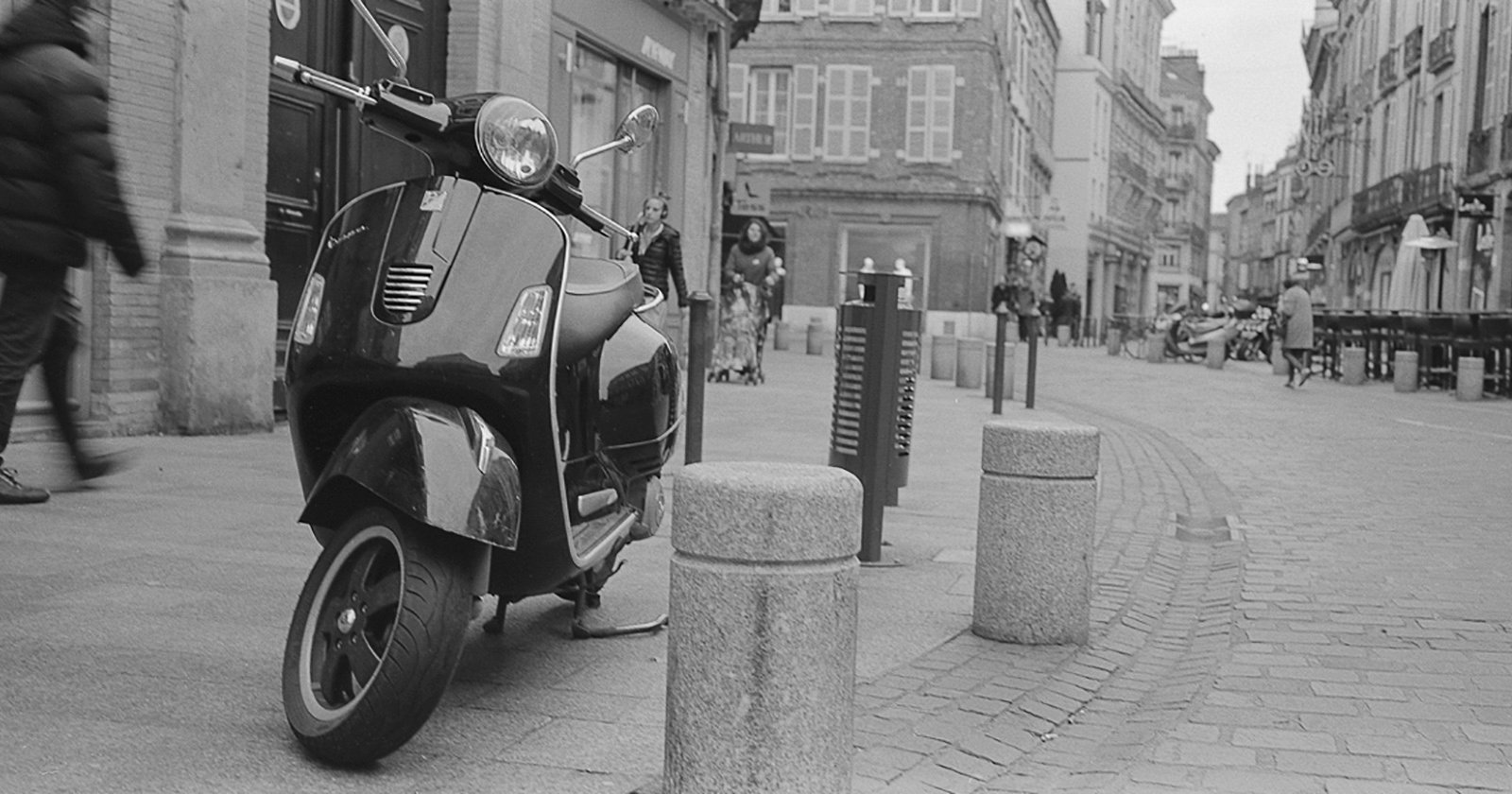
Film grain is the tiny, visible texture you see in film photos. It’s caused by microscopic metallic silver particles (in black and white film) or colored dye clouds (in color film) that form the image. It is the fundamental physical structure of film photos, so without the grain, we can’t have an image, but this also means that film grain has a lot of impact on how our photos will look and feel. So if we want to emulate this film grain in our digital photos to give them the soft, nostalgic feel of analog images, slapping some grain texture overlay on top of your photos won’t cut it. We need to edit our images in such a way that we give the impression that our images are made out of grain. And before I explain how I emulate film inside of Lightroom, let’s first discuss how actual film grain behaves.
Film Grain Shapes
First of all, film grain is organic and gives a pleasing aesthetic, especially when compared to digital noise, because of its nature. Film grain and film grain clumps that occur while we expose film to light and while the film is developed will give film photos their unique feel. By contrast, digital noise is just a matrix of squares, and this will not give us the soft analog feel we are chasing. Digital noise will look harsher and give our photos a digital sharpness, while grain adds texture without becoming a distraction. This means we can’t use digital noise to simulate film grain.
The only caveat is that all our digital photos are actually made out of square pixels, so we have to pay attention to the image size as well. If we zoom in too close while analyzing our final edits, we might be under the impression that our grain looks like noise just because we zoomed in too far. So keep an eye on how far you zoom in while analyzing your edits.
Film Grain Size
The physical dimensions of the individual silver halide crystals or dye clouds that make up the images on film vary according to the ISO of the film we used. So when emulating film grain, we want the size of our film grain to get bigger when emulating films with higher ISO. But since on film images are made out of grain, we want to be sure that our grain remains the smallest visible detail in the photo by reducing the sharpness of the image as the grain particles get bigger.

Sharpness / Details
This is a very important part for the feel of the image and its measurable information. Because of their size, the number of grains per unit area can vary. A low ISO film has a very high grain density (many small grains packed tightly together), which leads to high-resolution photos and the ability to resolve finer detail. But as our emulated grain gets bigger, our photos will start to lose fine details.
Perceived Details: This is the subjective appearance of how grainy the image looks. A high ISO film has a low grain density (fewer and larger clumps), so the grain itself is highly visible and perceived as “grainy,” even though the actual amount of detail in the photo (resolution) is lower. So when emulating photos that seem like they should be shot on film with higher ISO, we want to decrease the amount of perceived details in the image by lowering the sharpness, and inside of Lightroom, we can do that via masking.

Grain Density / The Perception of Film Grain
On negative film, highlights are formed where the most light hits the film. This exposed a very high number of silver halide crystals, which developed into a dense, overlapping layer of metallic particles. This means that our highlights will be a lot denser with lots of grain particles, but at the same time, because the grains are so densely packed together, they blend into a continuous, smooth tone. We can’t distinguish individual grains very well.
As we move into the midtones and shadows, the relation between grain perceivability and density changes. Midtones receive less light, so we get a moderate density of grain where the particles are distinct enough to create the film’s characteristic texture without being overwhelming. However, in the shadows, where the least light exposes only a few isolated crystals, we will see more of the film grain and fewer small details.
This natural behavior is a huge part of the “film look.” It’s why underexposed film gets noticeably grainy and why well-exposed highlights look incredibly smooth and clean. This is also why high-quality film emulation methods don’t just add a uniform layer of grain; they carefully vary the grain’s intensity across the tonal range of the image to mimic this beautiful, organic paradox. Striking a good balance is more than necessary for realistic-looking film emulation.
Grain Color
Color film is physically different from black and white film. On monochrome film, the silver halides create the image on their own, while on color film, dyes are used to produce the color. This means that color photos should have colorful film grain and black film grain. But there is one more detail we must touch on. The dye clouds are softer, more clumpy, and less distinct in texture, which is often described as “creamy” or “cloud-like.” The colors and values blend more smoothly, making the grain feel more integrated into the image itself. This is a major reason why color grain typically feels less abrasive and more cinematic than its black and white counterpart. So when adding grain to our digital photos, we want to make it look rougher in B&W images than we do in color photos.

Lightroom Film Grain Emulation – Everything You Need to Know
I’ll start this chapter of the article with some bad news. At the moment of writing this article, Lightroom can only add black and white grain. No matter how much I complained on the web about this, I’m just a single voice, and this doesn’t seem to be an important detail for them at the moment. That being said, I’ll move forward and break down the various ways we can add grain to our images using all the tools that we currently have available inside Lightroom.
Global Grain Sliders
Lightroom’s grain tool offers three sliders that work in concert to simulate the physical properties of film grain. Here’s how they function based on Adobe’s design:
- Amount: This slider is the overall intensity of the film grain effect. It controls the global strength of the texture applied by the Size and Roughness sliders. Think of it as an opacity slider!
- Size: This controls the physical dimensions of the simulated grain particles. Increasing the Size value creates larger, more noticeable clumps, similar to the effect of using a higher-ISO film stock. Lower values produce a finer, subtler grain.
- Roughness: This adjusts the uniformity of the grain pattern. A low Roughness value creates a more even and regular distribution of grain, which can appear smoother. A high Roughness value introduces more variation in the spacing and clumping of grains, resulting in a more irregular, organic, and “grittier” texture that better mimics the random nature of actual film emulsion.
What is lesser known is the way these sliders work in combination with each other. If you mix similar values of Size and Amount, Lightroom actually manages to apply some kind of blur to the underlying image, and the grain starts to blend in really nicely with it, and you won’t get smaller details in your photos than a particle of grain. Also, the Roughness slider has its default value set at 50. That’s not because you should use 50, but because it is a nice starting point. If you go below 50, you will get smooth-looking grain, and if you go above it, you will get rougher-looking film that is more suitable for simulating pushed film, high ISO film, or black and white film stock.
Grain Inside Lightroom Masks
More recent versions of Lightroom also allow us to control grain inside of local masks, but with a few caveats.
- Roughness and Size sliders are actually global – meaning that whatever we adjust in a mask will affect the grain settings everywhere else
- The film grain applied in a mask works as an overlay on top of your images, and it will not affect the sharpness of the image underneath, but that’s not a huge problem. We can blur a photo by going on the negatives with the sharpness values inside the same mask.

How to Get Realistic Grain in Lightroom
To overcome Lightroom’s uniform grain application, I mix global sliders with local masking. Film grain emulation should take into account the luminosity values in the photo. And I do this by combining some global amount of grain with 3 luminosity-based masks: one for the shadows, one for the highlights, and one for the midtones. In this specific order, because the mask order inside Adobe Lightroom actually matters.
This allows me to strategically place heavier, more pronounced grain in the midtones, have softer shadows with less details, and replicate film’s organic behavior by mixing the amount of grain I add in each mask with negative clarity, texture, and sharpness adjustments so I can get as close as possible to the film paradox of grain being more apparent in the darker tones while it is a lot denser in the highlights and renders more details there. This is the key to authentic feeling grain, not synthetic noise or overlays. And if you want a more step-by-step tutorial, watch the video at the top of this article starting from the 10:00 mark.

Ultimately, while adding grain is a vital step in emulating film, it cannot, on its own, convince the eye that a digital photo was shot on film. Grain is just one piece of the aesthetic puzzle; it provides the authentic texture but not the foundational color language. Film Grain Emulation needs to be integrated into a workflow that also simulates film colors. That’s why I would strongly encourage you to check my article on color response curves.
This way, you can first transform the digital color palette and tonal response to match the soft highlights, rich shadows, and specific color shifts of your desired film stock, and you create a believable canvas. Then, when you add the precise grain structure that matches that stock, the elements work in harmony.
If you don’t feel like going through all this work to fine-tune your own grain presets, you can always grab my All in One Grain Presets on my store. I am constantly updating my grain presets to reflect my current understanding of film grain emulation and trying to make them look as realistic as possible, and I will write another one of these articles if I stumble upon something big.
About the author: Vlad Moldovean is a photographer and visual artist from Brasov, Romania. The opinions expressed in this article are solely those of the author. You can find more of his work on his website, Facebook, and Instagram. This article was also published here.