Improve Your Architectural and Interior Photography with These Top 5 Pro Tips
If you’re an aspiring architectural and interior photographer this one’s for you. Have you ever found yourself frustrated with spending hours on-site photographing commercial or residential spaces, then staying up until 2 am in the editing dungeon, only to get lackluster results? Trust me, I’ve been there.
Full disclosure: This article is brought to you by Academy of Visuals.
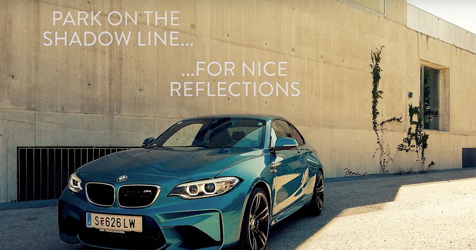
Tip #1: Embrace the Shadows
Shadows are what give an image depth, texture, and atmosphere. When you attempt to remove shadows completely, you lose dimension, highlight textures, and mood resulting in a flat and unrealistic image. Shadows contribute to a natural, realistic feel. By balancing highlights and shadows accurately you will create much more visually pleasing images.
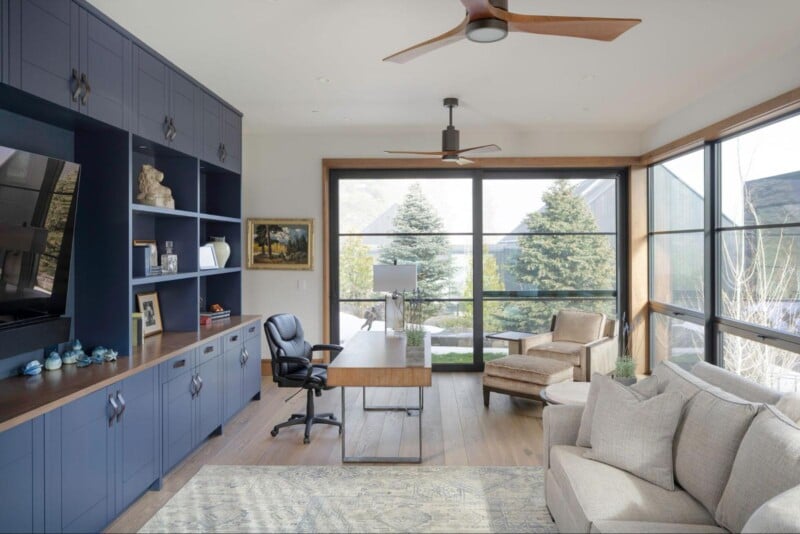
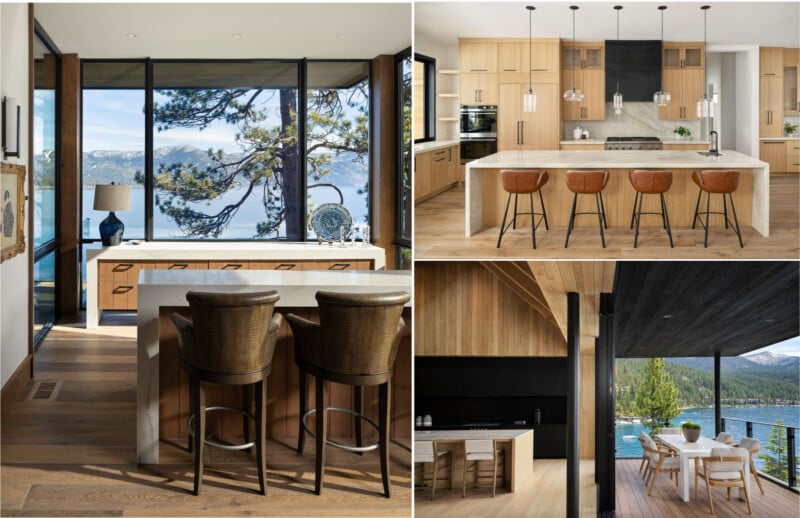
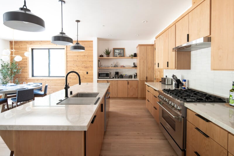
Tip #2: Position Yourself Further Away From Furniture
Positioning your camera too close to furniture can distort perspectives, limit composition options, and compromise the overall representation of the space. Maintaining a suitable distance away from furniture ensures a more accurate, balanced, and appealing portrayal of the interior. Nobody wants to look at an image with a warped table in the foreground. Give yourself enough space so that the furniture doesn’t have any distortion from wide-angle lenses. Which leads to my next tip.
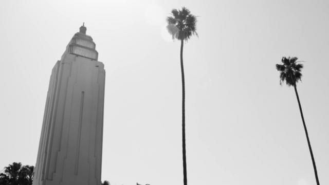
Tip #3: Avoid Shooting With Super Wide Focal Lengths
While real estate photographers often use wide-angle shots to make the space look larger, shooting excessively wide can lead to distorted proportions, exaggerated spaces, and unintended inclusions of unwanted elements. Photographers looking to work in the Architectural and Interior Design space need to rethink composition. Instead of using super wide focal lengths like 12-16mm try using 24mm-50mm focal lengths to compress the background. Focus on highlighting architectural details and vignettes of design elements instead of shooting the entire space.
Tip #4: Don’t Over-saturate Your Colors
Over-saturating your colors, especially blue and yellow tones leads to an unnatural appearance, an overall inaccurate representation of colors, and distracts away from interior design elements. Striking a balance in color adjustments is essential to maintain accuracy, which is crucial in architectural and interior photography.
Tip #5: Easy on the Clarity and Sharpening Sliders
Maxing out the clarity and sharpening sliders while editing architectural and interior photos can lead to a cartoonish or artificial appearance. The clarity slider creates noise or graininess, introduces moire, and makes highlights that look muddy. The worst offender of all is the unpleasant halos caused by the overuse of these tools. A nuanced approach is essential to maintain the image’s natural look and professional quality.
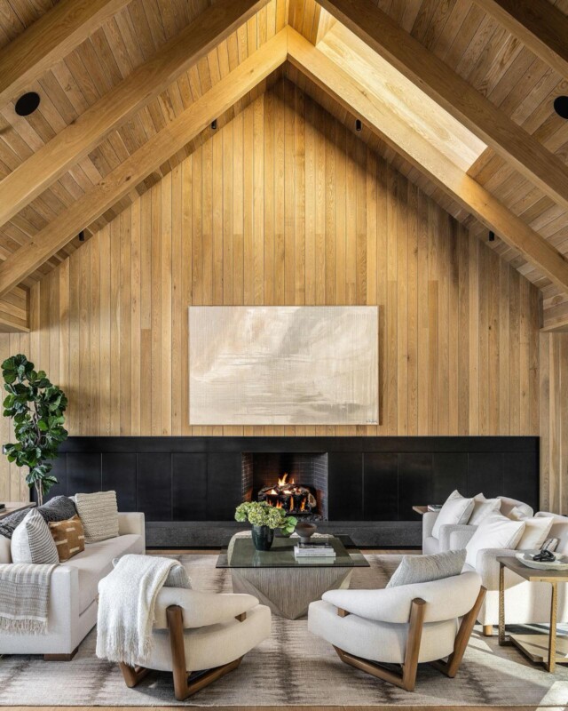
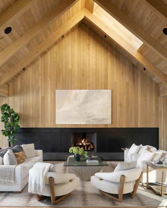
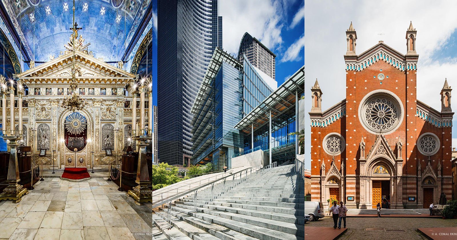
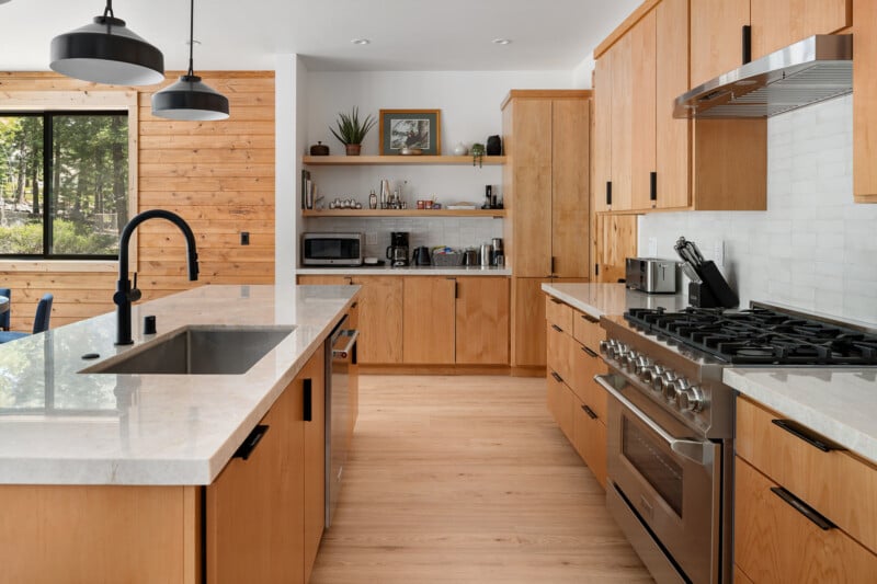
Bonus Tip: Verticals MUST BE STRAIGHT
When I look at interior and architectural images from photographers new to this industry the biggest tell-tale sign that they are not experienced is when I see keystoning meaning their verticals are converging at the top or bottom. Making sure your verticals are perfectly straight is an absolute must with Architectural and Interior photography. The only exception would be 3 point perspectives looking down onto a staircase or over a railing into a space below.
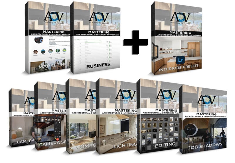
If you enjoyed these tips and would like to learn my entire workflow for framing, lighting, and editing Architecture and Interior photography check out my new course Academy Of Visuals – Mastering Architectural & Interiors Photography.
About the Author
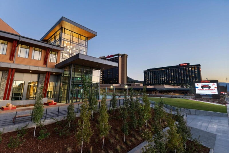
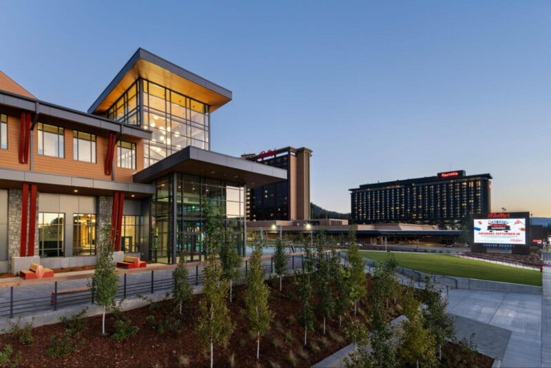
Brad Scott is a distinguished name in architectural and interior photography and video production in the Reno | Tahoe area and the founder of Academy Of Visuals.
With over 10 years of specializing in capturing the essence of residential and commercial spaces, Brad brings a seasoned eye for detail and a commitment to delivering compelling visual narratives. With a total of 15+ years in photography and video, his expertise extends beyond architecture, ensuring clients receive versatile and impactful content. See more examples of Brad’s Architectural & Interior Photography
About the Course
Academy Of Visuals – Mastering Architectural & Interiors Photography
Our Architectural and interior design photography course already has over 45+ in-depth training videos live in the course, everything from camera gear, camera settings, lighting the scene with both natural ambient light as well as flash, composition, in the field job shadows one of a beautiful $28,000,000 property and an extensive editing module that covers everything you need to know to combine multiple ambient frames and flash frames into the final deliverable image.
There is also a private members area with over 220 students which is a great place to ask questions, post photos for critique before sending them off to a client, ask how you might bid on a job, etc.
The marketing and business modules include everything about how I find clients through outreach and inbound marketing through various sources as well as in-depth training about licensing images you have already captured to make additional income, how to price your services, and write bids ( I have a Bid template for your guys to use) how to do split share licensing for instances when multiple parties are interested in using the photos as well as how to talk about copyright with your clients.
Total Value – $2377
Summer Sale – One time payment of $497
ENROLL TODAY
Full disclosure: This article was brought to you by Academy of Visuals.