10 Common Photography Website Mistakes (And How to Fix Them)

When we think about websites, search engine optimization (SEO) is often top of mind. How is Google ranking you against other similar photographers? Are you showing up on the first page of search results? There’s no doubt SEO is important for every photographer to consider. However, there are some big misconceptions when it comes to SEO.
Before you focus on improving your page ranking, you need to make sure your website is easy to navigate, features great photos, and has a great user experience. Without that, your SEO efforts will largely be futile.
Below, we’re breaking down ten website mistakes we see on a daily basis. From broken links to missing contact info to repetitive or absent metadata, see how your site stands up.
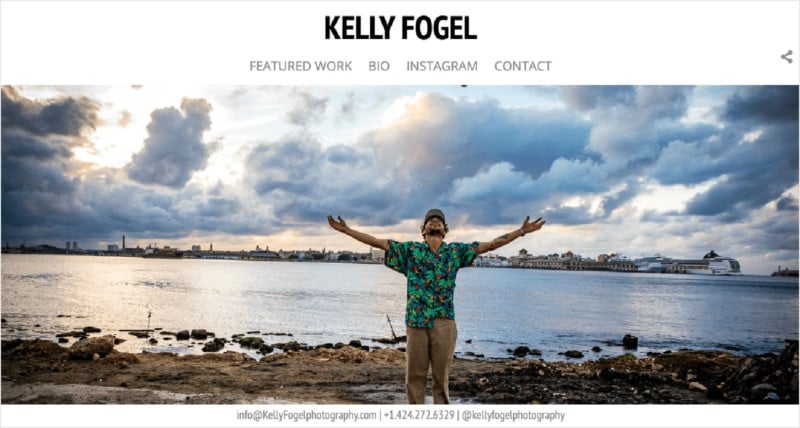
1. Social Media Profiles Linked Incorrectly
While we can all agree that websites are a must for photographers, there’s definitely still a place for social media in the modern photographer’s workflow and business plan. Offering opportunities to take people behind the scenes, share new or personal work on an ongoing basis without having to update your website and more, social media should be a component, however big or small, in every photographer’s identity.
One of the most common mistakes we see on photographers’ websites is improper links to social media profiles. Whether it’s a broken link or something just unlisted, improper social media linking will have you missing out.
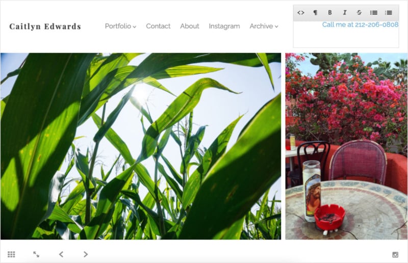
2. No Public Phone Number Listed
We get it. Putting your phone number on a website? That sounds like a recipe for even more spam calls. But we’ve heard from editors that adding a phone number can make a difference. Anything that makes you easier to get a hold of makes it easier to book you.
If you haven’t already, consider adding your phone number to your homepage or contact page. It’s an easy way to make yourself more available and proves that you’re ready to work.
You can even link your phone number with custom HTML so if someone clicks the number, a phone call will immediately begin on their cell (or in the case of a laptop, FaceTime usually launches).
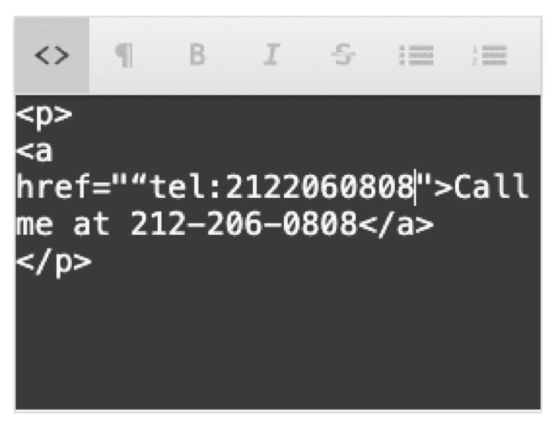
<a href=“tel:5555555555″>Call us at 555-555-5555</a>
Also, if you don’t want to post your personal cell number publicly, check out Google Voice. It’s a free service from Google that allows you to forward phone calls to any device or the web all while keeping your personal number just that: personal. Fear of spam shouldn’t stop you from putting your most professional, accessible self out there.
3. Relying Exclusively on a Contact Form
Just like that phone number, don’t get skipped over because your e-mail address isn’t listed publicly on your site. Many editors and clients prefer to use their own email templates or lists when it comes to reaching out. For them, having to go through a form can feel like a chore — and often one not worth completing.
When it comes to adding your email, two great places to list it (and that phone number!) are your homepage and on the contact page itself.
When it comes to contact information, redundancy is key.
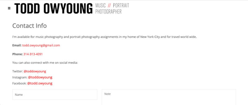
Like linking your phone number, you can also link your email with custom HTML. Setting that up means anyone who clicks on your email address from your website will immediately see their preferred email client launch.
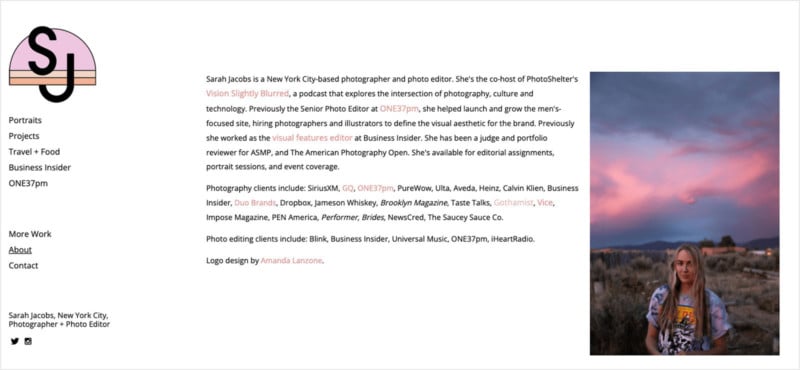
4. No Bio or About Page
We all know photography is about storytelling, and that shouldn’t stop with your camera skills. Working with a photographer is often just as much of a personality fit as it is a talent fit.
Take a little extra time with your bio and, at the very least, make sure something besides “[bio information goes here]” is displayed. Provide potential clients with details about what you specialize in. List your clients to provide some credibility. Link to venues you’ve worked with or the published pieces you’re most proud of. Feature some testimonials.
If SEO is the top priority, we suggest prioritizing content for your local market. One easy way to do this is to make sure to include your location alongside details about yourself and your work.
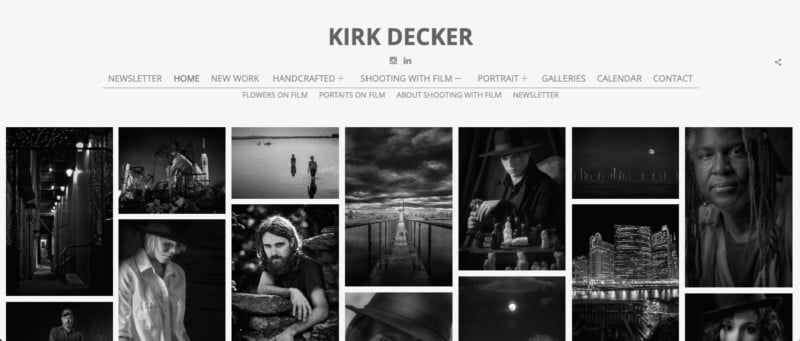
5. Bad Navigation
While “bad” is subjective, it’s important to remember that your website’s navigation is there to help. It needs to help site visitors get where they want to go. If possible, it should spark a little intrigue and keep people on your site for longer than they’d originally planned.
If it’s not obvious what something is or where it’s located, consider renaming it or removing it entirely. We’ve seen this through links to priced galleries, renaming your Archive something like “Client Area” and hiding unwanted or unused pages.
“I kind of sigh when I get emails from photographers asking, ‘Where should I include keywords, how many should I include and what should I do with these SEO tags? Should I create a page for all the venues I’ve worked with?’ – all when their websites have an ugly navigation menu,” Alex Vita tells us.
6. A Lack of Gallery Descriptions
Gallery descriptions are one of the most underutilized elements in photographer galleries. They can help you get more out of your galleries.
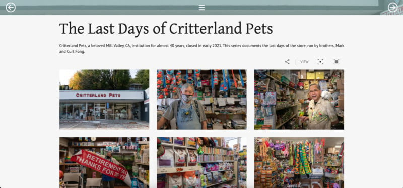
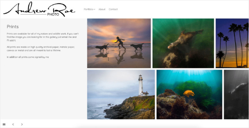
Like Suz and Andrew above, gallery descriptions don’t necessarily need to feature long essays (though they certainly have that capability). Just be specific and think about providing more context to your site visitors.
If you’re looking to take full advantage of gallery descriptions, consider using our Sonnet or Pivot templates, both of which are friendly for longer-form storytelling.
7. No Page Titles or Meta Descriptions
Some of the most important elements of your search result and your SEO strategy are your page titles and meta descriptions, which help define the relevant content of pages on your site and increase your site’s overall searchability. It’s important to keep in mind that these fields do not display on the page itself, but are plugged into the header tags that make up the code Google crawls when indexing your site.
When drafting your Meta Description, Google will truncate it at about 160 characters, so be concise and succinct in the way you describe your site and don’t exceed three sentences. “It also should be one to three sentences with details about your type of photography, your name and the location of your services,” says Jelan Coley, Technical Implementation Lead at PhotoShelter.

8. Broken Links
What good is a link if it doesn’t work?
Links seem so simple and yet it’s another common mistake we see repeated across all photographers’ sites regardless of expertise and template choice. Links can be anywhere: on a custom page, in your navigation menu, or an image link, so it’s important to make sure you’re entering yours correctly.
Not only do broken links become frustrating for site visitors, but a broken link also leads Google to question your credibility. Link-checking is vital during any website audit, so make sure everything is displaying and loading the way you intend!
9. Metadata issues
Too few, too many, or none at all, metadata can feel a bit like Goldilocks.
But if we back way up, just think of metadata as a means of providing more context and credibility to your images. Captions, keywords, headlines, they all have a purpose and they’re all crawlable by Google.
Outside of more obvious image captions or titles, if you’re looking for some direction with where to start when it comes to metadata as we mentioned above with your bio, locality is your friend here. And when it comes to keywords specifically, we highly recommend using keywords that indicate a locality.
Google will consider how well a local listing matches a user’s search terms. The more niche and specific you can be in your metadata, the more Google will have to work with when trying to match a search query with relevant results in its indices.
Think of IPTC keywords as a combination of words and phrases that give context to your images. Without these keywords, a search engine crawler won’t index an image because it lacks readable content.
But remember: you can’t outsmart Google.
“Google is looking more at user experience: how visitors are behaving on your website and then turning those into ranking factors,” says Alex Vita. “Because, the technical SEO stuff, like trying to jam a lot of keywords into your content, that’s actually now considered an older SEO tactic. You can’t game the system with keywords anymore. They’re trying to look at user experience signals and factors and use those.”
10. Not Taking Advantage of Menus
In addition to renaming, reordering, displaying, or hiding your navigation items, consider using a menu on your homepage to help site visitors see more of your work while also keeping your site nice and tidy. Menus enable you to keep that homepage clean—you’ve got to stay in Google’s good graces!—while allowing you to nest items underneath one another.
Once you get the hang of menus, your site becomes far more customizable.