There is No ‘Formula’ for Good Photo Composition
It’s very easy to get stuck in grooves in photography, to find something that makes sense or comes from a position of authority; once habits are formed around ideas about genre, style, or technique, it can be very difficult to break out of those constraints.
Shortcuts are tempting but are about as much use for actually developing as a conscientious, active photographer as replicating someone’s exposure settings without accounting for lighting conditions. There is no one-size-fits-all exposure, and there is no one-size-fits-all-composition, but that doesn’t stop people from chasing them with the hopes that what seems to have worked for others will work for them.
The composition of elements in a frame is an area that seems to have plenty of advice and rules and guidelines, including stencils on which to arrange reality within your frame. These have their uses, but if relied on entirely can really erode the capacity of a photographer’s personal expression.
If a photographer manages to maintain a consistency in the way they arrange elements in their frame, then any other aesthetic choice like black and white/color or other “looks” can be allowed to fade into the background — most aesthetic “looks” can be mimicked, but I would argue that the real photographer’s eye is in the way they include elements and cause them to interact within the frame.
I broadly differentiate art from design as design being about the predetermined destination, whereas art is about the journey. As such, there is a lot to be said in the way a situation “feels” at a certain time in a frame, rather than there being some set requirement that needs to be fulfilled before an image is made.
Balance achieved in the eye and mind — to be understood as whatever feels right to the artist — can be daunting to anyone who doesn’t really trust their ability to do so and would rather rely on the crutch of learned “rules”.
However, by using anyone else’s tools, you are “borrowing” a very ephemeral version of their eye, not working towards finding your own. Your photographs need to represent what makes sense to you and not to some other photographer, even if that means being less successful or famous. It’s more important to maintain my integrity and shoot what and how I want to, and not to find someone else’s path to retread.
I don’t even think it’s as specific as mimicking anyone else’s project or “style” but more intangible things that can’t really be quantified, like someone’s sense of space, awareness of the values they hold, their influences culturally and so on. For example, I wear an annoyingly restrictive glasses prescription, and this influences my use of longer lenses and is one of the reasons I find it difficult to shoot wider — my peripheral vision is almost nonexistent. Anyone who looks at my work and thinks that achieving the same way of seeing and shooting is as simple as using a 90mm is missing a lot of that context.
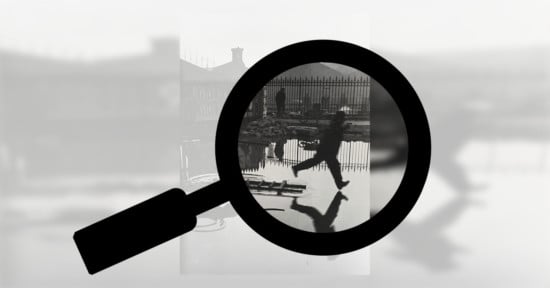
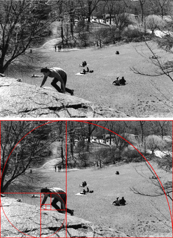
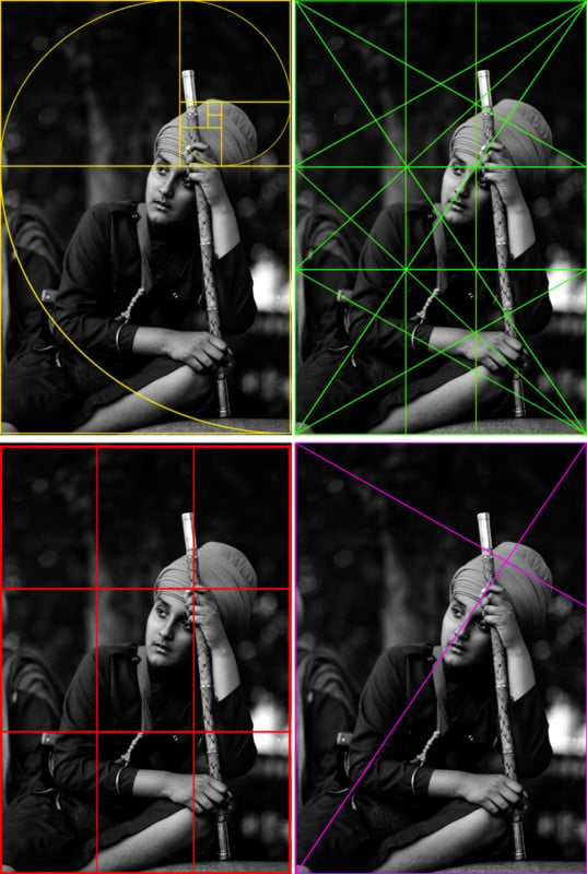
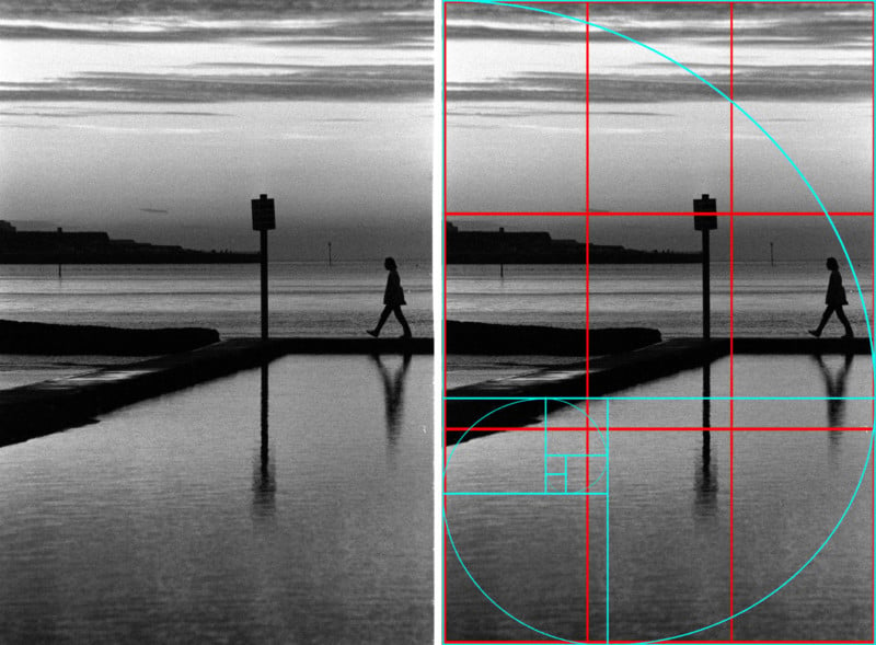
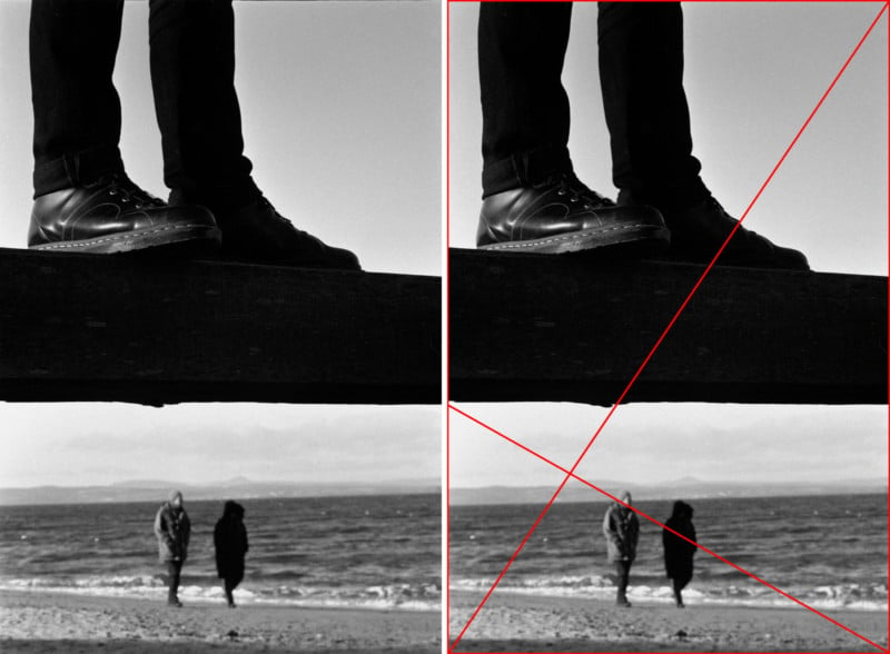
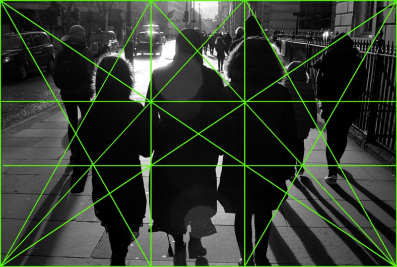
The “alternative” to this more instinctual and natural process of shooting, reviewing, and learning what feels right from your own body of work seems to revolve around the use of something like a grid to see what parts of a frame line up. Part of my reason for writing this article came from seeing a series of images analyzing the work of great photographers which used gridline overlays to show how well these photographers’ works fit these constraints.
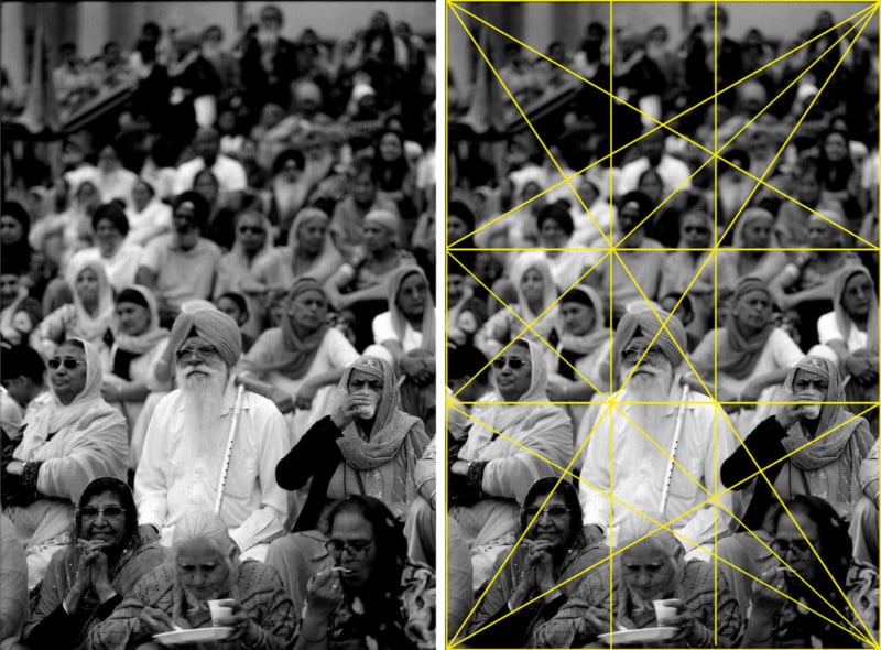
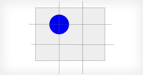
The issue I have with this method of studying work is that there is almost never a scenario outside of staged scenes and situations where the majority of these grids would ever be on that photographer’s mind. Many cameras have some kind of thirds/ninths grids and some film cameras have interchangeable Fresnel screens offering other options, but aside from these basic options, I’m not aware of any options for some of the more complex grids I’ve seen used in analysis.
On top of this, I think there are very few images if any that are only good because of the rule they follow. In my opinion, a photograph that really justifies its existence would be good even if it followed no artistic/visual guidelines. Any aesthetic merit is just the icing on top of what ought to be an inherently interesting cake.
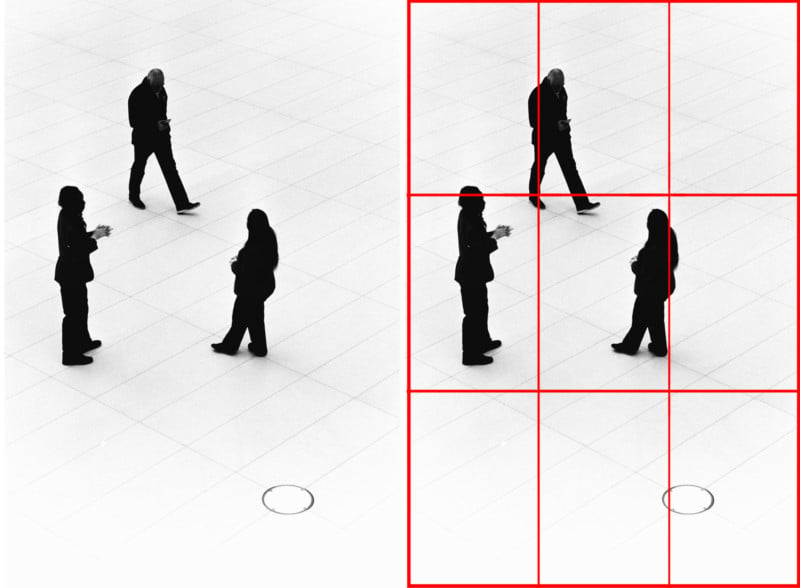
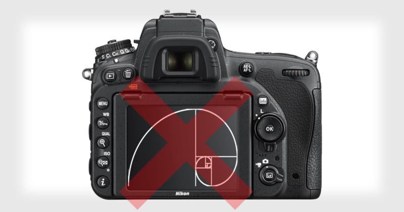
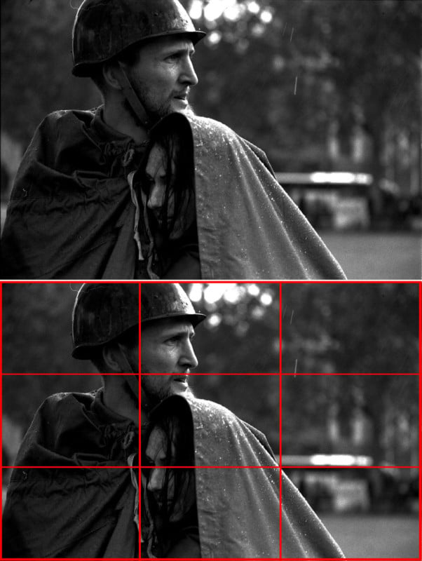
For any kind of “analysis”, these grids placed after the fact are entirely arbitrary and not a system worth taking seriously as a learning tool. The photographs accompanying this article are examples of some of my photographs where the grid sort-of-but-doesn’t really line up to show that if you try hard enough you can probably find something that fits, but well-composed work doesn’t just naturally conform to these shapes. And if you look hard enough, you can make anything feel like it makes some kind of sense within a pattern.
If gridline “analysis” demonstrates anything, it is how what fits naturally to many photographers’ eyes are similar and reflective of ideas found in nature or classical art — that these ideals themselves may be worth studying to discover why we gravitate to similar shapes.
Instead, it’s a more forceful process of shoehorning these ideas into places they were never intended to be, and then lauding that this was the artists’ intention the entire time. Realistically these grids can be placed over most images and line up with something eventually; if it doesn’t work with one grid, just try another until it clicks.
I truly doubt that any photographer went out with a grid overlaid on their camera and then searched for things that would fit inside that grid and produced a masterpiece as a result of that workflow. Artists feel out a balance within constraints and produce visuals that make sense. Basing compositions around your own compromises between values, working despite the situation, timing, gear, and other limitations, and still managing to produce something impactful is not something that can easily reduce down to a formula that can be as generally followed as a simple grid.
This endless series of absolutely subjective and constantly fluctuating micro-decisions… that’s where the vision of the artist is revealed. If the only elements to work with are a single black mark on an otherwise plain white canvas, it will be these values and decisions that allow the artist to position that mark anywhere. Any guidelines mean a predetermined result: someone else’s work; a repeatable formula; overdone outcomes.
About the author: Simon King is a London based photographer and photojournalist, currently working on a number of long-term documentary and street photography projects. The opinions expressed in this article are solely those of the author. You can follow his work on Instagram. Simon also teaches a short course in Street Photography at UAL, which can be read about here.