Recreating the Look of Vintage War Photos
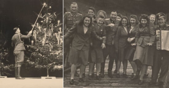
The horrific conflicts and wars of the past have shaped the world we know today. Each era has been documented by generations of photographers, with specific color tones or grain patterns evoking these periods in our minds. The culture surrounding military life has always been highly visual and has been captured in photojournalism, fine art, as well as propaganda.
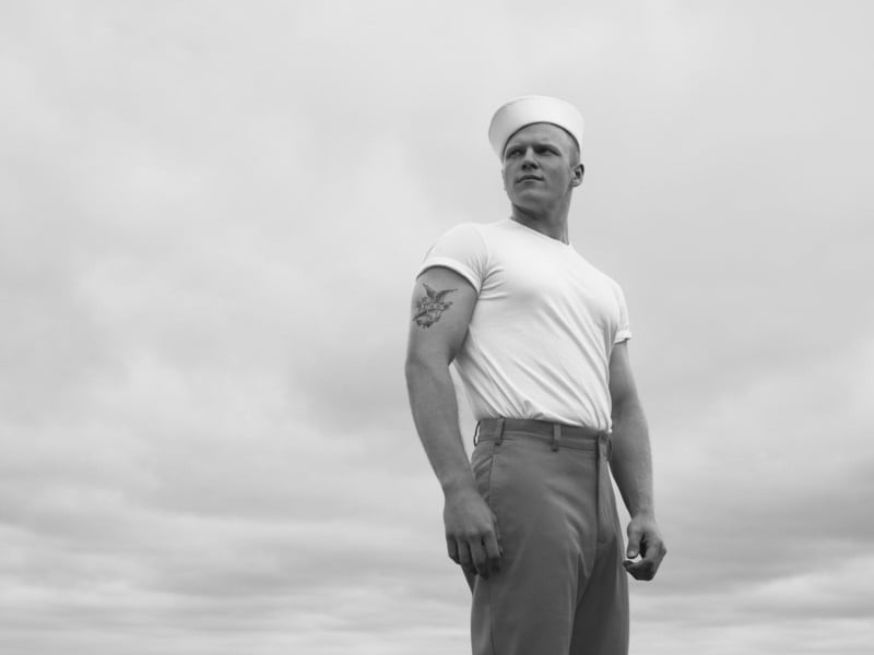
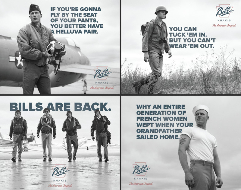
As you can imagine, we wanted the photographs to focus less on the realities of armed conflict, and more on the kind of flamboyant Americana that emerged from these decades. It was a low budget project but the creative had a lot of potential. I immediately knew I wanted to hop on board.
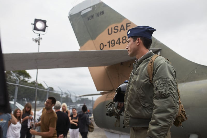
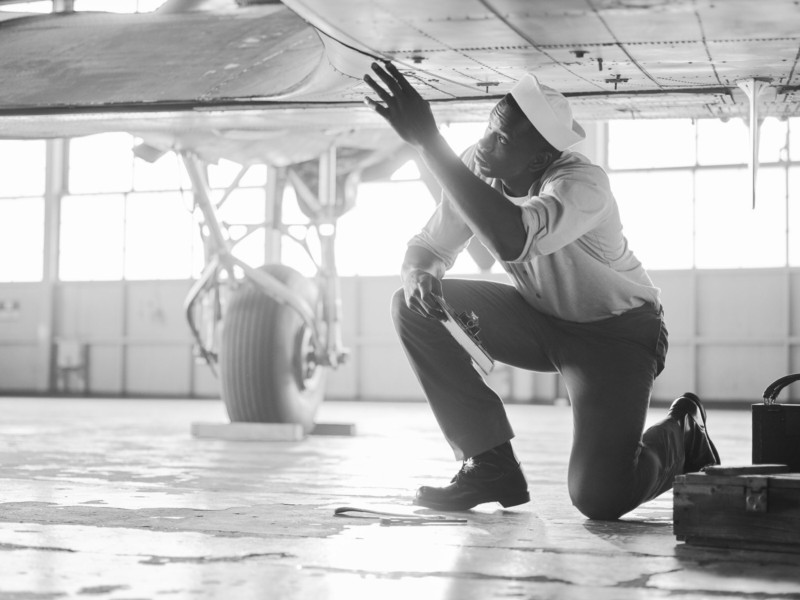
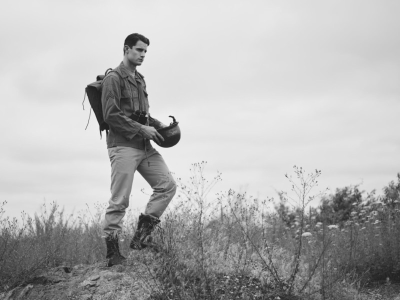
The shoot took place at the American Airpower Museum in Farmingdale, New York, which houses numerous vintage aircraft and aviation artifacts, affording us access to a runway, a hangar, and vintage military airplanes and vehicles.
The creative team at ICR, Hero Content, and our great stylist Mariana Guerrero made sure everything was period correct, from the flight suits to the military supplies to the haircuts. In that spirit, I decided to use both digital and vintage film photography for the shoot. I’m not really someone that believes, “Ra ra ra you have to use film, it’s so much better and artistic.” However, this was the perfect opportunity to do so.
Using only film would have been risky — I’m one of these stooges from the digital age that doesn’t have extensive experience with film photography, and I was flying in from another shoot in Sierra Leone the day before this one, so I wouldn’t have time to practice with the vintage camera before the work began. Plus, advertising shoots are fast-moving, high-pressure, and costly, so there’s no room for mistakes. If I messed it up on film, there was no going back.
On the other hand, using exclusively digital photography and adding a grain effect in post felt like a shortcut. Plus, using film meant I would have a real-life example of what a photo might have looked like during that time period. That made it easier for me to replicate the grain patterns and the tonality in the curve, color grade, and the retouching in my digital versions.
Deciding on the appropriate vintage camera and film for the project took some research and required some compromise. The photos were meant to harken back to both the WWII and the Korean War eras, but obviously between the 1940s and the 1950s cameras changed. A lot of the cameras that were around during WWII were not the advanced pieces of hardware we know today—they were slow and they couldn’t load much film. By the 1950s, cameras had seen improvements: They loaded similar styles of film, but the advancing was easier and you could shoot multiple exposures.
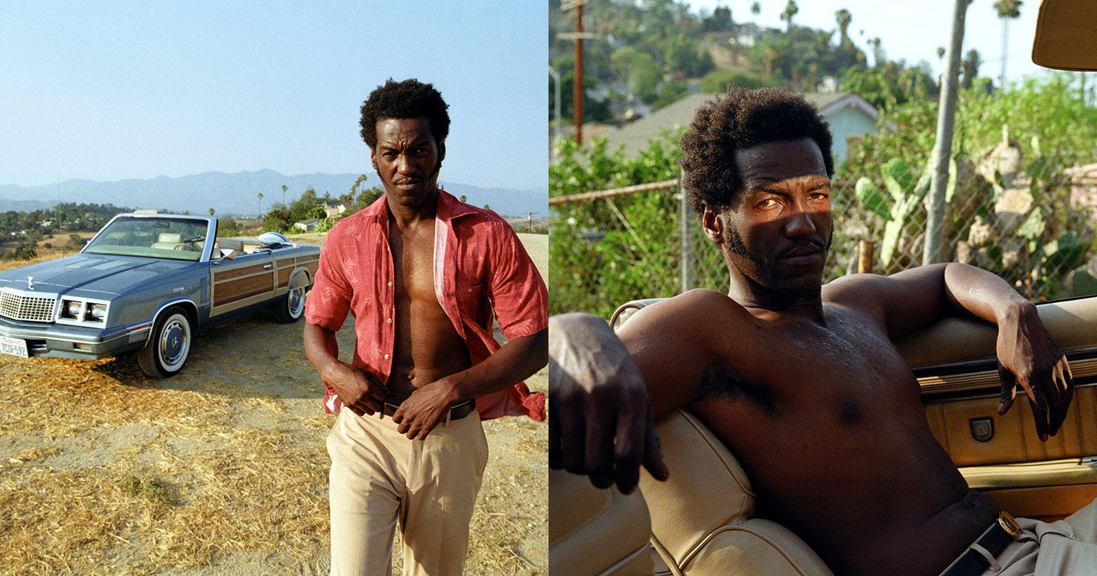
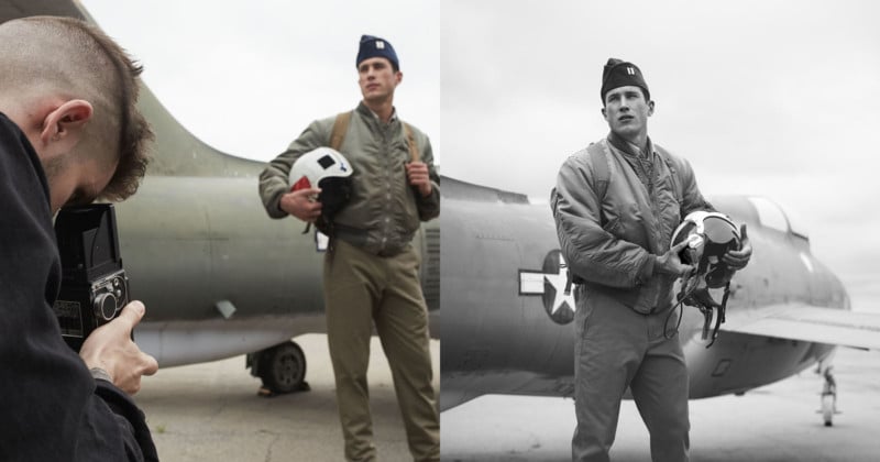
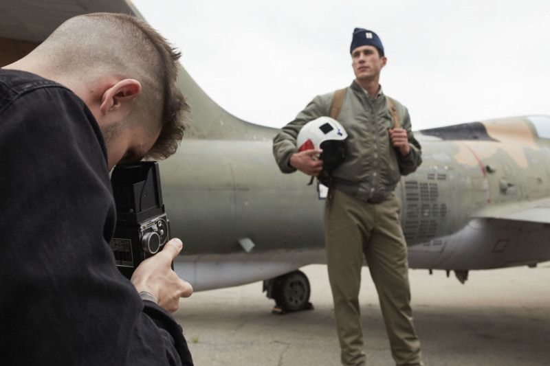
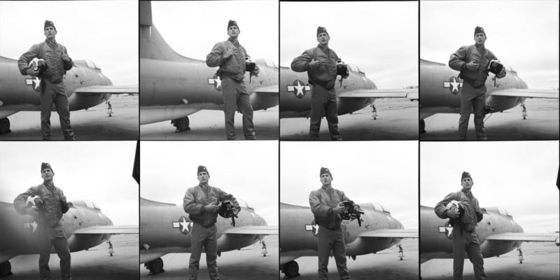
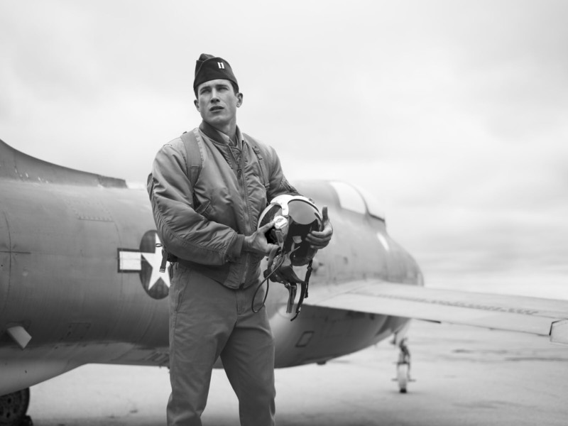
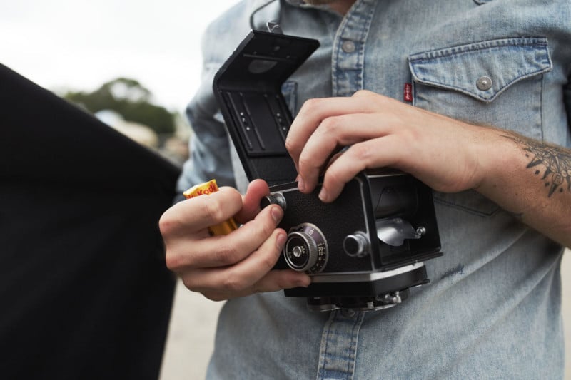
While I don’t know a tremendous amount about the history behind these developments, I do know that in creating a faux-vintage photo, the film you use is more important than the camera. So I went with a film used during both wartime eras—Tri X 400 black-and-white Kodak film in 120 format—and loaded it into a vintage Rolleicord DBP DBGM twin lens reflex camera.
This camera allowed me to shoot multiple exposures on one roll, so I didn’t have to shoot one frame at a time. It also allowed me to use larger film that would match up nicely with my digital images made with a Phase One XF + IQ250 digital back, and despite the different aspect ratio, it allowed the formats to be cohesive.
The Tri X 400 has a bit of grit to it, but it’s subtle, which is appropriate. If you look at vintage war photos from the Korean War era, most are not over-the-top grainy like you might think. They have a nice organic pattern. Empowered by the fast Tri-X film, many photographers of that time were making clean images.
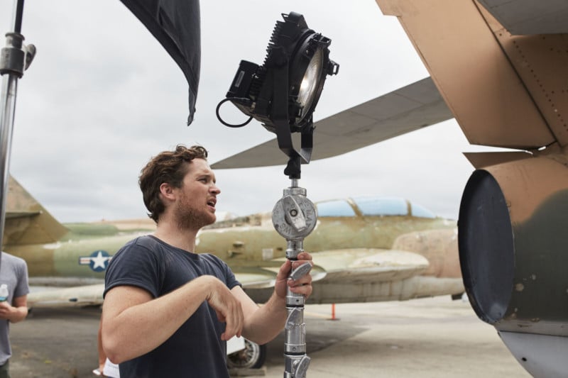
Obviously, during WWII and the Korean War, photographers mostly relied on natural light to make their photos; they weren’t lugging around lights while on deployment. But this was an ad shoot, and the light and the time of day wouldn’t always be perfect, so I used a few subtle light sources: one Zylight F8 LED Fresnel and some black flags. I used the black flags as a negative fill to suck some of the light out of the side of the face, and I used the fresnel as a punchy source or eye light, with the light fully flooded so it didn’t spot and lent a natural look and a bit of direction.
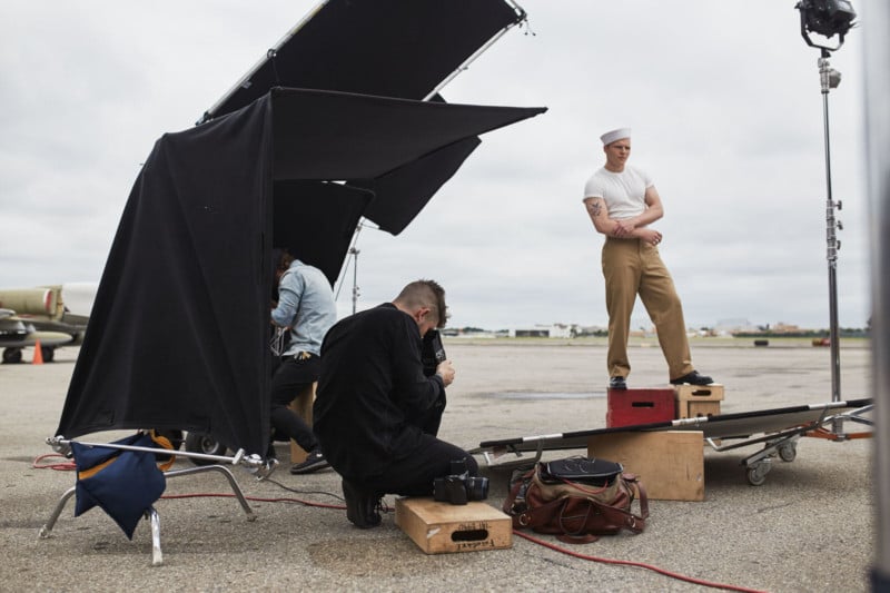
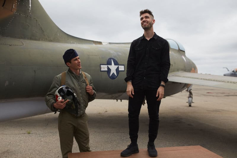
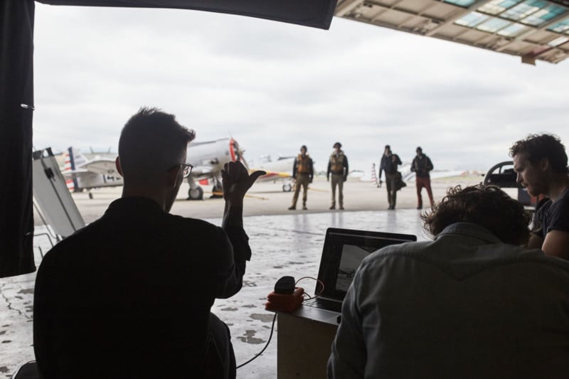
The shoot was go-go-go (like most commercial projects); we had an hour for each setup. With digital, you can make as many photos as you need, so I found it easiest to start with the digital images, and once I’d hit upon the ideal composition, I’d shoot some photos with the film camera.
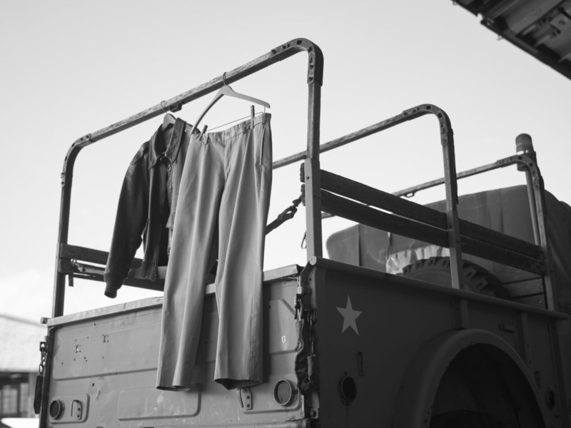
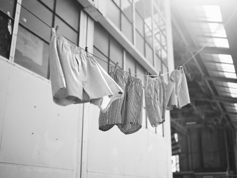
Several of the images stood out: For one photo, the team decided to hang a pair of the pants from a vintage vehicle at the museum, even sourcing period-correct clothespins for the setup.
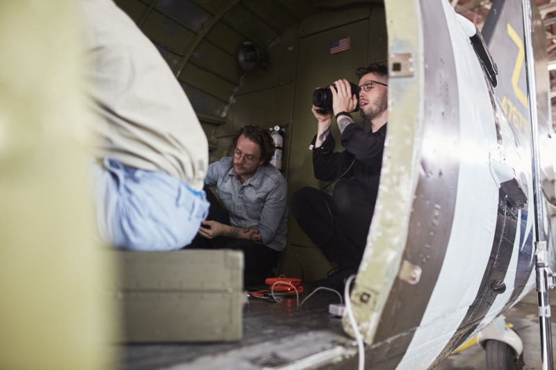
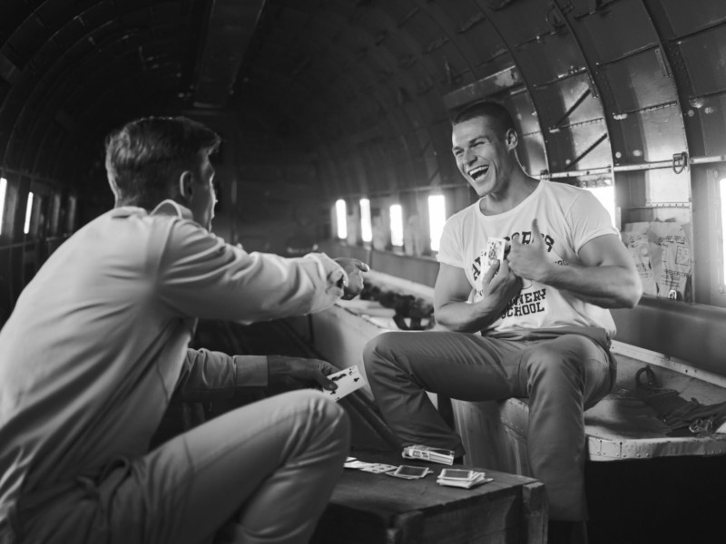
Another image features two soldiers on break playing cards inside a transport carrier. I liked this composition because it incorporates some humanity, a deviation from some of the other photos where the soldier stands alone.
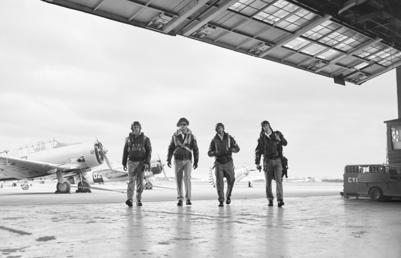
One of the more challenging shots was one made of four soldiers wearing period-correct Korean War flight jackets walking into the hangar. We wanted certain aircraft in the background, and though the museum was hesitant to move the aircraft, they eventually agreed to move four of the airplanes into a row on the runway.
The challenge here was to make a photo where the airplanes were in view in the background but didn’t overcomplicate the composition. I managed this by letting the light bleed in behind the models and by snapping the photo at just the right moment and exposure. Any closer to the camera and the models were completely in the dark; outside the hangar door, they were overexposed. I photographed this one tethered to my laptop, which helped me get the exposure right.
Ultimately, I found the project to be a nice challenge and enjoyed experimenting with vintage film photography as well as creating digital images that replicated the grain and complexity of the older photography. Without those film images to emulate, I don’t think my digital versions would have been as convincing.
My hope is that the viewer can’t tell which images were made with my Phase One XF, and which were made with the Rolleicord.
Thanks to everyone who brought this project to life. Creative / production team on set: Gene Cernill, Kyle Kostesich, Tim Kane, John Crocco, Zara Hayden. Camera / Lighting assistants: Caleb Adams, Dustin Stefansic, Brian McGuffo, Will Martinez, Ehrin Feeley. Stylist: Mariana Guerrero. HMU: Michelle Tang. Talent: Brett Bartholomew, Alexander Molina, Ross Wellinger, Maurice Baldwin, Dante Costabile, Brock Harris, Matt Heller. Retouching: Nick Leadlay, Pratik Naik