Why Photography’s B&W vs Color Debate Is No Debate At All

In the 1950s, early color photography was widely scorned. Now it’s the default. What happened?

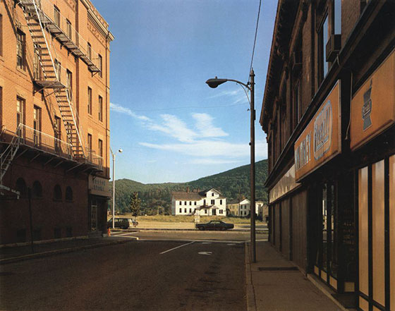
Prologue: No Space for Dreams
In 2015, Leica released a beautiful, ridiculous ad. It was for a special product in their lineup; a digital camera that only takes black-and-white photos.
The clip itself is strangely compelling. Set to hypnotizing black-and-white patterns, a calm voiceover says B&W is purer than color. The hyperrealism of color, it points out, isn’t just overly crass, it’s unnecessary. Color is an aid for people without imagination: “In the color world, there’s no space for dreams.”
Of course, this is wrong. If anything it’s the other way around: color is actual, we don’t see in monochrome. Insisting on black and white is often a pretentious turn. Leica’s ad rehashes one of the oldest debates in the history of photography: Which is better, black and white or color? The two do different things, the debate is fruitless. However, it helps to know about this “controversy” in order to understand how we and photography got here.
Act I: Color is Bulls**t
Let’s recall that photography only became an art form relatively recently. When it came about at the end of the 19th century, observers had considered it “too literal to compete with works of art” because it was unable to “elevate the imagination”. Leica’s ad used the same line of argument — that something too realistic couldn’t possibly be artistic.
At first, photography competed with fine art: It required long exposure times and used heavy, static equipment. The most popular subjects were landscapes and portraits — both hallmarks of painting.
Portable equipment or rolls of film (a blessing compared to the unwieldy cameras or glass plates used before) only became available around the First World War. It allowed photographers to take pictures in previously unimaginable settings — and to differentiate the photographic medium from painting.
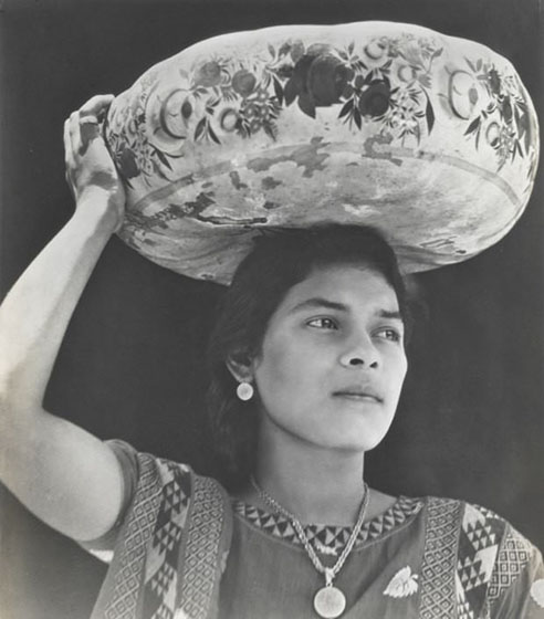
Pioneers like Henri Cartier-Bresson and Helen Levitt did it by deploying the realism in unexpected ways. With their “decisive moments” and unexpected subjects, they froze the unseen, demonstrating that photography was about beautiful compositions and subjects far different from painting. The snapshot aesthetic emerged. Street photography was born.
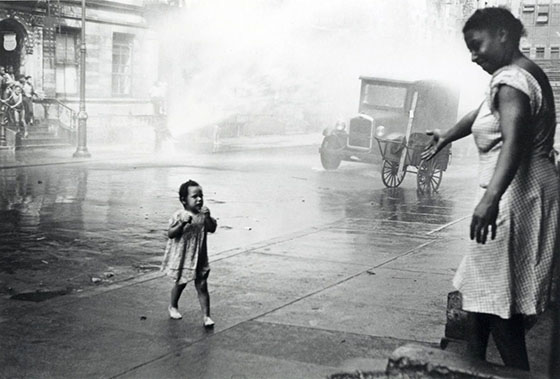
These now legendary photographers learned their craft in a black-and-white world. Which is to say that whenever they took a picture, they knew it to be in black and white. The abstraction was a natural quality of the picture — just like the two-dimensionality of the shot.
Color photography only became practical in the mid-1950s after film manufacturers had invented processes that made color pictures sufficiently easy to develop. It was another technological shift to change the medium, just as the portable camera and film before. And perhaps inevitably, photographers now assumed the role that the defenders of painting had before them: They refused to embrace the new technology.
Rather than enjoy their sudden ability to depict the world more realistically, artistic photographers shunned color. In their minds, serious, documentary and fine art photography had to be shot in black-and-white. Photography legend Henri Cartier-Bresson, known for his evocative monochrome shots, even quipped that “color is bulls**t.”
Act II: Seeing in Monochrome
Why would Cartier-Bresson dismiss color so forthrightly? Most likely because black and white works so differently than color does.
Subjects that look great in black and white often don’t look good in color. It’s for the same reason that vivid color pictures look boring once desaturated. Images in the photo-historical cannon were made for one palette or another. One sees and shoots in the same color or B&W of your camera film or sensors.
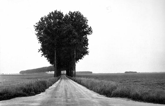
For the pioneers of photography, it had meant learning to shoot subjects that worked well in black and white — just look at the high contrast shots of the Modernist like Edward Weston and Tina Modotti, the abstract portraits of Man Ray. They didn’t just shoot in but also for black and white, emphasizing form, contrast, and shapes.
“Color negates all of photography’s three-dimensional values”, Cartier-Bresson would later claim. Black-and-white wasn’t limiting to him — photographers of the time knew how to use it.
These photographers’ ways of taking pictures also explain their stance when color arrived on the scene. Color forced them to look differently. After experimenting in polychrome, Cartier-Bresson was reportedly so unhappy that he destroyed his negatives — and now he continues to be known for his monochrome work only.
In Understanding a Photograph, John Berger wrote that “paintings, before the invention of photography, are the only visual evidence we have of how people saw the world.” I would argue that black-and-white photos, before the invention of color photography, also give us a clue how photographers saw the world: In beautiful shades of grey.
Just as black-and-white now looks reduced to our eyes, color must have seemed gaudy to the photographers of the 1950s: It looked like embellishment. When advertisement photographers embraced color, the artists’ disdain only grew. In 1959, Walter Evans dismissed, “There are four simple words for the matter, which must be whispered: Color photography is vulgar.”
Today, that stance seems absurd. Color photography has long been the standard way of picturing the world. What happened was yet another paradigm shift — and a small rebellion.
Act III: The World is in Color
While artistic photographers turned their noses at it, color film quietly conquered the global mainstream. In the post-war years, photography turned from something only professionals did to an amateurs’ hobby. The invention of (usable) color film — Kodak introduced Kodachrome in 1936 and Ektachrome in the 1940s — led to a gradual, popular adoption of color photography.
And why wouldn’t it? Why would amateurs, unperturbed by the dogma of black-and-white, use black-and-white if they could capture life in all of its brilliant colors?
In the black-and-white years, being a photographer had meant developing your own film, cropping pictures, and making prints. Processing color photographs, in contrast, was too complicated for many professional photographers — but lent itself perfectly to amateurs, who simply had their photos developed in a lab.
Most of all, it must just have seemed more realistic. Black and white “elevated a photograph from banality to a work of art”, but hobbyists just wanted to shoot realistic family photos. William Eggleston once summarized what must have been on the mind of many people at the time — and what we have come to accept:
“The world is in color. And there’s nothing we can do about it.”
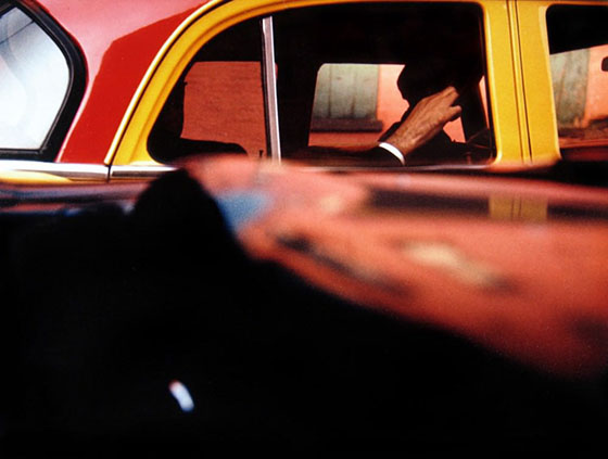
Along with Saul Leiter, Steven Shore, Joel Meyerowitz and others, Eggleston is widely credited with pioneering color in the artistic realm. In the 1970s, they made the switch from black and white to color — despite fierce opposition.
“Photographers looked down on color or felt it was superficial or shallow,” said Leiter. Meanwhile, photography legend Paul Strand told Shore that shooting in color was a “disastrous career move”.
They wanted to rebel. To break out of the monochrome world that had been prescribed by earlier generations. Joel Meyerowitz’ recent retrospective at C/O Berlin included plenty of quotes demonstrating that the photographer perceived color as a way to break with convention:
What I saw was that the color image had more information in it, simple as that! There was so much more to see and consider, whereas black and white reduced the world to shades of gray. And while that reduction had provided us with more than a hundred years of remarkable images, we were entering a new era at the time, and color, for me anyway, seemed to offer a challenge to the conventions that always undermine any medium.
William Eggleston, who once proclaimed to be “at war with the obvious” followed a similar line of thinking: He was able to take “perfect fake Cartier-Bressons” but wanted to do something different, to challenge the status quo. “When I switched from black and white to color, the only thing that changed was the film,” he said.
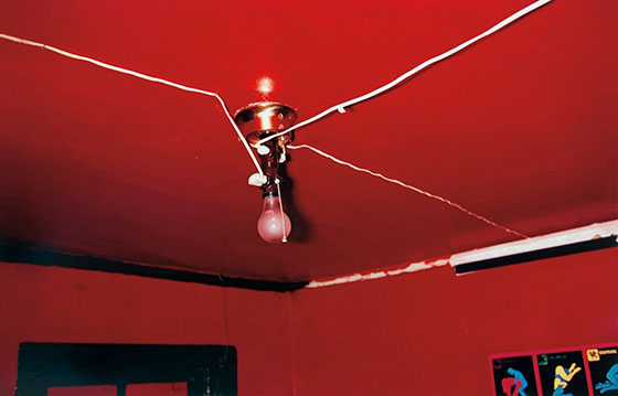
That isn’t quite true: The switch from black and white, as championed by these photographers, went hand-in-hand with a change in subject matter. They started shooting subjects that weren’t beholden to the logic of black and white — less geometric, high-contrast settings, but much rather everyday occurrences where the colors stood out. Eggleston shot shopping malls, Leiter the smudged colors of a rainy city, Shore the vivid mundane.
In the excellent book William Eggleston — From Color to Black and White, art curator Agnes Sire writes:
It’s no coincidence that artists like Eggleston and Shore managed to picture banal subjects in an interesting way, and it was their use of color that helped them accomplish it. The transition from black and white to color was as much a transition from supposedly salient subjects — like the photojournalism championed by Magnum — to the more poetic everyday object.
At first, nobody wanted to see this kind of work. Now, the early exhibits of these photographers are legendary. It took a while for the artistic world to open its eyes to a new kind of subject — and to color photography. While black and white had turned the mundane artistic, the pioneering color photos were successful exactly because they were mundane: They alerted the general public to the hidden beauty in everyday life.

Epilogue: An Unresolved Question
Color is no longer controversial. It is simply the standard. Today black-and-white is mostly used by photographers who enjoy the classic look, or in fashion shoots emulating the modernist style, or by marketers who want to convey a vague notion of class and sophistication.
That doesn’t mean the controversy has been fully resolved, nor can it be. It’s not about being right or wrong, being realistic or snobbish, forward-looking or old-fashioned. The controversy is fundamentally about how you think the human imagination works–or how it should work.
“Color is not a question, but rather an answer”, Joel Meyerowitz has said. For a photographer, it is a decision among many others, all part of their way of seeing and interpreting the world.
So let’s close with something the photographer Alec Soth said in an interview with Aperture a few years ago, looking back at a black-and-white world:
Sometimes you think, eighty years ago the world must have been black and white. But of course, it didn’t actually look like those photographs. The way that it was photographed shaped that reality just as much then as now.
About the author: Lars Mensel is a photographer and writer based in Berlin, Germany. The opinions expressed in this article are solely those of the author. Mensel is also the host of the Available Light podcast. You can find more of his work on his website. This article was also published here.