5 Professional Product Photography Tips
![]()
As the digital marketplace grows, the demand for good content and eye catching media increases with it. More and more brands and entrepreneurs are taking the photography in-house to keep up with demand, while keeping production costs down.
As a product photographer recognizing the need for assistance, I wanted take the time to share 5 key thoughts and tips that could be useful.
1. Product photography tells a story, but are you telling the right story?
Every detail in the frame communicates something to the audience, and makes them feel a certain way (i.e, the light, the tonality, the point of focus, the composition, etc.) So be aware and be intentional.

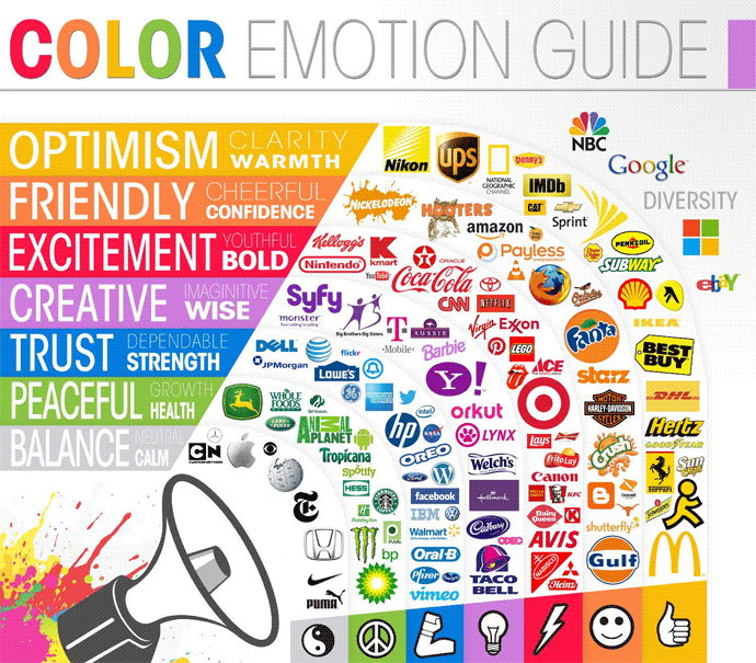
Understand color theory, and use it to your advantage
Color alone can be a great tool to create a sense of harmony, trust, craftsmanship or luxury… or in the same way, it can create a sense of high stimulation, fast paced energy and tension.
Color is also a great way to re-enforce the brand. Color is an amazingly sensitive visual tool for communication. The same tones can communicate very different emotions when paired with another color. The 2 images below are an example of emotional difference between red against white, and red against black. The image on the left should make you feel happy, safe, fresh, and clean… while the image on the right should make you feel a little seduced, mysterious, and a little more risky.
![]()
It’s just light
This is another one of nature’s incredible gifts that is so simple, yet so complicated for a lot of us to understand (let alone master). It can be our best friend, or our worst enemy. However, one of the beautiful things about product photography is the fact that usually products are shot in studio, and we are in control of it. So, DON’T over think it.
I often start with one light, then build from there. It’s easy to get caught up using our brain to imagine/predict how the light will fall on a subject rather than simply use our eyes. Working with one light source at a time allows you to see what each light is doing, and often saves a lot of time problem solving (i.e., detecting unwanted reflections, shadows, etc.).
See light with your eyes, and not with your mind… but stay “artistical!”
Product Photography is much less artistic than it is technical, especially with catalog photography. However, when shooting “conceptual,” you can get “artistical.” Either way, when it comes to light, be sure and study what it’s doing, and look at your product and consider the following:
- Does the lighting bring the focus to the branding, and provide clear visibility to the logo?
- Does the light accentuate the shapes and design materials used and or does it mask them?
- Does it convey the mood you are going for? Below is an example of how light will dictate the overall feel.
![]()
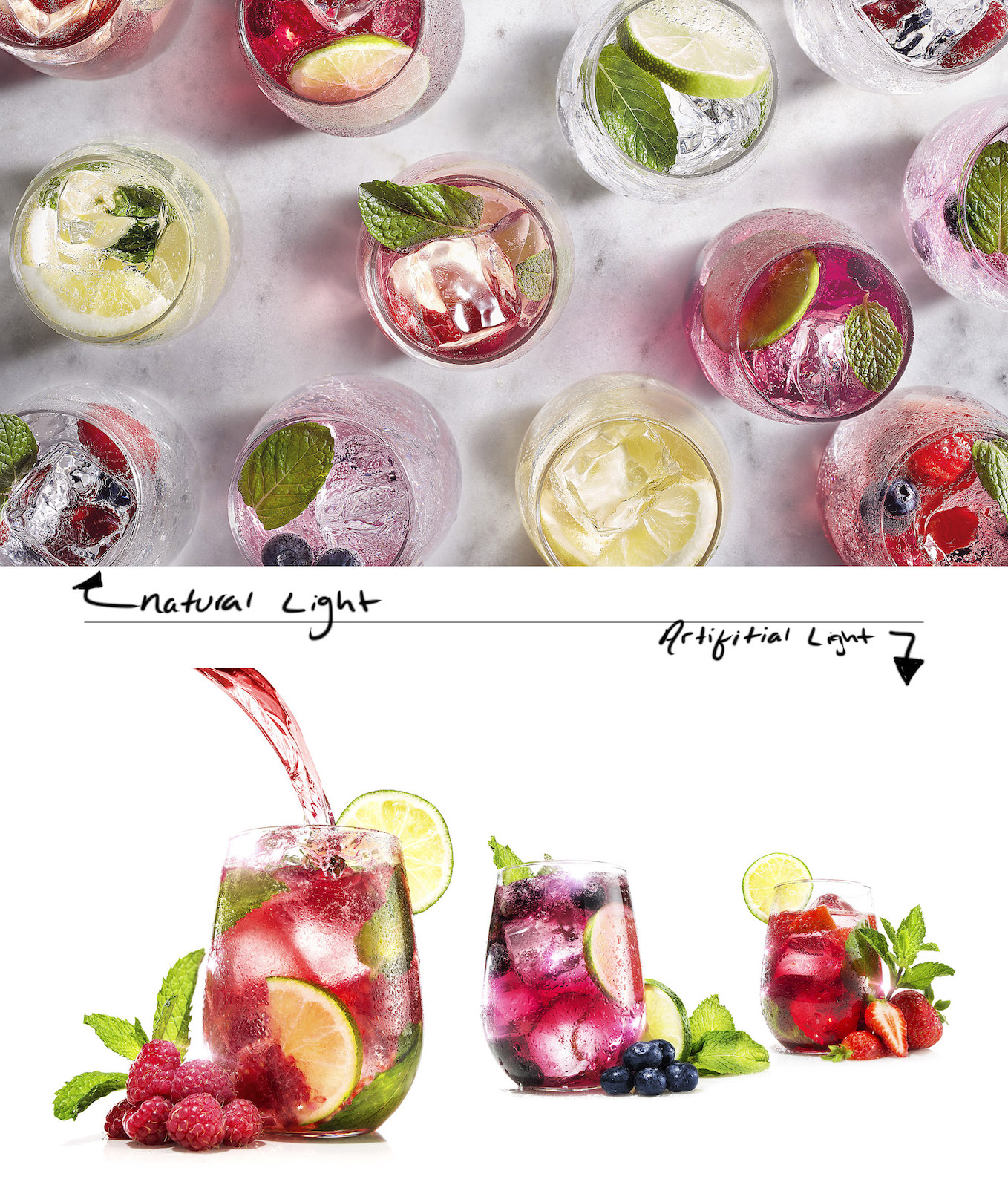
2. Natural Light vs. Artificial: There is no right or wrong, there is simply whats best for the job at hand.
Natural Light
Advantages:
- A natural window scene can be a simple and inexpensive solution for beautifully lit product shots, especially if your going for a more natural & organic look and feel. Just style and shoot! (great for social media, e-commerce, and many other media outputs).
Disadvantages:
- Less control of the light- Natural light changes constantly, therefore everything changes constantly (i.e, color, mood, camera settings, etc.).
- Natural Light can lead to longer exposure times or higher iso settings (creating unwanted noise/grain).
- can create problems with unwanted ambient light (reflections, mixing color sources, etc.)
- If you are planning on shooting a whole catalog of product images, you will likely be facing an uphill battle when it comes to consistency and color matching.
An example of the final point: if you photograph a lovely woman’s purse in a warm morning window light setting, it will most likely look great! However, if you are photographing a whole line of purses in the same setting, the look will dramatically change throughout the day… and then the sun starts to go down just when you’re on a roll… and then you need to add ambient light, and then everything goes down hill, and then the retoucher no longer likes the photographer. Just saying.

Artificial Light
Advantages:
- Output consistency – Consistent lighting in product photography is key for many reasons.
- When your shooting catalog product photography, it is very important that the color balance is accurate throughout, and this can only be achieved with a constant light source. Also, if you ever need to re-create your set for either a repeat client or look you loved and want to match, you can record your lighting/camera settings and pick up right where you left off.
- In a more styled or conceptual setting, lighting consistency matters greatly, as is common to work on one shot for many hours… and if your light keep changing on you as you work, you will find yourself working in circles. Not fun or productive.
- Control – When it comes to artificial light, there are tons and tons of tools, modifiers and techniques to shape light. This will allow much more flexibility to either get creative or to find the most flattering and ideal light that suites your subject and look.
Disadvantage:
- Cost – Some of the lower end lighting gear is pretty affordable, however even then it all adds up. The higher end gear can get very expensive. The reality is, your needs may not require a bunch of studio lighting, and there are ways to save costs and get inventive with the natural light around you. At the end of the day, light is light.
- Space – When it comes to lighting a set, you often find yourselves in a space that is too small with ceilings that are just never high enough. Artificial lighting requires light stands, boom arms, and plenty of other grip equipment. This can take up a ton of space, and quit often, space that you may not have to give up.
- Learning – Depending on the size of your team or experience with the equipment, it can be a bit overwhelming learning all of the gear. I recommend getting to know your needs, and trying before buying.

3. Just because you can, doesn’t mean you should.
Trendy filter effects
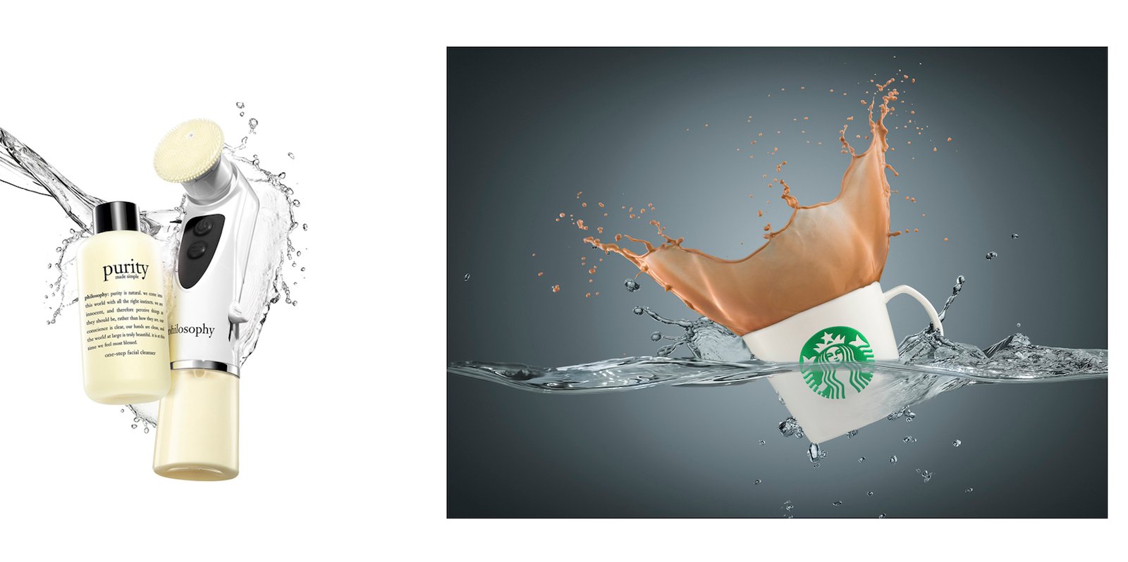
Often times, when we see cool lighting or a splash technique, film filter, or other trendy effects, we naturally feel the urge to use it, but does it fit the brand’s identity or the product’s purpose? If so, go for it, if not, just be true to the brand and you will stand out that way.
Also, these filters tend to disregard all of the hard work that went into color balancing and brand consistency.
Product and Prop Styling
Styling a set is a challenge, a real craft, and it requires a skilled eye and a good amount of patience. It is something that gets over looked by many, but here are a few things to keep in mind:
- Less is more. Respect the negative space — it can create a nice simple backdrop for copy or other design elements.
- Props, they have a purpose, but they are not the hero. Keep an eye on what goes into the frame, and be careful not to over-clutter or take away from the product.
- Mind your surfaces. Surfaces can be a nice and simple way to place a product in a scene that queues a sense of place, and speaks to the brand’s target audience. On the flip-side, a roll of a solid colored seamless paper can be a great “go-to” for clean & simple silo shots.
- Be mindful of the legibility of product labels and brand logos.
Bringing in a local prop stylist that understands the brand can relieve so much stress, save time, and can dramatically improve the shot.
4. Tell the story, visually.
I always approach my subjects with the brand in mind, then the designer, then the messaging. I like capture the details and the story or a product, just as a portrait photographer would with their model.
In every line, every curve, every movement and every bit of texture of a well-designed product has character and purpose, and it should be captured. When I look at a good product photograph, I get a sense of how it feels, how it smells, and in some cases how it sounds (i.e, fizz from a fresh carbonated beverage or the soft ticking of a wrist watch).
![]()
5. Shoot, edit, print, edit, print.
I think the process of printing work, living with it for a day or two, revisiting it, tweaking it, then re-printing it tends to be more and more of an impractical task in our fast past world; however, I think it is a practice that you will find very rewarding in the end, even if the end goal is never to print.
Viewing a print is a much different experience than viewing a digital display. I find that pinning a work print up on a wall and stepping back and reviewing it reveals things that all to often get missed when viewing only on screen. This process is invaluable when working on a large catalog!
Last but not least, seeing all of your previous and current projects up on a wall as a whole allows you to easily see the brand’s uniformity, and quickly detect when something feels off.
About the author: David Butler is a commercial product & still life photographer and digital artist specializing in high-end luxury products and other forms of natural still life. To see more of his work, head over to his website, check out his blog, or follow him on Instagram. This post was also published here.