How to Achieve Compositional Balance in Photography

I was born in early October, under the seventh astrological zodiac sign of Libra, which has a symbol of balancing scales.

It is not surprising then, that I regard balance and harmony as the backbone of composition in photography. To me, a perfectly balanced composition is much more important than the “rule of thirds”, or ensuring a straight horizon, or any of the other (supposedly unbreakable) rules of composition.
So what is the definition of a perfectly balanced composition?
If we divide a photograph into two horizontal halves with an imaginary fulcrum in the middle, then a perfectly balanced composition is one where the sum of the visual weights of all the objects (compositional elements) in the left half of the image is exactly equal to the sum of the visual weights of the elements in the right half of the image.

You might be inclined to think that finding perfectly symmetrical scenes and placing your primary subject(s) in the center of the frame would be the best way to achieve perfect compositional balance. It might, though it rarely works in practice. A “perfect” reflection of something is seldom achieved in photography. This is due to the physics of light. Your lens would have to be half-submerged if you wanted to capture a photo of something “perfectly” reflected in some calm water (and even that wouldn’t work).
In the photo of the fishing boats above there are three boats to the left of the centered (green) boat and only two boats to the right of it. So why does this composition feel balanced despite that? It works for two reasons – there are more clouds in the sky on the right than on the left, and the cluster of houses perched on the cliff adds additional visual weight to the right. The fact that the boat shadows are pointing towards the right also helps.
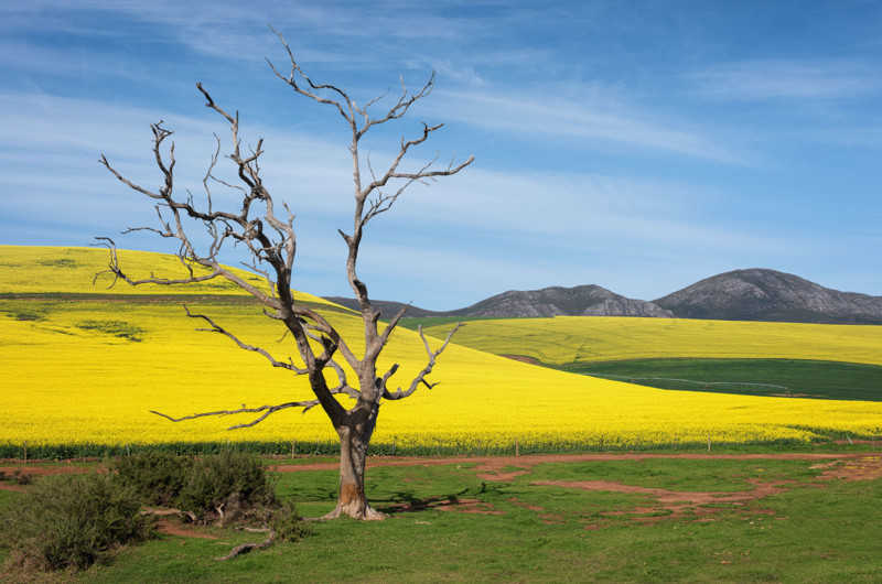
In the photo shown below, I decided to position my primary subject (the dead tree) roughly in the left third of the composition. While it is usually a good idea to move our primary subjects off-center into either the left or right third, for a perfectly balanced composition I would need some other element(s) of equal visual weight to the dead tree on the right side of the frame. I didn’t have any such balancing elements at my disposal here, and my movements were also fairly restricted (I was standing on a bridge). To make matters worse, the hill immediately behind the tree is much larger than the two smaller hills on the right, and the small dark bushes below the dead tree add even more weight to the left half of this image. This all adds up to a very unbalanced, left-heavy composition.
Sometimes the only way to save a poorly composed photo is to crop it.
Nobody is forcing us to stick to the original aspect ratio of our camera systems or to any of the other “standard” aspect ratios (like 1×1, 5×7, 16×9, etc.). I always crop my photos afterwards for optimal compositional balance, whatever the end result might be in pixels. I might lose some valuable pixels by cropping all my photos, but since most people will only ever view my photos on their phones, what difference could a few fewer pixels make between friends? I also mostly tend to shoot multiple-image panoramas, so I usually have plenty of pixels to play with.
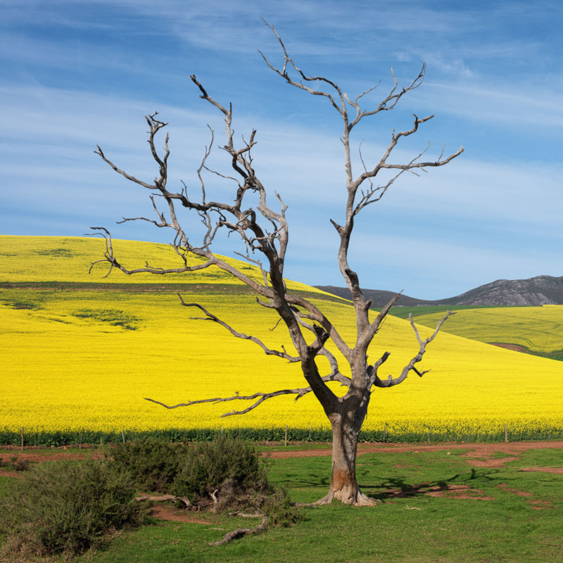
The only way that I could save the photo above was to crop it square as shown below. Despite the square crop, I still felt that placing the tree trunk horizontally centered would result in an unbalanced composition. This is because the canola-covered hill and the small dark bushes are all still in the left part of the frame. This forced me to move the tree off-center towards the right.
If I already know that I’ll be cropping all my photos (and panoramas) afterwards, then it makes sense for me to leave a bit more extra space around my primary subjects while I’m composing my photos. Sometimes zooming in too tightly on something has prevented me from improving my compositions when editing those photos afterwards.
It’s always much easier to take something off than it is to add what wasn’t there before.
So what am I talking about when I’m referring to “primary subjects” and “compositional elements”?
The primary subject is (usually) the thing that made us decide to stop and take a photo of something in the first place. It doesn’t necessarily have to be a single thing that urged us to try and capture a particular scene, but it does help if we would like our viewers to know exactly why we took that photo. If you are unable to clearly identify what it is that you would most like to show me in your photo, then the chances of me liking your photo are greatly diminished.
Compositional elements are all the other things that I might look at in your photo besides (and including) your primary subjects. Anything ranging from the tallest mountain to the smallest speck of litter is a compositional element, providing it can catch our eyes and attention. Essentially everything that you might be able to photograph could be considered a compositional element. A clear blue sky, however, contains zero compositional elements. A clear sky with only one cloud contains only one element. Add a flying bird and you have two elements. Any object(s) in your photos that our eyes might stop to look at is a compositional element. I’m sure that you get the picture.
Not only should we try to balance our compositions horizontally so that the left half weighs roughly the same as the right half, but we should also always try to balance our compositions vertically, ensuring that the upper half contains elements that weigh the same as the elements in the lower half.
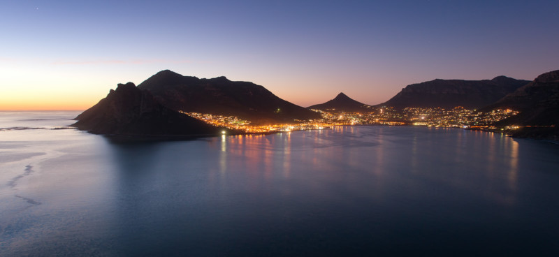
The panorama shown below is a good example of a photo that is both horizontally and vertically unbalanced. Although the dark mountains surrounding the town of Hout Bay (at dusk) are all the same visual weight, they are touching the right edge of the frame which makes the composition feel too heavy on the right. The mountains are also positioned in the upper half of the image, with nothing but the ocean in the lower half to provide vertical balance. This makes this image feel top-heavy.
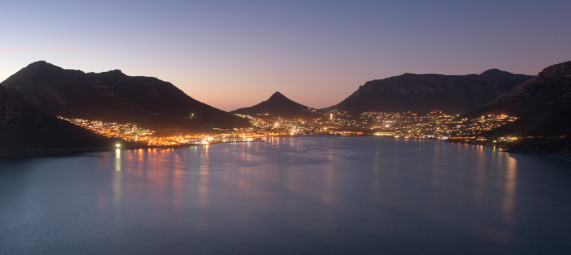
To improve both the horizontal and vertical balance of this composition, I could have used a longer focal length to zoom in a bit closer on the town lights and I could also have positioned them a bit lower in the frame. Or I could simply crop my final panorama as shown below.
Although we should always strive to find a perfectly balanced composition for every subject that we photograph, sometimes it’s practically impossible.
The only possible way to balance the composition in the photo shown below is with a dark cloud over the ocean on the right side of the frame. Zooming in would not have helped much in this particular situation, since all the heavy stuff will always be in the left half of any composition here.
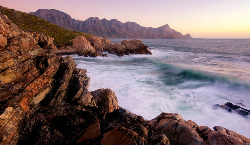
As with most of the rules of composition, there are some situations where a deliberately unbalanced composition will be more effective than a perfectly balanced one. Unbalanced photos often help to attract the viewer’s attention to a particular part of the image, and the unusual placement of a single object or leading line can also produce a welcome sense of unresolved tension.
In the photo shown above, the visual weight of all the rocks and mountains on the left does help (to some extent) to direct the viewer’s eyes to the long-exposure curling wave. This is because our eyes will always tend to move from the heaviest side of the composition towards the lightest side.
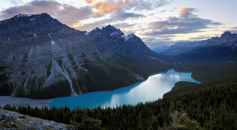
The photo shown below was captured at one of the most beautiful locations that I’ve ever visited, namely Peyto Lake in Canada’s Banff National Park. Although I love the quality of the light and all the crisp detail that I was able to capture in this seven-image panorama, the mountains, lake, and colorful clouds are unfortunately all in the left half of the frame, which creates a very unbalanced composition.
Despite its incredible natural beauty and popularity among photographers, it is actually very difficult to find a perfectly balanced composition at Peyto Lake. The lake shore and the lower part of the surrounding mountains are all completely surrounded by a thick pine and spruce forest, and the most obvious (and popular) view of the lake is from a wooden viewing platform that has been built in a small clearing in the forest near the car park.
There are, however, a number of paths through the forest leading away from the viewing platform. So after a bit of exploring on a different day, I managed to find a relatively clear view of the lake with some small trees that I could include in the lower right corner of my foreground, thereby balancing out my composition. I was also somewhat luckier with the clouds this time, as most of the colorful clouds were now to the right of the mountain instead of behind it.
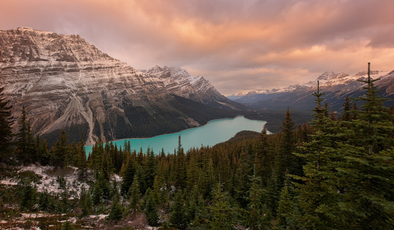
I’ll be the first to admit that my second Peyto Lake photograph is not nearly as visually striking as my first attempt, but there’s no denying that the composition feels much more balanced.
So if a perfectly balanced composition is achieved by adding up the visual weights of all the different elements in a composition, how does one go about measuring the weight of a cloud, a mountain, or a tree?
Most people have an inherent sense of visual balance and finding a perfectly balanced composition is mostly an intuitive process. Some images however can be a bit more difficult to balance, so it helps to know how we can calculate the visual weight for each of the various elements.
Although a mountain might be physically heavier than a cloud, its visual weight within the composition depends primarily on 4 things;
- Relative size. A large object (element) always feels heavier than a smaller element, unless…
- Brightness. When two elements are the same size, the darker one always feels heavier, unless…
- Distance from the camera. When two elements are the same size and brightness, the one closer to the camera always feels heavier, unless…
- Distance from the edge of the frame. When two elements are the same size, brightness, and distance from the camera, the one that is closer to the edge of the frame will always feel heavier. The only way that you could balance a fat kid and a skinny kid on a see-saw, is when the fat kid sits closer to the center (fulcrum).
So in a nutshell… big objects mostly feel heavier than small objects, dark objects mostly feel heavier than bright objects of the same size, distant objects mostly feel lighter than objects which are closer to the camera, and an object that is close to the edge of the frame will mostly feel heavier than one which is further away from the edge.
Our objective should be to mentally calculate the relative visual weight of each element within our composition and then make sure that the total weight of all the elements in the left half is roughly equal to the weight of all the elements in the right half.
There is no unit of measure for visual weight. You could use kilograms or pounds or elephants, or any other measure of your choice. It is more important to be able to judge if one element feels heavier than another one than it is to know exactly how much they each weigh. This is the same as when we try to find equilibrium with balancing scales. It doesn’t really matter how much the individual objects that we place on each side of the scale weigh, as long as the total weights of all the combined objects on each side are equal.
If we get the feeling that one side is heavier than the other, we could either try to reduce the weight on that side, or else we could add some more weight to the other side. We don’t add more weight by physically adding more rocks or other elements to our composition – we do it by adjusting the placement of our cameras slightly so that the elements will be distributed in a more balanced and pleasing way.
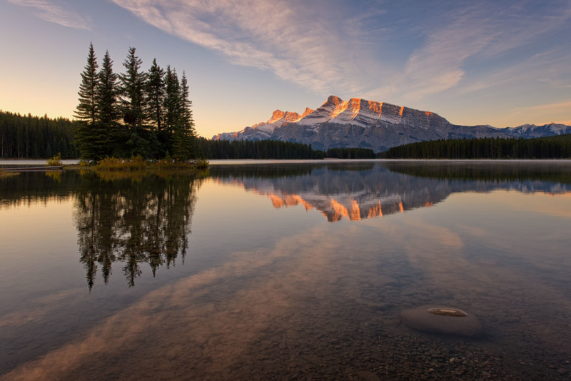
The above photo is a good example of a well-balanced composition. The dark trees and their reflection on the left are clearly heavier than the brighter mountain range on the right, especially since they are positioned closer to the camera and also closer to the edge of the frame. But when we add the weight of the clouds and the rock in the immediate foreground to the weight of the mountain in the background, then the left and right half of this composition become perfectly balanced.
Similarly, if we add the weight of the rock in the foreground to the weight of the reflected clouds and all the smaller submerged stones along the bottom edge of the frame, then it compensates for the off-center horizon line and prevents the composition from feeling either bottom or top-heavy.
Achieving a perfectly balanced composition is not a hard-and-fast rule that must always be obeyed, nor is it something that requires measuring scales to physically weigh up all the elements in your composition.
It is, however, something that we should always consciously consider if we want our images to feel harmonious and appealing to the viewers.
But these are merely my insights and opinions. I have no doubt that some of you will feel differently. I’d love to hear your thoughts on compositional balance in the comments section below.
About the author: Paul Bruins is a semi-retired South Africa-based professional landscape photographer. The opinions expressed in this article are solely those of the author. For the past 20 years, Bruins has worked to explore and photograph every corner of his hometown and country. He has organized and hosted a number of photographic exhibitions, workshops, and tours around the world. His photos have also won numerous competitions and awards and have been published in calendars, magazines, and books. You can find more of his work on his Flickr and Facebook.
Image credits: All photographs by Paul Bruins.