Mood.Camera is a Film-Like iPhone App With Point-and-Shoot Style
![]()
Despite the leaps in smartphone camera tech, many remain nostalgic for the analog days. Enter Mood.Camera, the latest app meant to fuse film with phones.
Mood.Camera is simple enough. There’s a viewfinder and a capture button taking center stage while to the left are the various preset options, which are the first thing users really interact with upon downloading the app. These feel like the real draw of Mood.Camera overall. Then, there’s an exposure dial that’s easily accessible and always present on screen rather than tucked away. There are also a few zoom options to avoid the need to pinch (although users can do that too), an in-camera library, and settings.

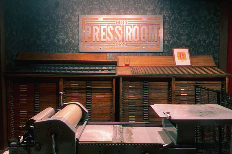
The best part of Mood.Camera truly lies in its ease of use. When moving through preset filters, users can see the effects on 11 different sample images, including portraits, landscapes, architecture, city streets, and greenery. Plus, scrolling between the presets offers a short explanation of what exactly it’s bringing out with best use cases. For example, Portra’s description reads, “Soft airy tones for captivating portraits.” It makes the app and its features more accessible to newcomers who may not yet be able to quite put their finger on what exactly makes a certain filter special.
One of my favorite details is the ability to adjust the placement of these preset looks, which is incredibly convenient once users start to develop favorites.
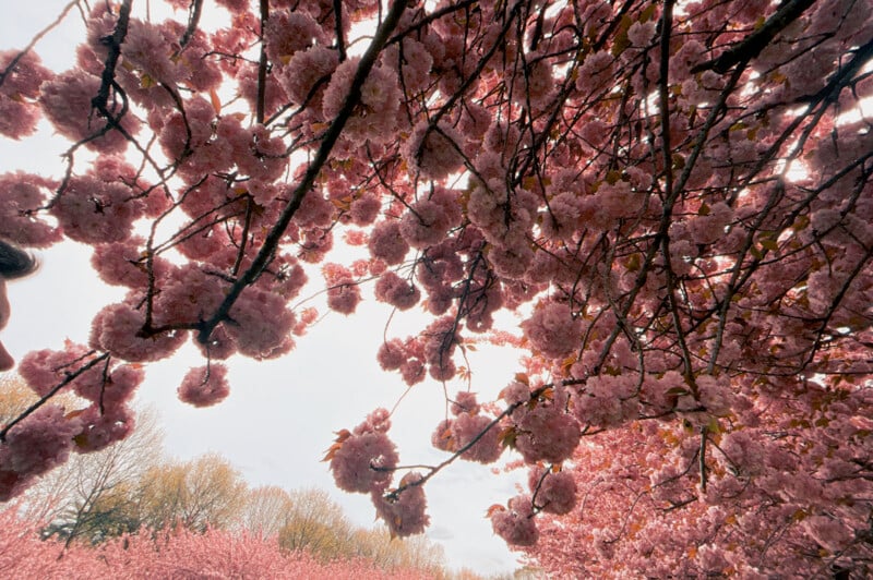

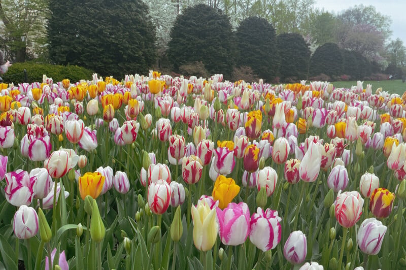
Unlike many of its counterparts, Mood.Camera doesn’t let users apply these filters to existing images in their camera reels. Instead, it operates as a point-and-shoot app. Mood.Camera creator Alex specifically decided not to offer such a feature saying, “I wanted to discourage this kind of work flow as it goes against the core concept for the app.”
In fact, Mood.Camera doesn’t have any editing options at all. At best, users can switch on a setting that lets them save both the “original” image along with the analog makeover one courtesy of Mood.Camera. The most users can change are the “quality,” which affects the balance of sharpness to grain, and the “tone” settings, which alter the contrast and dynamic range. Similarly, the viewfinder doesn’t actually show a “filter preview.” It merely shows what users would see in their regular camera app.

“Since the first Polaroid camera, photography has been focused on more convenience and more control, but I think we’ve lost some of the magic along the way,” Fox explains in a release. “Some of the design decisions I made were intended to reduce the conveniences we’re used to, urging users to be in the moment, instead of worrying about which filter to use, or staring at their phone editing.”


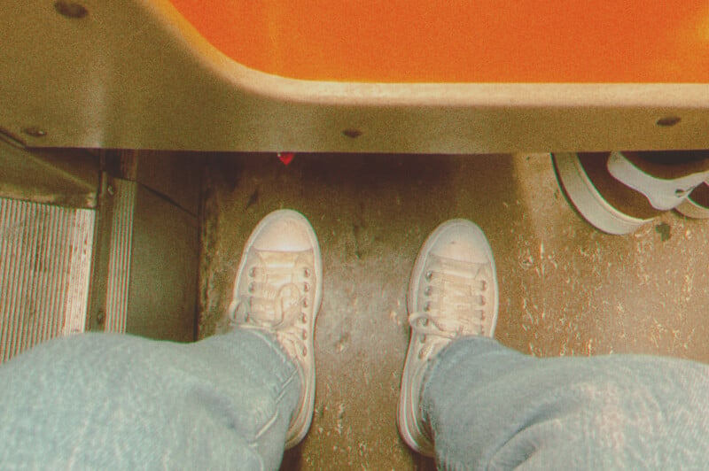
It’s a bold choice and is one that will either encourage people to make Mood.Camera their go-to for taking photos on their phone or one that will quickly alienate possible long-term users. Still, the company says Mood.Camera has been trialed by “a select group of photographers” over the last two months, taking more than 100,000 photos collectively and providing feedback along the way.
Mood.Camera really is fun to use and the filter presets do look quite nice capturing the analog look in a way that many apps strive for but few actually excel at. It’s just difficult to avoid asking whether that’s enough. The camera app replacement field is quite packed and as good as Mood.Camera is, it’s not the only one going for the film aesthetic.


It’s certainly worth taking a look at all the same. Fox notes more features should come, though he hasn’t decided what those features will be. It’ll be interesting to see how Mood.Camera evolves.
Mood.Camera is available in the Apple App Store now and comes with a free seven-day trial. Paid options include a one-time fee of $15 or $2 a month. Android users are a bit out of luck here, though. There’s no option on the platform, and creator Fox doesn’t seem to have plans to change that anytime soon.
Featured image credits: Mood.Camera