Color Gamut in Smartphones: What You Should Know

Nothing to see here. You take photos on a smartphone to share them on social media, and that’s it. Only a tiny minority of phone users would ever ponder the color gamut of smartphones or their color management. Accuracy is not a priority.
My interest in this was piqued when I realized I’d have to sacrifice a beautiful deep red from a DCI-P3 image on my PC when converting profiles. DCI-P3 is an RGB color space I wouldn’t normally use. It’s not a space designed for stills, but it is a common target among smartphones with an OLED or AMOLED display.
Do Smartphones Have Wide-Gamut Displays?
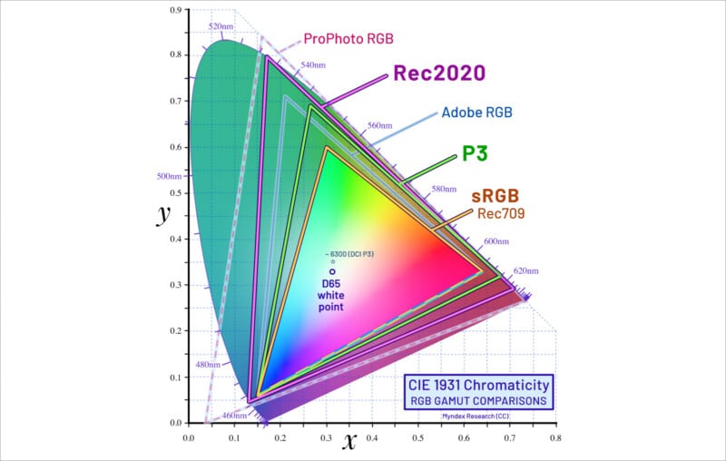
A wide-gamut display has a significantly wider gamut than the sRGB color space, as vague as that description is. That would include any gamut in proximity to Adobe RGB or DCI-P3. Both are about 25-26% bigger in surface area than sRGB when mapped against the CIE 1931 reference space. The difference is appreciable, anyway.
Let’s loosely define Adobe RGB and DCI-P3. The former was designed to encompass the colors in CMYK printing and is a strong landscaper’s space with rich and nuanced cyan hues. DCI-P3 is a digital cinematic space that is more about yellows, oranges, and reds (strong greens, also). Notably, it enlivens skin tones.
It’s tempting to think that DCI-P3 (Digital Cinema Initiatives – Protocol 3) is preferred in smartphones because they are overwhelmingly used for portraits and selfies. But that’s just a side benefit of a color space employed in digital cinema and 4K video content. Playing such content is within a smartphone’s remit.
The Problem of Zero Color Management
Color management gives photos a consistent appearance across multiple devices, browsers, and apps. But when the device has no color management or it’s patchy, which is true of many cell phones, all that goes out the window.
Any high-saturation mode on a wide-gamut cell phone that does not employ color management will cause sRGB web images to look oversaturated, at least compared to how they were meant to look. It gives them a color bump.
Some cell phones approximate the sRGB color space in their “Natural” mode or equivalent. This would greatly improve color accuracy when browsing the web, even without color management. They may also have a DCI-P3 mode for 4K content and a “Vivid” mode bigger than DCI-P3. Commonly, the latter two are wrapped as one.
Wildly saturated color often looks better to the casual eye than restrained, subtle color. Lust among the masses for saturation far outweighs the desire for precise control. With phones, you aren’t usually engaged in any process that needs color fidelity.
However, sticking your phone in super-saturated mode won’t let you see photos as the author intended unless color management is in play. An element of communication is lost. That might be relevant for folks sharing work on Flickr or buying artwork online.
A Question of Technology
I probably wouldn’t be writing this article if all smartphones had an LCD, as per the average PC monitor or laptop. Most mid-level or high-end smartphones of today do not have an LCD. Instead, they utilize OLED (Organic Light Emitting Diode) or AMOLED (Active-Matrix Organic Light Emitting Diode) technology.
OLED and AMOLED technologies are especially good at producing vibrant colors and deep blacks. The biggest difference between this technology and LCD is that each pixel emits light rather than having a backlight project light through it.
AMOLED technology is a subset of OLED technology but is considered superior. It uses an active-matrix backplane to control each pixel, resulting in faster response times and improved image quality. Both technologies are easily capable of wide gamuts.
Another fundamental benefit of OLED technology over LCD is its thinness, helped by the absence of any backlighting. This is a winning feature in smartphones, though older LCD iPhones were already impressively slim.
Case Studies
We can look at past and present phones to compare their color gamuts and related features. Let’s make it a manageable three.
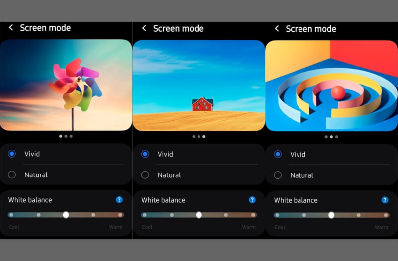
Samsung Galaxy S24
The Galaxy S24 has an AMOLED screen and supports a wide gamut. Upon its release, there was a big furor over the lackluster color in Vivid mode as compared to the S23.
It’s hard to know exactly what Samsung did to the S24’s Vivid mode, except to say they probably applied a level of control versus the no-color-management trick that is common in such modes. Adding color management would potentially make the two modes look similar or identical, especially if viewing sRGB images.
According to Samsung’s small print, the Dynamic AMOLED 2X display of Galaxy S24 models encompasses 100% volume of the DCI-P3 color space, effectively meaning its gamut is larger by an unknown degree.
The S24 has an Adaptive color tone feature, which automatically adjusts screen color and white balance based on ambient lighting conditions. (This is not the cause of the Vivid mode issue.)
Apple iPhone 15
The Apple iPhone 15 has a 6.7” AMOLED Retina XDR screen. It boasts an impressive 460 ppi pixel density, but a more remarkable feature is its extreme 2000-nit brightness during outdoor viewing. What about the color?
Apple targets its own wide-gamut Display P3 color space on the color-managed iPhone 15. This color space is the same as DCI-P3 in its primaries but aims for a D65 white point and sRGB gamma (i.e., a modified, less linear 2.2 gamma).
Note: The original DCI-P3 color space, geared towards movies and digital projection in murky rooms, uses a correlated color temperature of 6300 K as its white point and has a 2.6 gamma. A D65 white point is inherently more precise. The sRGB gamma of the iPhone is better suited to everyday use as it yields a brighter image than a 2.6 gamma outside of color-managed apps, albeit also less saturated.
Most smartphones use a similar variant of DCI-P3 without renaming it. D65 is a common target, though the 2.2 gamma often specified may not aim for the sRGB standard as it does on the iPhone. A fixed 2.2 gamma is more contrasty and darker than an sRGB curve in shadow areas. sRGB was designed to emulate CRT monitor output.
Fully color-managed smartphones do not need Natural or Vivid color modes for the most part, as they prioritize color fidelity. Hence, you don’t find these modes on iPhones, and perhaps they were superfluous on the Galaxy S24.
Incidentally, iPhones and the Galaxy S24 both export images in the P3 color space. Photos taken on a modern phone are quite likely to appear in a wider gamut on the device, but most web photos will be sRGB. Ditto photos funneled through Facebook.
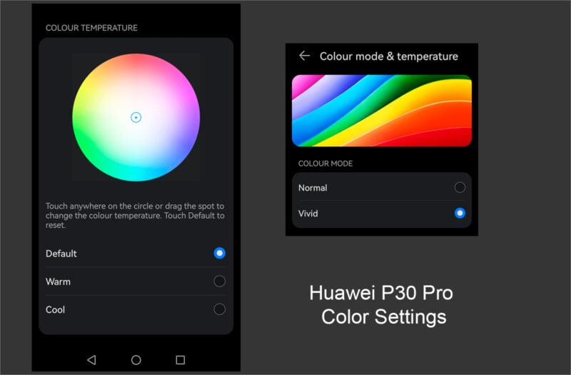
Huawei P30 Pro
When it was released in 2019, the Huawei P30 Pro was among the best smartphones for digital photographers. It has triple Leica lenses and an OLED display with a ~398 ppi pixel density to make pictures look sharp. But what does it do with color?
There is no color management in a P30 Pro. It features Standard and Vivid modes that target sRGB and DCI-P3. The former mode would display most pictures “accurately”, while the latter would be more saturated as a natural consequence of no CM. The P30 Pro produces and exports photos in the sRGB color space.
The sRGB images created by the P30 Pro cause boosted color in Vivid mode, as per the user’s expectations. It’d probably cause widespread angst if the phone made P3 photos, as they’d look close to natural in Vivid mode and flat in Natural mode.
While an absence of color management equals an absence of control, there’s much predictability about its effect and what you’ll roughly see.
What About Budget Phones?
Sub-$100 budget smartphones are likely to have LCD screens. Typically, they’ll only have a standard gamut that aims for sRGB and often falls short of it. That’s okay unless you’re used to a Disney color diet. Many photographers on laptops would see similar.
AMOLED phones are normally more expensive than LCD, but even the cheaper among them tend to support a wide DCI-P3 gamut. Examples include the Realme 8 Pro or the Xiaomi Redmi Note 10.
Self-Indulgence
Getting back to that deep red I glimpsed on my PC monitor. I liked it. I’d like more of it. But DCI-P3 pushes outside of the profiles I normally convert to and embed. It’s not designed for still photography, though that’s not an unmovable obstacle.
Something else: you’d need a wide gamut monitor to benefit from DCI-P3. The more expensive 4K displays cater to that color space and may also offer good Adobe RGB coverage for printing enthusiasts. Bright colors aren’t cheap on big screens.
DCI-P3 could be seen as more self-indulgent than Adobe RGB. After all, who’s going to notice those extra fiery hues other than you staring at your costly wide-gamut display? At least Adobe RGB reaches beyond the computer into CMYK print output.
On the flip side, satisfaction from photography has to start with yourself. You should never be taking photos purely to impress others or gain acceptance. If little things in photography please you, that’s a good enough reason to keep doing them.
Sharing Potential & Final Musings
What I hadn’t appreciated until now is the scope for sharing wide-gamut photos with many smartphone and tablet users. It’s an academic point because most won’t notice or give a proverbial fig about one shade or another, but still…
What’s more interesting to me is the idea of bringing phone color over to the PC. That color is noticeable on a bigger screen, where you’re more likely to luxuriate over the details. And maybe it suits the kinds of photos I take.
With a little effort and some expense, you might enjoy the same vivid hues through your PC that you see on your portable device—hybrid cinema colors. I can’t decide whether this is a great idea or a sorry concession to the cell phone.
Did I tell you about that amazing red I saw? Zzz.