Unlocking the Power of Photoshop Levels for Photography
Levels often seems like a boring old tool in photo-editing programs. Maybe you’d use it to quickly fine-tune contrast by dragging the left and right sliders inwards. But it’s good for much more than that.
Table of Contents
The Hidden Colors Of Levels
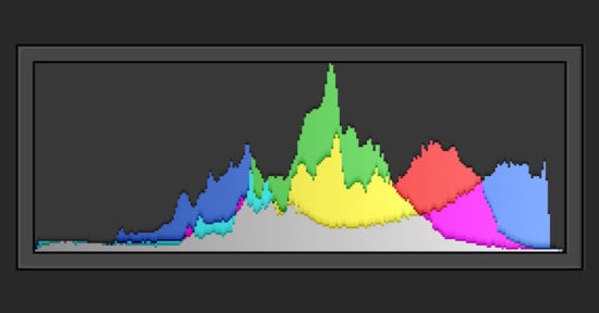
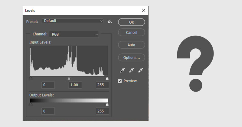
In Levels, you can view and adjust discrete red, green, and blue histograms. It’d be easy to think these histograms only represent the three primary RGB colors, but that’s untrue.
Yes, if you drag the right-hand sliders inwards, you’ll add red, green, or blue to an image via the respective channel. However, the left-hand sliders modify the opposing secondary color in each case.
Thus, the left-hand sliders add cyan in the red channel, magenta in the green channel, and yellow in the blue channel. This is useful to visualize when correcting color, especially in photos that have no neutral tones to help you.
The individual color channels define black and white points, too. Any pixel fully saturated in red, green, and blue becomes pure white with no textural detail. Any pixel likewise saturated in cyan, magenta, and yellow becomes black.
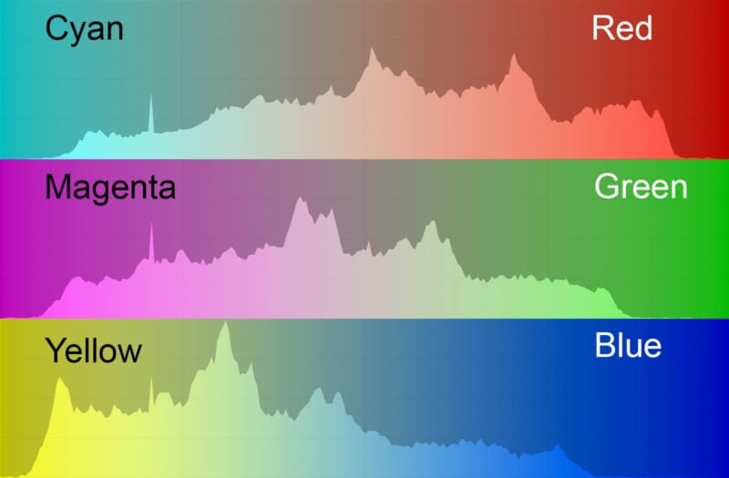
Here are some other points to note about RGB histograms:
- Pure cyan (0, 255, 255 *) is a blend of green and blue and contains no red.
- Pure magenta (255, 0, 255) is a blend of red and blue and contains no green.
- Pure yellow (255, 255, 0) is a blend of red and green and contains no blue.
- Big gaps on either side of a red, green, or blue histogram can signify a color cast.
* RGB values.
Color Corrections Using Levels
There are several ways to correct color using Levels. Some are also possible in Curves. Below, you’ll find three such methods.
1. Simple Levels Eyedropper Method
You’ll see three eyedroppers in Levels and Curves tools. You’d use the outer two to set the image’s black and white points, though this isn’t often needed. It’s the middle eyedropper tool—the mid-tone eyedropper—that you can use to correct color.
One of the easiest ways to remove a color cast is to find a neutral gray area in the image (like concrete or dark clouds) and click on it using the dropper tool. You may need to do this a few times before you get a result you like.
This method is akin to a white balance adjustment. As such, it’s better performed at the raw processing stage if you have that chance. A problem arises when there are no neutral tones in the image, as is often the case in nature. You can feed a gray card into your photo shoots to make color correction easier.
In photos shot under mixed lighting (e.g., daylight and artificial), white balance corrections in general become more difficult. You’ll correct a cold hue in one part of an image, only to increase the orange hue elsewhere. Levels layer masks can help in that situation, enabling you to address specific areas.
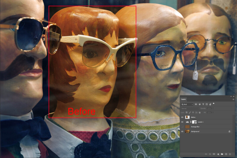
2. The Average Blur Method
This method also uses the middle eyedropper tool in Levels or Curves. It works well on images that have no obvious neutral tones to guide you. However, don’t use it on photos that are dominated by one color.
First, duplicate your background layer. In Photoshop, go to Filter>Blur>Average and click on it. Your duplicated layer will turn into one solid color, which represents the averaged hue of the whole image.
Open a Levels layer and, using the middle eyedropper tool, click on the single color of the duplicated layer. It will turn into a mid-gray. Delete the duplicated layer and merge the Levels layer with the background image.
3. Individual Histogram Method
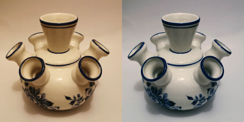
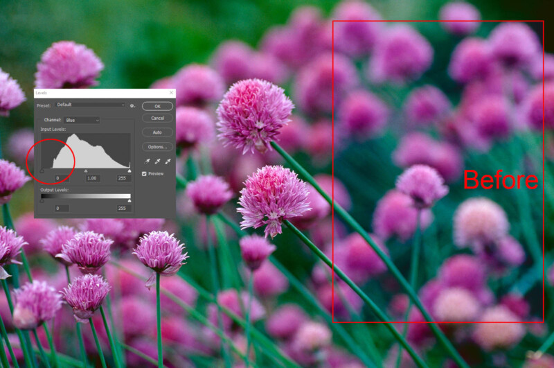
One way to get rid of color casts and improve the overall look of an image is to examine the separate red, green, and blue histograms in Levels. When there’s a strong color cast in a photo, it’ll show itself in a Levels histogram.
An example of the above is a photo that has a cold blue cast. That being the case, you should see an absence of blue histogram data to the left. You can remove the cold cast by moving the left slider inward to add yellow. Because yellow is a mixture of green and red, you’ll enrich those colors at the same time.
A color cast on the magenta-green axis is more likely to come from artificial lighting than daylight. Modern artificial lighting (i.e., fluorescent and LED) uses a correlated color temperature with this precise potential. The backlighting in your monitor is the same, making calibration and profiling all the more important.
It’s possible to improve pictures by adjusting contrast in all three RGB Levels channels one by one. However, this can also create color problems, so it’s not something you’d do religiously. Try it on photos containing a variety of hues.
Viewing the RGB histograms separately can help you make editing decisions and affirm your assessment of an image. Being aware of secondary colors in Levels helps.
Types of Levels Histograms
Aside from the individual red, green, and blue channels in Photoshop Levels, you also have the composite RGB histogram. As you’d expect, this is a blend of the three.
RGB Histogram vs Luminosity Histogram
The RGB histogram warns you about clipping in any or all of the three red, green, or blue colors. Clipping refers to overexposure or underexposure, which always causes a degree of detail loss. If at least one of the three RGB channels still holds data, some detail is still possible (that’s what highlight recovery tools depend on.)
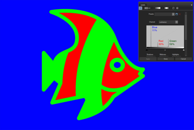
A luminosity histogram represents the perceived brightness of an image. To account for human color sensitivity, green is weighted with 59% of a histogram’s luminosity, with red at 30% and blue at 11%. This histogram is also sometimes called a luminance histogram (e.g., in ACDSee software), which is technically imprecise.
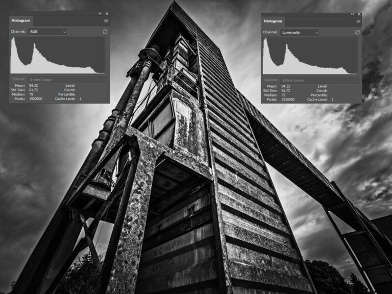
Photoshop only includes an RGB histogram in Levels. Other programs vary. A luminosity histogram won’t show highlight clipping unless all three channels are clipped. With monochrome images, the RGB histogram is identical to a luminosity histogram.
You can use Levels inside Photoshop whilst looking at the histogram window for extra info if you want. For instance, the Colors histogram would give extra live detail on any channels being clipped.
The Clipping Display
In Photoshop and other programs, a clipping display lets you see which areas of detail are being lost. To access it, hold down the Alt/Option key and move the right or left Levels sliders inwards. You’d usually stop once pixels begin to appear on either side.
There are times when Levels adjustments aren’t so easy. An example is when there are many pixels close to full saturation while the main subject sits stranded in the middle of the histogram. In such a case, the outer sliders will forfeit detail if moved. One solution is to adjust the mid-tones with the middle slider and limit your use of the outer sliders.
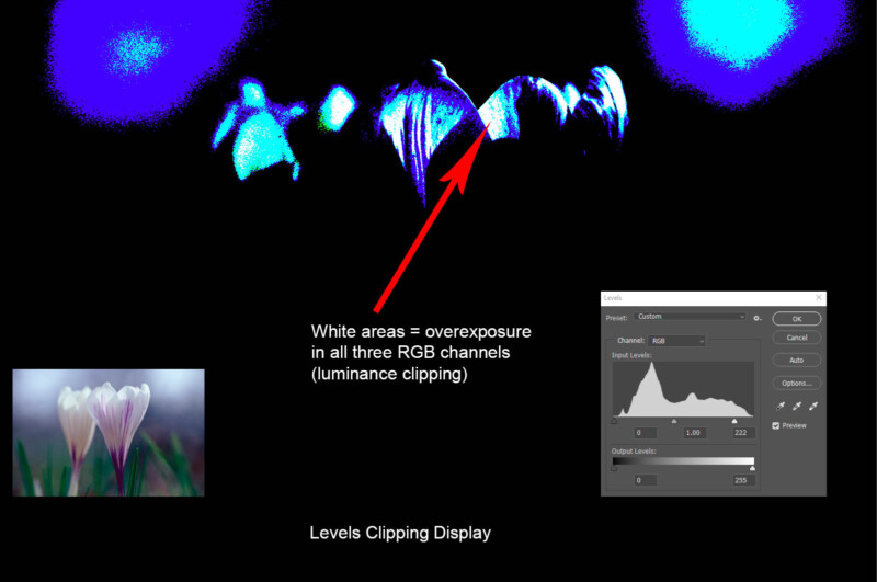
Highlight clipping is often more important than shadow clipping as it catches the eye. Even so, you wouldn’t usually want to block large areas of shadow (denoted by black pixels against a white clipping display.)
If a photo already has clipped Levels channels before you start editing, don’t go overboard trying to fix it. Doing so will often spoil the image, and the look of said image always trumps what the numbers and graphs tell you.
Making Sacrifices
It’s useful to note that some instances of clipping aren’t disastrous. For instance, no one expects to see detail in reflected sunlight (i.e., specular highlights.) You’ll need to make judgment calls about how much you can afford to sacrifice.
The size of an area being clipped is a vital factor, as it’ll certainly ruin a photo if you have large swathes of emptiness where detail once was. Color clipping (rather than luminance clipping) can also cause ugly posterization effects.
Game-Changing Possibilities?
You can now use content-aware fill and generative fill in Photoshop to help you patch up lost detail. This might affect how far you’re willing to go to prevent clipping, especially in a secondary area of the image.
Output Levels
Input Levels are most commonly used in Photoshop, but beneath those you have Output Levels sliders. Output Levels limit the tonal range of Input Levels, though by default they’re set to the same 0-255 span.
One nice use of output Levels is to achieve a more print-like feel to your online photos. Pull the left and right output sliders in to suppress highlights and shadows until you achieve a look you like.
You can also pull in output sliders before the use of high-contrast LUTs or micro-contrast tools like Clarity. This helps to prevent clipping, albeit by reining in the result a little.
The use of Output Levels compresses the histogram, regardless of whether the image was originally clipped. What it can’t do is restore detail in formerly blown areas, alas.
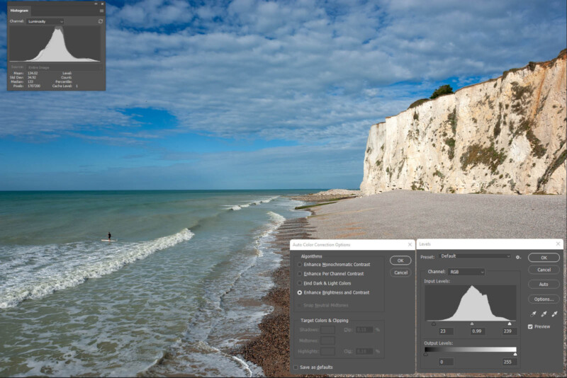
The Levels Auto Options
An auto button is tempting in editing programs, especially if it gets you close to where you want to be. In Photoshop Levels, its effect varies depending on the algorithm selected under the Options tab. There are four in all.
Enhance Brightness and Contrast
Enhance Brightness and Contrast is the default selection, largely because it’s the smartest and most refined. One way it differs from the other three choices is by making intelligent tweaks with the mid-tone slider. It often clips individual RGB channels while avoiding luminance clipping. Image brightness is sometimes overcooked.
Find Dark and Light Colors
This choice with Snap Neutral Tones selected is the equivalent of Auto Color under the Photoshop Image tab. It was once the default setting and often gives a nice result. However, it clips your photo by the amounts specified under Target Colors and Clipping, so there’s no smart editing going on.
Enhance Per Channel Contrast
Enhance Per Channel Contrast is the equivalent of Auto Tone under the Photoshop Image tab. This option may create color casts as it routinely adjusts contrast in the discrete red, green, and blue channels. It works well when it works, making pictures pop with extra color contrast.
Enhance Monochromatic Contrast
This selection is akin to Auto Contrast under the Photoshop Image tab. It doesn’t dive into the distinct RGB channels. Rather, it sticks only to black-and-white contrast, like a Luminosity Levels adjustment. On the plus side, it won’t create color casts. You can also alter Target Colors and Clipping to minimize clipping.
Wrapping Up
Simple tools like Levels or Curves might not be as magical as the latest AI-powered potions, but they still offer satisfying results. These are the tools you’re likely to use on every picture in some form. They can be used creatively, but at the very least they’ll imbue your photography with an underlying quality and understanding.